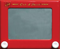
 Charley Parker has blogged an interesting post about the Etch-a-Sketch, one of my favorite childhood toys. Did you know that the gray stuff inside is actually powdered aluminum? You learn something new every day.
Cut paper design
 Here is one of my ideas for a cut paper design. The cut paper version will be at least 11″ x 17″; that’s the size of the drafting film upon which I lettered the poem. The idea came from that original scrap on the left (one of those scraps I saved the other day when I was cleaning out the box), which is a bit of calligraphy about 3″ x 6″. The scrap is at least 11 years old. See, I just knew it would come in handy one day!
How this is going to fulfill the requirement that there be foreground, middle ground and background I haven’t worked out yet. I suppose I could make a case that the large leaves are foreground, the lettering middle ground, and the background — which will be also cut paper on a smaller scale and maybe stick out through the large-leaf areas. I don’t know yet.
I bought a 100-pack of #11 X-acto blades about 15 years ago and I still have 3/4 of them in the box, but that’s changing rapidly. Cutting drafting film dulls the blades quickly!
Drawing I work — copying the masters
 Making a drawing is nothing like, say, creating a worksheet detailing the journal entries of the merger of two companies.
In the latter case, the process is logical, orderly, comfortable, and and I know when it’s done I know whether it’s right. In the former case, all bets are off.
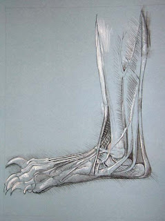
The assignment: to make a copy of a drawing by a master. My choice: a drawing of a bear foot by da Vinci (original shown here at The Royal Collection website). The blue sheet of charcoal paper stares me in the face, challenging me with its blankness. I wonder how in the world I can possibly end up with a 16″ x 20″ copy of his 5.4″ x 6.3″ drawing. But it’s homework, and it’s due, and that’s beauty of it. Somehow it gets done. And it even works — even if it takes awhile to be sure that it is finished, and even if it’s not clear at first that it’s successful. There are no reconciling figures or completed worksheet to signal the end of the drawing.
Some time after taking a week-long workshop with Ann Hechle, I attended her lecture at the 1990 Letterforum about the process of working on the piece about the first hexagram of the I Ching, The Creative. It was also a lecture about the nature of working creatively, which gave me insight into the stages of the creative process — the new idea and all its possibilities, the first stages of work on the ideas and culling out/giving up extraneous ideas, advice and input from others, the chaos in the middle, knowing when it’s finished, and letting it go. All very valuable wisdom … which I completely forget every time 🙂
Cut paper – links
I think I’ve got a cut paper design ready to start. I think. The possibilities are many.
Here are links to some paper cutting sites I like:
- Kako Ueda‘s work, which cannot be adequately described;
- Beatrice Coron incorporates paper cutting in her books as well as in broadsides (there’s a lot to see, including her recent work, inner city series, commissions, and more);
- Peter Callesen, see my later blog post here — he was one of the first cut-paper artists I remember seeing online;
- Chris Natrop‘s incredibly intricate (and huge) masterpieces;
- Lane Twitchell‘s beautiful abstract pieces;
- Su Blackwell‘s book-cut sculptures and installation pieces;
- the work of Ingrid Siliakus showcased at the Holland Paper Biennial 2006 (check out her “Ferris Wheel” page, created for the White Book);
- the cut-paper book objects of Georgia Russell;
- Jill Sylvia‘s show “Ledger” at the Eleanor Harwood Gallery in San Francisco;
- a variety of paper cutting by Drew King;
- “Universal Language: The Art of Papercutting” was an exhibition shown at the Selena Gallery, NYC, in 2003, under the auspices of the Guild of American Papercutters.
Here are some related paper arts sites that blow me away:
- wholemovement, a site showcasing paper models made from 9″diameter paper plates;
- the architectural paper sculptures of Nishimura Yuko;
- Ronnie Remmentilla’s flickr site showing his paper model of Howl’s Moving Castle.
Many of these links I first saw on Paper Forest, a blog about all kinds of paper art, or on the Rag & Bone blog.
In case these links are not enough, here is Beatrice’s comprehensive list of links.
Scraps
 After a series of tight deadlines, the stacks of art paper in my studio are piling up and weighing me down. I’ve begun organizing all this paper, and the scope of task is commensurate with Hercules’ in the Augean stables. Although my studio smells better (than the stables).
Actually, if you’re a little under the weather, as I have been, it’s rather pleasant to sort through the scraps of paste paper, calligraphy, watercolor washes, color studies, off cuts and so on. It stimulates all kinds of ideas … which makes it harder to throw anything away. I look at a 2″ scrap of interesting marks and think: “That would go well in a book whose theme is …” and “That could be the anchor in a collage on …”
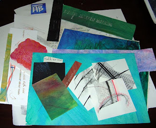
Here’s a display of some of the keepers. To give you an idea of scale: The white squares at the lower part of the picture are about 3″ square.
The big question is how to organize them. I don’t have a final answer. This time I sorted them into plastic bags by general size and shape. It’s no good keeping papers together by technique — paste painting, watercolor, calligraphy, mark-making — because of the smaller smaller items get lost between the bigger ones.
Like loose change, my inventory level of paper scraps is constantly being adjusted. No inventory, and I’ve got to start from scratch for even a little 1/2″ block of orange-red, say, that will “make” the piece. Too much inventory, and every project is overwhelming in its possibilities. Way too much inventory, and I might as well have none because I don’t even want to open the box.
Stephen Wiltshire draws Rome
 This video shows an amazing savant, Stephen Wiltshire, drawing a 5-1/2-foot mural of Rome from the memory of a 45-minute helicopter ride. It took him 3 days, and his perspective and detail are incredibly accurate, as revealed by an overlay of aerial photos.
We are an amazing variety of human beings, aren’t we? I contrast this feat with my experience last week: After 3-1/2 hours of staring at and drawing just part of an arrangement of tricycle, open box and ladder, I was still seeing new details. And further contrast: the experience of my friend who finds stick figure representations of people simply daunting.
Tunnel Books — Links
I’m not a fan of tunnel books, but a current class assignment has led me to look at them more closely.
It’s often frustrating to look at images of tunnel books. You’re shown the cover, you see the sides, you see the sculptural aspects of the book, but only rarely do you get to see even an approximation of what one sees when one looks through the tunnel book.
Here are some of my favorite tunnel books that you can see online:
- Roberta Lavadour’s Harvest Moon, a luminous view of the moon with layers of twig branches covering the main image.
- A collaborative tunnel book made in Julie Chen’s class at Pyramid Atlantic. I like it that the square confines of the outer shape are breached.
- Tara Bryan’s World Without End, with the story on the accordion panels and the images in the tunnel. At roughly 3″ x 3″, it seems a little small for comfortable tunnel viewing, but since the story is on the outside, maybe that’s not as important as it might be otherwise.
- Ed Hutchin’s Grandma’s Closet — a great use of the tunnel structure. (Update Nov 2017: no longer on the internet except on Pinterest and as a rare book for sale.)
- Peter and Donna Thomas’s awesome Ukelele Tunnel Book, part of a series of uekele books. The back of a ukelele was sawed off to allow for the tunnel structure. The entire series is here. Although I found this book first, I list it last, so that the rest of the list wouldn’t be disappointment.
I don’t like tunnel books as much as I like other book structures, I think because it functions more as a sculpture than a book. You get the whole picture at once, and time doesn’t play the part that it does in books whose pages have to be turned and whose images and words appear serially. In a tunnel book, there are more things to see as you look around more, but that’s true of paintings and sculptures.
Blogs on a Roll
Over at the Book-Arts-L, there’s been some discussion about book artists who blog. As a result, I’ve updated the blog roll at the right for some of the interesting blogs that have been mentioned there. Especially, check out Riverlark, Rag & Bone Bindery. Also, for a long time I’ve been subscribed to the feeds for Dennis Yuen’s blog (Cai Lun) and the podcasts from University of Alabama’s Book Arts Program, but somehow never added them to the blog roll. All these deficiencies have been remedied.
Check ’em out.
Drawing I — graytone drawing
 We did this still twice — although we were allowed to move around and find another view after the first one if we liked. The first one was a straight value drawing in charcoal. My first one went so badly that I never finished it. And no, I don’t want to talk about it. On the second day, we started by covering our paper with a mid-tone gray and then “drew” in the highlights with a kneaded eraser. Only after all the highlights were lifted out did we go back in with charcoal and get the dark tones. I still have some work to do on the darkest shadows.
These things take so long! This was 2-1/2 hours.
Drawing I – latitude-longitude contour drawing
 Another image from my Drawing I class, drawn on 18″ x 24″ paper. The Sharpies we used here fall more in my comfort zone than do charcoal or pencil. With a Sharpie (though I like Zig markers, which don’t stink), a mark is a mark is a mark. It’s not a shadow or a hint of a mark or a slightly darker tone, it’s a mark. Never mind that we used marks to put in the shadows 🙂 and never mind that when you make a mark it’s simply there and there’s nothing you can do about it from then on. I was still more comfortable making this drawing than making any others we’ve done so far in class.
(In case you wonder about my contours on the swan, know that the swan is made of plywood, with a Styrofoam half-oval for a wing.)
