 A mysterious depiction of a alien nest? An excavated cave drawing? No, just the hodgepodge of brush strokes that are the result of working through the first 40 pages of Adobe Photoshop CS2 Studio Techniques. It’s a great book. It’s not so much that there are too many pages on brush options and settings … it just seems that there are too many brush options and settings. It’s pretty amazing.
Madeleine L’Engle: science + religion = pure creative magic
Madeleine L’Engle, one of the creative gems of our world, has died. I’m doubly grateful for the written word: without it, we may have lost her wisdom forever.
The New York Times reported:
“Why does anybody tell a story?” Ms. L’Engle once asked, even though she knew the answer.
“It does indeed have something to do with faith,” she said, “faith that the universe has meaning, that our little human lives are not irrelevant, that what we choose or say or do matters, matters cosmically.”
Webmaster Certification
This morning I got notice that I am a Certified Webmaster. Yay, me! I’m not sure what it signifies exactly. It definitely means that I completed courses in web architectures, XHTML, CSS, Photoshop and Dreamweaver, and that I designed a website that is compliant with W3C specifications and is accessible. As a bonus, the website I (re)designed is my own. Take a look at www.callibeth.com. Even though it was certified, I’m still not altogether happy with it — I’m continuing to work on converting all pixel measurements over to em measurements so that the website design won’t break when browsers choose to enlarge the type.
I do like my redesign of the 6 book swaps. They used to be rather ragtag and there were errors on the pages. Now it’s all consistent, and I like looking through all the books. See the books by starting here at www.callibeth.com/bookswaps.php.
Traditional Stick Ink
One of the pleasures of calligraphy is handling the traditional tools and materials that have been used for centuries. I mean, I love gel pens, which have their own delightful tactile properties: the glistening of the gel as it comes out of the pen and forms a line that sits on top of the paper … but I digress. As fun as they are, the experience of writing with a gel pen on black paper, even, doesn’t hold a candle to the delight of writing with a quill and freshly ground stick ink on a piece of parchment. That’s really the point of this rambling, in case you were looking for one.
Joe Vitolo at the Ornamental Penmanship list on Yahoo Groups has drawn our attention to several interesting YouTube videos having to do with stick ink:
In the first video, Haiying discusses what makes a stick ink good or not so good.
In the second video, she talks about how to protect your stick ink during use, and more about the qualities of stick inks.
 In the third video, Hirokzu Kosaka talks about how stick ink is made.
Even beautiful people are not perfect
I’m beginning to think about digital photography, one of my art classes which start next week. In synch with these thoughts comes a post on a web designer’s list pointing to this site which shows how photos are retouched to “perfect”the beautiful people. Click on the title of this post or the link in the previous sentence, then click on “Portfolio”. At the Portfolio page, click any thumbnail and then compare the images with your cursor in the “hover” and “not-hover” positions. Amazing.
Web design as fine graphic art
 I see a lot of interesting web design and a lot of great art online. Hardly ever do I see both on one site. Checkland Kindleysides is one of the few sites I’ve seen that combine great web design with great art. Not only that, it’s one of the very, very few Flash sites that use Flash in an integrated way. It’s a magical experience.
One criticism: You can’t adjust font size on a Flash site.
That book again


A few more pictures from the book I did as a final project in one of my summer classes. These are C, G, and H. The ladybug is mostly a collage of 3 papers, with colored-pencil highlights and black-ink spots and legs. The spinybacked orbweaver is Chinese stick ink and gouache, mostly done with a folded pen. The beetle is a piece of ink-jet blue-colored paper (a scrap from an artist book with a blueprint background that I don’t think is on my website anywhere) with stick ink and white ink. I was pleasantly surprised to find that it looks rather like a bandana print.
I enjoyed doing a sort of survey of techniques in the book, but if I were to do a book to enter in an exhibition, I’d like to try and limit myself to one of the techniques. I think. Who knows until the doing of it, right?
Image transfer techniques
 Whew! The summer semester is over, and I’m ready for a little break from deadlines. I finished the final project (this book) only by staying up all night on Tuesday; it was due at 9:30am on Wednesday. I’ll take some photos and post them later, but for now I want to memorialize the links I found for image transfer techniques. Some of them I tried, some of them didn’t work, and some of them did sort of, some of them I didn’t have time or materials to try, and so on. Sometime I want to go through each of these techniques in more detail. For now, here are the links, before I lose them:
- Art-E-Zine‘s list of image transfer techniques (thanks to Jackie at TJ Bookarts) with links to how to do them, including …
- the famous Great White transfer technique;
- Riverlark’s list of non-toxic transfer processes which she learned at an MCBA class;
- Jackie Poutasse’s list of links concerning image transfers. posted on her TJ Bookarts blog.
The image above is from the book I made, but this image transfer technique is not listed anywhere in these links above. It’s a color foil application called ColorTag, made by Letraset. The foil is formulated to stick to photocopy toner by heat. I doubt that Letraset is still making these, but I loved the process 20 years ago, and still have the little square iron that is about the size of 3 iPods stacked together, and I have some of the foil too.
Blast from the past
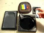
 Found while looking for a photo I took of a golden silk spider (nephila clavipes) … this photo of my old waxer. Anybody else remember these? You dropped a stick of wax into the well of the waxer (the well is stoppered by that red rectangle you see), plugged it in, waited for the waxer to heat up — this last bit of patience being necessary to the well-being of your waxer. Then, applying wax in much the same way we apply packing tape to a carton, roll on the wax to the back of whatever you wanted to apply to your … paste-up, or mechanical.
I took this photo in 2004, just before dumping it in the garbage.
I haven’t missed it at all.
Final project for class
 Wednesday is the last class of the semester, and that’s the day this artist book is due. I’m about 20% through, which is not good. Once again, I’m trying to do something that is too complicated for the time allotted. This is an abecedary bestiary about creepy-crawlies, a subject which is constantly in mind by the end of summer in Florida.
I’ve had to cheat on Q: it was either include the Queensland beetle — whose appearance in Florida is only anticipated with dread but not actually in the population — or something else. I chose something else: the mosQuito. I’ll put the mosquito in the Q, I think. No creepy-crawliary of Florida would be complete without the mosQuito anyway.
The nematode, whose microscopic head and tail are blown up across two pages and two papers, was drawn with a school nib and Chinese stick ink and McCaffrey’s ivory ink. I knew drawing on that unsized leaf-inclusion paper would be a difficulty. But I did it anyway. You can see some bleed-through on the next spread for the zebra butterfly. Oh well. I kind of like that too.
The zebra butterfly image is an acetone image transfer of a photocopy of a drawing I made by using a folded pen (a butterfly pen, it’s called, haha). The image transfer is a little “pebbly,” probably because of the texture of the Arches Text Wove paper it’s on. I like it. The bit of vermilion gouache matches the rust-colored leaf-inclusion paper better than is shown by the photograph, which turns the rust sort of maroon, for some reason.