 Where does the time fly? What with semester final projects and work and eight days in Mexico, I’ve hardly had time to take a breath.
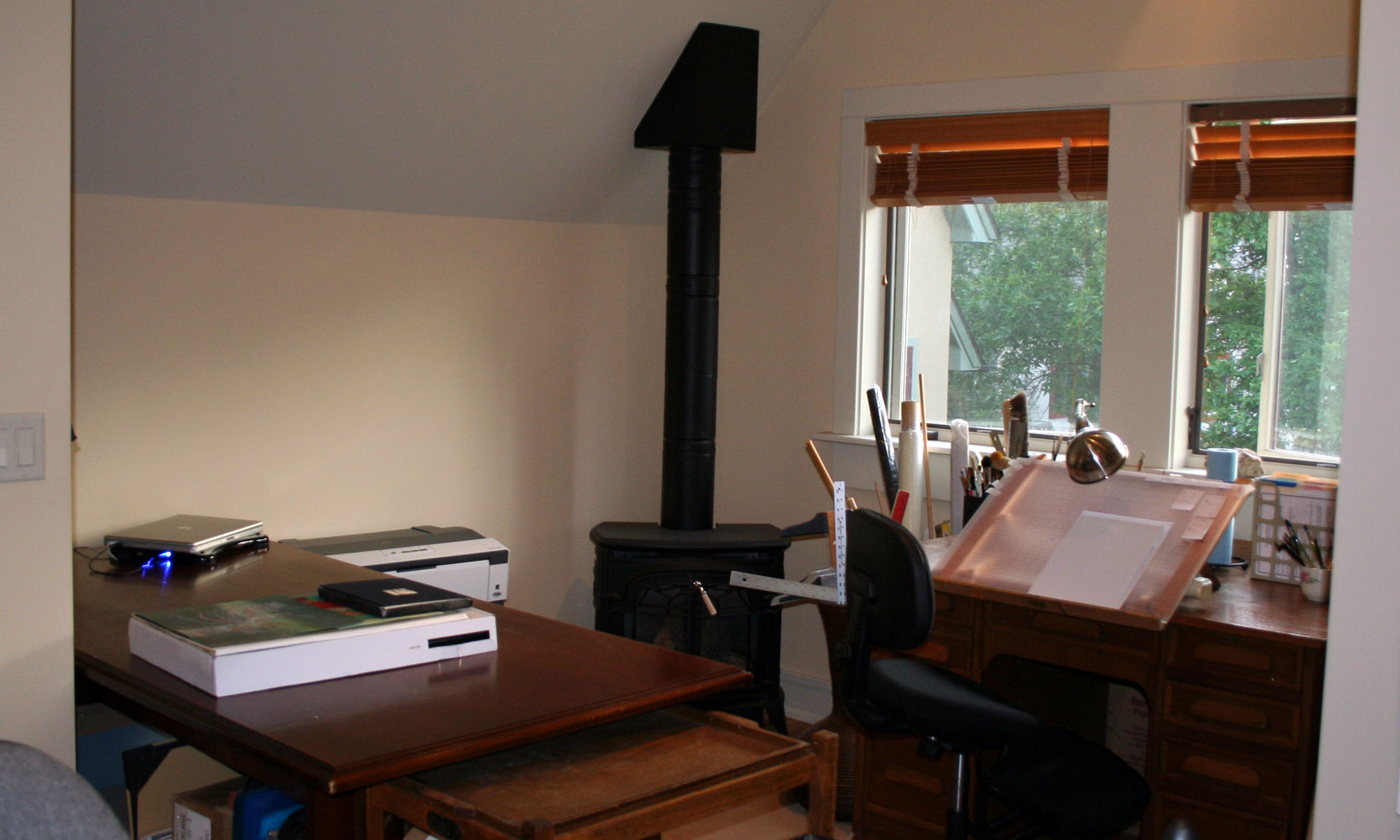
But I just caught sight of my large drafting table, and it looks so … satisfying. There’s my final project in 3D Design — an assemblage of found objects — propped against the back wall. That’s partially covered by two envelopes in the midst of construction for the Black Tie Exchange over at the Yahoo list, Calligraphy Exchange.
In front of that is some trial lettering and rubrication for a Kipling poem. And then there are stacks of wedding envelopes done in black copperplate, and the brown envelopes with gold italic in front are Christmas card envelopes. The Crane stationery has a luscious gold and green palm tree on the front. It’s simply luscious, writing on that dark brown paper and watching that gold ink flow through the pen and sink into the paper.
That beautiful jumble of work on my drafting table is so happy-making. And I think of what Brenda Ueland wrote:
Why should we all use our creative power … ? Because there is nothing that makes people so generous, joyful, lively, bold and compassionate, so indifferent to fighting and the accumulation of objects and money.
I am so lucky.


