 I haven’t been posting anything from my classes because I’ve been working on them right up until the due date, and once I turned them in they were in the classroom until the semester ended.
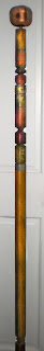
So I’ve got all this stuff in my studio that I don’t know what to do with. This walking stick was our penultimate project in 3D Design. We brought a 2×4 to class and then, after being shown most of the tools in the wood shop, we were told to work on that 2×4 until it was a walking stick. Many people’s sticks were all naturalistic and such — carved leaves and vines and so on. One very unusual one was a bright multi-colored syringe full of candy. Another very cool one was a sharpened stick with 3 carved fishes on it, as for a barbecue. Mine looks like a piece of furniture. I had fun on it, though.
I ripped my 2×4 into two 2×2’s so it would be square, then mitered the corners of square on the table saw. The knob at the top is 2 2×4’s glued together and then ground into a squared globe and doweled into the 2×2. Each section is a different experiment with the grinder or the drill or the Dremel or the band saw or the sander, or some combination of those.
I enjoyed the finish work: the rough sanding, the finer and finer hand sanding, the painting (cheap acrylic paints in the scrapbook aisle at Target) and the ebony stain over top that.
It’s a big image, but you’ve got to click on the thumbnail to see it properly.
Like this:
Like Loading...
 It’s another new beginning today: the first day of school.


