January in Tallahassee


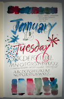
I saw Toni’s post this morning, and decided to try something similar. It combines photography, calligraphy, graphic design and Photoshop. This first attempt is fairly chunky and heavy handed, but it’s a start. I always enjoy reading Toni’s blog, and Victoria’s blog too. Victoria beautifully combines photography with calligraphy. Toni, I tried to comment on your blog, but my browser wouldn’t let me. I’ll figure that out soon.

Left-handed writing and a low-key 3-color palette

I’ll never be able to write left-handed. It’s amazing how different a metal #5 Mitchell roundhand pen feels in my left hand, compared to how it feels in my right hand. My son walked by as I was trying this, and told me that I was holding the pen much further back on the staff than I do with my right hand. So I choked up on the pen and it went a little better, but it was difficult just to get the whole width of the chisel down on the paper at once.

The watercolor palette is all Winsor-Newton:

  • Rose Madder (Alizarin)
  • Prussian Blue
  • Terre Verte
for a subdued palette. I did this last night.

Doodling


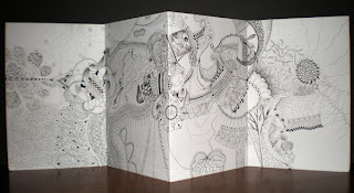
Here’s something I started last semester as homework in my Drawing II class. From time to time I’ve added to it, and I did a little more today. It’s a piece of drawing paper 18″ x 24″ (you only see half of it in this photo) we were given and told to doodle upon throughout the semester. When I complained that it was difficult to doodle in the middle of a sheet of paper that large, the instructor said we could fold it if we liked. So I folded my sheet into the one-page book structure that was the subject of my January 1 post. Which is why you can only see half of it.

InDesign on January 13

Yesterday I opened up my newly purchased and installed CS3 Suite application InDesign. I’ve been using Publisher 97 for … well, since it was new. My Graphic Design class this semester uses InDesign and so I’ve got to get up to speed on it quickly. My first attempt in InDesign was, oddly enough, on January 1 when I printed the one-page book. That was done in InDesign CS2. Since then the semester has started, and it’s been clear that I had to get CS3 in order to be able to work in the classroom on the Mac as well as in my studio on my PC.

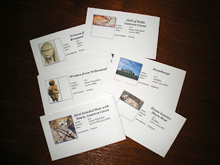
Here I killed two birds with one stone, so to speak, by making flashcards in InDesign for my Art History class. I made about 20, although only 6 are shown here.

Asian Dinner for 8

Today’s creative endeavor was an Asian Dinner for 8. My daughter came back from a semester overseas determined to learn how to cook. So we’ve been cooking. Today’s meal was a birthday celebration. The recipes all (or nearly all) came from Epicurious.com:

Egg Drop Soup
Lee Wan Ching’s Chinese Broccoli with Ginger Sauce
Jasmine Rice with Garlic, Ginger, and Cilantro
Jade Dumplings with Soy-Sesame Dipping Sauce
Vegetable Stir-Fry
Steamed Sea Bass, Cantonese Style
Tea-Poached Pears with Tapioca Pearls and Satsumas
Five-Spice Fortune Cookies
Bubble Tea

It was quite a spread. No matter how much I reminded myself to take photos, I forgot it all in the midst of preparations.

January 10 – Pointed Pen Script

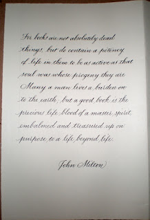
One day a year is inadequate for World Literary Day, so I’m continuing the theme today.

Pointed pen is not my first tool of choice in lettering. I’ve never had a class in pointed pen scripts — copperplate, engrossing, Spencerian, business hand, etc. — so what I know I’ve mostly picked up on my own … and mostly from the folks in Ornamental Penmanship discussion group at Yahoo. The resources available there are simply incredible.

Broad-edged pens are more familiar to me. But I’ve just finished addressing 450 double-envelope wedding invitations in my own brand of pointed pen script, and it’s starting to feel a little more comfortable than usual. The shoulder, now, that’s not so comfortable at the moment …

World Literary Day


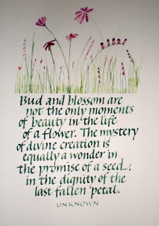
Some quotations in honor of World Literary Day. All done at 4 pen-widths high with a worn-out metal #3 Mitchell nib. (I have no idea why I hang onto these corroded, disgusting pens. Is it a sort of self-flagellation for the sin of neglecting to clean my pens properly? Scottish parsimony? I don’t know.) All in gouache, except that the black is Moon Palace sumi ink.

The green drove me crazy, glopping off the pen — you can see the unevenness in the close-up view. Since it was only the green that was a problem, I think it was the lemon yellow that was causing it, because the ultramarine and the touch of vermilion were fine in the other mixtures. Or perhaps it was the combination of the lemon yellow and ultramarine — mixing them seems to me something like mixing low-fat milk and Kool-Aid.

I’m not recommending the color scheme! I’m still cleaning out old palettes — more parsimony, perhaps, and the pleasure of exploring color in a serendipitous manner.

I can’t remember what this paper is. It’s something to do with printmaking — very, very smooth and more of an eggshell color than it looks here. Superfine Letterpress, perhaps?

First Day of School

It’s another new beginning today: the first day of school.

I had thought to make naive letter forms, and partially succeeded. I failed mostly in that I could not bring myself to abandon the Roman capital proportions, and thoughtlessly (without thought) kept the verticals more heavily weighted than the horizontals.

But I was more interested in making letters that were difficult, awkward to make, required thought, were not automatic. In this I succeeded: I worked to keep the pen angle at 90 degrees to the stroke, which required a constant change of pen angle to the writing line. Very awkward to do.