 I like this poster better than the one I was working on before. Still, not sure it appeals to college-age people. I think I’ll submit both and see what happens.
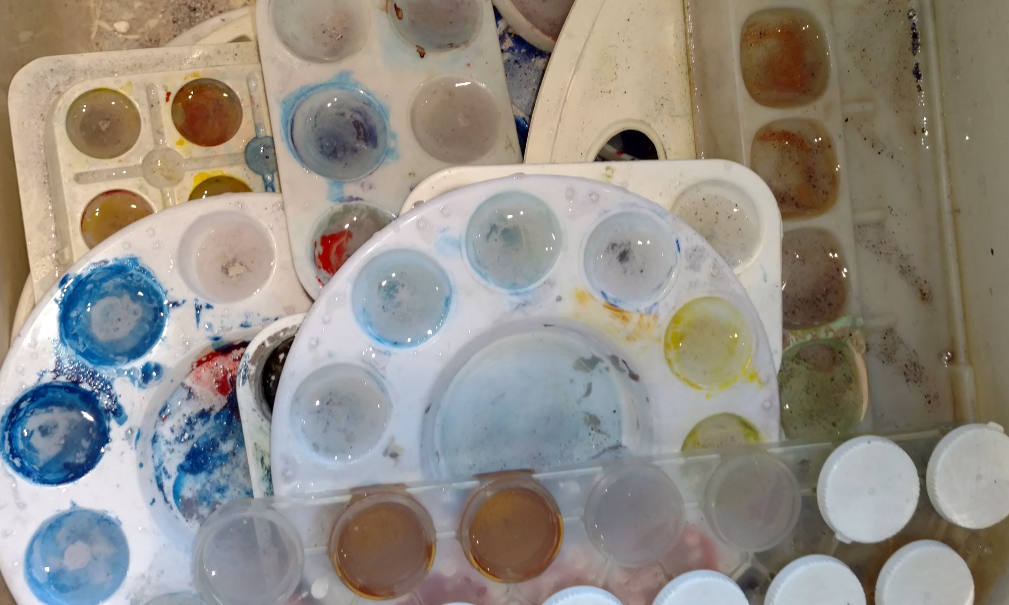
Getting these things printed at Kinko’s was expensive.
Calligraphy & more — the studio of Beth Lee, Bozeman, MT
I like this poster better than the one I was working on before. Still, not sure it appeals to college-age people. I think I’ll submit both and see what happens.
Getting these things printed at Kinko’s was expensive.
 InDesign homework for Graphic Design class, due Monday. I’m not happy with this 17″ x 22″ poster, but I’ve been working on it awhile, and it’s the one that gotten feedback for in the past several classes. I feel like I’m stuck with something I can’t stand behind. It’s frustrating. I like the graphics but not the salesmanship. I’m no salesman.
 I’m pedaling fast to get up to speed with Adobe’s page design program, InDesign. At Barnes & Noble today I got this book, How to Wow with InDesign, by Wayne Rankin and Mike McHugh. I’ll enjoy going through it, tutorial by tutorial, but meanwhile just looking through the book is an inspiration.
 On January 24, I continued my survey of handwriting, this time a survey of my current handwriting with variations in spacing and writing utensils.
I’ve currently got two large chunks of work — 450 certificates, 400 wedding invitations — and this little divertissement was just what the doctor ordered.
 In honor of National Handwriting Day, I’ve gone through various boxes of memorabilia to create a survey of my handwriting throughout the various stages of my life. I’m amused.
I like to say that I got into calligraphy out of sheer stubbornness: In elementary school the only subject in which I couldn’t get an A was … handwriting. I’ve been working on it ever since.
If you click on the thumbnail at left you’ll see my handwriting at 5-1/2, 11, 16, 24, and 42. The big gap in there could possibly be filled only by locating the children’s artwork with my explanatory labels on it; the years of rearing young children evidently didn’t provide much free time for longhand.
 I’ve got so much work at present, it’s a pleasure to sit down and mix paints and doodle in my journal. I’m into the second signature of the journal. When I get a sufficient number of signatures done, I’ll bind them. I’m looking forward to it.
Schmincke Calligraphy Gouaches are a real pleasure to letter with. These are three of the six colors I most often work with: vermilion red, ultramarine deep, and lemon yellow.
I won’t bore you with my practice sheets of copperplate. Rows of ovals, rows of beginning strokes, rows of other ovals, rows of stems … you get the point.
This weekend I hosted five high-school boys plus our own for a four-day meeting. I have been driving and driving and driving. And cooking. I am pleased to have done something creative every day during it all. I got out some exemplars and worked on some new capitals before I started addressing the invitations … there are 400 invitations to this wedding, so I’ll be doing a lot of pointed pen work during the next couple of weeks. The x-height of these letters is about 1/8″.
![]() To paraphrase a well-known saying: If it weren’t for bad results, I’d have no results at all! This time I tried a sheet of 3M transparency for inkjet printers (CG3480) on that Superfine Letterpress paper which I’m beginning to really hate, at least for transfers. This is an image from my January 2 post. The G transferred best; I think it’s because I burnished it more, but I’m not sure. Parts of this transfer are image are a complete mess, with bits of paper torn up from the substrate.
To paraphrase a well-known saying: If it weren’t for bad results, I’d have no results at all! This time I tried a sheet of 3M transparency for inkjet printers (CG3480) on that Superfine Letterpress paper which I’m beginning to really hate, at least for transfers. This is an image from my January 2 post. The G transferred best; I think it’s because I burnished it more, but I’m not sure. Parts of this transfer are image are a complete mess, with bits of paper torn up from the substrate.
![]() Then I transferred this image from my January 1 post (printed on the same transparency as the above image) onto an Arches Text Wove page. No tearing paper, but the transfer wasn’t a tearing success either! I burnished it a lot, and let it sit quite awhile before I pulled up the transparency.
Then I transferred this image from my January 1 post (printed on the same transparency as the above image) onto an Arches Text Wove page. No tearing paper, but the transfer wasn’t a tearing success either! I burnished it a lot, and let it sit quite awhile before I pulled up the transparency.
I’m flummoxed. (Isn’t that a great word, though? I’ll take my amusements where I can get them …)
![]() These transfers went even less well than yesterday’s transfers. Part of it was the paper, which is the Superfine Letterpress (I think) that is part of the first signature of this journal. It buckled and didn’t want to take the images. The top image, of our plum tree, wasn’t a total failure … until I kept rubbing until the pigments started to shift around with my finger. The left middle image — a bouquet of pen-made flowers — turned out surprisingly well. The image of an old worksheet from a workshop with Ann Hechle (great workshop!) was a disaster, although the bits that did work yielded very clear, tiny letters. The bottom image, Boy with Accordion, worked in places but mostly not. Interestingly, it was very unpleasant to write with pen and watercolor on the matte medium areas of the paper. The paint didn’t want to leave the pen and the paper didn’t want to take the paint. W/N manganese blue and ultramarine, plus some other brand of cadmium orange. And colored pencils in the same colors.
These transfers went even less well than yesterday’s transfers. Part of it was the paper, which is the Superfine Letterpress (I think) that is part of the first signature of this journal. It buckled and didn’t want to take the images. The top image, of our plum tree, wasn’t a total failure … until I kept rubbing until the pigments started to shift around with my finger. The left middle image — a bouquet of pen-made flowers — turned out surprisingly well. The image of an old worksheet from a workshop with Ann Hechle (great workshop!) was a disaster, although the bits that did work yielded very clear, tiny letters. The bottom image, Boy with Accordion, worked in places but mostly not. Interestingly, it was very unpleasant to write with pen and watercolor on the matte medium areas of the paper. The paint didn’t want to leave the pen and the paper didn’t want to take the paint. W/N manganese blue and ultramarine, plus some other brand of cadmium orange. And colored pencils in the same colors.