Even more ABCs

Alphabet on that inexpensive "rice"paper you can get in packets. Drying-up Pentel color brush.
Alphabet on that inexpensive “rice”paper you can get in packets. Drying-up Pentel color brush.
Alphabet on Strathmore charcoal paper
Alphabet on Strathmore charcoal paper -- starting from Z and working up.
Alphabet on Strathmore charcoal paper — starting from Z and working up.

Someone stop me. No, not really. Well, maybe.

I’ve now done several alphabets in Z-to-A order. The third image is one of those. It is about focus to some extent. I find it easier to be more even* when I work up, and it’s interesting how the questions of space change when I’m going in the opposite direction.

*By “even”, I mean that my focus and tempo and looseness tend stay more constant throughout. This third image is a poor example of that, but as a rule, this evenness is more pronounced when I start at the end.

As always, click on the images for a closer look.

Another day, some ABC practice

2015-08-18-daily-ABC-with-Pentel-brushThinking about space and connection. I find the KL area difficult.

I think of myself as a person with a long attention span, but I’m finding that I lose focus about J or so. Maybe it’s not attention span; maybe it’s kinetic memory. The ABC is solid, DEF are coming along. GHIJ, slightly less so. And after that it’s in and out.

In college when I had to memorize music, especially Bach, I began with the last measure, then the penultimate measure and last measure, and so on (or would that be “so back”). Memorization has always been difficult for me. This method of back-to-front memorization meant that as I played the piece in performance my comfort level increased. It also meant — again, especially for Bach — that if I had a finger fault in one measure, solid ground was available just a few beats away at the beginning of the next measure.

Maybe I should start with XYZ tomorrow. The next day, though, I’d need to start with WXYZ or YZ; there are no measures in an alphabet.

Just a small sample of my stream of consciousness during these ABC exercises …

Gestural ABC practice from Ewan Clayton’s workshop at The Passionate Pen

2015-08-14-daily-ABC-with-Pentel-brush
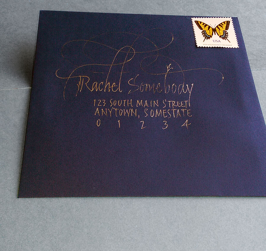
At the annual calligraphy conference held this year in Sonoma County last month, I was honored to attend Ewan Clayton’s four-day workshop entitled “The Spirit of Invention”. We looked at new directions which several German calligraphers took after World War II. One of these calligraphers, Werner Schneider, explored handwriting and gestural mark-making.

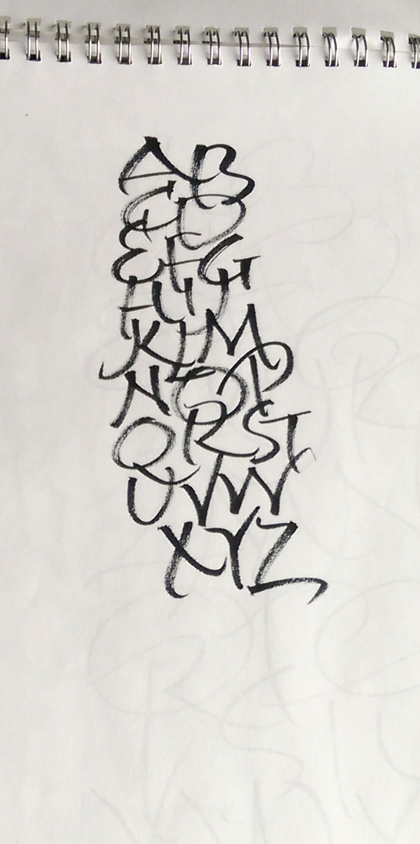
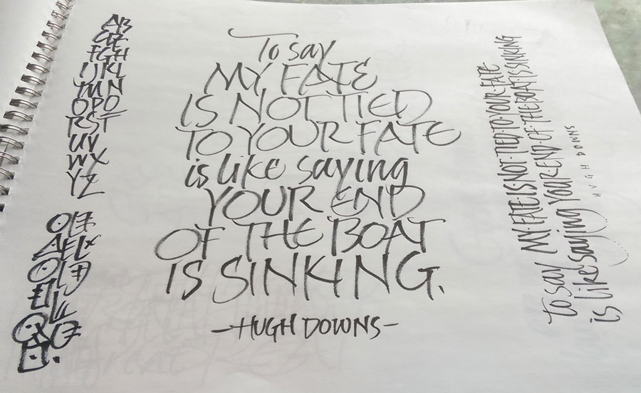
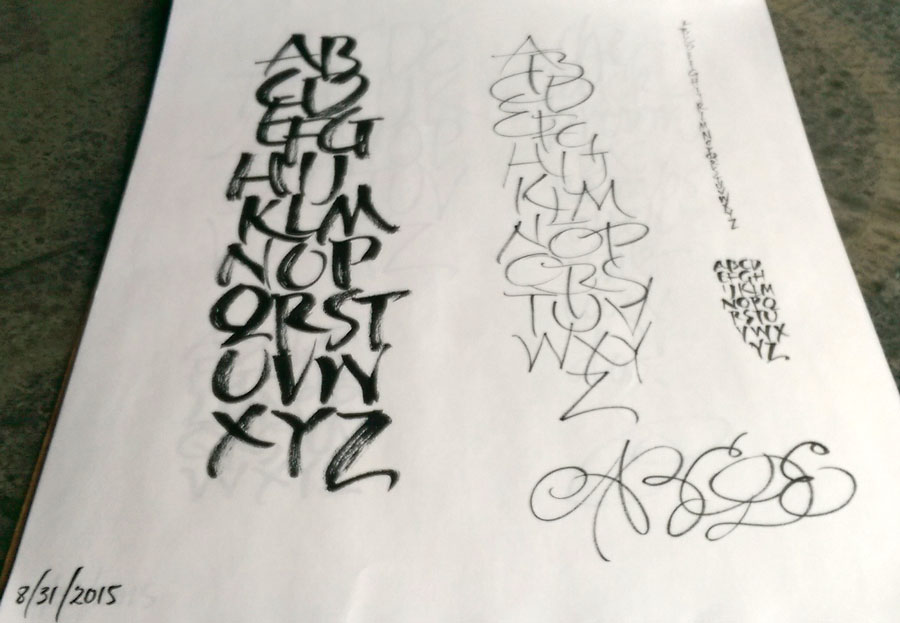
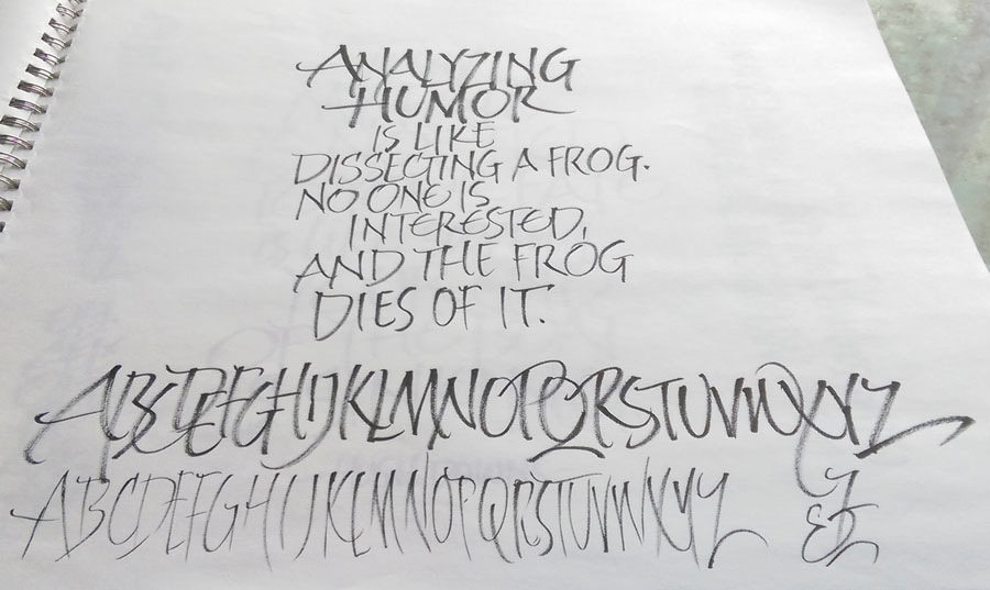
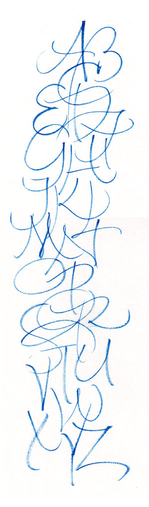
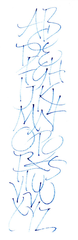
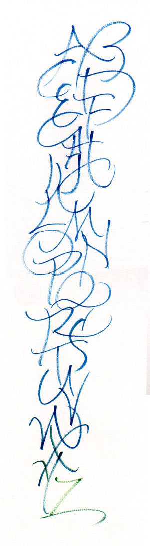
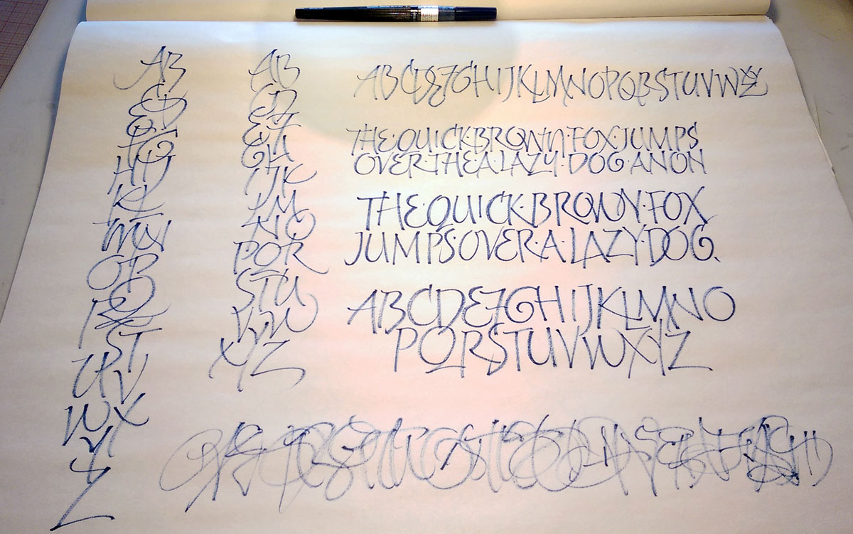
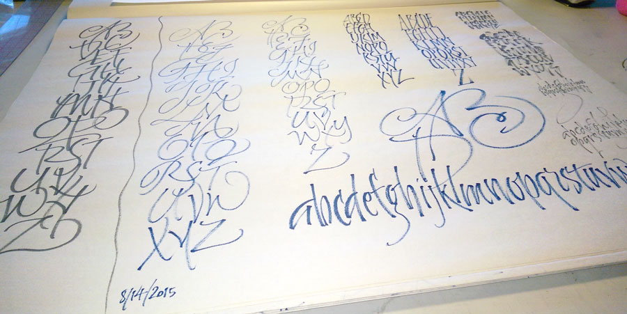
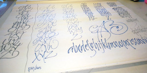
We were introduced to an image of a gesturally made “ABC”, and every morning we began with a page or more of the same, first copying that gesture and then branching out on our own, changing the gesture and/or adding more letters.

As we repeated the exercise each morning of the workshop, I was interested to see not just kinetic memory development but a change in my own awareness of what I was doing. Here’s one example: I would make the A and the B and then change my position to make the C. I was totally unaware of this until Ewan pointed it out to me. Something I figured out on my own, later: I was losing focus at the end of the C.

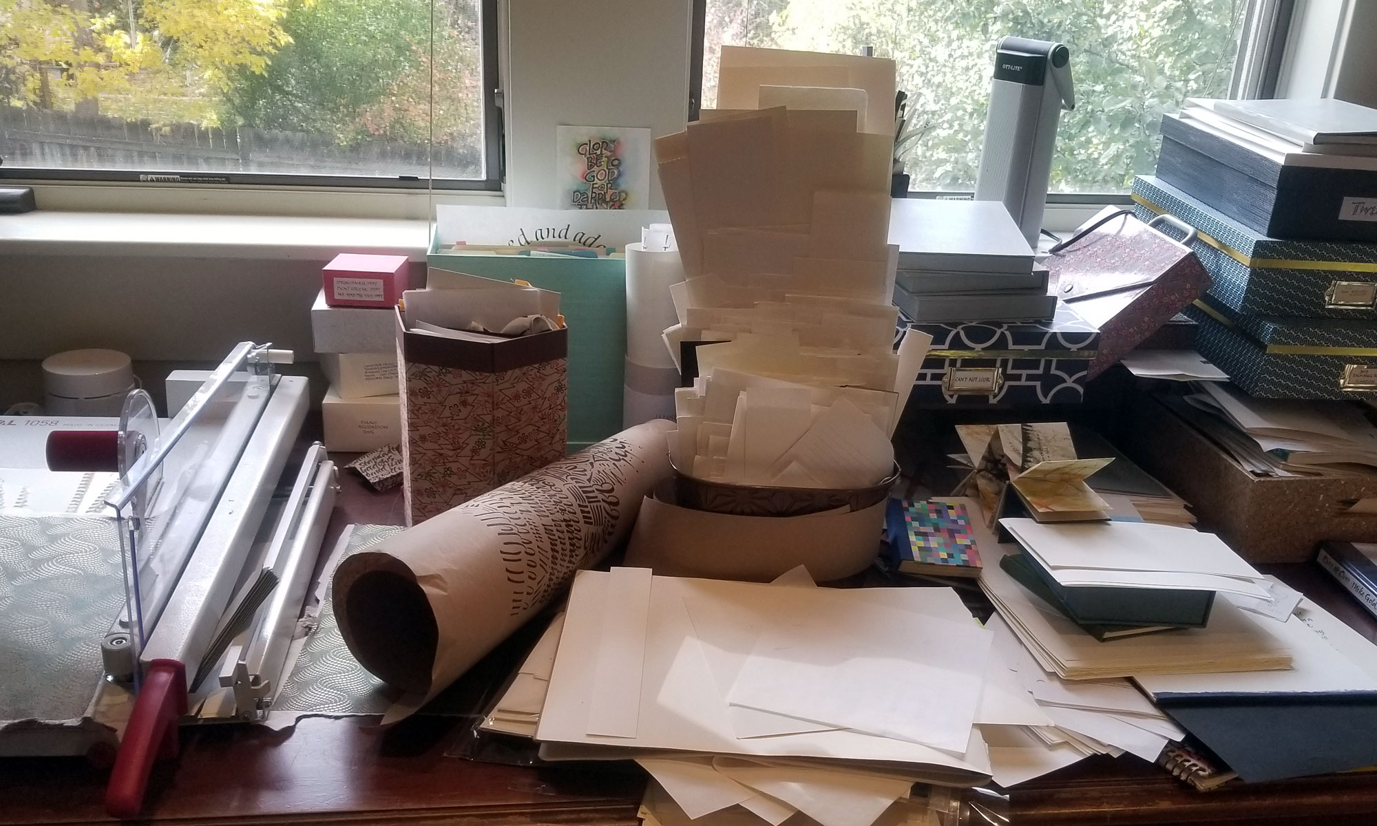
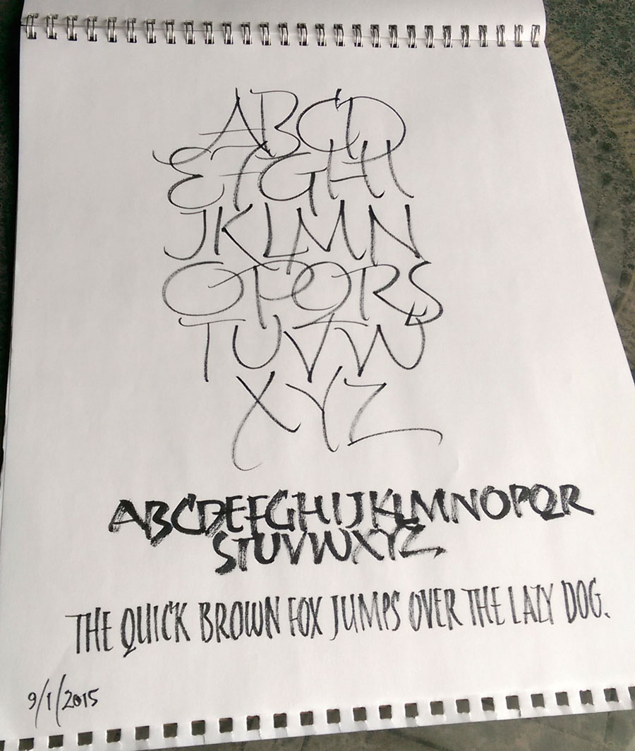
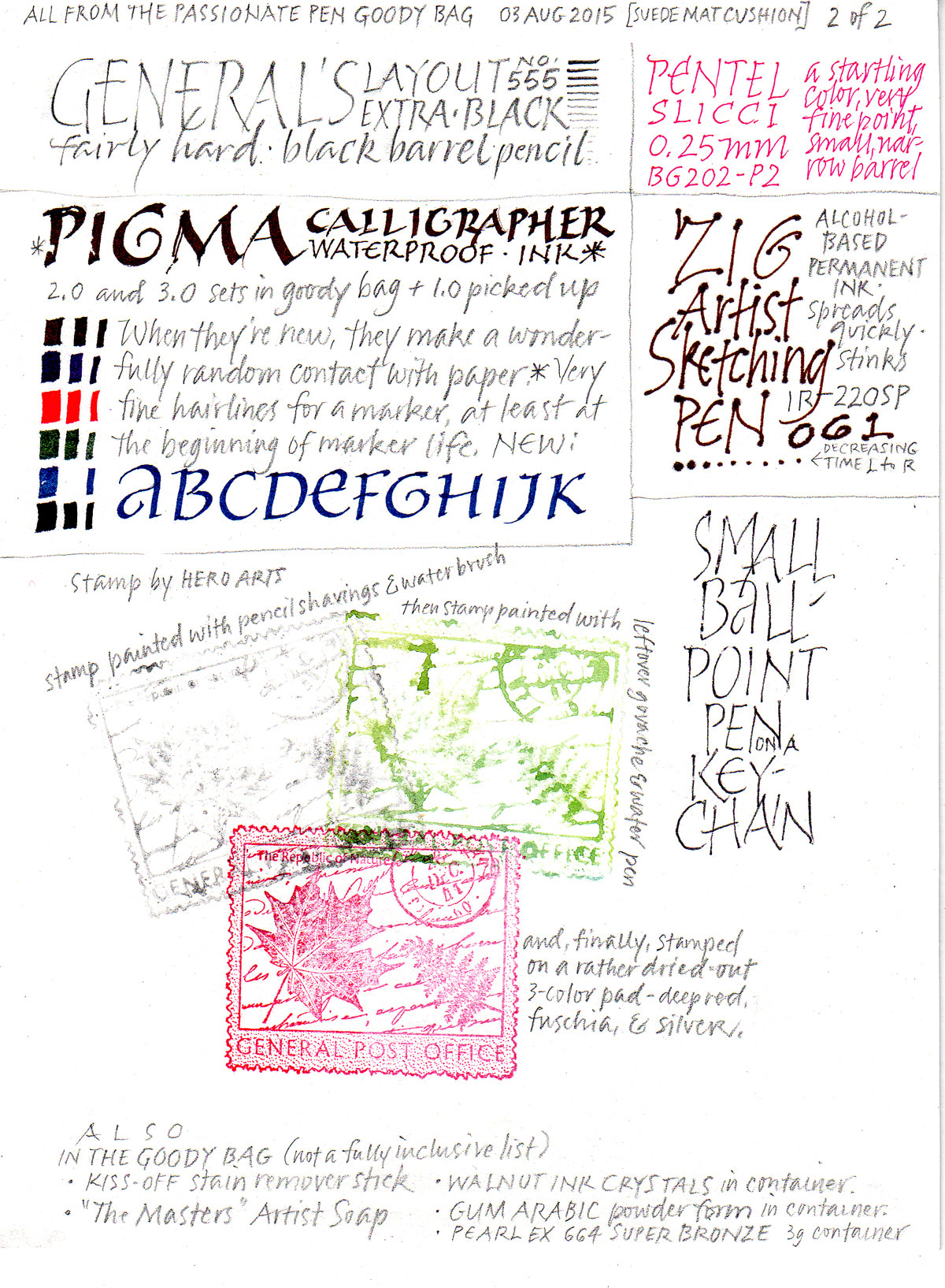
Back home, I’ve continued the practice, spurred by the purchase of a 100-sheet roll of packing paper at Home Depot for $4.97. A few days later I realized that I had an 18″ x 24″ pad of newsprint that would serve even better, especially in keeping the pages in order. (I’m working from the back of the pad of paper to the front.) Every once in awhile I’ll switch to better paper. I’ve used a number of tools: the Winsor Newton 7 Series brush that I used for most of the exercises during the workshop, a blue slick-rolling pen that was in our conference goody back, a couple of Pentel Color Brushes.

I’m learning a lot, but most of it is difficult to communicate.

Language of Bindings Thesaurus: a new bookbinding reference

The new site Language of Bindings is an intriguing references for bookbinders. It was conceived and published by Ligatus. As Nicholas Pickwoad explained in a post to the Book-Arts-L listserv, Ligatus is:

… a research centre of the University of the Arts London with projects in libraries and archives and with a particular interest in historic bookbinding.

The Language of Binding thesaurus is the result of our long experience with historic bookbindings, but has been greatly assisted by contributions from an international group of bookbinding experts and book conservators. This work was made possible by a Networking Grant from the Arts and Humanities Research Council in the UK.

The aim of the thesaurus is to present a consistent vocabulary for the use of all those who work with early bindings, built wherever possible on existing resources, but adapted for use in an on-line hierarchical environment that will allow terms that are not known to a user to be found. It is constructed around concepts (such as different bookbinding components, features, materials or techniques) that can be expressed by a number of language terms (labels). The thesaurus allows one concept to have more than one label, which allows the same concept to be searched for by the different terms that may have been used historically to describe it. It will also allow the concepts to be expressed in different languages.

The Language of Binding thesaurus can be used as a reference online resource that can be searched by keyword or alphabetically. The concepts contained in the thesaurus are, however, also arranged hierarchically, based on a class/sub-class relationship, which allows concepts to be retrieved by navigating down the hierarchies even if their label (the term) is not known.

It is hoped that the thesaurus will enable all those who work with books in early bindings to arrive at more consistent descriptions of those bindings. By being based primarily on single concepts, it has tried to avoid the more familiar but sometimes frustratingly imprecise language that has often been used in the past. This means that some of these familiar terms will not be found as labels, though they may be referred to in the scope notes that define and describe the concepts (and can therefore be found by a simple keyword search).

At the moment, the thesaurus contains labels primarily in English, but work on its translation has already started, and plans for the addition of illustrations are also underway. The thesaurus can, in addition, be used as a look-up service for software applications that need to populate schema fields from thesauri.

An accompanying volume, Coming to Terms: guidelines for the description of historical bindings, which is based on the terms in the thesaurus, is to be published in the autumn.

The success of the thesaurus will to a large extent depend on contributions made to it by its users, either to add more concepts, refine existing scope notes or correct mistakes. Such contributions to the thesaurus will be welcomed, and can
be made online following a registration process.

I like it!

More play from the conference goody bag

2015-08-06-goody-bag-testing-3Well, I didn’t get all the goodies from the goody bag put away, and the 50%-off paper I bought at Paper & Ink on the last day of the conference was still out too.

Freely written with a Sakura 3.0mm felt-tip calligraphy marker on Arches MBM paper. I like the skipping quality of the marker. I’m afraid it will start to fill in as the marker ages, but so far it’s still good.

Hope

2015-08-04-hope-quotation

I mentioned earlier that our local calligraphy group has been lettering a quotation on one of ten topics each month. This month we will be deciding how to order and layout the book that we’ll bind from prints of these quotations.

Now that we’re down to it, there are a couple of the quotations I’ve done that are sub-par. With the deadline next week, I’ve been re-doing them. Here’s the final version of the quotation on Hope. I enjoyed painting the negative parts of the letters in a fairly spontaneous way.

Gouache with brush and Brause nibs on Arches Text Wove, at 3″ square.

I’ve shown my earlier earlier version below.

2015-08-04-original-hope-quotationIt just doesn’t hang together well. It’s a good deal larger (about 9″ x 12″, I think), but it’s not good. It needs some vertical element between the two halves of the quotation, but I moved on to something new instead.

Pencil on … Khadi, maybe? I don’t remember.

Just what are all these goodies from The Passionate Pen calligraphy conference?

2015-08-03-goody-bag-testing-12015-08-03-goody-bag-testing-2

One of the many fun things about the annual calligraphy conference is the goody bag. It’s always packed with interesting tools, samples, information, and ideas. At The Passionate Pen, I never got a chance to go through the goody bag in any depth, so I packed it up with all my other art supplies at the end of the week. Today when I unpacked it in my studio I couldn’t just put away all those shiny toys without finding out about them, at least a little. Here are the results of those explorations.
Pencils were very big this year in the goody bag. We got three different kinds of broad-edge pencils, a wash pencil, a couple of sketch pencils, and more. Then there was the ZIG Artist Sketching Pen with its alcohol ink, the little ballpoint pen/keyring, a stamp, 2 sets of Sakura Pigma Calligrapher markers (plus a 1mm set that I picked up at the trade show in return for proof that I had experimented with the 2mm and 3mm sets), and a shocking pink gel pen.
Other tools included artist soap, KISS stain remover (which many calligraphers swear by), gum arabic powder, walnut ink crystals, Pearl Ex metallic powder, and a rubber stamp. It was fun trying most of this stuff out.
And, um, I never did finish unpacking.

More pencil lettering, now with a wash pencil

2015-08-02-wash-pencil-italicsBack in my studio, I’m pleased to have most of my gear unpacked, and the spilled ink cleaned up. And I’m also pleased to get back to a daily lettering practice. In the conference goody bag was a General’s Sketch & Wash Pencil No. 588. When I was unpacking, it caught my eye, so I lettered a page of Strathmore Drawing 400 using it. Then I went back in with a Pentel water brush to see what would happen. I’ll probably do more on it later, but right now the kitchen is calling …

As usual, click on the image for a closer look.

Returning from The Passionate Pen calligraphy conference

2015-08-02-Burgert-layout-in-pencil-08-01

Yesterday I returned from The Passionate Pen in Sonoma County, California. It was a wonderful week seeing old friends and new work, experimenting with new ideas, tools and materials. I was surprised to find myself working with a pointed brush most of the week. I’ll post more about the conference in the days to come, but today I’ll share the page I did in the Oakland airport and on the plane to Salt Lake City. I learned more about “form themes” in Ewan Clayton’s four-day workshop, especially during the study of Hans-Joachim Burgert’s work. On this page, my form theme includes condensed capitals, line leading that is smaller than the height of the letters, and three rogue letters that are not condensed. The choice of three letters changes in each of the three blocks. It was a good way to spend the hours in the airport coming down from the conference.

Bic 0.5mm #2 mechanical pencil on a Strathmore 400 Drawing (heavier weight) sheet about 9×12.