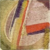
Color Theory – dimensional color study

In Color Theory we’ve been working with Color-Aid pasted onto bristol. This image fulfilled the assignment to make a color study which gives the illusions of three-dimensionality, rendered through a consistent depiction of light and shadow. I missed making the light and/or shadow progressive. It’s hard to hear when I’m looking at color. And when the 400+ different colors of Color-Aid are all laid out on the tables, I feel something akin to panic.

The craftsmanship of these exercises is challenging — a bunch of little pieces of painted papers adhered with PVA onto one side of a 9″ x 12″ sheet of bristol. And as we all know, pasting anything on one side only will cause cockling, wrinkling, generall drawing-up of that side of the paper. Can’t fight physics. The study shown above is 6″ square.
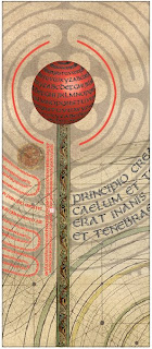
Typography poster

Typography poster completed in class today. I began with the split uncial typeface I’ve been designing, added a scan of a sheet of vellum and some medieval images of a maze, a sky chart, manuscript illumination, and probably a few other things.
It’s part of a continuing exploration of the historical made contemporary. Not as contemporary as I’d hoped, but still interesting to me.

As usual, click on the image for a closer look.

Handmade in Graphic Design

raphic designers have been taking up handmade lettering and graphics with a vengeance lately. Look at these recent popular books:

… and these recent essays and posts:

Not to mention these showcases of current design that incorporate the handmade look:

I could go on and on.

What is behind this pull toward the handmade? I think it has to do with the fact that the tools used to produce anything show through to the finished product. As more and more of graphic design is made wholly on the computer, the variety of design tends to be narrowed. Good designers are cognizant of this tendency and work to combat it. Hence the move to make what comes out of the computer look as though it hadn’t been made on the computer. Hence to move to start with the wide variety of media that were the tools of graphic design, and then take it to the computer.

Web Design project

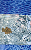
We’re starting an interesting project in my web design class. Groups of 4 people get together and agree on a basic narrative story and then each contribute 5 images that connect to the story. Then each person creates a website using the narrative and at least 1 image from each person in the group.

Our group narrative includes the following elements:

  • going to sleep;
  • a forest setting;
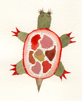
  • a fish named Lord Elric and a turtle named Sam, recurring characters;
  • being sent on a quest;
  • eat something, get special powers;
  • a monster or impossible situation;
  • wake up, write dream down, link to other narratives.

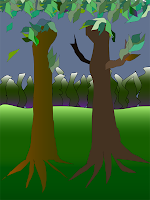
Here are 4 of the images I’m sharing. I have no idea what the others will contribute; I hope these will work. The lettering looks so much better than it would have before I’d worked with lettering in Illustrator. I’m pleased with it.

This last image is my very first attempt (well, 2nd, but I had to trash the first one because of a basic minunderstanding about paths) to make a drawing in Adobe Illustrator. I’ve done quite a lot now with type and converted images, but had never started from scratch to make an image in Illustrator. It’s a weird result, but I’m pleased that I was actually able to accomplish it.
As usual, click on the thumbnails for a closer view.

New and improved business card (at least on paper)

I’m knee-deep in Illustrator and InDesign. Yesterday I used my new knowledge in these software programs to update my business card. It looks much sharper — in person, at least. I don’t know about on screen. This is basically the same design I’ve been using since about 1983. I keep thinking I’ll change it — at least update that rather lame 1983 attempt to copy Friedrich Neugebauer’s script for the word “Calligraphy” — but so far I’ve just tweaked it.

[After posting this I see that the thumbnail is incredibly fuzzy. But if you click on the thumbnail to get to the regular-size image, that image is clear. Must be the way Blogger creates thumbnails. I don’t know.]

In graphic design class on Monday we had a critique of our masthead design. I rather like mine.

In web design class we started an interesting project called “Shared Narrative”. Groups of 4 people decide on a narrative and each contribute 5 original images to the pool. Then we each create a narrative website using the story and at least 1 image from each member of the group. It reminds me of a challenge quilt event, in which quilters use the same 3 fabrics to come up with a quilt; usually, the results vary widely. I’ll be interested to see what happens in this project.

Calligraphy, InDesign, Calligraphy, Dreamweaver, Calligraphy

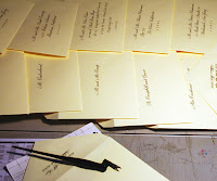
Oh, for a few more hours in the day. But I’m enjoying it all. I’ll do a daily allotment of invitation addresses (did I mention there are 425 of these?), move to the computer and work on a graphic design assignment, switch back to the big drafting table to fill in some certificates, move back to the computer to tussle with Dreamweaver’s unfamiliar rendering of CSS rules, then back to the drafting table for some work on an artist book …

It’s a great life if you don’t weaken, as my grandfather used to say.

February 1 — Illustrator and Calligraphy

Today’s creative endeavor involved taking what I learned about Adobe Illustrator at the awesome demo during Wednesday’s class meeting and applying it to yesterday’s camera-ready calligraphy for a wedding invitation. I placed the Photoshop document in Illustrator and then Live Traced it to make a vector image. The first Live Trace was pretty much a bust because I didn’t change any of the preset settings.

But I kept experimenting with the settings and got something that looks pretty good at 100% even if it looks lousy at, say, 400%. I tried using the Smooth Tool, to transform bumpy lines into smooth curves, but I must have been doing something wrong there, or had a setting wrong somewhere. I succeeded on the entrance stroke to a J, shown above left but not on the straight bit. The right figure is part of a J elsewhere on the camera-ready, untouched. You can see the difference in the smoothness of the curve — but probably only if you click on the thumbnail and look at the image full size. And, on another note, wouldn’t it be nice if the thickness of that upstroke had a more gradual thinning so that there wasn’t some much thinness between the upstroke and the stem? A 400% view of lettering is way harsh, man.

January 31 — camera-ready invitation

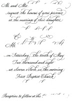
Well, this is work, but it’s also creative. I’ve been working on this camera-ready invitation for awhile now, and the time had come to finish it up, call it done, and send it in. So I did. And I’m much happier with it than I thought I’d be when I was working on it. I don’t have a lot of confidence in my pointed pen work, and swashes are for the very experienced penman only. Well, I’m experienced. And when I compare this to some of the swashed pointed pen invitations I see, I’m brilliant. And then I compare this to the work of our present-day master penman, and … well, that’s the way of the world now, isn’t it?

In today’s global village it isn’t possible fool oneself into thinking one is the best. On the other hand, we all have instant access to the very best models, which wasn’t possible until the Internet.

January 26 — InDesign Poster 1

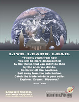
InDesign homework for Graphic Design class, due Monday. I’m not happy with this 17″ x 22″ poster, but I’ve been working on it awhile, and it’s the one that gotten feedback for in the past several classes. I feel like I’m stuck with something I can’t stand behind. It’s frustrating. I like the graphics but not the salesmanship. I’m no salesman.