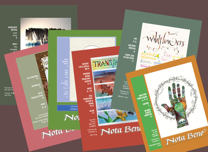
Recent of issues of the Big Sky Scribes’ Nota Bene.
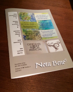
As editor of the Nota Bene, Big Sky Scribes’ triannual publication, it is always a pleasure to sort through the many contributions from our state guild’s members to put together an issue that showcases their work. The most recent issue went out to members a couple of weeks ago. That lovely image on the latest cover by Shelby Barrentine commemorates Earth Day.
As a side note, did you know that “triannual” means three times a year, while “triennual” means once every three years? Just thought I’d clear that up.
This article about the resurgence of #bauhaus on social media on the AIGA website caught my interest when it was first published on January 8. I’ve kept open in a browser tab ever since, returning to read it several times since. And now I’m posting about it so I can close the tab 🙂 (Housekeeping is such chore.)
The article raises a few separate issues that resonate.
First, what does it mean when a hashtag gains popularity? Do those who post it know what they’re saying? We don’t know because it arrives with little or no context. And #bauhaus in particular! a concept that is all about context and interdisciplinary work, and which sought to weave art and craft into the fabric of everyday life.
And yet. And yet. As the article points out, social media has succeeded beyond every expectation in weaving itself into our everyday activities — without much of the art/craft, one could say. But new ways of communicating, the memes, the construction of meme generators — many of these are so creative and on-point.
As the article points out, both the Bauhaus school and the social media companies have attempted to present a neutral face, letting their students/users take the political stands. It hasn’t worked out well for Bauhaus or Facebook.
The day after I went to the Grolier Club, The Frick, and The Morgan, Ed and I visited The Metropolitan Museum of Art. This time, for a change, we took a tour of the highlights of the museum. It was interesting enough, but afterwards we wandered, and some things particularly caught my eye.
Gallery 690 displays a rotating selection of The Met’s prints and drawings. We made it a point to visit this gallery to enjoy the etchings by Rembrandt and Castiglione that were on view. The costume studies by Leon Bakst were also incredible.
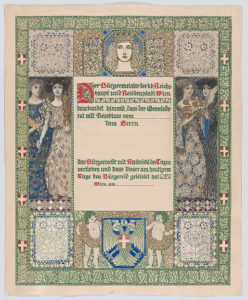
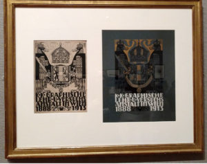
I was interested to see examples of the graphic design of Erwin Puchinger, an Austrian who designed for Viennese newpapers and periodicals at the beginning of the 20th century. According to the information provided by The Met, this design for a certificate of Viennese citizenship shows his early exposure to the English book illustrations of the Arts and Crafts movement, its four allegorical figures are reminiscent of Pre-Raphaelite, and the decorative borders show Moorish influences.
This framed piece shows the black-and-white design of a book cover with notes indicating color and adjustments, as well as the 3-color-printed piece on blue cloth. Puchinger was chair of the manual graphics design department of the Viennese Graphic Design School and this was 1913 publication honored the school’s 25th anniversary.
You can see images of everything on display in Gallery 690 here. Take a look at Leon Bakst’s illustrations!
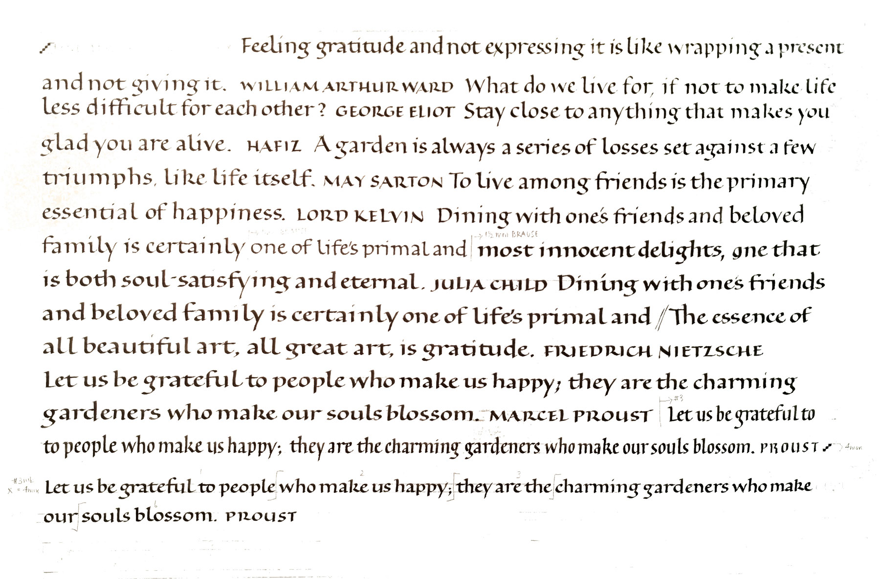
This week in the bookhand class I’m teaching, we talked about layout and copy-fitting strategies. One strategy is to write the quotation, cut up the lines and rearrange them to fit the space allotted. I did the first part here:
Trial bookhand lettering for a series of cards.
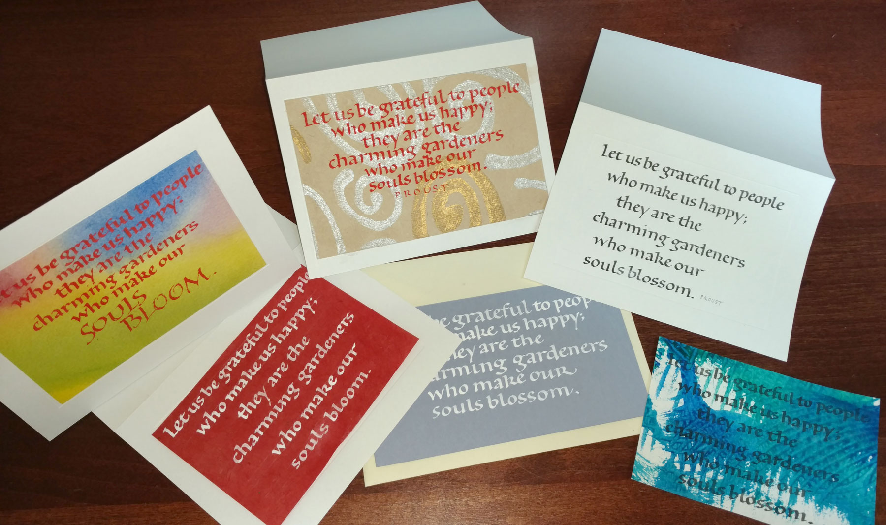
I didn’t actually cut up the lettering, but I did measure the lines and begin each line based on those measurements. I did a series of cards based on the one Proust quotation. As shown below, I can get very different looks using the pen and the same basic centered layout. What I’ve changed: writing fluid, ground (paper), line leading. In a couple of cases I wrote the lettering with no guidelines, and so the x-height and line leading are also variable. Also in a couple of cases, I wrote “bloom” instead of “blossom.” Oops. Lettering variations done with one pen and a centered layout.
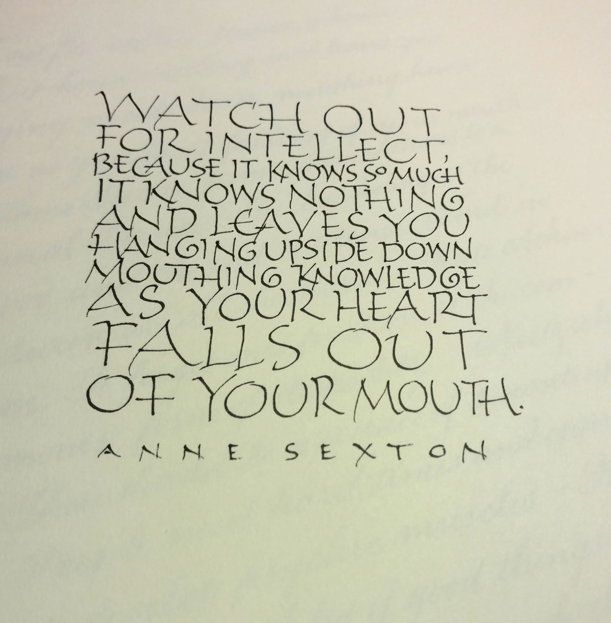
Sometimes the daily lettering isn’t about working on letter forms or loosening up with gestural strokes. On Friday, it was a sort of on-the-fly copy-fitting exercise, right-brained and hard to describe. Two or three things are going on, I think.
First, there is the guestimating about horizontal space − evaluating how big the letters should be, and how compressed or expanded. I was running out of room on the third line … but I kind of like that my choice for “so” makes it stand out. It almost gives “Valley Girl” emphasis to the phrase, which amuses me.
Second, though, there is the goal of making the current letters respect (and also with respect to) the line of letters above it. I added an entrance stroke to the “k” on “knowledge” to avoid having its spine line up with the spine of the “p” on the line above. “Falls out” doesn’t work very well here, opening up a big space between the “a” and “l” which connects to the space on the line above between “as” and “your” to make a big blob of white. I don’t mind the space between “falls” and “out” because it leaves room for “heart” to fall through to the last line. But “falls out” is just two few letters to work well on that line.
Third, there is the question of whether the letters should be larger or smaller than the others, given their importance to the content. Looking this over, I like my choices. I can read simply:
Watch out for intellect,
as your heart falls out of your mouth.
Or:
Watch out for intellect,
it know nothing and leaves you
as your heart falls out of your mouth.
Describing this process breaks it down and destroys the flow of the process. As Jacob Bronowsky said in a lecture memorialized in The Origins of Knowledge of Imagination, “It is an essential part of the methodology of science to divide the world for any experiment into what we regard as relevant and what we regard, for purposes of that experiment, as irrelevant. We make a cut. We put the experiment, if you like, into a box. Now the moment we do that, we do violence to the connections in the world … we are always decoding a part of nature which is not complete. We simply cannot get out of our own finiteness.”
A page from a Paul Klee notebook, online at Zentrum
According to Open Culture, Zentrum has put 3,900 pages of Paul Klee’s personal notebooks online, presenting his Bauhaus teaching from 1921-1931.
Introductory notes (translatable by Google) and a link to the notebook are here. I found that Google translation was, for once, unhelpful on the notebook pages. If your German is inadequate (as mine is), your best bet is to click on this icon and scroll down, clicking on any thumbnail that grabs your fancy.
Their online collection of Klee’s work are listed here (see the menu of links on the right).
Lately, for various reasons, I’ve been hanging out at the local printer a lot. I was wearing my guild newsletter editor hat on Thursday, when I picked up the current issue of the Big Sky Scribes newsletter, the Nota Bene. This morning I took all 90 or so of them to the post office. A lot of great stuff was submitted this time, and it’s a good issue. Guild members should see it in their mailbox early next week.
When I’m laying out hand lettered text in Photoshop, there are a few shortcuts I always use. If it’s been awhile since I did a digital paste-up, I have to look up the shortcuts online because I’ve forgotten them. So I’m posting this for my benefit as much as for anyone else’s use. I use a PC because that’s where my latest copy of Photoshop (CS5) is. If you’re on a Mac, make the following substitutions in the notes below: Cmd = Ctrl and Opt = Alt. Because your workspace is likely not to look just like mine, some of these steps may require a little Googling to adapt them to your setup. Most of this can be done using Photoshop Elements, I think, but the tools are organized a little differently from Photoshop.
I’ll use this common scenario:
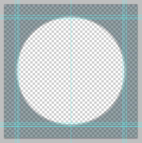
Laying out raw copy to fill a circular area
Here’s an overview of what I do. I begin with two files — the scanned text stitched together digitally, and the master document with a circular mat which delineates the area that will hold the text. I drop a merged layer of the scanned, stitched text onto the master document, use the penciled guidelines to create digital guidelines. Then I cut up the lines to fit the matted circular area just the way it used to be done with blue-lined paste-up boards (my master document), wax (Photoshop) and printed copy (my scanned text file). It’s not a short process, but if you’re proficient in Photoshop it’s not a fiddly as this description might seem to indicate.
The advantages of digital paste-up over physical paste-up are that these files are available for future use and they can be reused, enlarged, reduced, and guidelines mixed and matched in a way that doesn’t work in physical paste-ups.
Scanning and setting up the lettering file
Letter the copy in nice long lines on penciled guidelines. The fewer line breaks I have, the better. (Experience taught me this. When I used to set type blind on a Mergenthaler Linotron, the copy came out in a long line, the easier to paste up on layout boards.) Don’t erase the guidelines.
Scan in the lettering at 300 pixels/inch. I usually have to scan the lettering in in chunks, making sure to have scans that overlap one another.
Recreate the big block of layout text as a Photoshop file. Note: I always keep the Layers palette docked to the right of the image window. You’ll need to see the Layers palette a lot.
Open the 1st scan file; I usually choose with one with the top left chunk of lettering in Photoshop.
Estimate how much bigger the canvas will have to be to accommodate pasting all the other chunks to this one chunk. Enlarge the canvas: Ctrl(Cmd) + Alt(Opt) + C or Image > Canvas Size
Check to be sure that you’ve got the background color you want.
Type in new canvas dimensions and set the anchor to top left.
Open the 2nd scan file, one that overlaps the 1st file.
Duplicate the layer and add it to the 1st file (which is still open). Drag the 2nd filename away from bar so that it floats and you can see both images. Click in the 2nd image window and drag from 2nd image window to 1st image window Now that you have both layers in the 1st scan file, close the 2nd scan file.
Align the 1st and 2nd image:
Select both layers – Shift+ Click/Click on the 2 layers in the Layers palette.
Edit > Auto-Align Layers > choose the Auto radio button
Because I can’t stand not to, I usually decrease the opacity of the top layer so I can see to erase the edges of the overlap. But it’s not necessary for a rough layout. Just remember to increase the opacity of the top layer again afterwards.
Select both layers again (step E.i.) and merge the two layers: Ctrl+E
Repeat steps C-E for each additional chunk of text you’ve scanned in.
Now you’ve got a digital version of the raw text you lettered.
Finally, when it’s all stitched together, duplicate and merge a copy of all the layers –
Select the top layer to make it active, then Ctrl+Alt+Shift+E.*
This is the layer that I will drag onto the master document, once I’ve set that up.
T file of scanned and stitched hand lettering,
Here I’ve scanned some daily lettering I posted recently. The original is 12″ x 18″. It was scanned in three parts because the whole thing won’t fit on the scanner. I’ve stitched these three parts together into one T file, and purposely let the edges of the pieces show here, so you can see the stitching. (Click thumbnail for a closer view.)
Setting up the master document
Create a master document at least the size of your finished piece. Because I’m writing within a circle, my document will be square. My image is 3600 px by 3600 px; at 300 ppi, that’s 12 inch square. I chose this because my circle will be 10 inches square.
Ctrl+Nor
File > New Type in the dimensions in pixels and choose a resolution of 300 pixel/inch to match the resolution of the text you scanned. That’s important. I choose a transparent background.
Set up your Rulers to begin at zero/zero at the top left corner of your image –
If your Rulers aren’t visible, Ctrl+R to reveal them.
Find the top left box where the vertical and horizontal Rulers meet.
Click and drag that box to the top left corner of your image.
The master document with dimension and center guidelines, and circle mat
Create a “matted circle” the size of the circle in which you wish to position the text:
Create a box the size of the circle with guidelines –
Using the Move tool (V), click the Rulers and drag 4 guidelines to make a box the dimensions of the circle. I chose a 3,000 px circle (10 inches @ 300 ppi), so I dragged two horizontal guidelines down to 300 and 3300 px, and then I dragged two vertical guidelines across to 300 and 3300 px.
If you have the Info palette visible, this task is easier and more accurate.
Prepare the Circle tool –
Select the Circle tool (U – under the rectangle tool – right-click to get to it) set it to Shape layers (not Paths or Fill pixels) in the secondary menu bar at the top.
Choose foreground color white and background color black (or another color).
Create the circle –
Holding the Shift key down to keep the oval a perfect circle, click on the top left intersection of the guides — at 300 and 300 on the Rulers — and drag down to the bottom right intersection of the guides — at 3300 and 3300. Release to form the circle.
Make the circle function as a mask or mat –
Select the Magic Wand (W) and click on the white area of the circle to select all the white area. Press the Delete key to make that area transparent.
De-select by pressing Ctrl+D.
In the Layers palette, click the dropdown next to Opacity and click and slide the slider to 50% or so.
I like to create a vertical center guideline: type V to choose the Move tool and then drag in from the vertical Ruler to the mathematical center of your image — 1800 for me.
Dragging and dropping the top layer of the T file into the M file
At this point, I have the two files, and they’re both open. I drag the top layer (only) of the T file onto the master document. This should be familiar process, as you’ve probably done step 3.D. of the first file at least twice by now. You can close the T now, so that only the master document is now open.
Creating the lettering paste-up guidelines
Position the T layer so that guidelines are at the top of the circle –
Click and drag the T layer below the circular mask layer so that you can see the mask.
Using the Move tool (V) drag the layer so that the first guideline is vertically placed where you plan to write your first line of text within the circle.
Trace your guidelines –
Create a new layer (Ctrl+Shift+N). It should be below the mask layer and above the T layer. I named this layer “guidelines”.
Select line tool (U – under the rectangle tool) set to Fill pixels (not Shape layers or Paths) in the secondary menu bar at the top. If need be, also choose Weight: 1px, Mode: Normal, and Opacity: 100%.
Holding the Shift key down (to keep the line perfectly horizontal), click and drag from left to right along a scanned guideline to make a digital guideline.
Repeat for each guideline. Some hints:
If you run out of guidelines, select the T layer and V and drag the layer down and match up guidelines to provide more lines to trace.
Remember to switch back to your guidelines layer to continue making more lines!
Make your lines longer than the width of the circle each time, in case you have to enlarge your circle later because the text didn’t fit (aargh).
Zoom in to whatever magnification works best for you.This process doesn’t take long because the exact lengths of the lines is not critical and the use of the Shift key means that you only have to get the first click accurate because dragging will be perfectly horizontal.
If you lose track of what guidelines you’ve trace, turn off the visibility of the underlying text layer so you can see the digital guidelines more clearly.
You can also make a new layer between the guidelines and the text, fill it with white so that you can see whether you missed any guidelines.
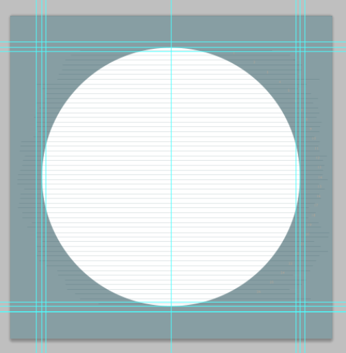
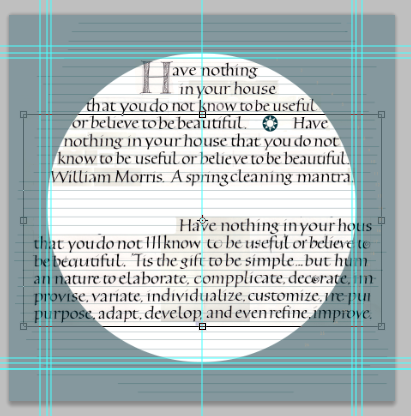
Master image as shown above but with the addition of paste-up guidelines and a white bottom layer for easier viewing.
For this screenshot, I’ve turned off the visibility of the T layer. I’ll mention here that I’m using the master document from the “real” job I’m working on today, but I’m using the T file created from recent daily lettering. There are three sets of dimension guidelines because I had the devil’s own time getting the real lettering to fit properly, so there have been three sets of dimensions and three circle mats. This screenshot shows the original lettering/paste-up guidelines, but you’ll see that on the next screenshot the guidelines are further apart. Between this screenshot and next I just lengthened the guidelines layer to match the guidelines on my daily lettering T file. In a non-digital environment I would have had to re-draw those lines.
I can print file with the T file not visible for use as a guide for my final lettering. Usually I’ll just fold it in half vertically, copy the lines as tick marks on my good paper and then pencil the guidelines on the good paper with a T-square. (Click thumbnail for a closer view.)
Now begins the copyfitting. It doesn’t hurt to add up all your line lengths to make sure this going to work before you start this step. The sum of all the line lengths of your trial lettering should be close to the sum of all the lines within the circle.
Pasting up your lettering within the circle mat
Heads up: Each line of lettering will be in a layer, and these layers will be put in a Group. But you must have the first layer before you can have a Group, so the Group isn’t created until step F.
Select the T layer. Using V, drag the layer so the first line is positioned where you want that line to go.
Select, copy, paste, and position the first line of text onto a new layer –
Use the Marquee tool (M), to drag a rectangle around the first line of text.
Make sure that “Auto-Select” box at the top of the window in the submenu is NOT selected.
I prefer to use the rectangular Marquee tool (the default one) and erase stray ascenders and descenders, but there are other tools below the Marquee tool of different shapes.
Ctrl+C to copy the selection.
Ctrl+V to paste the selection in place on a new layer.
Rename the new layer “line 1” so you can keep track of it.
Use V to move the new layer into place on the first line. If you are centering your text, you can set up to snap to your center guideline: Ctrl+Shift+;
First time through only:
Your new line-1 layer should be selected at this point. Create a New Group: Ctrl+G and name it “lines”. Drag it above the guidelines layer.
In successive iterations:
Drag your new layer onto and into the Group “lines”.
Select the T layer. Using V, drag the layer so the second line is positioned where you want that line to go.
Do steps B-G for each succeeding line. When I combine two sections on one line, I wait until I have the two new layers created, then merge them (Ctrl+E) and then rename them before moving them into the Group.
Midway through pasting up raw copy (shown at the bottom) into lines within the matted circle.
This screenshot shows work in progress on pasting up (not that I’ll finish it.) Line 6 was a little long, so I compressed it just a bit. When a paste-up is finished, I can print it full-size, tiling the printing over several pages if necessary and tape it together. I can then use it as a guide when doing the final lettering. I can fold the printed piece to the current line I’m writing, and place it just below the line of writing where it can double as a guide and a hand guard.
Whew! It’s a lot quicker to do than to explain, especially after you’ve done it a few times.
If I’m doing this for Hebrew lettering, I’m always in danger of skipping or repeating text, much like the illiterate medieval scribes writing out Latin texts. To minimize errors I will often make a copy of the T layer, lock and hide the original layer at the bottom of the layer stack, and instead of copying and pasting the lines of text I will cut and paste (step B Ctrl+X instead of Ctrl+C to cut and Ctrl+Shift+V to paste in place). Or copy and paste, but then erase each line from the T copy layer as I go. This helps me to keep track of what I’ve used and what I’ve got left to use.
*This is a shortcut I use a lot — it simultaneously duplicates and merges all visible layers. Turn off the visibility of anything you don’t want included. Select the top layer to make it active, then Ctrl+Alt+Shift+E.
Some fun with type punched out over a pasted-painted background, and hand lettering over a wall of Velvenda Cooler type, done for Print Design class. The quotation is from Henry Adams. I’m working toward integrating hand lettering with type. “Toward” being the operative word here. The print version of this has better contrast, by the way, and at 11″ x 17″ the background type on the right was a more noticeable and readable list of adjectives.
Contains information related to marketing campaigns of the user. These are shared with Google AdWords / Google Ads when the Google Ads and Google Analytics accounts are linked together.
90 days
__utma
ID used to identify users and sessions
2 years after last activity
__utmt
Used to monitor number of Google Analytics server requests
10 minutes
__utmb
Used to distinguish new sessions and visits. This cookie is set when the GA.js javascript library is loaded and there is no existing __utmb cookie. The cookie is updated every time data is sent to the Google Analytics server.
30 minutes after last activity
__utmc
Used only with old Urchin versions of Google Analytics and not with GA.js. Was used to distinguish between new sessions and visits at the end of a session.
End of session (browser)
__utmz
Contains information about the traffic source or campaign that directed user to the website. The cookie is set when the GA.js javascript is loaded and updated when data is sent to the Google Anaytics server
6 months after last activity
__utmv
Contains custom information set by the web developer via the _setCustomVar method in Google Analytics. This cookie is updated every time new data is sent to the Google Analytics server.
2 years after last activity
__utmx
Used to determine whether a user is included in an A / B or Multivariate test.
18 months
_ga
ID used to identify users
2 years
_gali
Used by Google Analytics to determine which links on a page are being clicked
30 seconds
_ga_
ID used to identify users
2 years
_gid
ID used to identify users for 24 hours after last activity
24 hours
_gat
Used to monitor number of Google Analytics server requests when using Google Tag Manager
1 minute
You can find more information in our Cookie Policy and .
 This framed piece shows the black-and-white design of a book cover with notes indicating color and adjustments, as well as the 3-color-printed piece on blue cloth. Puchinger was chair of the manual graphics design department of the Viennese Graphic Design School and this was 1913 publication honored the school’s 25th anniversary.