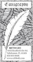
 I’m knee-deep in Illustrator and InDesign. Yesterday I used my new knowledge in these software programs to update my business card. It looks much sharper — in person, at least. I don’t know about on screen. This is basically the same design I’ve been using since about 1983. I keep thinking I’ll change it — at least update that rather lame 1983 attempt to copy Friedrich Neugebauer’s script for the word “Calligraphy” — but so far I’ve just tweaked it.
[After posting this I see that the thumbnail is incredibly fuzzy. But if you click on the thumbnail to get to the regular-size image, that image is clear. Must be the way Blogger creates thumbnails. I don’t know.]
In graphic design class on Monday we had a critique of our masthead design. I rather like mine.
In web design class we started an interesting project called “Shared Narrative”. Groups of 4 people decide on a narrative and each contribute 5 original images to the pool. Then we each create a narrative website using the story and at least 1 image from each member of the group. It reminds me of a challenge quilt event, in which quilters use the same 3 fabrics to come up with a quilt; usually, the results vary widely. I’ll be interested to see what happens in this project.

I’m new to blogging and a friend/calligrapher gave me your blog address to visit. I’m also a calligrapher and do like your business card. I don’t have a calligraphic BC myself right now but am inspired to put my new logo on one. Thanks for the inspiration.
Renee Troy
Thanks for the comments, Renee. I was surprised that even the large image of the business card wasn’t all that clear on-screen.