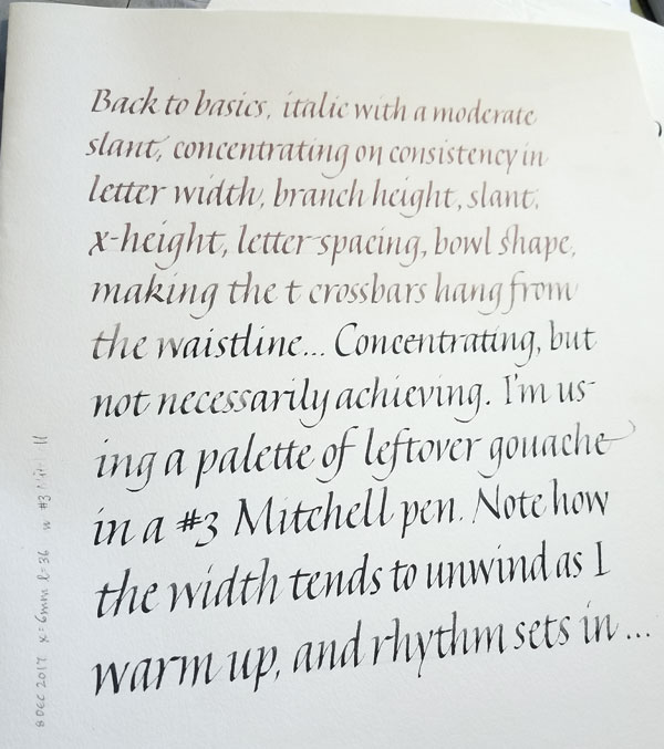
Time passes, I travel, I do other things, and suddenly I realize it’s been awhile since I practiced any lettering. Sure, I’ve done an edition of 1-5/8″ x 3″ books with tiny capitals lettering in it, and finished a baby quilt, and done some lettering on mirrors. None of that “counts” towards lettering practice — as is proved by the uncertainty and inconsistency of today’s practice lettering. I’m preparing for a long piece, and this must improve!
New calligraphy class in Jan-Feb 2018
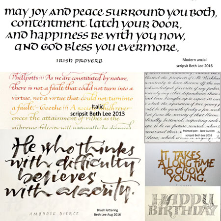
To make it as inclusive and accessible as possible, I’ve set up a poll to discover what you are interested in learning and what time of day and week you could attend. If you’re interested in taking the class, scroll down the examples to let me know what interests you and when you could attend.
In response to some questions about the class, here is a little more information.
Depending on how many students we have, the cost will be $100 to $120 per person for the course.
- 4 Mitchell dip pens (in 4 sizes) + 1 ink reservoir
- 1 basic pen holder
- 1 pad of Strathmore Drawing 300 paper
- dip pens — a sampler of pens is $12.95 or $15.95, although a student could buy a few nibs from me @ $1.25 each;
- sumi ink — available at the MSU bookstore or pay $6 for small jar of Moon Palace at John Neal;
- Strathmore Drawing 300 paper — a pad of 11×14 paper will cost about $11 (or less with a Michaels coupon or when it’s on sale).
Another baby (um, toddler) quilt
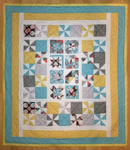
About a week and a half before Thanksgiving, I received, unexpectedly, a quilt from my sister. It is absolutely beautiful, a mixture of windmills and pinwheels, with deconstructed appliquéd pinwheels in the border, French knots and big-stitch quilting.
It galvanized me to finish this long-overdue baby quilt for a great-nephew. Because Wesley is now 22 months old, I had taken to calling it a toddler quilt. A week and a half before Thanksgiving, I had all the quilt blocks made but no plan. No matter. I just started stitching – 1/2″ strips to fill out a too-small square, sashing and more sashing to marry up the dimensions of my inadvertant mix of 5″ and 4.5″ squares, a couple of borders, another border to make it a little large … and so on. And, voila! a quilt top.
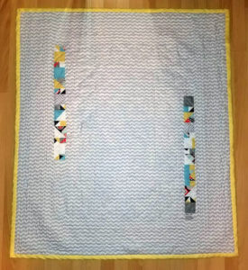
Then what to do? I had all these bits of blocks that went unused on the front; I stitched those together into a couple of strips which helped fill out the width of the quilt back.
Then what next? I made a test sandwich of top-batting-bottom, looked at a tutorial or two, put on a quilting presser foot and learned how to machine-quilt for about 15 minutes. With the tiny bit of knowledge, I machine-quilted the pin-basted quilt. It went pretty well, with minimal ripping and re-stitching.
After trimming, I machine-sewed one side of the bias binding to the quilt, gathered a few airplane-approved sewing tools (needle, thread, small thread snips), and put it in my carry-on backpack for the trip to Florida.
On the planes, at my sister-in-law’s house, in the car … I hand-stitched the other side of the bias binding. After we pulled up into the driveway of my brother-in-law’s house for Thanksgiving dinner, I took the final two (!) stitches to finish the quilt.
These photos were rather hurriedly taken on the floor of a bedroom. Not ideal, but at least I have a record.
It was a different way of working for me. Not the work-right-up-to-the-deadline method; that, unfortunately, is common. I mean the idea of taking what I have and organically building up and out, rather than planning it out all in advance, making a model, do a trial run, and then, at long last, making the final thing. I like it.
Historical costumes made from paper
Pretty awesome.
New artist book
I’ve been steadily working on a new edition of 12 little books. Fun stuff! And I can’t believe I mailed off 7 of them today without taking photos. Hmph. When I know they’ve arrived safely, I’ll post some in-process photos and as well as photos of the books I have here. In the meanwhile, a couple of details …
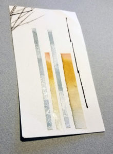
Isn’t this simply luscious? One of the frustrations/pleasures of working on an edition is seeing scraps like this come — and go. This sheets appeared when I pasted up scraps of painted Arches Text Wove onto another scrap of ATW to make closure loops for the wrappers. It was so beautiful on its own, I hated to cut it down into 1/4″-inch strips.
One day I’m going to finish the paper mosaics I’ve begun with all the irresistibly beautiful little bits of paper that I can never bear to throw out.
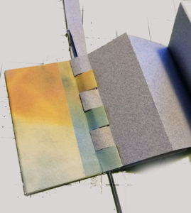
Even though I’m not going to show the book today, I will show one in-process photo. The structure is a flat-piano-hinge binding from Keith Smith’s, Non-Adhesive Binding. Threading a flat strip of Canson Mi-Tientes through the folded tabs was driving me bonkers, until I located this loop turner in my sewing supplies. I finally worked out a method of guiding the strip through the loops with the aid of the loop turner and a micro-spatula. The structure requires that this be done three times for each book, so I’ve gotten pretty good at it by now.
In case you’re wondering about the scale … the book is 3 inches tall and 1-5/8″ wide. (See how I mostly got rid of the lime green cutting mat that clashed with this little book? But you can still see the 1-inch grid in places.)
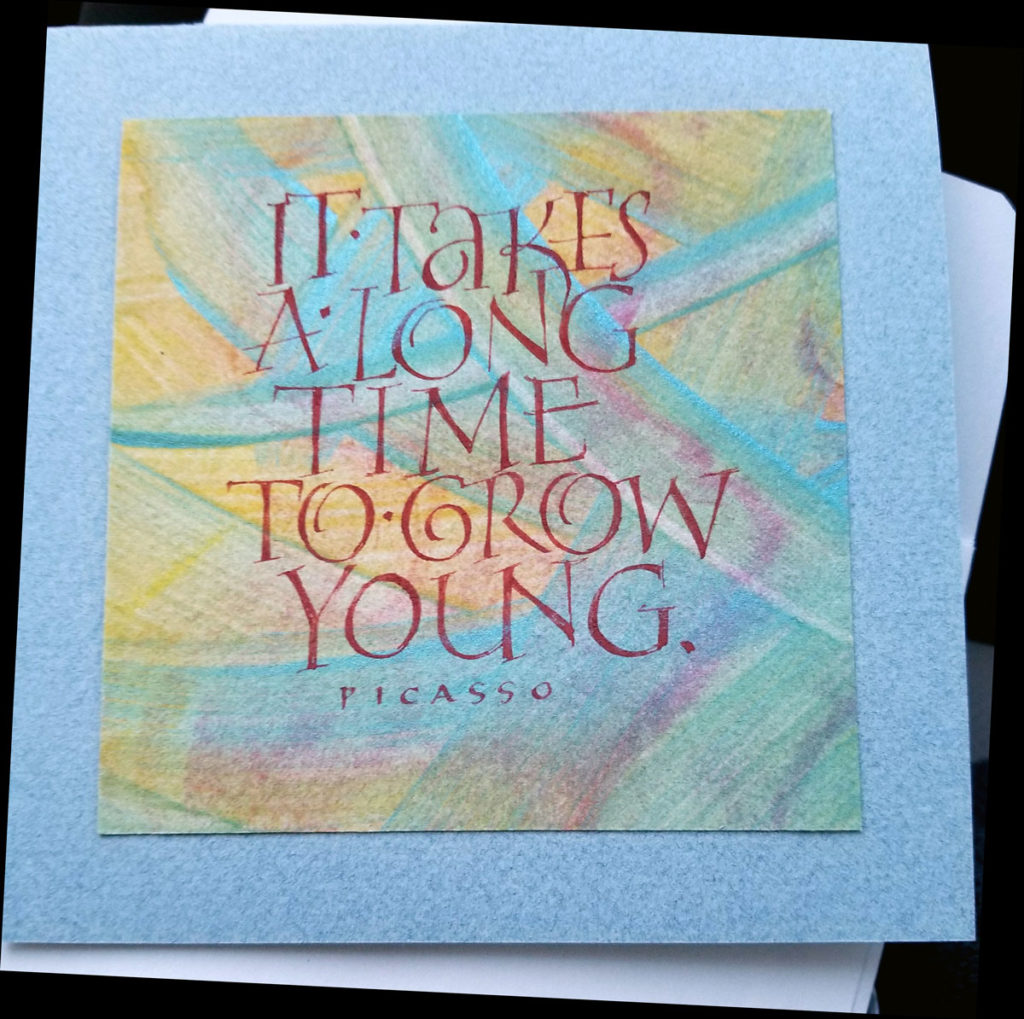
Birthday card
Guanajuato / Cervantino from a logophile’s perspective
We’ve just returned from a wonderful week and a half in Guanajuato, Mexico. A World Heritage Site, Guanajuato annually hosts the Cervantino festival, which celebrates art and culture. This year was the 45th festival. Maybe I’ll post more about the festival later, but today I’m focusing on the lettering I saw in Guanajuato. (As always, click on an image for a larger version.)
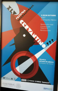
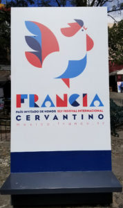
I enjoyed the graphics that were created for the festival this year. Here are two examples, but there were many variations. The theme of the festival this year: Revolution. The country theme: France.
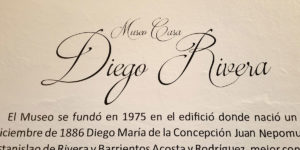
We visited the childhood home of Diego Rivera; despite the fact that he left there at age 6, it’s been converted into a museum. An interesting pointed pen variation headed up the sign on the wall.
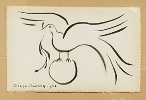
More interesting, was Rivera’s version of the bird flourish. I’m kind of kidding. Not about it being interesting, but it did remind me of the tons of flourished birds that have come of the hands of master penmen (and penwomen) over the past 150 years.
Guanajuato is a walking city, and boy did we walk. My FitBit registered at least 10,000 steps each day we were there, with a top reading of 17,555 steps.
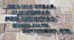
We didn’t walk up to the Pipila — we took the 47°-grade funicular — but I took this photo of the lettering at the foot of the Pipila. It’s not the Trajan column, but here I was, totally ignoring the huge statue towering above the lettering to concentrate on the lettering below. Typical calligrapher.
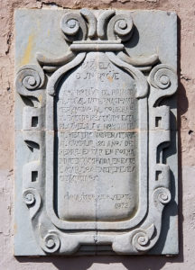
This carved sign in one of the plazas commemorates the first Cervantino festival in 1972. Some of the letters remind me of David Jones lettering, especially the S. Here are two details that illustrate what I mean:
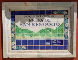
Another day, we went to Presa de Olla, a nice neighborhood above the city topped by a park. This tiled sign reminded me a bit of Gemma Black’s open versals and her Art Deco-rative designs. (I do recognize that this sign is totally inferior to Gemma’s work, of course).
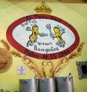
Speaking of inferior, this cheerful sign was painted on a restaurant wall in San Miguel de Allende, which is an hour’s bus ride from Guanajuato. I recorded this sign as a cautionary tale for beginning students who tend towards that 0° pen angle. Contrary to what you might think, those wheat stalks are not coming out of the big soup pot, but are painted on the wall behind it.
We attended a lot of music concerts, some dramatic performances, walked the streets with an estudiantina and about 150 Mexican tourists, and much, much more. It was a good trip.
Versals after Gemma Black
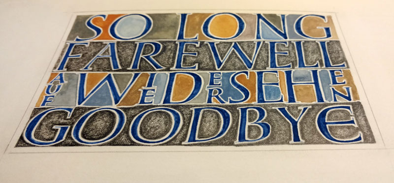
This farewell card gave me a chance for further practice on the versals I studied with Gemma Black at LetterWorks this summer in Ogden, Utah, and again last month in Missoula, Montana.
Lettering is done in gouache, as are the counters of the 1st and 3rd lines . The counters of the 2nd and 4th lines are done with a Palomino Blackwing pencil.
Shopping for the artist: pigments, brushes, and eye candy
OMG!
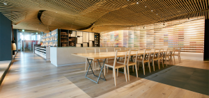
I would love to visit Pigment Tokyo! An artist dream of color. The scale is dizzying, and the design intimidatingly slick. They claim to carry over 4,200 pigment colors, more than 200 antique ink sticks, and 50 animal glues.
And the brushes …!
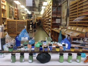
When I visit New York City, I try to get by to Kremer Pigments. It’s more like an apothecary of color, and I love it.
via Colossal
Daily lettering – sprung italics and interlinear small caps
Changing it up from versals and other drawn letters … sprung italics after Denis Brown’s example, with interlinear brick-red capitals to provide contrast. The text probably means very little to anyone but me. For example: Why “Ugh” as the penultimate word in the italic lettering? It was an opinion about the preceding letter z. And why “ghosts” as the last word? I wanted another go at that “gh” combination in “Ugh”; the first time it was too close.