I’ve been trying to draw some more. (“More” is not a difficult accomplishment when it follows a period of “none”!) Since I’m primarily a calligrapher, the drawing inevitably leads to the question of how to combine letters and drawings on the page.
The integration of image and text in Oriental calligraphy is not the same problem it is in Western calligraphy. While Chinese characters, for instance, were once pictures, our Western letters are symbols of sounds. So there’s a jump from image to sound in Western language that doesn’t happen in languages whose characters began as pictograms.
The “windows” solution is illustrated (haha) throughout countless medieval manuscripts, in which rectangular frames and the counters of decorated capitals often act as a two-dimensional frame for a three-dimensional scene which exists on the page in another visual plane.
Over a hundred years ago, William Morris concerned himself with the integration of text and image through his work at his Kelmscott Press, designing type, decorative initials and woodcut borders to work together. So did others in the Arts & Crafts Movement.
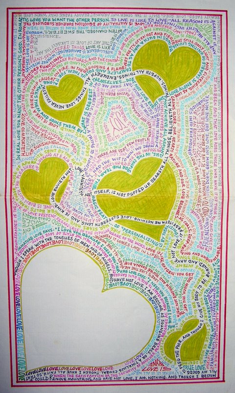
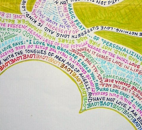
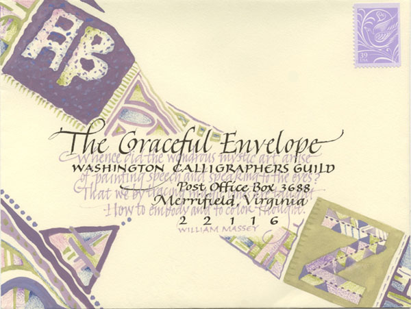
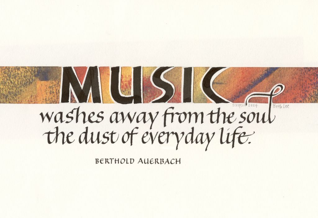
The current fad for combining words and images is to simply layer them willy-nilly over and amongst and between one another. I believe this is both a reaction to, and a symptom of, our information-crowded lives. It’s not efficacious for me, except perhaps as a means of letting off steam. I’ve over-simplified the situation: I have seen layered work that is stunning and meaningful. But I’ve seen more that can be described as a chaotic mess.
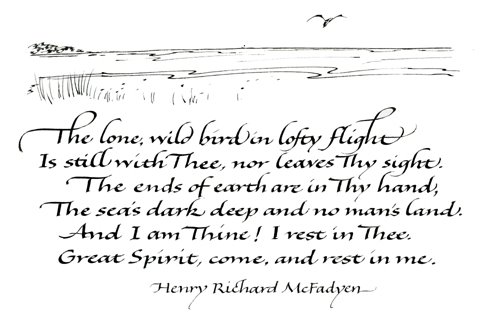
I’ve started a black-and-white (so far) art journal recently. I’ve been working in it every day (so far). Here’s the 3rd page of it, which is mostly an attempt to integrate image and text by using the same tool for both. Another goal of this page was to work on a wider, flowing-but-not-too-sweet italic variation.