How in the world do people manage to travel and blog daily? It’s a mystery to me. It’s taken me a long time to adjust to the change in time zone and climate.
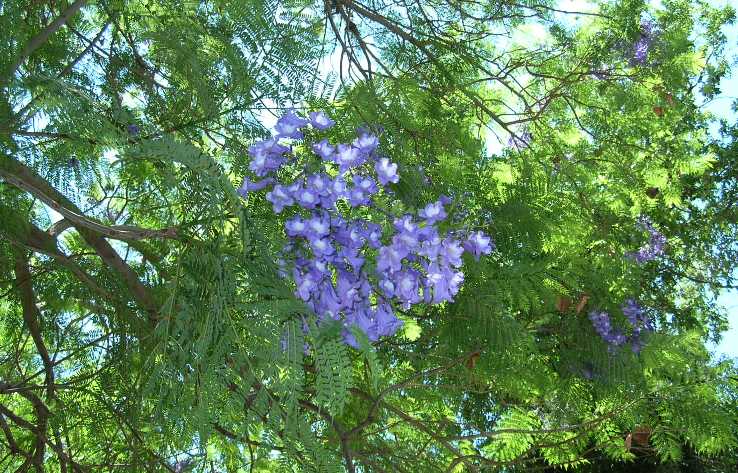
 I’m continually amazed at the lushness of the flowering trees and shrubs in Jerusalem. Here’s a view of the sky from the sidewalk on Hamelitz, near our apartment. It’s quite pleasant to walk in Jerusalem if one avoids the main roads and keeps to the gardens, parks and neighborhood roads. This is easy to manage. I’ve been walking a lot here. On Thursday, I walked at least 6 of the hours between 10a.m. and midnight.
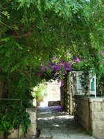 Here’s a photo of the entrance to a house near our apartment. This is a relatively high-maintenance entrance, because the overhead vegetation has to be trimmed frequently. At least that’s my impression, judging from the number of people I’ve seen trimming branches from sidewalks and walls. But the maintenance is well worth the shade! The difference between standing in the shade and standing in the sun is, well, night and day. Haha. Okay, I’m exaggerating. But still.
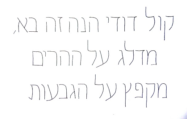
In between all this walking, I’ve been taking a non-correspondence version of Izzy Pludwinski’s Hebrew calligraphy correspondence course, geared toward “Latin” calligraphers. For anyone who’s taken a good course in foundational bookhand or Roman capitals, the course begins in a comfortably familiar way, with monoline skeletal forms.
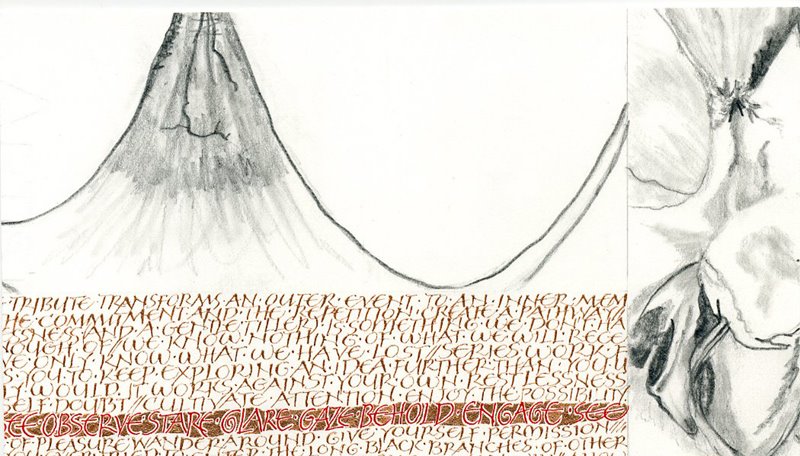
 An optional assignment is to amend the aleph-bet to produce a variation. In my variation, I narrowed the proportions to 2/3 of the original, and added curve to a couple of elements that are repeated throughout the aleph-bet. A thumbnail of my variation is shown at right. Click on the image for a closer look. (And please excuse the quality of the image. Microsoft Office Picture Manager can’t match Adobe Photoshop in dealing with my indifferent photography skills.)
The next lessons introduce the broad-edged pen and and x-height of 3cm (!), reduced to 8mm after some practice. This smaller size is still plenty large for at least some errors to be glaringly obvious. Not to mention the sneaking suspicion that there are glaringly obvious errors which I’m completely missing. Not to worry: Izzy will point them out to me at the next meeting.
So, all in all, the letters are not so familiar to me, but the process — of seeing and learning and seeing more and learning more — is much the same as it is for any Latin hand. It is difficult for a non-Hebrew calligrapher to work out the basic architecture of the aleph-bet, because so many different pen-made and drawn versions of it exist. So far, the most valuable thing I’m learning is that basic architecture.