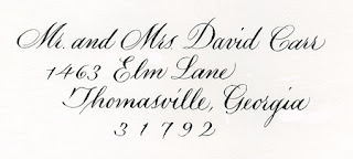
A quick, cold, unretouched (except that I Photoshopped out the smudges made when I slapped it down on the scanner glass before it was dry) fake address in my current pointed pen script. My website is so out of date, even this quick one is a better sample.
Art 21 / Geometry of Design
 I’ve been spending some time at PBS’s Art 21 website recently. It’s packed with information about contemporary art and artists, and excerpts from the 20-minute interviews shown on their PBS television series.
I’ve ordered the book associated with the first season.
Another interesting book I just got in the mail: Geometry of Design: Studies in Proportion and Composition, by Kimberly Elam. It’s got a lot of compact information about the golden section and illustration as circles (which I’ve seen a lot) and squares (which I’ve seen less often), as well and some great overlays illustrating the underlying geometric design of various commercial artwork.
Miniature Writing
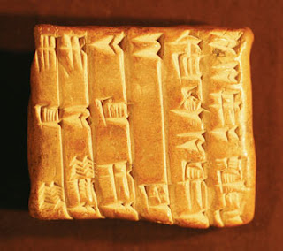 This luscious image of the earliest example of miniature Sumerian writing illustrates an interesting article entitled “A Minor History of Miniature Writing” at Cabinet. Cabinet is a quarterly magazine that looks so interesting I’ve just subscribed for a year to check it out.
This brings to three the total number of magazines I subscribe to; the other two are Letter Arts Review and Bound & Lettered.
Anybody got any magazine subscriptions they can’t live without?
Thanks to Notebookism for the link.
My light table, in all its usual chaos
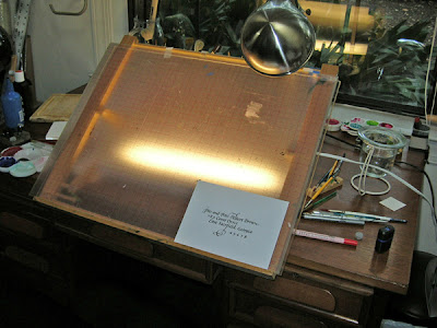 A quick photo of my light table, still set up for the broad-edge calligraphy I was doing on some wedding invitations earlier this week.
The easel is lightweight and adjustable, and folds down so I can take it to classes and workshops. (The link is to a selection of similar easels at John Neal Bookseller.) On the easel is a piece of Plexiglas — bought at the local glass store — covered by a clear mat with 1/8″ grid printed in red on it. Every 5 years or so I replace this grid, and it’s always a struggle to find it. It’s made by C-Thru Ruler Company, and it’s Item No. 158. They also make other gridded mats, but that one’s the most useful to me. You can see the light from the fluorescent strip on the desk behind the easel; I bought that at the local hardware store.
Designers Toolbox — a useful resource
Despite the missing apostrophe, this very cool website provides all sorts of useful information for calligraphers and web designers alike:
- standard sizes of envelopes, folders, CD covers, and postcards;
- glossary of proofing marks;
- a “lorem ipsum” generator — useful for web designers struggling with, oh, CSS, for instance;
- legal documents which freelancers need, such non-compete agreements, copyright statements, and so on.
Be warned that the actual templates and legal document files require registration (online, that is, not the kind needed for 4-color separations — isn’t the English language a complicated thing?).
Graceful Envelope 2007
Anybody get their envelope mailed today? I was at the post office at 5:59pm, mailing mine. The postal worker was rather surly (maybe because there were 5 people behind me), and hand- canceled my envelope for me … twice. I can’t imagine why.
I’d post a picture of my submission here except that I finished it so late I didn’t even have time to take picture or scan it. I erased a few pencil guidelines at the stop light at the end of our road. I like parts of the envelope I did, but parts of may take it out of the running for Honorable Mention. We’ll see. The theme this year is “A Mailable Feast”. There were almost too many good possibilities.
Feng Shui?
While viewing the last blog post, I noticed a curious thing: the bubbly-giddy post immediately follows the post about cleaning out the pantry. Coincidence? Karma? Feng shui? Who knows?
Yippee!
I just got back from the opening of “Creative Tallahassee,” the juried art show I blogged about here. And guess what?? Second place! Yup. Second place, for the ABC book, as I tend to call it. I was very surprised. Life is good.
Now that I’m going back to school for a degree in art — did I mention that I originally frittered away my undergraduate education in accounting? — I’m swamped with work. Wedding invitations, commissions, certificates, more certificates, more wedding invitation addresses . . . the list goes on and on. Pretty soon I’m going to have to quit accepting at least some work. Not that I’m complaining.
Really, there’s simply nothing to complain about, except perhaps that there’s not time enough to do all the things I want to do. In a little over a week I’ll be playing the piano for a doctoral student’s ensemble recital, and accompanying a violin major for her spring jury. I like all the music: Loeffler’s Two Rhapsodies for oboe, viola and piano; Elgar’s violin sonata, and a violin arrangement of Debussy’s La Plus Que Lente. Much fun. And art school classes start on May 9. And we’re getting a puppy on Memorial Day weekend. And somewhere in there — hopefully before classes start — I need to finish the webmaster certification project which is my redesigned website. All things I’m looking forward to.
I feel like there are little champagne bubbles floating up from my head. And I only had water with dinner. Yes, life is very good.
Spring cleaning and sand mandalas
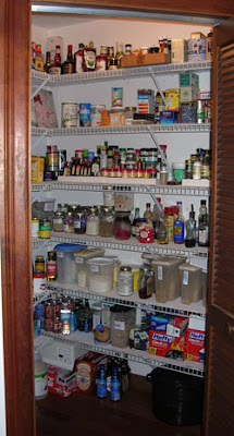 The Tibetan monks don’t have any monopoly on an understanding of time. I’ve watched with amazement when they spent days and days creating a sand mandala that was then poured into a nearby river. But anybody who engages in spring cleaning has a pretty good understanding of the transience of states of reality. I’ve spent the better part of 2 days cleaning out this pantry. It’s gorgeous now … and the fact that I say that gives you some inkling of the condition it was in when I began cleaning it. You just know it won’t look like that for more than 72 hours or so.
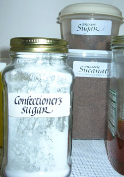
In case you were thinking this was going to be yet another non-calligraphy post … I did get to do a little calligraphy in the midst of spring cleaning: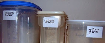
Two accepted in juried show
Remember the juried show I blogged about in February? Well, two of my three submissions were accepted. The one I was finishing up just in time for submission didn’t make it. (I realize why, but I would have enjoyed the irony: The last time I submitted artwork to this juried show was about 20 years ago, and the piece that was accepted was based on the same quotation about topsoil.)
And this book was accepted (here’s one page view and few thumbnails of other page views):

I’m very pleased. Calculating from the information given in the acceptance letter, 2/3 of artists who submitted work had their work accepted, and only 1/4 of accepted artists had 2 pieces accepted. But who’s counting, eh?
Anybody planning to enter anything in the Letter Arts Review “Review 2007” juried show? I’ve never entered anything, but many years I’ve planned to. I’m planning to this year, too 🙂
But at the moment I’m immersed in Loeffler’s Two Rhapsodies for Oboe, Viola and Piano. I blithely agreed to play the piano part for an oboist’s spring jury and recital next month. After I’d looked at this 42-page behemoth a little more carefully I had a minor crisis of confidence as to whether I could actually play the thing. This is a first — the crisis of confidence, I mean, as far as playing the piano is concerned. But I’m feeling better about it, after several hours’ practice, and some time with the score at the gym. I’ve discovered that it takes a little more than 35 minutes to get through the whole 42 pages twice with the iPod set to a 2-track playlist — depending on which elliptical machine I’m using. Evidently all the elliptical machines don’t count time exactly the same. Who knew?
