
 What to do today? It’s such a beautiful spring day! Maybe a spot of paste- painting on the deck? Or some work at my desk, overlooking the azalea hedge and live oaks. Decisions, decisions!
Portfolio

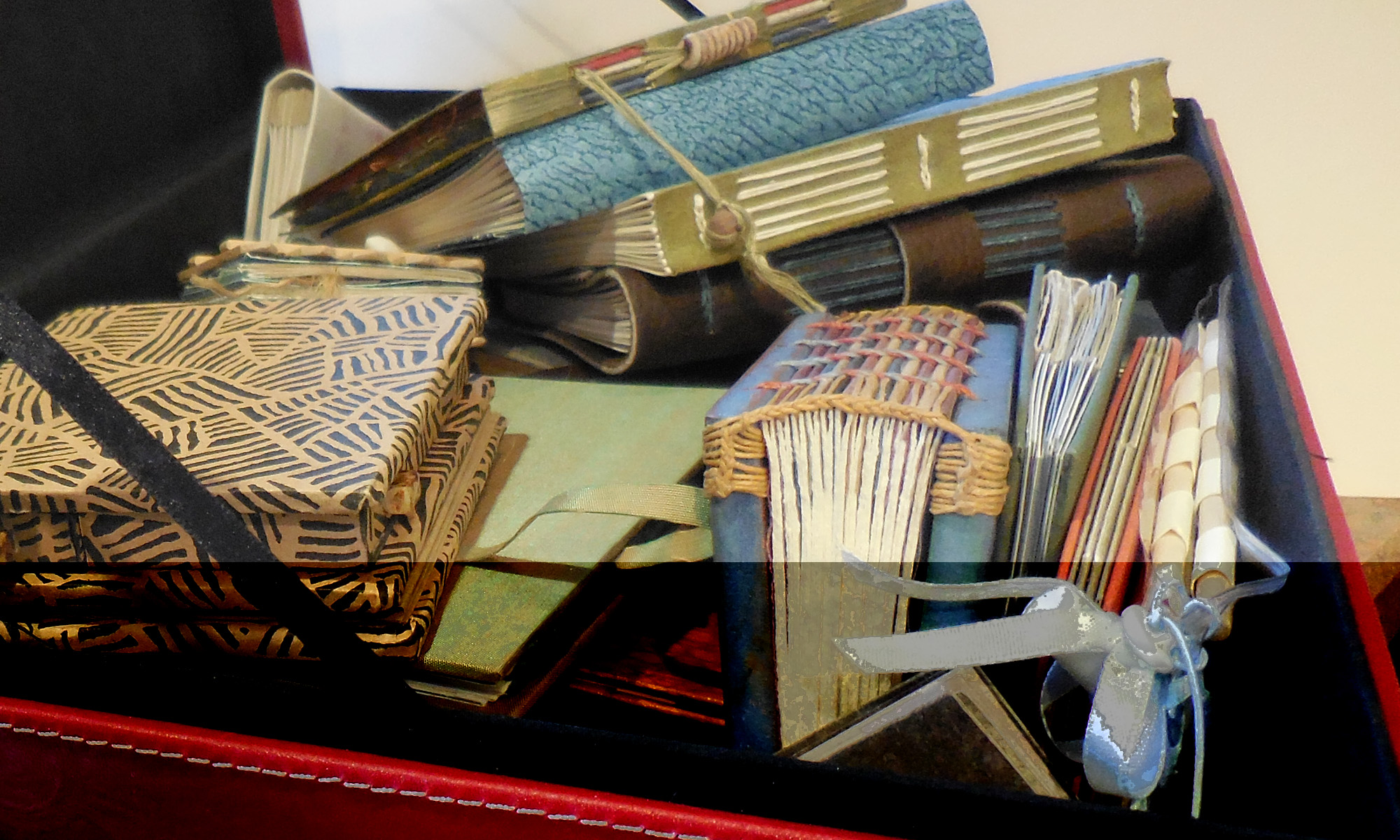
I had a portfolio presentation today, and I’ve been preparing all week. This weekend I built a tray for my small books, and a suitcase-style box to house the tray and three 12″x16″ pieces. I’d forgotten how much fun (and frustrating) it is to build boxes.
Here’s a picture of the whole tray.

Well, the deadlines are simply flying past. This was due in the mail 3 days ago. Continuing the theme of the pen-made flowers, which I’m still enjoying. Gouache and glair, metal pens.
Another version of a favorite quote

Here’s a piece I finished yesterday to enter in a competition. I haven’t decided whether I like it or not, and I that’s the problem with getting things done at the last minute, isn’t it?
Of course, by yesterday, my only choices were finishing it at the last minute or not getting it finished at all …
It’s a lot less structured and gridded than my usual work. I kind of like that about it. I think.
I’m currently rather taken with the pen-made flowers, an extension of a workshop I took with Alice at Camp Cheerio in 1998.
Spring Haiku Exchange

I’m running a little late on the deadline for this exchange amongst members of the Calligraphy Exchange group at Yahoo. Rozanne, I’m mailing it today, and here’s a preview. Click on the image for a closer look. I was working on another piece yesterday, and decided to do a similar wash on another piece of paper for testing; I cut this best 5″ x 7″ rectangle out of the middle to use for the spring haiku piece. Gouache + glair + Leonardt Principality nib + a Mitchell #3.5 nib. The wash is a little darker than I’d like, while, conversely, the wash for the piece I did yesterday always seemed a little too light, or at least too shallow or something. I’ll post that piece in a bit.
The Fine Press Designer’s Dilemma
The February issue (PDF link) of the Caxton Club’s journal Caxtonian features an intriguing article by Michael Russem, of Kat Ran Press, entitled “The Failure of Fine Printing.” He tells of the book edition he so carefully crafted, following, he thought, the best principles of book design — only to have his most avid collector tell him: I don’t buy your books to read.
This quotation encapsulates the main theme of the article:
Because we are so accustomed to mass market productions, the physical elements and processes traditionally chosen for fine press books—handmade paper, letterpress, and hand bindings—are foreign to the average reader and thus call too much attention to themselves, over stimulating the senses and spirit. It is impossible to handle them without relishing in the deliciousness of the materials — though all the while feeling panic over the possibility of damaging these precious items.
He concludes that fine binding is an impediment to the reading of the text, making them an example of bad design … while paperbacks, whose materials are so commonplace as to become invisible, function successfully as vehicles for the text.
I’m not doing the article justice; read it for yourself. And then go comment on the blog he set up for this purpose at http://failureoffineprinting.blogspot.com/
Still writing
… and writing and writing. Name, numbers, addresses. Nothing fun, but all very nice looking, if I say it myself 🙂
A couple of pieces of eye candy, thanks to the sharp eyes of folks on the Ornamental Penmanship list:

The incredible pencil sculptures of Jennifer Maestre.
More pencil sculptures on exhibit at Faber-Castell, work by Kerstin Schulz. (Scroll down on that web site to see the sculptures.)
More eye candy
All of a sudden I’ve got more work than I can shake a quill at. No time for much blogging. In the meantime, I’ll just point you to …

… a really fine collection of hand lettering at Claude Dietrich’s website.

And all kinds of art by Brody Neuenschwander.

And from Charles Pearce.
I hope you’re not too busy, because these web sites will take you some time.
Happy New Year!
I’ve been skiing and I’ve been web redesigning. I’m about ready to start 2007, maybe a little late.
Check out my new website design at www.callibeth.com. I’m still working on it, but I’m very pleased with what I’ve got so far. (In case you want to compare “before” and “after”, the old site is still up at mywebpages.comcast.net/callibeth
Ehon: The Artist and the Book in Japan

Here’s something I wish I’d caught when I was in New York recently: an exhibition of ehon, Japanese picture books at the New York Public Library that looks fabulous. Click on the title of this post to get to the NYPL’s description of the exhibit. Or click here to see a slide show and description at Slate.
Asian artists are so lucky. Their art tradition has always integrated drawing and writing and painting because their systems of writing are based on pictorial representations. In Western art, letters may have started out as representations of something — a yoked ox for an A, for instance — but for millennia those letters have represented sounds rather than pictures. So we are usually working to integrate two alphabets (capitals and minuscules) together with illustrations, and the mark-making for each of the elements is markedly (ha) different. The capitals are more a drawn letter form, the minuscules more a written/cursive form, and the illustrations are achieved by any number of methods.
Our medieval illuminated manuscripts solve this by placing the paintings in a window, setting them in a different plane of existence. It’s not nearly so satisfying as the Asian approach to book design. And this exhibit shows that clearly.
Thanks to members of the Book_Arts-L listserve who posted information about this exhibit.