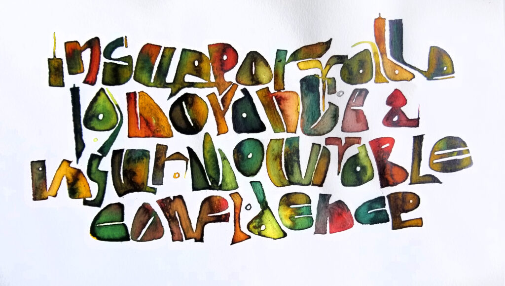
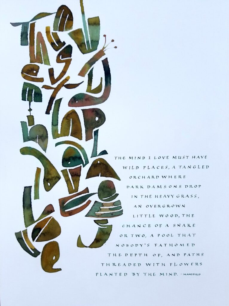
“The Mind I Love” — Inks and gouache on paper, 12 x 16 in.
I’m pleased to have this piece, titled “The Mind I Love”, accepted into WILD/LIFE. Hosted by the Guild of BookWorkers, this exhibition will travel to venues across the country from Summer 2021 to Fall 2022.
I enjoyed the work we did in Series 1 of Brody Neuenschwander’s online classes (see this post). So much, in fact, that I continued experimenting with it, and this piece is one result.
Gouache and sumi, Brause Ornamental pen nib and 00 brush, Arches Text Wove, about 10 in x 8 in.
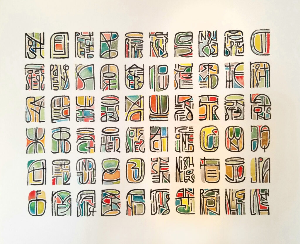
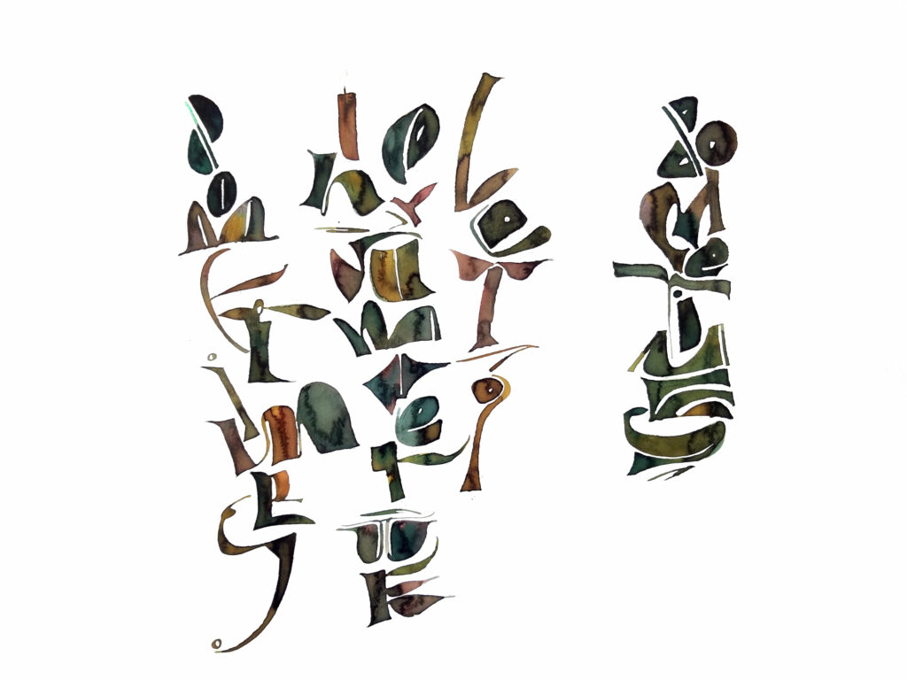
I’ve enjoyed the work so much in Series 2 of Brody Neuenschwander’s online classes that I did another, this time with color in the counters and 3:4 portion of rectangle. Compare this to the monochrome square figures in my last post.
Actually, I gathered up all the bits and pieces of work/play in this seal-script-inspired vein and was shocked at the height of the pile. I can see a number of applications for this style of working. So much fun!
#5 Brause Ornament nib and gouache on Rives BFK, about 12 inches square. With a hint of another bit of homework in the corner.
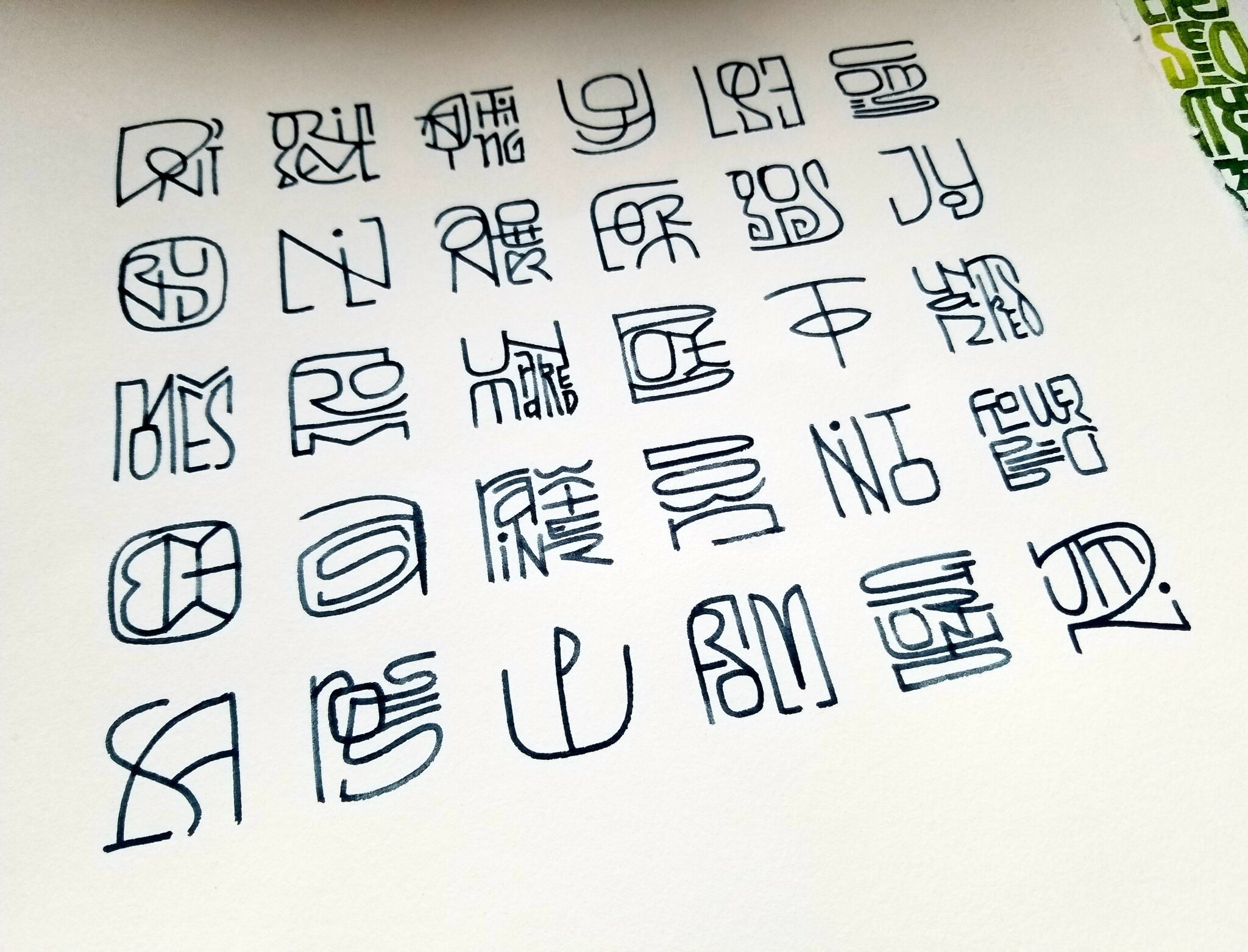
Series 2 of Brody Neuenschwander’s online classes is inspired by Chinese seal script. I am loving this shift in thinking from fairly uniform letters with discreet spaces between words to separate word bundles. It’s the difference between a grass prairie and tiered landscaping. Or it can be. I’m fascinated with the way the way of working shifts me toward thinking illustratively. For instance, the word “round” is enclosed by the “O”. And in the corner bit, the word “seed” begins to look like a pea pod. And what a change this improvisational construction is from standard formal Western calligraphy, where the letter placement is fore-ordained!
Click on the image for a much larger look.
If you missed my post on the first series, check it out here.
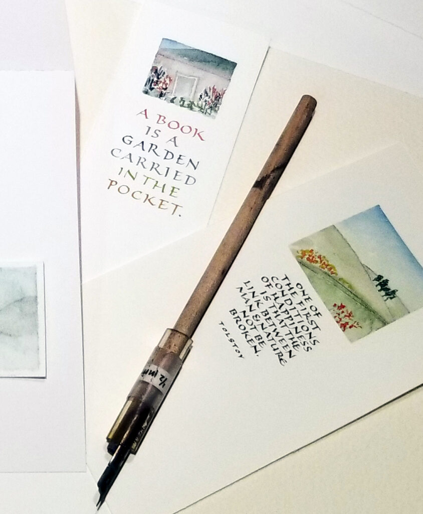
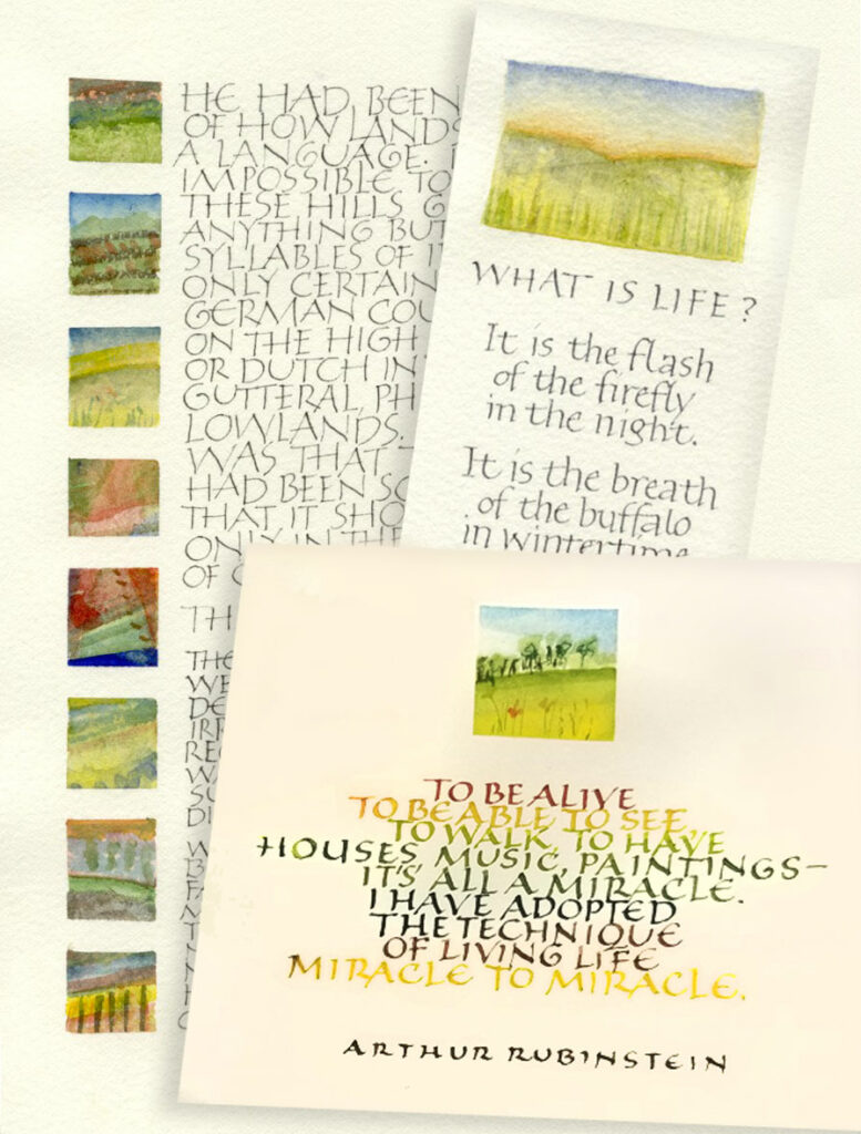
I’m looking forward to teaching a two-day workshop titled “Small Capitals with Small Landscapes” in September.
In this workshop, we’ll mix small Roman capitals fun with a landscape that is just one square inch. Start with pencil and fine marker, we’ll begin with monoline Roman capitals and gradually shrink them down for use as text lettering. Then we’ll focus on what creates rhythm and movement within those texts. We’ll use small broad-edged and pointed pens with gouache or watercolor, and I share a few strategies for making our small lettering sharp and clear. I’ll demonstrate a couple of ways to load the pen with changing colors that add further texture to the text block. And we’ll play with other kinds of texture, letter spacing, and more. And then we’ll create tiny painted landscapes as a graphic element that melds beautifully with our lettering.
These little paintings make beautiful greeting cards, bookmarks, and small framed pieces.
I’ve taught this workshop, “Small Capitals with Small Landscapes”, once before. This time I’ll be teaching members of a southern California guild. I look forward it!
“Sometimes in summer we let go … sometimes” – Bister ink and cola pen
The first of Brody Neuenschwander’s 8 series of online calligraphy classes has come to a close. It more than met my expectations, and my expectations were high.
A little history
I first met Brody during a week-long workshop at Camp Cheerio in 2000. He and Thomas Ingmire co-taught the workshop, “Textual Reverberations”. A good deal of time has passed, but I still have the book I made in that class. During that week, according to my notes — and perhaps the promotional materials, “we looked at meaning in modern text-based art and worked with more open-ended and suggestive processes. Inventive calligraphic writings were developed based on musical, emotional, rhythmic, visual, linear, and formal themes.”
It was a different workshop than most calligraphy workshops in that it tied calligraphy into the larger art world. Every morning we were treated to a talk about lettering in the contemporary art that included a slideshow of work by Cy Twombly, Jenny Holzer, Bruce Nauman, Barbara Kruger, and many others. During that week we also got see what Brody was doing in that wider world. One evening we watched “The Pillow Book”, directed by Peter Greenaway and including calligraphy by Brody. And we saw another collaboration with Peter Greenaway, “Bologna Towers 2000“, in which his writing was projected the towers of Bologna. For me, at that time, it was an eye-opener.
Edited to add: I wrote a blog post about this 2000 workshop here.
Series 1
The just-completed class series advances this theme of calligraphy in the larger world, taking inspiration from the Kufic form of calligraphy. From copying and then translating elements of those forms into Latin calligraphy, we learned to break the grid that our 26-letter palette and vellum/quill tradition have encouraged.
A list of sandwiches and bread in popular Western culture and literature, from Mrs. Lovett’s meat pies to the Hillel sandwich, with hot cross buns down the left side. You can hover over the image for a complete list. Pilot Parallel Pen and ink.
I haven’t begun to describe the class; a full description is beyond me. I’ve shown my homework submission here, but you can enjoy the fantastic work of some of the other students at instagram #brodyonline. Sorry you missed it? You can still take the class as a recording. Series 2 begins in April and looks to Chinese seal script for inspiration. I can’t wait!
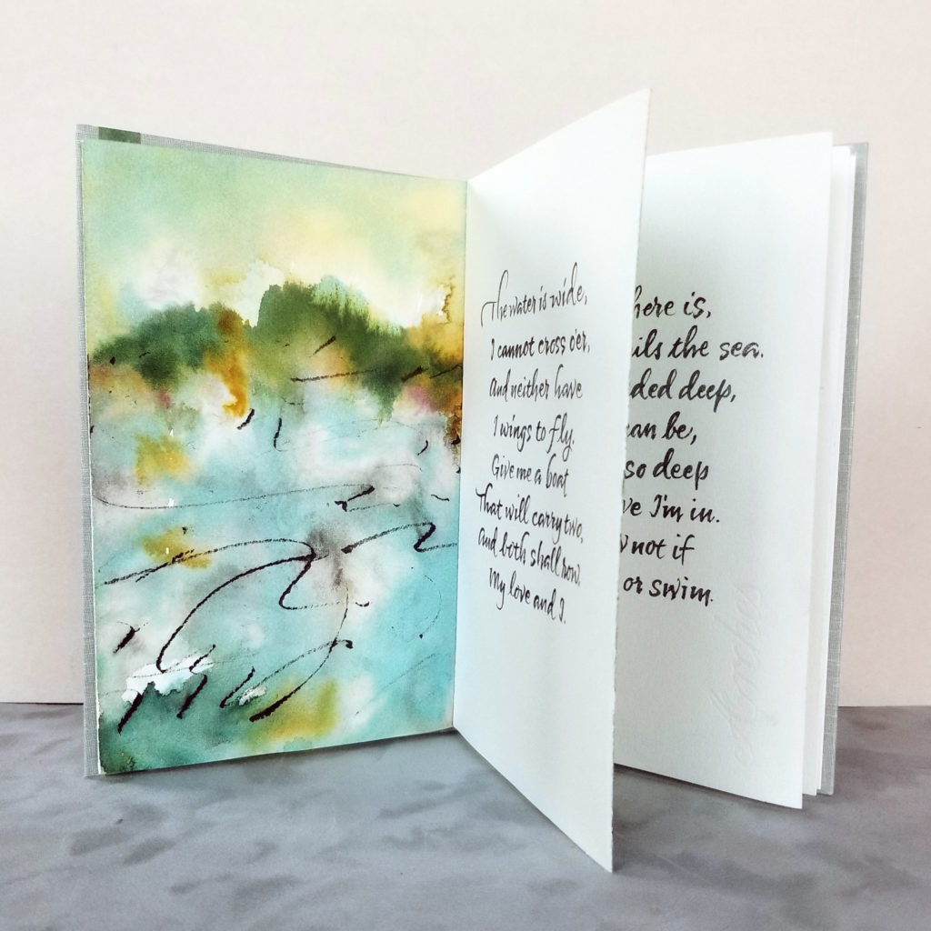
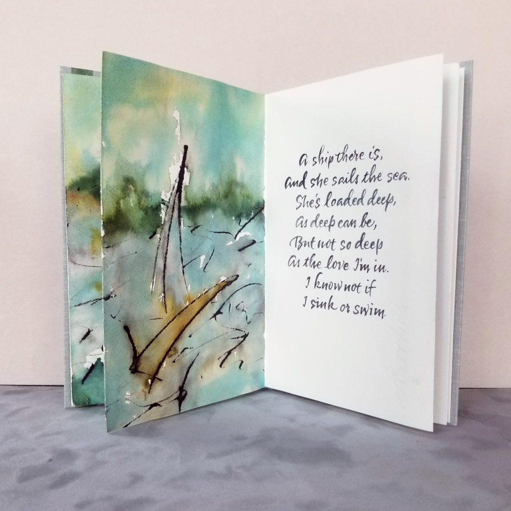
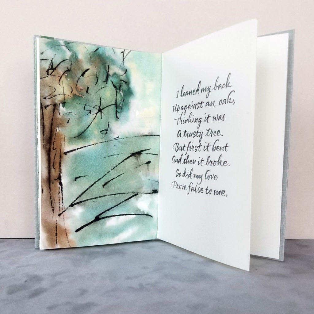
I realize that I’ve never shared the variable edition of 12 manuscript books that I made last fall. Here are photos of the three verses of The Water is Wide. 5 x 8 in, Bister and sumi inks on Arches Text Wove, lettering done with a no. 2 round sable brush. Book cloth over hard cover.
These books were the “comfort food” of the studio this past fall. The melody that goes with these traditional lyrics is the kind of tune that sticks in your brain, but it’s soothing.
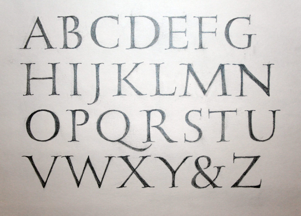
Drawn Roman capitals done at 3/4-inch height with pencil on Strathmore Drawing 300. Serifed Roman capitals done with a 3.8mm Pilot Parallel Pen on white butcher paper at 1-inch height. I don’t think I was that back-sloped at the bottom right; rather, I think I tried to fix the perspective of a not-straight-on camera shot. The stiffness of the strokes and serifs are all mine though, sadly.
These are two homework pages from session four of John Stevens’ excellent five-session course, Capitals to Uncials. Session five was held this weekend, and I’m looking forward to doing the homework from that session.
It’s been such a good class, and John presented about 10 times the material shown by my posted homework. I’ve got enough to work on for a year without stopping, and I’m sure that that year’s work would lead to another year, and so on.
Judging from the disappointed post of fellow calligraphers worldwide, I was awfully lucky to make it into this 5-week class on Uncials and Roman capitals taught by John Stevens. This is week 2. Here are the 2 pages of homework I was willing to share with the class.
I could easily work on this class full time! I’m quite sure that some of my fellow students have been doing so, and even working overtime. I’ve been drawn into spending much more time on it than I realized. So now I’m scrambling to get to all of the work piling up in my studio. Today and tomorrow will see me caught up (she says, optimistically).
Monoline capitals 1/4″ high, lettered with 03mm mechanical pencil on Strathmore Drawing 300.
A layout showing 3 sizes of an italicized variation of uncials. Brause & Hiro Tape nib in sizes 3mm, 2mm, and 1mm on a scrap of Fabriano Ingres. I’m still working out the details of this variation.
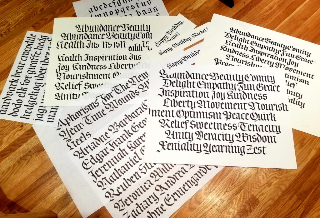
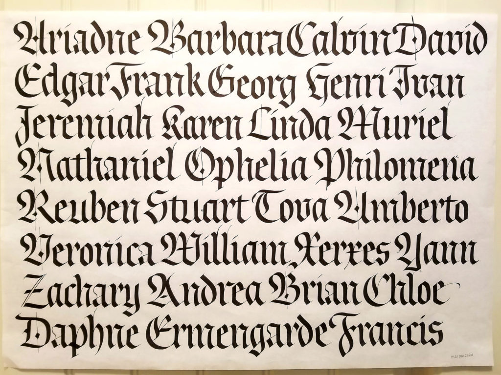
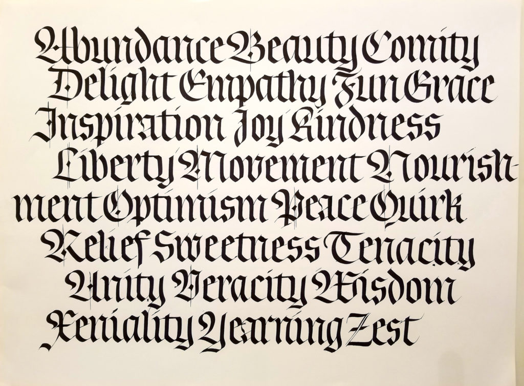
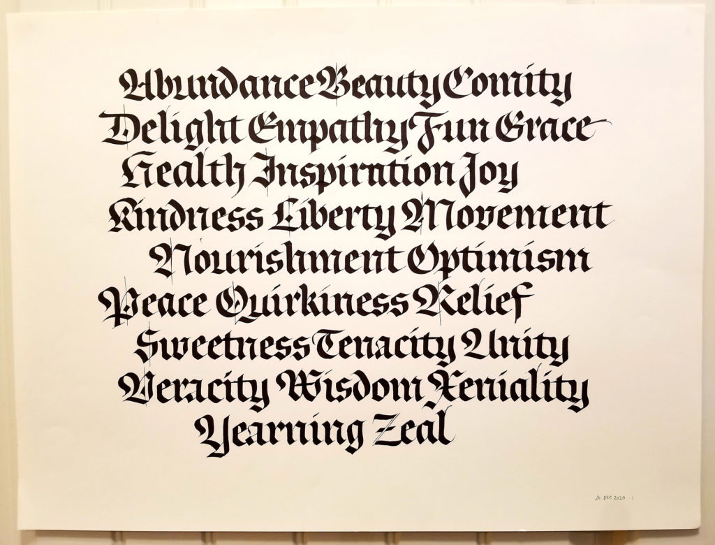
All the sheets I’m willing to share. There are a good many more …
Fraktur practice with 6mm Pilot Parallel Pen.
Fraktur practice with 6mm Pilot Parallel Pen.
Try the same materials but a shorter x-height.
I’m taking Luca Barcellona’s Advanced Fraktur blackletter class through the Society of Scribes, New York City’s calligraphy guild. The last of the three session will take place at the end of next week. Meanwhile, the floor of my studio is simply littered with sheets of blackletter practice. After a similarly structured class with Elmo van Slingerland, I’ve become a little more accustomed to working large. Most of the sheets pictured above are 18 in x 24 in. I’ve done these with a 6mm Pilot Parallel Pen on sheets cut from a roll of white butcher paper. Creamier-toned sheets are Strathmore Drawing 400 paper.
I haven’t taken blackletter from a teacher before, at least not in the past 25 years, and this has been a valuable experience. I missed the previous intermediate class, but I think I’ve been able to catch up. (Having taking twoclasses through Society of Scribes now, I’ve got to say that Phan Nguyen is the best facilitator ever. He makes the online experience a real pleasure.)
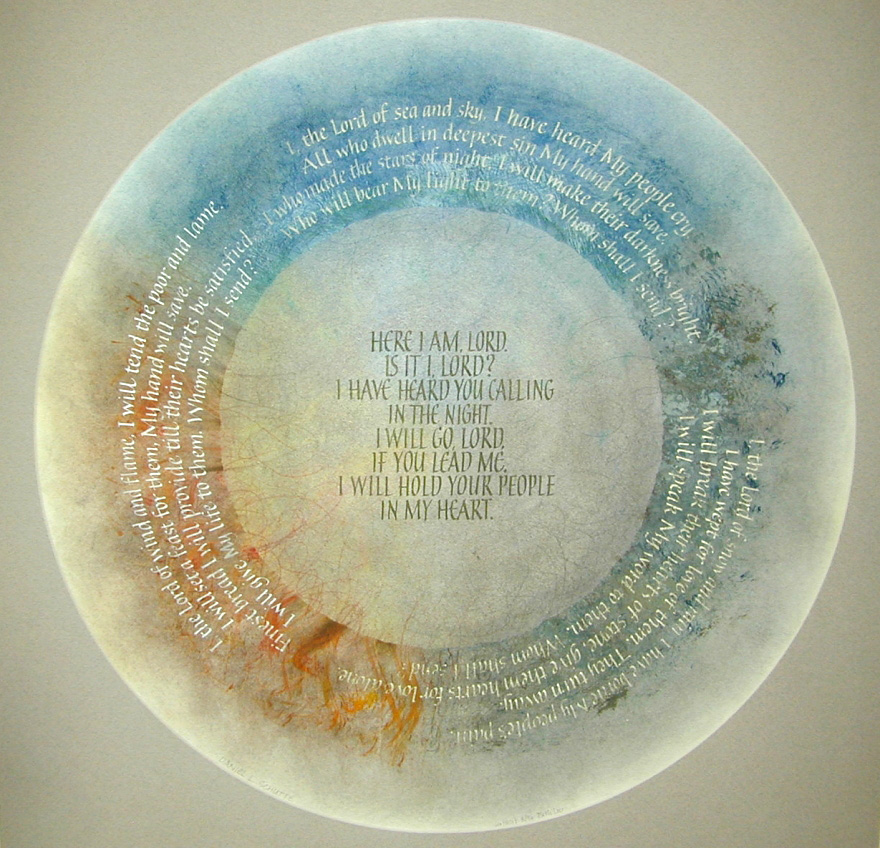
As I work on cards and presents for the holiday season, I think fondly of presents past. One of my very favorite pieces I ever made was for my mother. The text is the lyrics to “Here I Am, Lord,” one of her favorite hymns. The verses are ranged around the circle, surrounding the chorus in the center. It is hard to believe that I made this 24 years ago.
Contains information related to marketing campaigns of the user. These are shared with Google AdWords / Google Ads when the Google Ads and Google Analytics accounts are linked together.
90 days
__utma
ID used to identify users and sessions
2 years after last activity
__utmt
Used to monitor number of Google Analytics server requests
10 minutes
__utmb
Used to distinguish new sessions and visits. This cookie is set when the GA.js javascript library is loaded and there is no existing __utmb cookie. The cookie is updated every time data is sent to the Google Analytics server.
30 minutes after last activity
__utmc
Used only with old Urchin versions of Google Analytics and not with GA.js. Was used to distinguish between new sessions and visits at the end of a session.
End of session (browser)
__utmz
Contains information about the traffic source or campaign that directed user to the website. The cookie is set when the GA.js javascript is loaded and updated when data is sent to the Google Anaytics server
6 months after last activity
__utmv
Contains custom information set by the web developer via the _setCustomVar method in Google Analytics. This cookie is updated every time new data is sent to the Google Analytics server.
2 years after last activity
__utmx
Used to determine whether a user is included in an A / B or Multivariate test.
18 months
_ga
ID used to identify users
2 years
_gali
Used by Google Analytics to determine which links on a page are being clicked
30 seconds
_ga_
ID used to identify users
2 years
_gid
ID used to identify users for 24 hours after last activity
24 hours
_gat
Used to monitor number of Google Analytics server requests when using Google Tag Manager
1 minute
You can find more information in our Cookie Policy and .

Mrs. Lovett's meat piesThe HostEmilio's ham & cheeseHillel sandwichthe best thing since ... since ever")