 Yesterday I went kayaking with friends on the Graham Creek. It was a beautiful trip. We were on the water from about 5 to 9pm, I guess, and saw only one other boat. The tupelos were just beginning to bloom and the bees were beginning to gather on them. As we kayaked under blooming tupelo branches, a low drone permeated the air. Last year my friends, who also keep bees, were here on a day when the bees swarmed on the tupelo blooms and the noise was so deafening they couldn’t hear each other speaking. We were a few days too early to experience that.
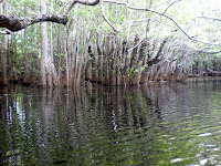 As the sun went down, the reflection of the trees on the water seemed to have the same weight of reality as the trees themselves. When the bees stopped humming, the air was still except for the occasional paddle.
 The spider lilies were in bloom, clumps of glowing white in the gathering gloom at the roots of the cypress stumps. These were growing close enough to the bank of the creek for me to photograph.
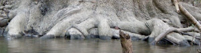
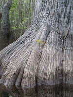 On the trip down to the creek, we had been talking about the connection of pagan religions to nature. (Notwithstanding the stained glass of Abbot Suger’s 13th-century Church of St. Denis which followed a theology of God as light. But I digress.) Out on the water, the overlapping roots and cypress knees reminded me of the animal style of Celtic decoration with its interlaced and knotted dogs and lions. I thought about how the monks on Holy Island began including birds in their illuminations in the Lindisfarne Gospels. And why not? They were on an island, and birds were a big part of their visual vocabulary.
So now I’m thinking about a North Florida animal style of illumination or knotwork which incorporates these roots:
Probably I’ll need to do more research. Another kayak trip. What we do for art, eh?

 Feathers, Fins & Foliage: Artist Books on Florida


