 WOW.
WOW.
Just. WOW.
I read this article (subscription required) in yesterday’s online edition of the New York Times. It’s about the project of Stiftsbibliothek to put their treasure trove of medieval manuscripts online. The article states:
The collection includes material as varied as curses against book thieves, early love ballads, hearty drinking songs and a hand-drawn ground plan for a medieval monastery, drafted around A.D. 820, the only such document of its kind.
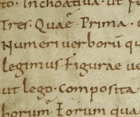
This morning I went over to the Codices Electronici Sangallenses (CESG) of St. Gall and looked around. They’ve done a spectacular job for those of us who really want to get a good look at the writing in these books. Each page of each manuscript has been scanned and is available for viewing at 4 sizes, from 416ox x 624px up to a whopping 3,328px x 4,992px. Click on the thumbnail at the top of this post for a 700×600 piece of the largest image size — and an idea of just how close a look these scans provide.
There are 144 manuscript books online now; St. Gall holds 355 manuscripts that were produced before 1000 AD, and their goal is to have all of those scanned, indexed and online by the end of 2009.
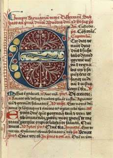
I’ve blogged before about the British Library’s Turning the Pages technology which allows browsers to use a virtual magnifying glass to get up close and personal with some truly magnificent historical manuscripts such as the Lindisfarne Gospels. Other manuscripts don’t have the magnifying glass option: the Luttrell Psalter and the Sforza Hours, to name a couple. (Hint: you have to click and hold to get the pages to turn.) They’ve now got Turning the Pages 2.0, but the technology requires plug-ins I haven’t downloaded yet, so I’ve only looked at these using their low-tech alternative. The largest available images are not more than 1,100px on any side, which is quite small in comparison to the scans on the St. Gall site.
Like this:
Like Loading...

 Kat Ran Press has a display of stamps designed by type designers. The list includes such luminaries as Hermann Zapf, Adrian Frutiger, and Eric Gill, and even reaches back to Peter Behrens and W.A. Dwiggins.


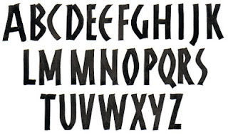
 ypography is interesting at the moment: we’re designing fonts. I wrote out an uncial font using a Zig scroll marker (first 4 letters shown above), scanned it in, and then vectorized the scan. The resulting paths are too complicated to go into Type Tool, and so I have traced each letter with the pen tool in Illustrator and then imported each into Type Tool. The initial letter of this paragraph has been traced in Illustrator. It’s tedious work, but somehow addicting.