Getting back to formal pointed pen lettering … some more

Daily lettering practice, or at least repetition.

Another day of pointed pen lettering, this time with McCaffery’s ink and my favorite pointed pen, the Principality. I’m not making much progress. This was done the same day as the copy-fitting exercise, which is to say, last Friday.

Copy-fitting and layout on the fly

x2016-04-29-copy-fitting-exercise
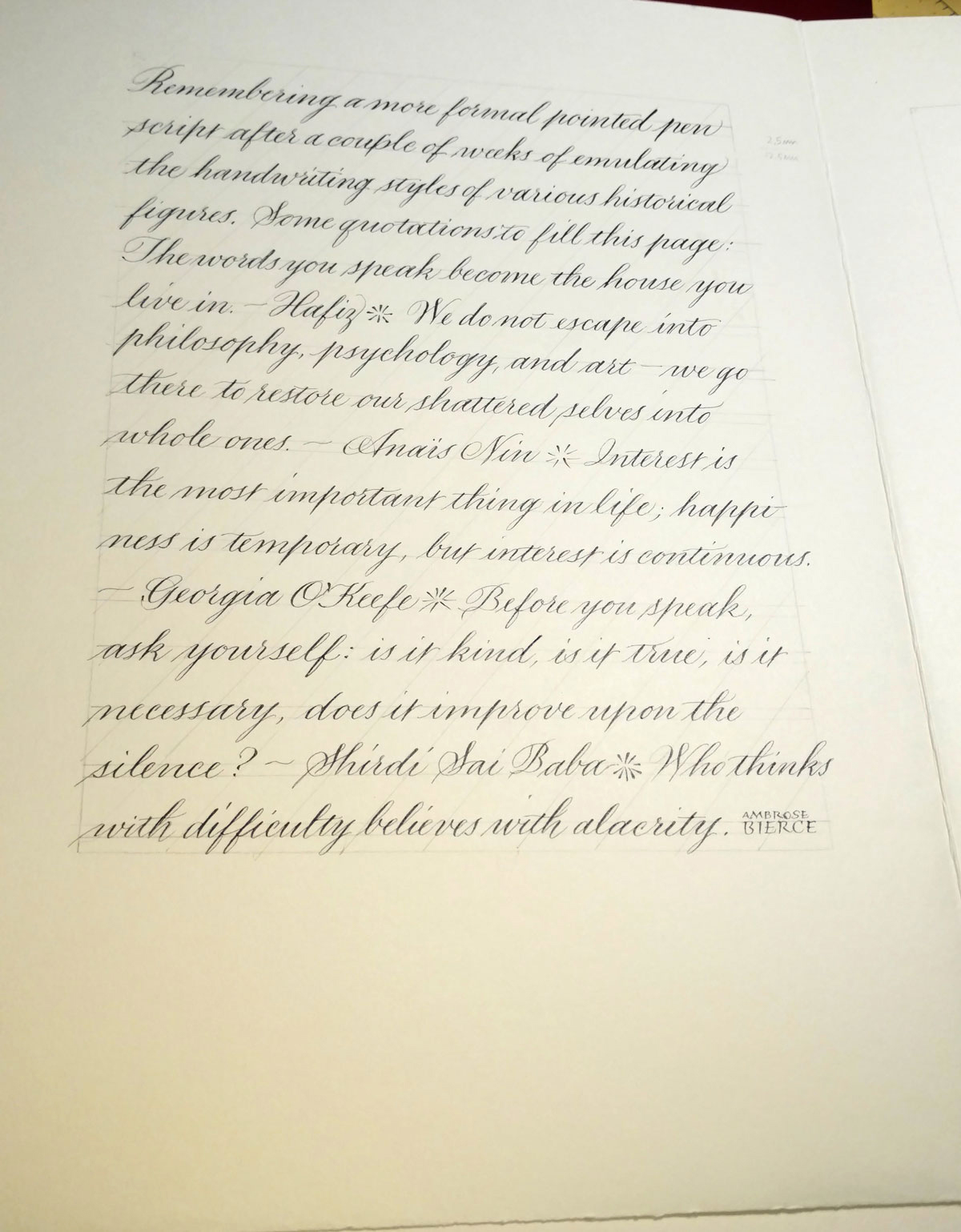
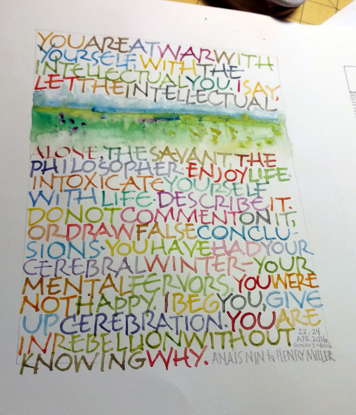
Sometimes the daily lettering isn’t about working on letter forms or loosening up with gestural strokes. On Friday, it was a sort of on-the-fly copy-fitting exercise, right-brained and hard to describe. Two or three things are going on, I think.

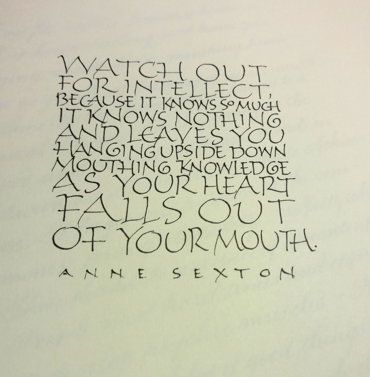
First, there is the guestimating about horizontal space − evaluating how big the letters should be, and how compressed or expanded. I was running out of room on the third line … but I kind of like that my choice for “so” makes it stand out. It almost gives “Valley Girl” emphasis to the phrase, which amuses me.

Second, though, there is the goal of making the current letters respect (and also with respect to) the line of letters above it. I added an entrance stroke to the “k” on “knowledge” to avoid having its spine line up with the spine of the “p” on the line above. “Falls out” doesn’t work very well here, opening up a big space between the “a” and “l” which connects to the space on the line above between “as” and “your” to make a big blob of white. I don’t mind the space between “falls” and “out” because it leaves room for “heart” to fall through to the last line. But “falls out” is just two few letters to work well on that line.

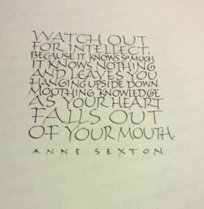
Third, there is the question of whether the letters should be larger or smaller than the others, given their importance to the content. Looking this over, I like my choices. I can read simply:

Watch out for intellect,
as your heart falls out of your mouth.

Or:

Watch out for intellect,
it know nothing and leaves you
as your heart falls out of your mouth.

Describing this process breaks it down and destroys the flow of the process. As Jacob Bronowsky said in a lecture memorialized in The Origins of Knowledge of Imagination, “It is an essential part of the methodology of science to divide the world for any experiment into what we regard as relevant and what we regard, for purposes of that experiment, as irrelevant. We make a cut. We put the experiment, if you like, into a box. Now the moment we do that, we do violence to the connections in the world … we are always decoding a part of nature which is not complete. We simply cannot get out of our own finiteness.”

After a commercial lettering job, formal pointed pen practice

I just finished (I think) an interesting bit of work with a publishing company. I provided the lettering for historical documents that a character in a book of fiction has unearthed: journal entries, letters, and so on. It was interesting and challenging to come up with appropriate handwriting styles for four very different characters. Afterwards, the pen nibs weren’t worth much, and neither was my formal penmanship. This page was a start at getting back to a formal hand suitable for, for instance, some upcoming place cards.

2016-05-01 pointed pen page 04-28
Getting back to a formal pointed pen style. Principality nib and Moon Palace sumi ink on 100# Strathmore Drawing 400. Page size is 9″ x 12″.

Another go at the Anais Nin letter to Henry Miller

Same quote, same basic layout as last week: all-over texture, no guidelines, fairly large lettering (for me, at least) … except that I used a Speedball Flicker B5 nib, and included a little bit of watercolor painting. Once time I picked up the #3 Mitchell nib (from last week) by accident, and wrote one word before I realized my mistake. Since the word was “alone” it seem appropriate to leave it … um … alone. (Sorry.)

Written out April 24 with a German version of the Speedball B nib and travel box of Winsor & Newton watercolors.
Written out April 22 & 24 with a Speedball Flicker B5 nib and travel box of Winsor & Newton watercolors.

The paper drill

Still life with four-hold binding and paper drill.

I’m having a great time teaching this 8-week manuscript book class here in Bozeman. Everyone in the class is doing such interesting work!

The last time we met I demonstrated the use of a paper drill and a Japanese paper punch in making a four-hole Japanese binding. Although the Japanese paper punch makes wonderfully clean holes, I thought that one student’s book would be too thick for the Japanese paper punch.

So I brought my Fiskars paper drill. I hadn’t used it in a good while, and I had forgotten how wonderfully efficient and easy-to-use it is — so easy, I accidentally drilled through something I shouldn’t have. And that’s all I’m going to say about that.

To prepare for the class meeting, I made a quick-and-dirty model using some Strathmore Drawing 300 paper and covering boards with one of the fabrics I had backed with kozo in an earlier class meeting. I drilled the holes with my paper drill in class, but afterwards, when I tried to sew it, I discovered that the holes were too small. I didn’t have any students handy to hold the book in place while I drilled bigger holes, so I lined up the holes with large-head pins, clamped it to my workmate, and went to work. And then finished up with the sewing. Note to self: even if you don’t measure and place the four holes precisely, the two corner holes should be carefully placed so that the sewing around and spine and head/tail makes a square.

A circular accordion book

2016-03-29-circle-book-and-wrapper
Circle accordion book (with monkey weight) and wrapper.

Towards the end of March, I made this circular accordion book as a gift for a friend. It’s a springy structure, so my three brass monkeys are sitting on the book to keep it closed. The book goes in the wrapper, shown upstage. I wrote one quotation out one side of the accordion, and balanced the message of that text with a poem on the reverse side, so that it functions rather like a dos-a-dos book.

Circle accordion unsprung.


Blizzard bookbinding fun

2016-04-20-folded-blizzard-booksAt this month’s meeting of the Bridger Mountain Scribes, I taught the group a folded blizzard book structure … having learned it earlier that day from this YouTube tutorial by Paper Kawaii. She makes it all look so easy!

So that we could get down to folding right away, I brought pre-cut pages and covers, plus ribbon and brads (available in craft stores thanks to the popularity of scrapbooking).

It’s a fun structure that I’ve considered for other purposes because of its potential modularity: rather than making 3 accordion sections, each folded spine piece could hold a single sheet folded once, and these could be replaced as needed.

One of these books was folded from scrapbook paper stock, and the other from Arches Text Wove (painted for the spine, plain for the text accordions).

Later, I had a good time folding envelopes and other structures from Paper Kawaii’s other YouTube videos.