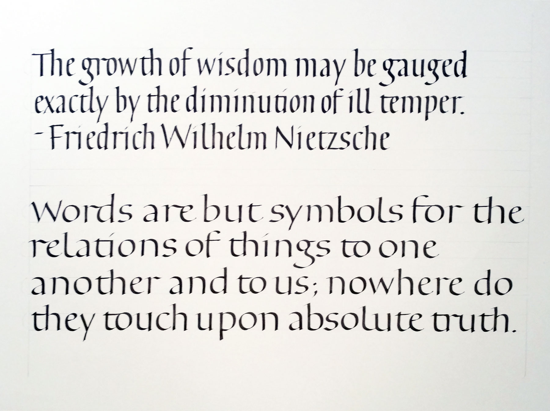
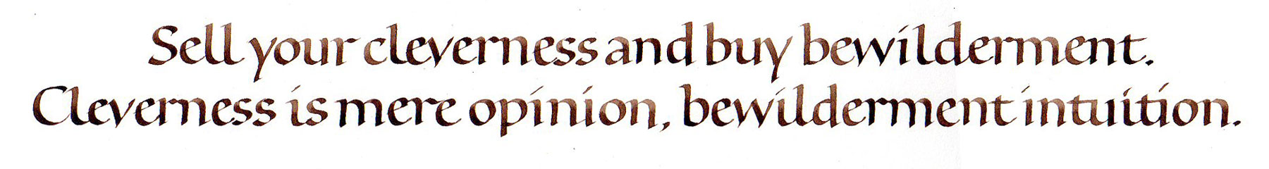
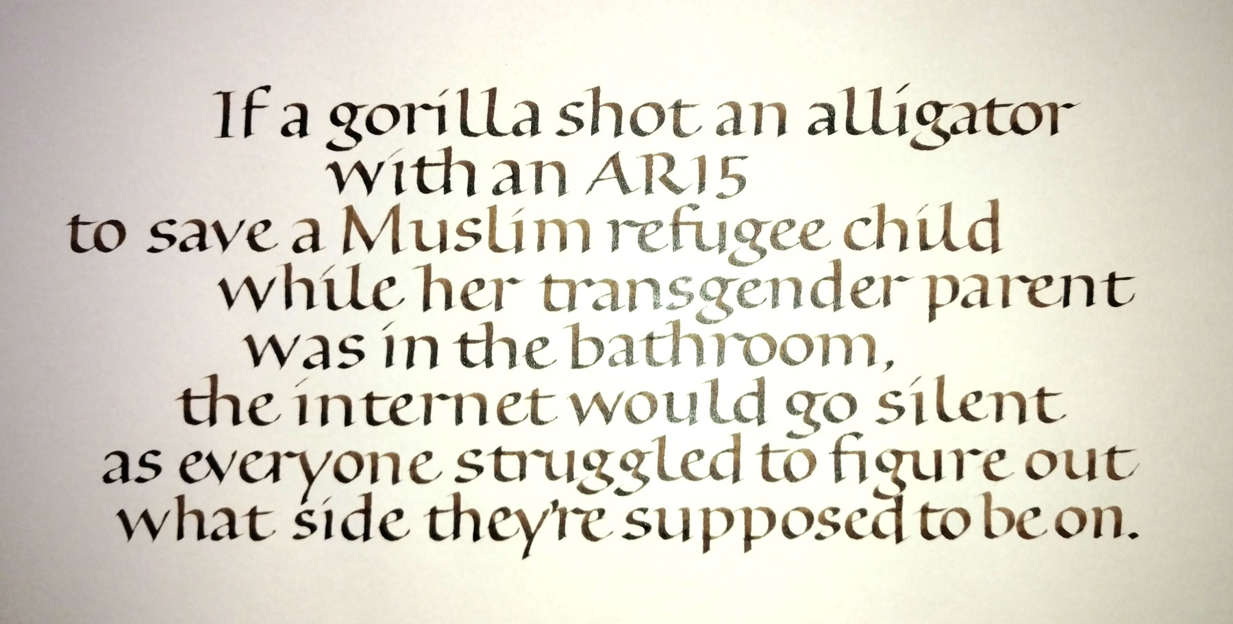
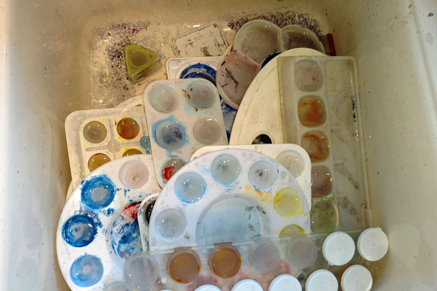
A gift – paste-painted with white lettering

Mixture of white ink and Chinese white on paste-painted background.
Mixture of white ink and Chinese white on paste-painted background. Matted size: 9″ square.

I dug out an old paste-painted paper that seemed appropriate for this Rumi poem. No planning, which left me with no margins. No guidelines, except that the paper is a laid paper. I like working without a net sometimes, and I decided to do this the same day I gave it, so it’s not like I had a choice, is it? The surface was somewhat plastic-y where the paint was thick, and therefore a little difficult to write on with a #4 Mitchell nib.

Bookhand homework – due week 4

This week in the bookhand class I’m teaching, we talked about layout and copy-fitting strategies. One strategy is to write the quotation, cut up the lines and rearrange them to fit the space allotted. I did the first part here:

Trial bookhand lettering for a series of cards.

I didn’t actually cut up the lettering, but I did measure the lines and begin each line based on those measurements. I did a series of cards based on the one Proust quotation. As shown below, I can get very different looks using the pen and the same basic centered layout. What I’ve changed: writing fluid, ground (paper), line leading. In a couple of cases I wrote the lettering with no guidelines, and so the x-height and line leading are also variable. Also in a couple of cases, I wrote “bloom” instead of “blossom.” Oops.

Lettering variations done with one pen and a centered layout.

Bookhand variations

2016-07-06-bookhand-variations-1-2
Bookhand variations using a Brause 2.5mm nib and Moon Palace ink on Strathmore Drawing 300 paper.

The bookhand homework

I always try to do the homework I’ve assigned. In this bookhand calligraphy class, part of the homework this week is to do work with the following specific intentions:

  1. x-height of your choice, expressed in terms of pen-widths (between 3 and 5);
  2. pen angle — your choice, but keep in mind that if you have few pen-widths in option 1, it will be natural to flatten your pen angle, and vice versa (between 15º and 40º);
  3. compression — your choice, keeping “o” and “n” as touchstones;
  4. letter spacing — partially a function of option 3;
  5. ascender/descender size — should be partially a function of options 3 and 6; and,
  6. line leading — partially a function of options 1 and 5, but also consider the size of your lettering in relation to the page, and also the length of your lines.
  7. serif — simple lead-in, beak, slab, or nothing.

My choices for the bookhand variations

In the above 2 examples, my intentions were roughly as follows (I should have made notes — and let that be a lesson to you students!):

  1. x-height is 4 pen-widths high in both cases, maybe a little more;
  2. pen angle is 30-35º in both cases;
  3. compression is roughly 2:1 (h:2) in the first sample, and 1:1.2 in the second sample;
  4. letter spacing is necessarily tighter in the first sample than in the second;
  5. ascender/descender height is the same for both, at about 2/3 the x-height; and,
  6. line leading is the same in both cases, being simply the addition of the x-height + ascender height + descender height, with no additional space between upper descender and lower ascender.
  7. the serif for first sample was beaked; for the second sample it was a simple lead-in.

It’s hard to switch from compressed to expanded without warming up. I also noticed that once I expanded the width of the letters I had to fight to keep the pen angle as steep as it had been for the compressed lettering.

A little bookhand practice

Got to keep ahead of the students, you know. Text by unknown of author, as is often the case with internet memes.

Bookhand practice. Walnut ink, Brause nib, Strathmore Drawing 300. And something of a case study in why you should always use appropriate padding underneath the page. I didn't.
Bookhand practice. Walnut ink, Brause nib, Strathmore Drawing 300. And something of a case study in why you should always use appropriate padding underneath the page. I didn’t.

Very poorly shot.

A truly foundational bookhand

I’m teaching a calligraphy class this summer in Bozeman. The subject: bookhand. I didn’t want to teach the standard Johnstonian bookhand, which seems dated and, well, English. So I’m teaching a pared-down bookhand which uses the same proportions of Johnston’s foundational hand and Humanist bookhand, but has no serifs to speak of.

I’ve assigned homework, but of course I must do the homework myself so I can talk about the problems and pitfalls of the hand as well as the problems and pitfalls of practicing. I’m learning / remembering.

An 18" x 24" page of pared-down bookhand written with a #3 Mitchell nib and walnut ink.
An 18″ x 24″ page of pared-down bookhand written with a #3 Mitchell nib and walnut ink.

Calculating a 4 pen-widths x-height with a #3 nib … that comes to 6mm (4 x 1.5mm manufacturing spec). But my nib must have been customized as some point, because 4 pen-widths actually came to 5mm. So that’s what I used.