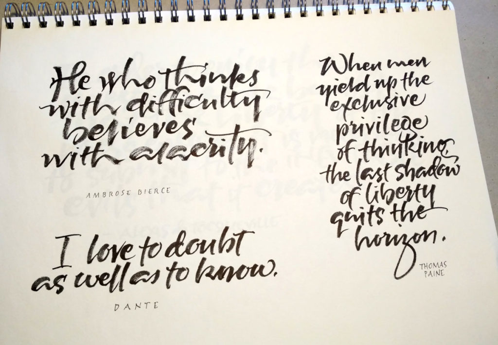
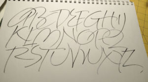
More from daily alphabets, as promised. The ink was going on the the brush pen I used for lettering the top alphabet, and then I picked up a full brush pen it for the lower alphabet. Strathmore Charcoal paper – so lovely for brush work.
Farmer’s Wife quilt blocks – completed!
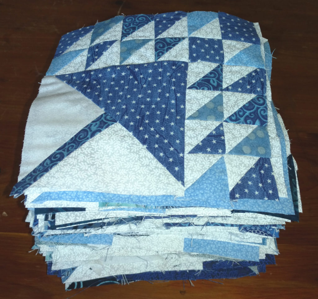
Well, folks, it’s a milestone for the Farmer’s Wife quilt I’ve been working on: A few days ago, I finished the last of the 111 blocks!
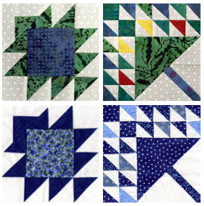
My sister and I have been making Farmer’s Wife quilt squares since January 2015. She has been drafting templates and instructions each week on her blog, Handmade Karma, and we’ve each been sewing the blocks on our own. As each week is completed Mary Jo has posted our scans of our blocks side by side. Shown below, and on her blog, is the final week, week 39:
I chose to use only blue and white fabrics so that all I had to deal with is value. Mary Jo jewel tones and an off-white. It’s been so interesting to see our squares side by side. I’m looking forward to putting the squares together with narrow white sashing and small navy intersectional squares.
Yes, I’m still lettering and making books. I’ve been working to complete this “edition” of manuscript books and I’ve got another one in the works. Also, prints, stationery, bookmarks … More on that soon.
A couple of interesting bits of Iceland
I’m still unpacking from our trip to Iceland and haven’t got any lettering worth showing yet, although I’m practicing. Meanwhile, here are a couple of interesting things we saw in Iceland.
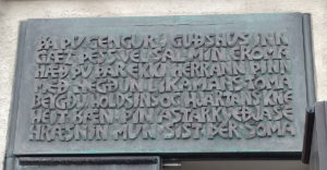
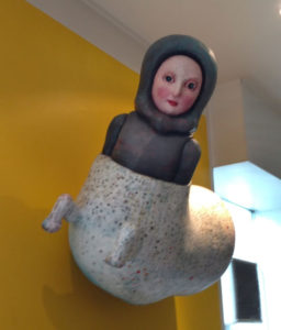
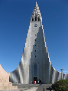
I realize that as I calligrapher I’ve done the same thing to this Reyjkavik church that calligraphers have done to the Trajan column: I’ve focused on the inscription and completely ignored the actual edifice. Here’s the whole church:
Julie Chen: Reading the Object
Today’s mail brought such a treat! It’s a catalogue raisonne of Julie Chen’s artist books. Just in case you don’t know what that is (I didn’t), it’s “a descriptive catalog of works of art with explanations and scholarly comments”. I have always admired Julie Chen’s work, and was so excited to learn about this publication.
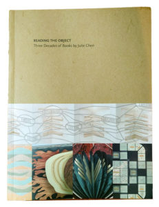
Reading the Object: Three Decades of Books by Julie Chen
Published by the Mills College Center for the Book and Flying Fish Press, 2016
Catalogue raisonne of Julie Chen and Flying Fish Press. With essays by Kathleen Walkup and Sandra Kroupa, and commentary by Julie Chen. Designed by Julie Chen. Printed offset. ISBN 978-0-9648938-9-4. $30.
It can be ordered by clicking on the link on this Mill College web page.
The publication of the book relates to two exhibits of her work, one that was held this spring entitled “Reading the Object: A Decade (or so) of Books by Julie Chen”, and one coming up February-June 2017 at the University of Washington entitled “Every Memoment of a Book: Three Decades of Work by Julie Chen”. Some of the text was written by Julie herself, but there are also essays written by others about Julie’s work. And, of course, the pictures of the works themselves. As Sandra Kroupa writes, “While her genius for structures is universally acknowledged, Chen’s facility with text is what holds students’ attention. Her structures are the initial draw, but her insightful, intense texts seal the deal.” Yes.
We just returned from a visit to Iceland yesterday, so a full and careful reading is not in the cards for today or tomorrow. But it’s something to look forward to!
And brush lettering again
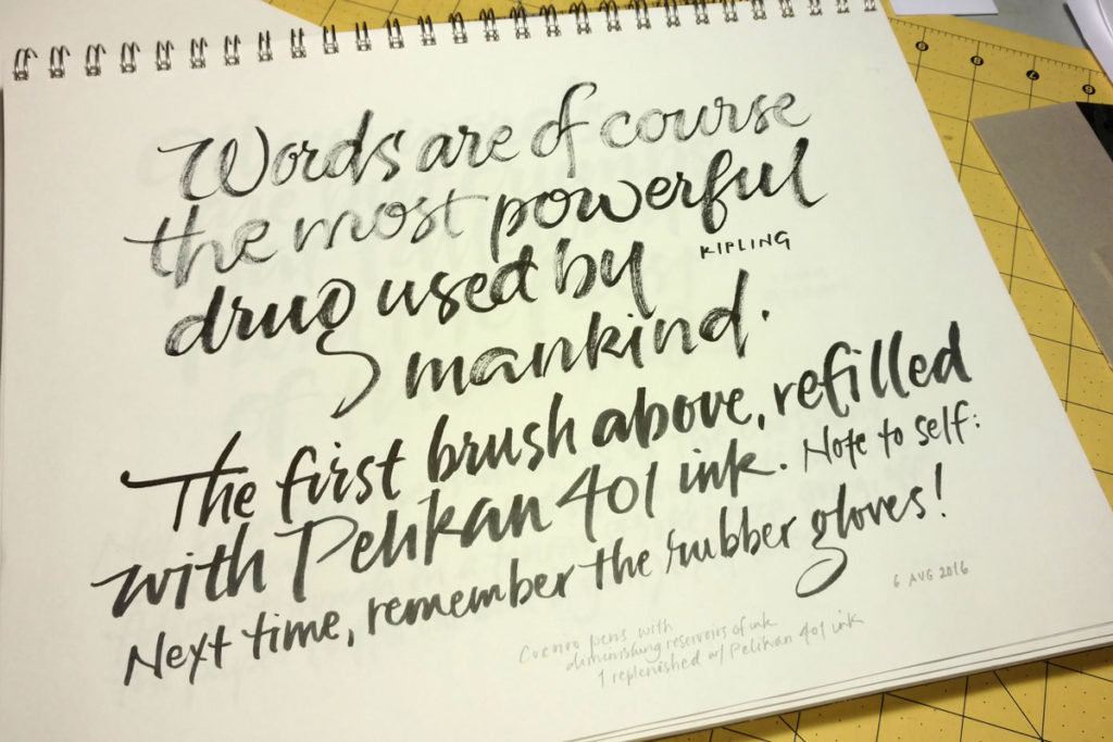
I’m not making much progress with brush lettering, so this will be the last post of brush lettering for awhile. Still, I’ve enjoyed it but I don’t see that I’m accomplishing much. I’ll be thinking about that in the meantime.
One of the brush pens ran out of ink and I didn’t have a brush refill (having accidentally ordered the extra-fine tip, which is more like a flexible drawing point). So, using my jewelry-making-size pliers, I pulled off the brush tip … and the base of the brush tip … and the stem inside that … and the base that the stem fit into. Then I squirted some Pelian 401 ink into the barrel using a thick needle-less syringe that was perfect for the job. Then put it all back together and tried it out at the bottom of the page. Interesting. As I wrote, next time: remember to wear rubber gloves. My cuticles will thank me for it.
Again with the brush
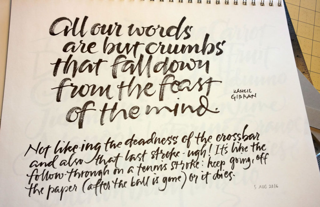
—
When practicing, I try to be in the moment. But afterwards, it’s a good thing if the left brain kicks and tells me what’s good, what’s bad, what I need change next time. Otherwise, it’s just repetition, repetition, repetition.
More daily brush lettering
Brush lettering as contour drawing
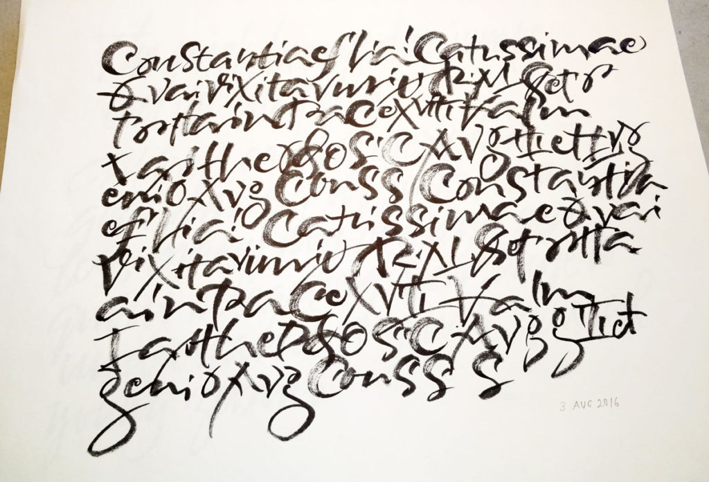
Today I returned a Carl Rohrs workbook that I had a borrowed from my friend Rose several (or more) months ago. Rose had been doing some brush lettering earlier, and we got to talking about the challenges of brush lettering, trying different tools, talking about that luscious dragging-the-bristles-around-the-arc thing that Carl does … the usual thing that happens when you’re standing in someone’s studio and there’s pen/brush, paper, and paint out on the table 🙂
Anyway, I kept thinking about it as I finished running errands. When I got back to my studio I opened up the Carl Rohrs workbook that I own and started copying a page of lettering he provided. I treated it like a contour drawing, not looking much at the paper but trying to feel the shape and speed and gesture of the letters. During some part of the exercise I realized that not even the letters were registering, much less the words, and I only later realized that some figures were Roman numerals, for instance. I like this kind of practice, and plan to continue it for at least a little while.
P.S. If you saw this side-by-side with the workbook page, you would probably be surprised at how little they resemble one another. For one thing, I skipped and duplicated and re-tried things as I went. For another, I didn’t duplicate the line leading, naturally crowding the leading as is my wont.
A Show of Hands
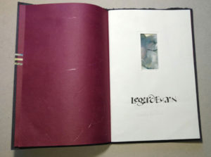
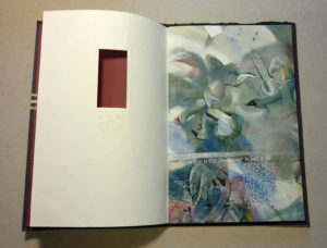
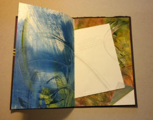
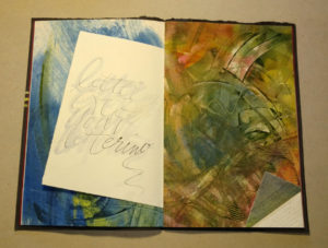
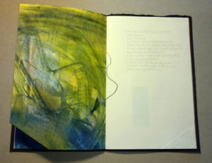
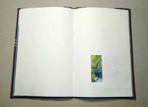
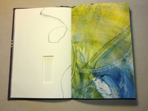
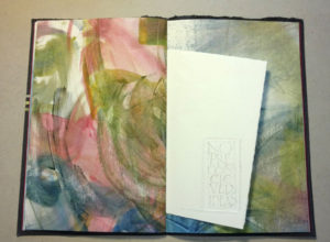
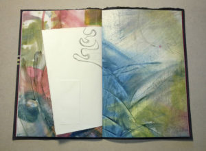
I was so privileged to attend the annual calligraphy conference, held this year in Swannonoa, NC, and named “A Show of Hands”. The week-long class I attended was team-taught by Rosie Kelly and Pamela Paulsrud, and it was WONDERFUL. They called it “Legerdemain,” meaning “sleight of hand”. We painted, made marks with all kinds of tools and paints, listened to poetry and Pam’s flute, talked about the creative process, and made books. I made two finished, or mostly finished, books. The first was a book with a favorite poem that you’ve seen here before. Then I decided I was putting too much on myself to try to do finished work. So my second book was more of a sampler of all the techniques we tried, and the text consisted mostly of notes on the process. Here are some images of that book.
Bits and pieces
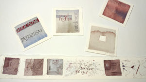
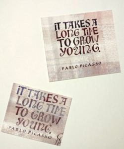
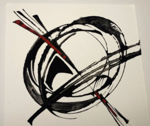
One of the really difficult parts about cleaning out my studio is figuring out what to do with all those bits of experiments that I’d like to develop further. A few cases in point:

And finally, in case you were wondering whether I’m still doing daily alphabets …
As always, click on an image for a closer look.
