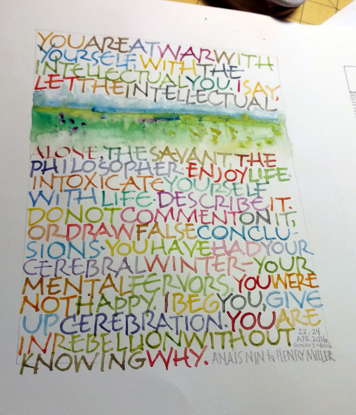
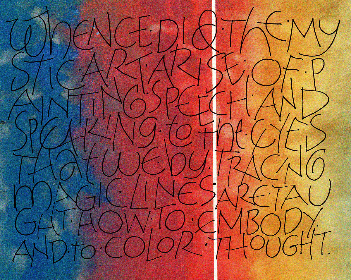
Same quote, same basic layout as last week: all-over texture, no guidelines, fairly large lettering (for me, at least) … except that I used a Speedball Flicker B5 nib, and included a little bit of watercolor painting. Once time I picked up the #3 Mitchell nib (from last week) by accident, and wrote one word before I realized my mistake. Since the word was “alone” it seem appropriate to leave it … um … alone. (Sorry.)
Written out April 22 & 24 with a Speedball Flicker B5 nib and travel box of Winsor & Newton watercolors.
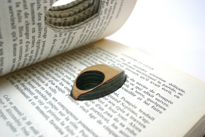
I love the idea of books transformed into jewelry. Colossal has written about jewelry maker Jeremy May, who designs jewelry from layers of vintage books. I particularly like seeing the jewelry situated in the vintage books from which they came.
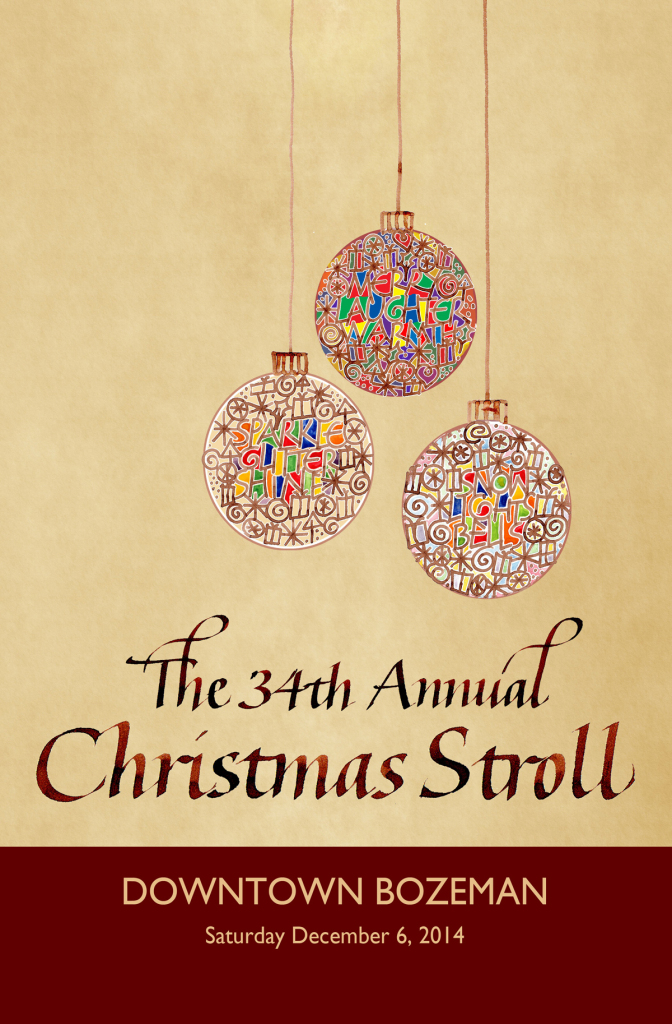
My poster design was not chosen for this year’s Christmas Stroll, but I did get second place. The image of it in the newspaper today was tiny and grainy. This one is better:
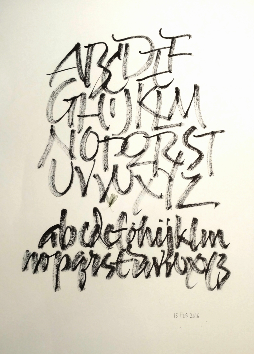
That’s my plan. I try to practice lettering every day. Now my plan is to scan it and upload it every day too.
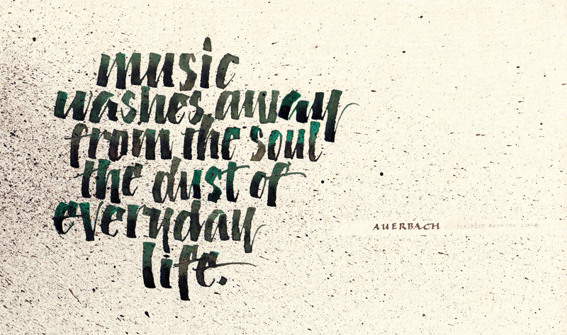
Today I had only about 15 minutes, so I used a scrapbook marker on a scan of some earlier painting printed on Mohawk Superfine paper — Eggshell, I think.
On a recent trip to Australia, I visited the best ever museum: the Museum of Old and New Art (MONA), up the river from Hobart, Tasmania. What a ride! And I’m not talking about the ferry we took from Hobart’s Sullivan Cove to the MONA — although that was a great way to start the journey.
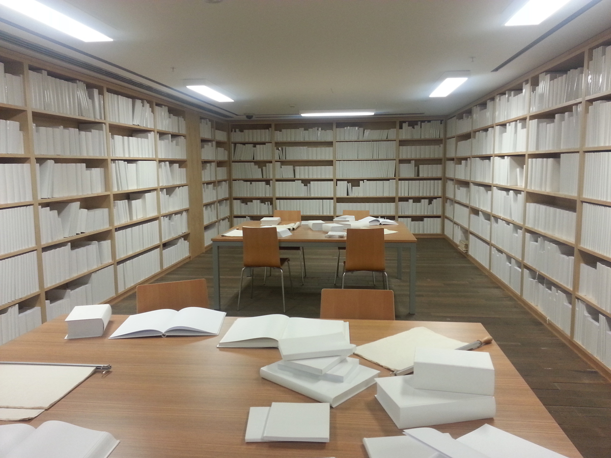
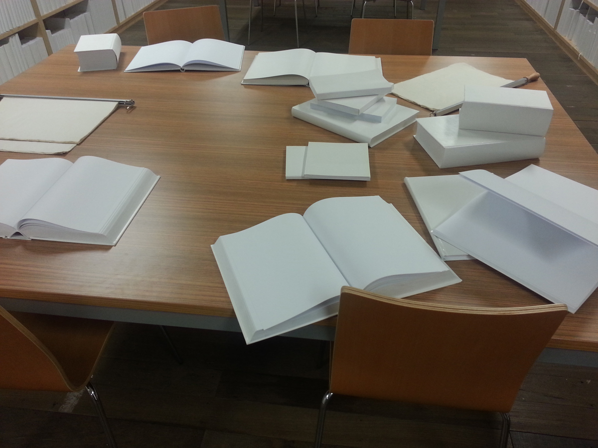
Here are a couple of photos of one of my favorite installations, entitled “”.
Untitled installation at the MONA
A closer look at the untitled installation
I was aware of so many simultaneous reactions to this room full of blank white books — undergoing a kind of vertigo of meaning while critiquing a loose headband; contemplating the horror of a zombie library while wondering at the artist’s control in not making a mark in any of the books or shelves or tables; imagining the impact of one red dot while wondering at the impulse to find meaning even in this blank room; acknowledging the urge to make a mark somewhere while mulling over various criticisms of the blank book made within the artist book community; remembering a cartoon from my childhood in which all the musical notes came loose from the staves and fell off the page; thinking about invisible ink, the perils of magnetic media …
And that was just one work of art on the three subterranean floors of the MONA. We stayed all afternoon and didn’t see everything — not even close.
Here were some of the highlights for me:
“Kryptos” by Brigita Ozolins— winding corridors upon whose walls were a binary code translation of The Epic of Gilgamesh, with ancient cuneiform artifacts set into the walls at intervals;
“Pulse” by Rafael Lozano Hemmer — a row of incandescent bulbs (imported from China because the are illegal to buy in Australia), each one blinking at the heart rate of a visitor who stepped up to the monitor and recorded his or her pulse — and then you turn the corner into a room full of the bulbs;
“When My Heart Stops Beating” by Patrick Hall — open each of the floor-to-ceiling drawers to read text and hear a recorded “I love you”; it’s indescribable, you just have to be there, but here’s an article about it;
There are all kinds of ways to make guidelines for calligraphy. Here are some of the ways I do it:
A Word document. This downloadable Word document prints landscape on a letter-size sheet of paper − x-height of 10 points (a little larger than 1/8″) with a leading of 36 points (about 7/8″) and 35º slant lines. The slant lines are in the header/footer area.
An InDesign document, which provides more opportunity fine-tuned guidelines. Here is a downloadable PDF from an InDesign document which has many layers of guidelines − slant lines and regular − that I can turn on and off for a variety of combinations. I could have multiple columns, or a shape that breaks up the text, or other complications that don’t work so well in Word.
I like manually inked guidelines too, especially for large pieces. I use a lining guide, T-square and slantboard for these. John Neal provides instructions for using a lining guide here.
If you don’t want to make your own, you can generate some online at several websites:
Contains information related to marketing campaigns of the user. These are shared with Google AdWords / Google Ads when the Google Ads and Google Analytics accounts are linked together.
90 days
__utma
ID used to identify users and sessions
2 years after last activity
__utmt
Used to monitor number of Google Analytics server requests
10 minutes
__utmb
Used to distinguish new sessions and visits. This cookie is set when the GA.js javascript library is loaded and there is no existing __utmb cookie. The cookie is updated every time data is sent to the Google Analytics server.
30 minutes after last activity
__utmc
Used only with old Urchin versions of Google Analytics and not with GA.js. Was used to distinguish between new sessions and visits at the end of a session.
End of session (browser)
__utmz
Contains information about the traffic source or campaign that directed user to the website. The cookie is set when the GA.js javascript is loaded and updated when data is sent to the Google Anaytics server
6 months after last activity
__utmv
Contains custom information set by the web developer via the _setCustomVar method in Google Analytics. This cookie is updated every time new data is sent to the Google Analytics server.
2 years after last activity
__utmx
Used to determine whether a user is included in an A / B or Multivariate test.
18 months
_ga
ID used to identify users
2 years
_gali
Used by Google Analytics to determine which links on a page are being clicked
30 seconds
_ga_
ID used to identify users
2 years
_gid
ID used to identify users for 24 hours after last activity
24 hours
_gat
Used to monitor number of Google Analytics server requests when using Google Tag Manager
1 minute
You can find more information in our Cookie Policy and .