Sample pointed pen lettering

2014-04-27-pointed-pen-page

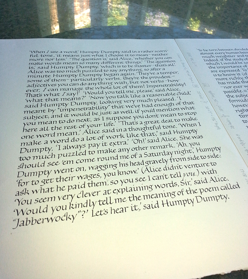
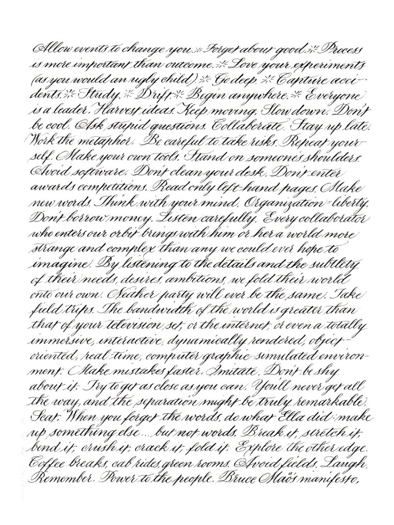
Done as comparison for a client, so she could compare this with trial lettering lettering that was larger lettering and had more leading. (The larger lettering was a birthday letter to her daughter, not shown here for obvious reasons.) This is a 9″ x 12″ page of lettering with 2.2mm x-height and 8.8mm leading. Moon Palace ink, Strathmore 400 Drawing paper. The text is from Bruce Mau’s “An Incomplete Manifesto for Growth“.
Pointed pen lettering

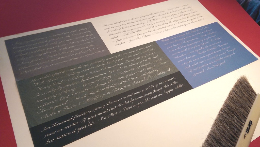
… on various papers with various mediums (or media, but people don’t put it that way).

This top image shows lettering done on Canson Mi-Tientes and Strathmore colored papers using McCaffery’s Ivory ink.

2014-04-14-pointed-pen-practice

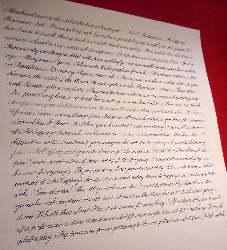
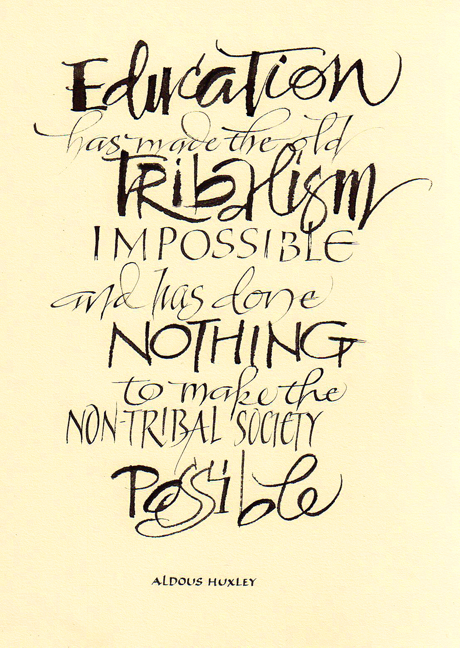
The image below shows lettering on a sheet of Strathmore Drawing paper using, in turn, McCaffery’s black ink, a mixture of Schmincke Calligraphy Gouache colors, that mixture + McCaffery’s Ivory ink, and that mixture + white gouache.2014-04-15-pointed-pen-practice

Daily lettering – yesterday

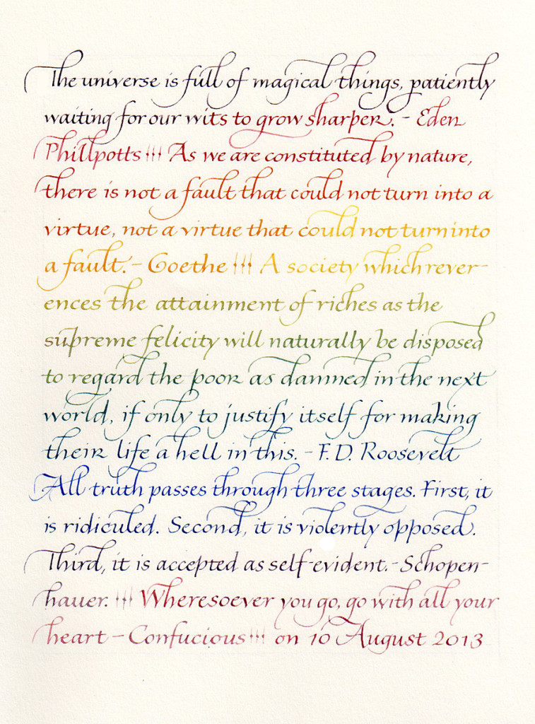
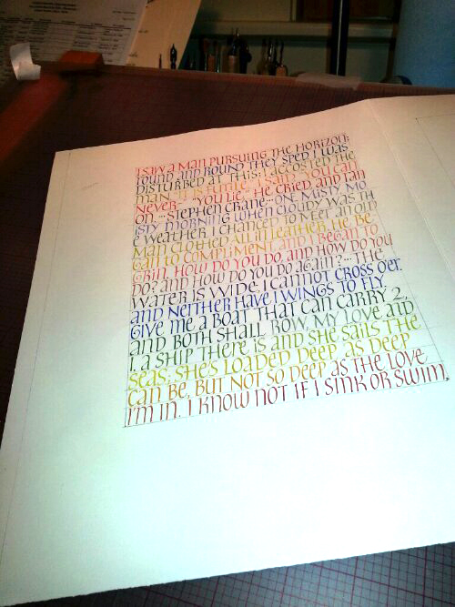
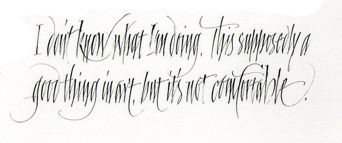
2013-08-11-italic-multi-color-page-08-10Cycling through the Schmincke Calligraphy Gouache colors that make up the 6-color primary palette. Strathmore Drawing 400 paper, #5 Mitchell nib.

Some unfortunate flourishes here. I really lost my way at the end of line 8: I made the flourish and head down toward the waistline when I realized I hadn’t made the x-height portion of the “d”. Dive-bomb landing with no target. Oops. This is what happens when the mind wanders and the hand completely takes over.

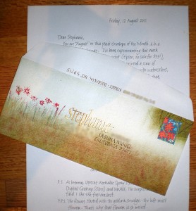
Envelope Exchange – August 2011

I’ve been busy on the book commission, but took a few minutes to do my envelope for the year-long 2011 Envelope Exchange. I’ve been spending a lot of time lately with my Epson wide-format new inkjet printer, and I carried that experimentation over to this envelope. (As usual, click on the image to see it at a larger size.)

These are the layers on this #10 Strathmore Laid envelope:

  1. Inkjet-print of a scan of some painting on Arches Text Wove.
  2. A layer of Utrecht Workable Spray Fixative.
  3. The name in Dr. Martin’s Iridescent calligraphy gold ink, shaded in FW Antelope acrylic ink(#2½ Mitchell nib and Principality pointed nib).
  4. The address in the same FW Antelope, with #4 Mitchell nib.
  5. Flowers with #3½ and #4 nibs.
I chose the stamp after I did the envelope. I’m surprised at how well they go together.