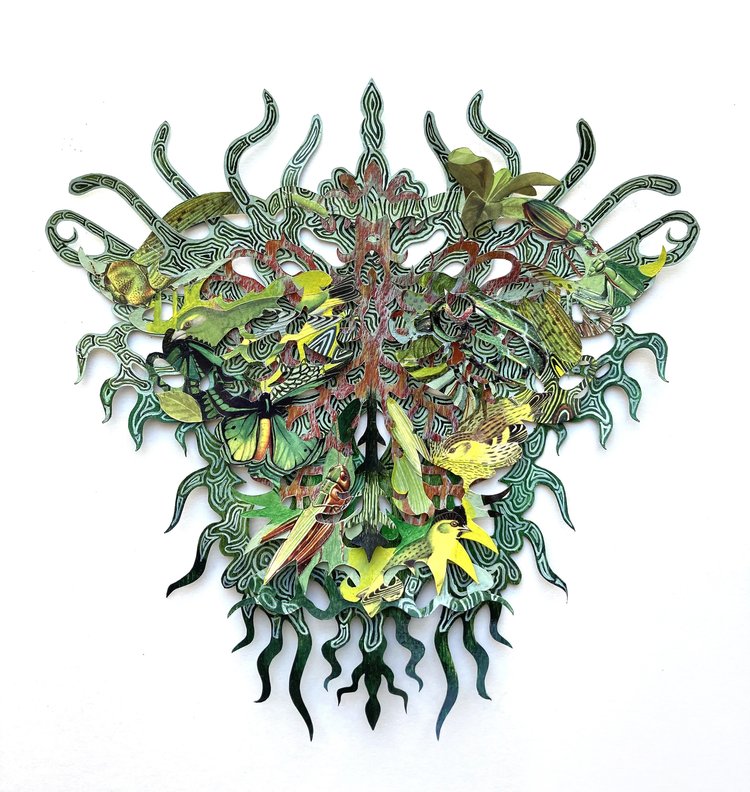
Kako Ueda’s cut-paper solo show, “Tori Tori Tori” in NYC this spring

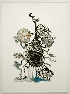
The opening reception for Kako Ueda’s solo show, “Tori Tori Tori,” will be held May 12 at Olympia in NYC. The show runs from May 12 through June 17. I wish I could be there to see it. Her cut-paper creations are beautiful, intricate and wholly absorbing.

The themes for the show “Tori Tori Tori” are migration and the presence of the chimera. For more information about the show, check out this page at Olympia Art.

I’ve posted about Kako Ueda’s work before: once about her solo show in 2008, and once as part of a list of links to paper cutting artists I like, back in 2007.

Luca Barcellona & DEM

Gavinana Reloaded from GoLd on Vimeo.

I’m a huge fan of Luca Barcellona, the images are compelling, and I like the idea of combining this text and these images into a performance piece. But there’s not much visual relationship between the text and image — not in layout, not in color, and most certainly not in mark-making. The flat blue line of the left mask strings makes one kind of statement, but it seems to jar against the gorgeously stapered black stem of the initial “P”, for instance. It’s de Stijl (which I love) vs. baroque (which I also love).

It seems as though Luca is incapable of making something that doesn’t hang together beautifully: the initial “P” fills the space beautifully and draws the eye down the quote, the smaller text capitals add interest to the texture of the whole, and the attribution flows from the flourished “y” so satisfactorily.

Mirror of the World: Books and Ideas

This new online exhibit from the State Library of Victoria presents some truly fascinating books. This image is from one of my favorites, and the oldest book in their collection. Here’s some information about it:

Originally written in 500CE by Boethius (c475–524), a Roman scholar and statesman, the work consists primarily of diagrams and explanations about the relationship of music to mathematics. This reflected medieval thinking that music was a mathematical discipline.

De Musica became the standard textbook on the theory of music throughout the Middle Ages, and was still prescribed reading at Oxford University in the 18th century.

The website divides its exhibit into four categories: Inspiration, Exploration, Imagination, Innovation. (I could swear this was the theme for high school history projects in the US a couple of years ago. Everything is miscellaneous, eh?) The site provides opportunities to zoom and pan, peel and reveal, and turn the page — technologies I first saw implemented on the excellent website of The British Library. At the British Library site, the Lindisfarne Gospels, headlined “Pinnacle of Anglo-Saxon Art,” is not to be missed.

Still writing

… and writing and writing. Name, numbers, addresses. Nothing fun, but all very nice looking, if I say it myself 🙂

A couple of pieces of eye candy, thanks to the sharp eyes of folks on the Ornamental Penmanship list:


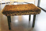
The incredible pencil sculptures of Jennifer Maestre.


More pencil sculptures on exhibit at Faber-Castell, work by Kerstin Schulz. (Scroll down on that web site to see the sculptures.)

More eye candy

All of a sudden I’ve got more work than I can shake a quill at. No time for much blogging. In the meantime, I’ll just point you to …


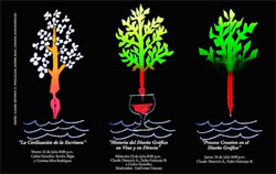
… a really fine collection of hand lettering at Claude Dietrich’s website.


And all kinds of art by Brody Neuenschwander.


And from Charles Pearce.

I hope you’re not too busy, because these web sites will take you some time.

Ehon: The Artist and the Book in Japan


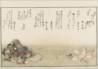
Here’s something I wish I’d caught when I was in New York recently: an exhibition of ehon, Japanese picture books at the New York Public Library that looks fabulous. Click on the title of this post to get to the NYPL’s description of the exhibit. Or click here to see a slide show and description at Slate.

Asian artists are so lucky. Their art tradition has always integrated drawing and writing and painting because their systems of writing are based on pictorial representations. In Western art, letters may have started out as representations of something — a yoked ox for an A, for instance — but for millennia those letters have represented sounds rather than pictures. So we are usually working to integrate two alphabets (capitals and minuscules) together with illustrations, and the mark-making for each of the elements is markedly (ha) different. The capitals are more a drawn letter form, the minuscules more a written/cursive form, and the illustrations are achieved by any number of methods.

Our medieval illuminated manuscripts solve this by placing the paintings in a window, setting them in a different plane of existence. It’s not nearly so satisfying as the Asian approach to book design. And this exhibit shows that clearly.

Thanks to members of the Book_Arts-L listserve who posted information about this exhibit.