Rachel Yallop
One of my favorite calligraphers, Rachel Yallop, does beautiful pointed pen work, among other letter styles. She demonstrated her method in the class I took with her at Legacies II in summer 2014. She keeps the angle of the pen staff to the paper quite shallow. I’m sure if I kept my pen at the same angle, my letters would look just this good. Not.
Here’s a video of Rachel Yallp, calligrapher extraordinaire, writing copperplate with a straight pen holder. Originally shared publicly by Rachel on Facebook May 15, 2014.
Follow her on Facebook for a real treat.
A video of Rachel Yallop , calligrapher extraordinaire, writing copperplate with a straight pen holder. Originally shared publicly by Rachel on Facebook May 15, 2014
Hermann Zapf video
Even though it’s been on the Internet for 2 years, I’ve not seen this video of Hermann Zapf until today.
The Art of Hermann Zapf from Johnny Dib on Vimeo.
It must have been filmed 40+ years ago. That paper is luscious, probably handmade. And his pen renditions of type are amazing.
Seen on It’s Nice That.
Luca Barcellona & DEM
Gavinana Reloaded from GoLd on Vimeo.
I’m a huge fan of Luca Barcellona, the images are compelling, and I like the idea of combining this text and these images into a performance piece. But there’s not much visual relationship between the text and image — not in layout, not in color, and most certainly not in mark-making. The flat blue line of the left mask strings makes one kind of statement, but it seems to jar against the gorgeously stapered black stem of the initial “P”, for instance. It’s de Stijl (which I love) vs. baroque (which I also love).
It seems as though Luca is incapable of making something that doesn’t hang together beautifully: the initial “P” fills the space beautifully and draws the eye down the quote, the smaller text capitals add interest to the texture of the whole, and the attribution flows from the flourished “y” so satisfactorily.
Postage stamps by type designers
 Kat Ran Press has a display of stamps designed by type designers. The list includes such luminaries as Hermann Zapf, Adrian Frutiger, and Eric Gill, and even reaches back to Peter Behrens and W.A. Dwiggins.
I’m showing Julian Waters‘ stamp lettering here in honor of Veteran’s Day. Besides being a great type designer, Julian is a brilliant calligrapher. His childhood was filled with calligraphy on his mother’s side and book conservation on his father’s side. Boy, do I envy him that. (He envies me my childhood piano lessons, but really, I just don’t think they begin to compare.)
via zeldman.com
More eye candy
All of a sudden I’ve got more work than I can shake a quill at. No time for much blogging. In the meantime, I’ll just point you to …

… a really fine collection of hand lettering at Claude Dietrich’s website.

And all kinds of art by Brody Neuenschwander.

And from Charles Pearce.
I hope you’re not too busy, because these web sites will take you some time.
Eye candy
I’ve been rather immersed lately in HTML, CSS and web design. But I need a break every once in awhile. Here are a few places I visit when I want a little eye candy:
Denis Brown’s website. This guy knows quills and he knows digital. After a week-long workshop two years ago, I brought home a slew of notes and experiments and his DVD, none of which I’ve yet digested.
Thomas Ingmire’s website. You’ve got to have Flash to look at it, but it’s worth looking at. You’d think that the “Collections” and “Gallery” links would be the best — and they are great — but the most interesting work on the site is in “Commissions”: a book of Richard Braudigan’s poetry, in code invented by Thomas Ingmire; poetry by Rimbaud; Canto V from Dante’s Inferno. I’ve taken week-long workshops with him several times over the past 15 years. His craftsmanship is unparalleled.
Martin Jackson’s website. He’s got portfolios of lettering samples and commercial art, which I like, but I especially like the portfolio of fine art. I’ve never taken and class from him, but I know several people who rave over his teaching.
Working
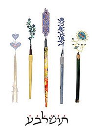
I haven’t been doing much lately except certificate fill-ins and cleaning my studio. And I’ve gotten back to working on the latest Hebrew calligraphy assignment from Izzy Pludwinski’s correspondence course. So I haven’t been posting much.
In the meantime, take a look at the work of a couple of calligraphers I met in Jerusalem this past month:
Izzy Pludwinski —
His website, www.impwriter.com features galleries of ketubot, fine art, liturgical work for synagogues, his limited-edition book Song of Songs, Judaica, commercial work, and more. There is also information about the Hebrew calligraphy correspondence course I began there and am finishing here.
David Moss —
This website, www.bet-alpha-editions.com, shows a tiny slice of the work of this prolific calligrapher. He brought out piece after piece in his studio for us to look at. And I was reminded of the story of one of J.S. Bach’s pupils asking him, “Papa, how do you ever think of so many tunes?” to which Bach replied, “My dear boy, my greatest difficulty is to avoid stepping on them when I get up in the morning.” I’m sure that David Moss suffers from the same difficulty.
Lettering artists online – Part 1: John Stevens
Here in Tallahassee, where the book arts are not exactly thriving, it’s easy to become disheartened. I am fortunate to have one friend, at least, who understands my preoccupation with serifs, ligatures, spacing, and the myriad concerns of the book arts.
When I begin to think that the long hours spent practicing my ABCs might simply be an unsupportable self-indulgence, I take a break and stroll through the virtual galleries of some of the best contemporary lettering artists.
John Stevens is one of the lettering artists I revere most. Before I tell you why, I should explain that I was a musician before I was a calligrapher, and over the years I’ve amused myself by matching various well-known calligraphers to famous composers and musicians.
I think of John Stevens as the Arthur Rubenstein of calligraphy. Both Stevens and Rubenstein share an expressiveness underpinned by impeccable technical fluency. And both have brought to their work a clarity of vision which combines breadth of perspective with attention to detail. The results have been fresh, contemporary interpretations which keep the best of historical forms without slavishly copying them.
His piece entitled Namaste is an example of these qualities: the spontaneity and expressiveness of the brush-lettered italic word belies the painstaking carving and gilding that followed.
I wander through galleries such as this, and return to my lettering inspired. And I ponder Rollo May’s question: “What if imagination and art are not frosting at all, but the fountainhead of human experience?”