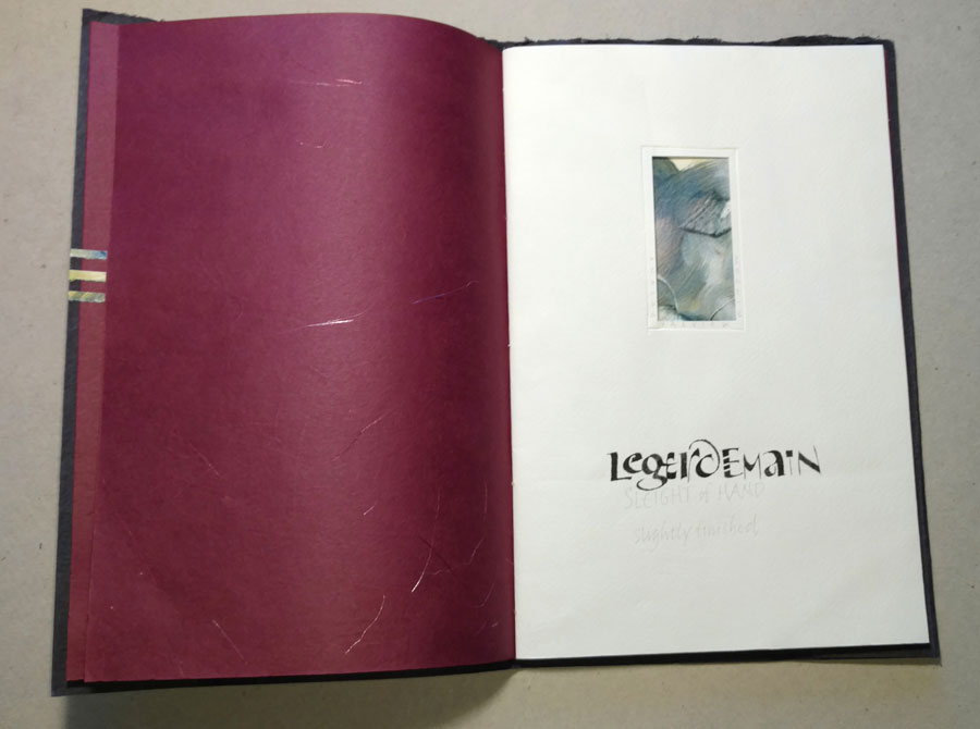
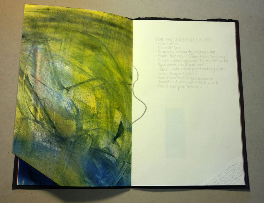
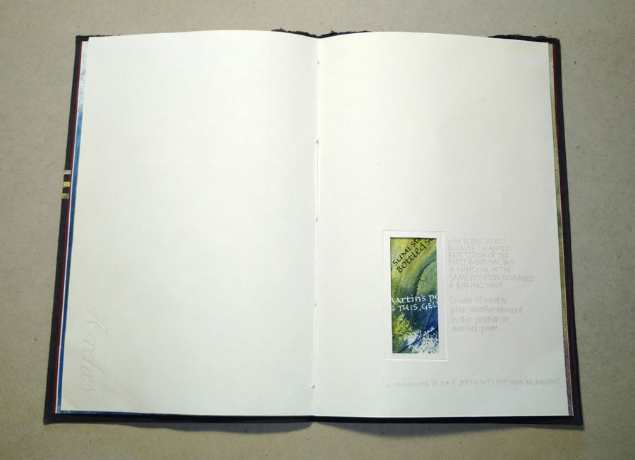
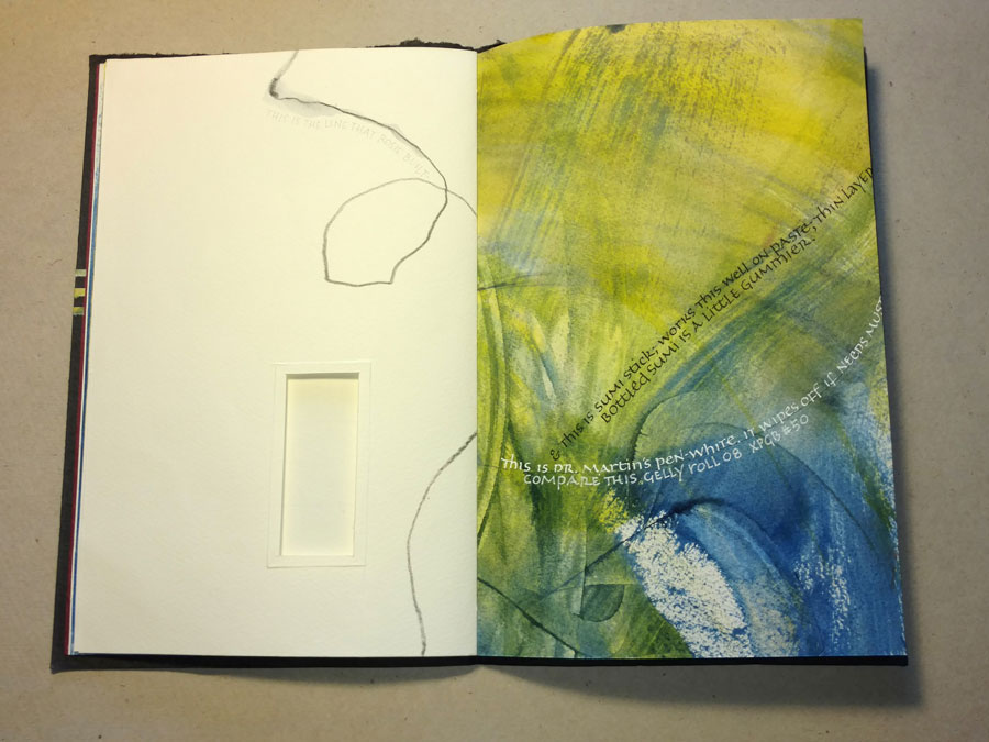
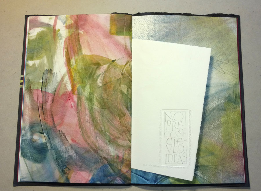
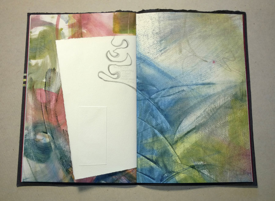
Long time no post! We’ve been traveling, and I’ve been Instagramming, and … well, honestly, inspiration has been sparse on the ground. Anyway, remember this artist book I was working on? I mostly finished it shortly thereafter, but never posted any photos. I had a few binding chores left on the last couple in the edition, and I worked on that recently … which reminded me that I had never properly photographed it. Here are some images from the book.
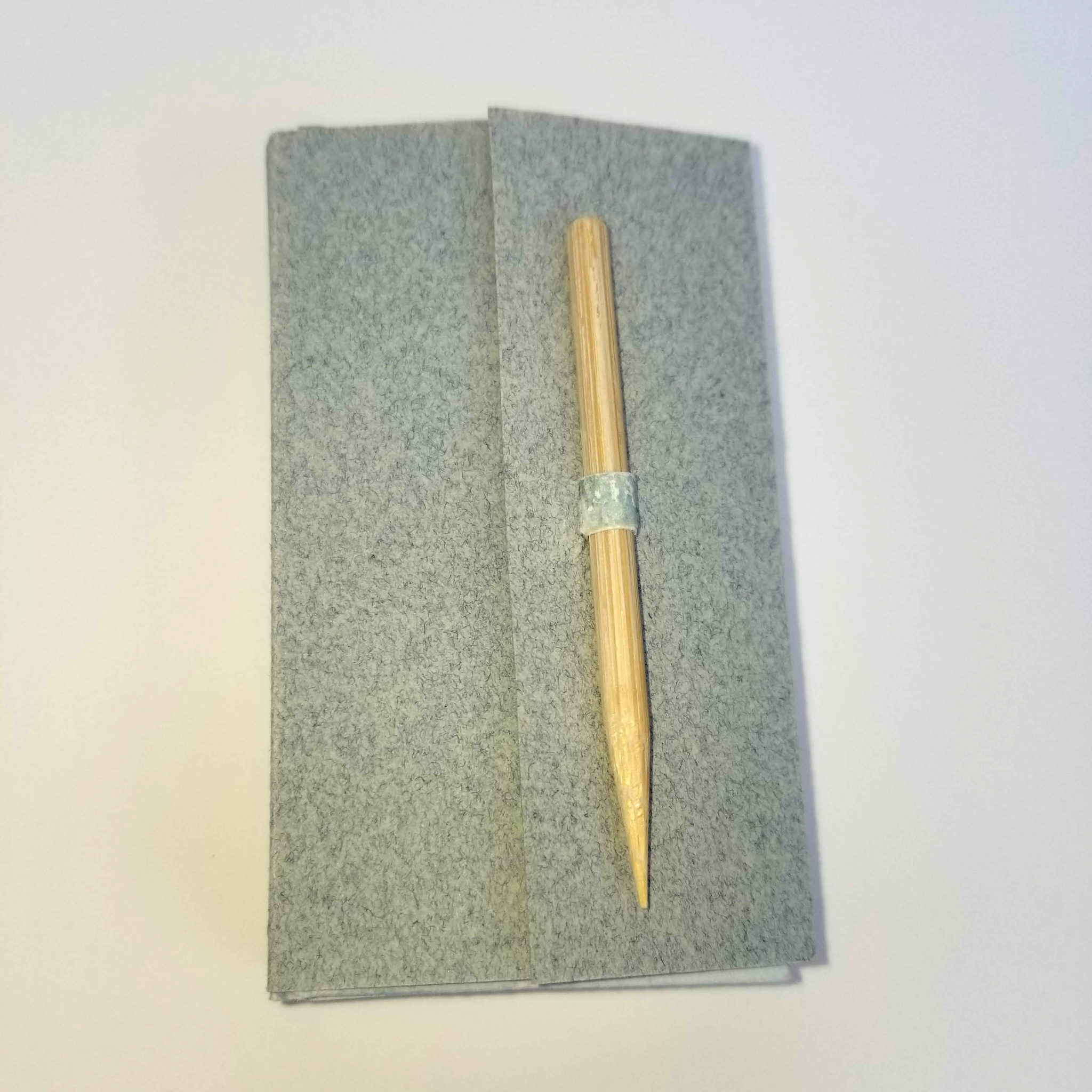
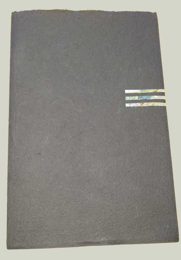
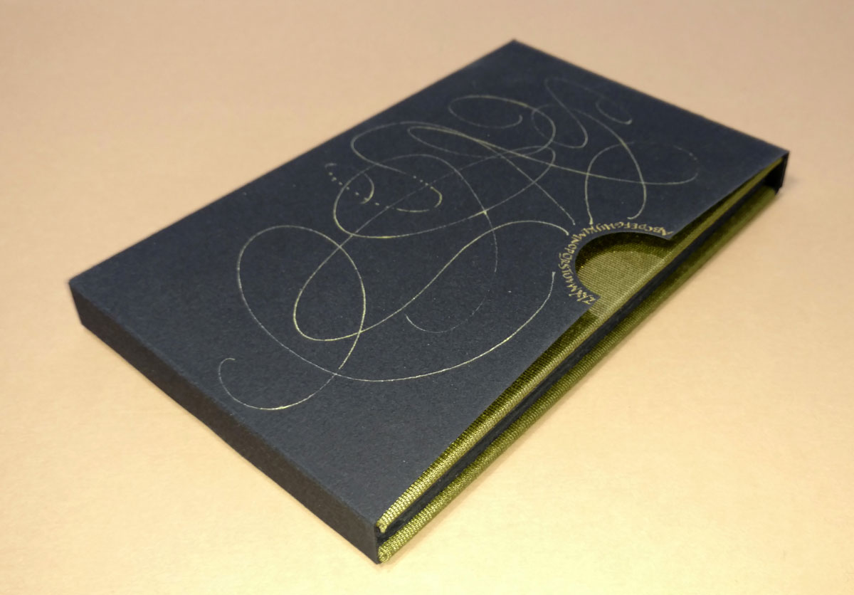
A variable edition of 12 manuscript books; 4 are still available. The books are small at 1-5/8 in x 3 in x 1/2 in, and lettered in gouache with a metal pen.
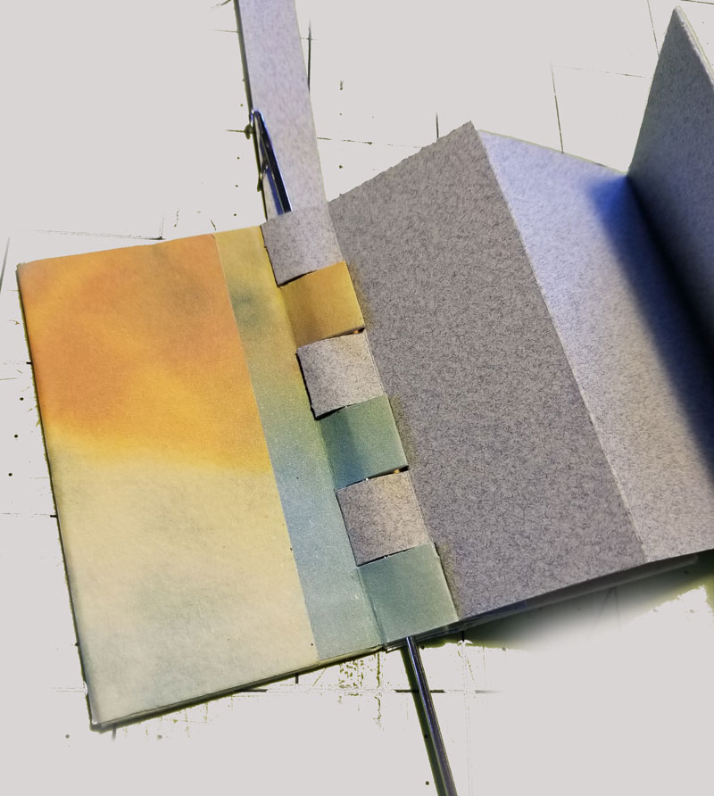
The structure is a modified version of a flat-piano-hinge non-adhesive book described by Keith Smith in Non-Adhesive Bindings.
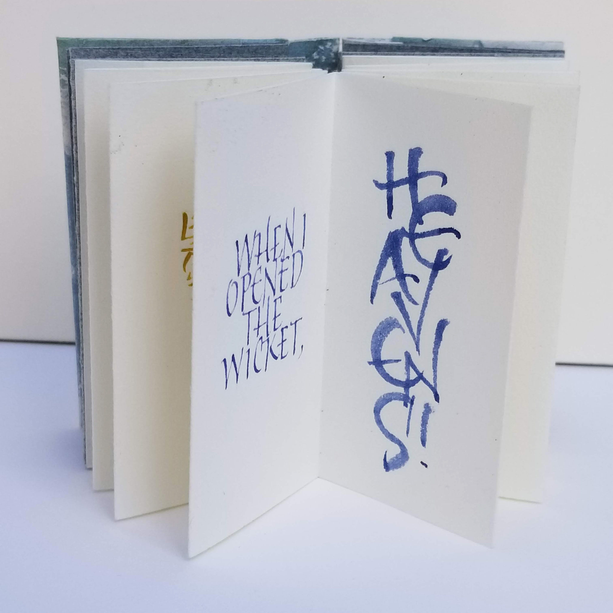
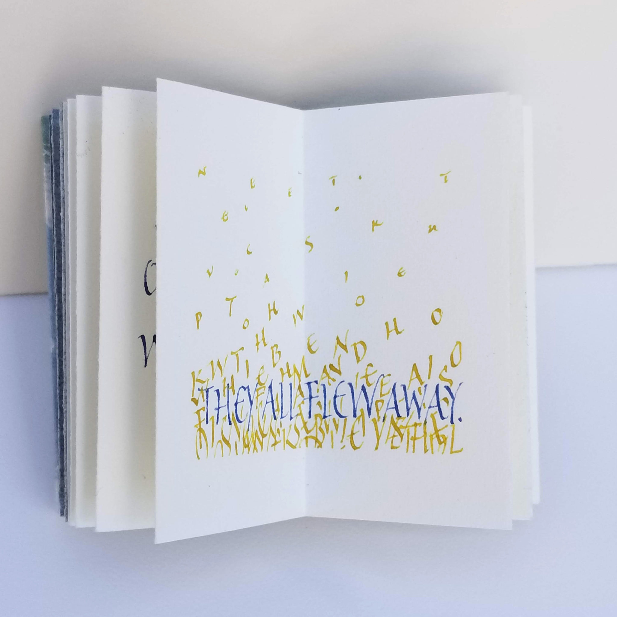
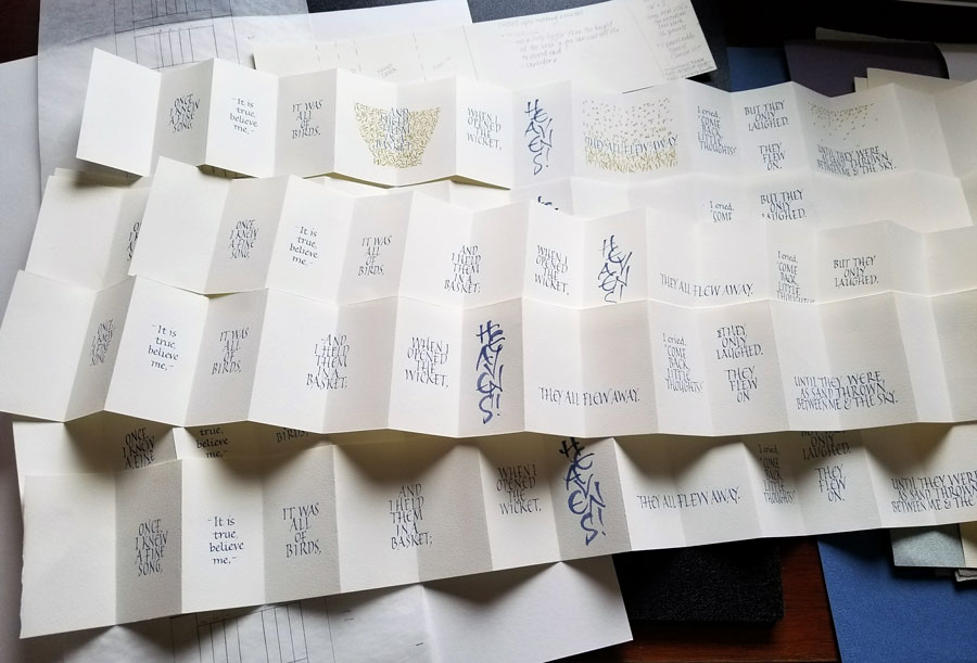
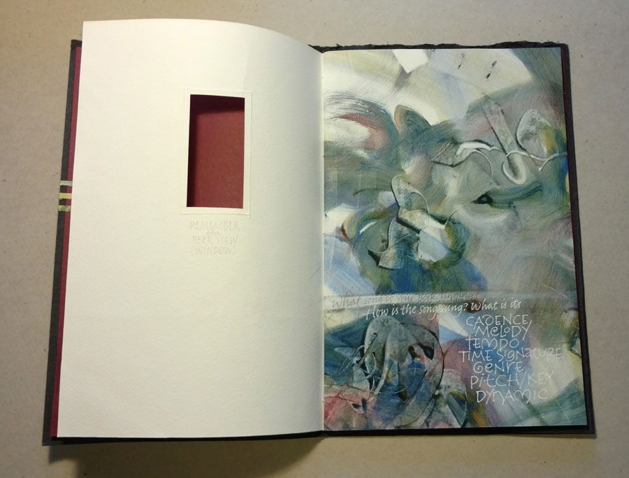
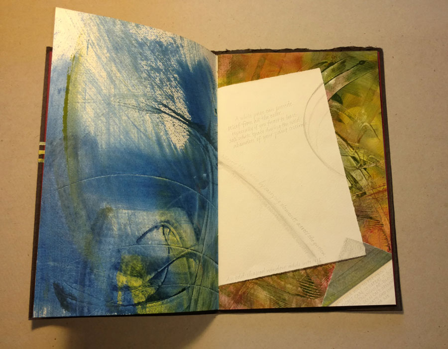
The clean, strong imagery of this text appeals to me. Indeed, the visuals were so strong that I endeavored to make the letters themselves illustrate the poem, which describes so beautifully the preciousness of words as well as our tenuous hold on them.
The text:
Once, I knew a fine song,
—It is true, believe me,—
It was all of birds,
And I held them in a basket;
When I opened the wicket,
Heavens! They all flew away.
I cried, “Come back, little thoughts!”
But they only laughed.
They flew on
Until they were as sand
Thrown between me and the sky.

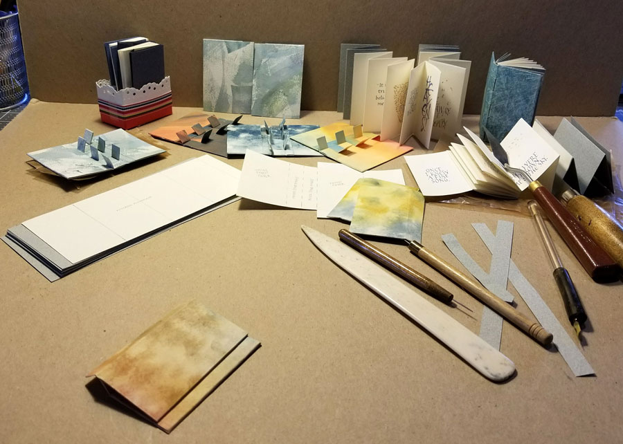

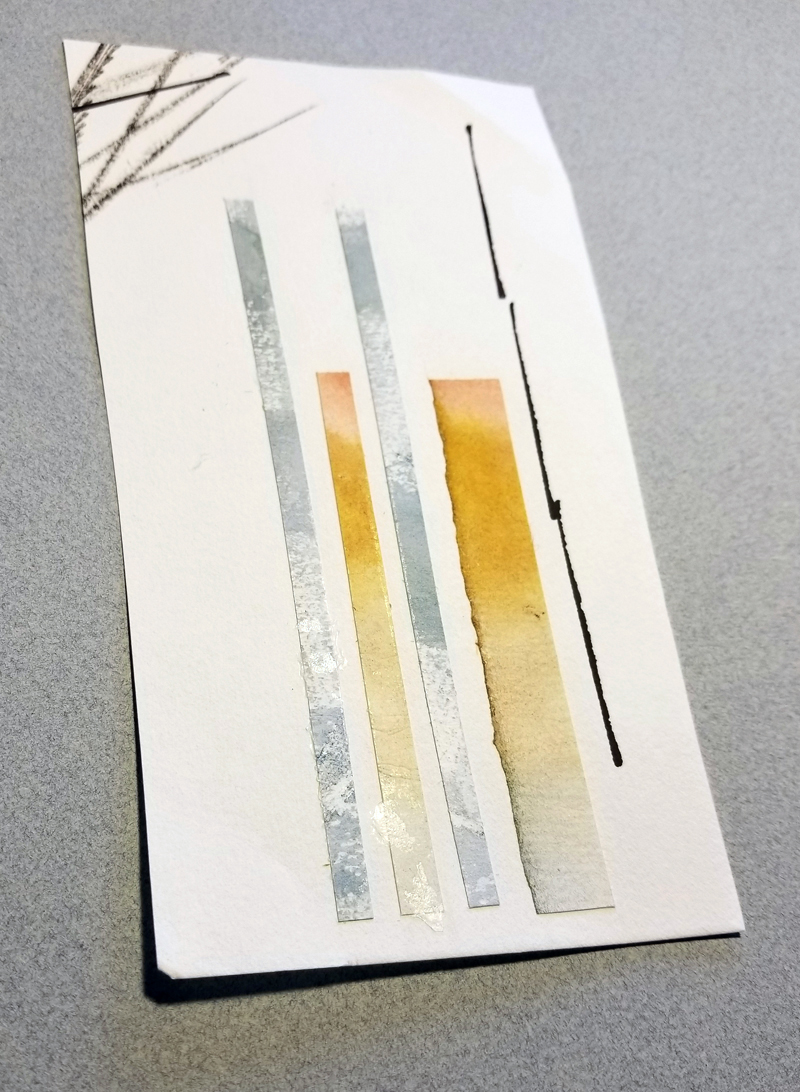
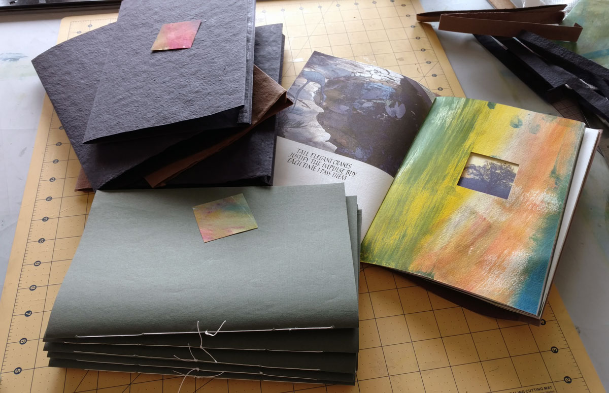

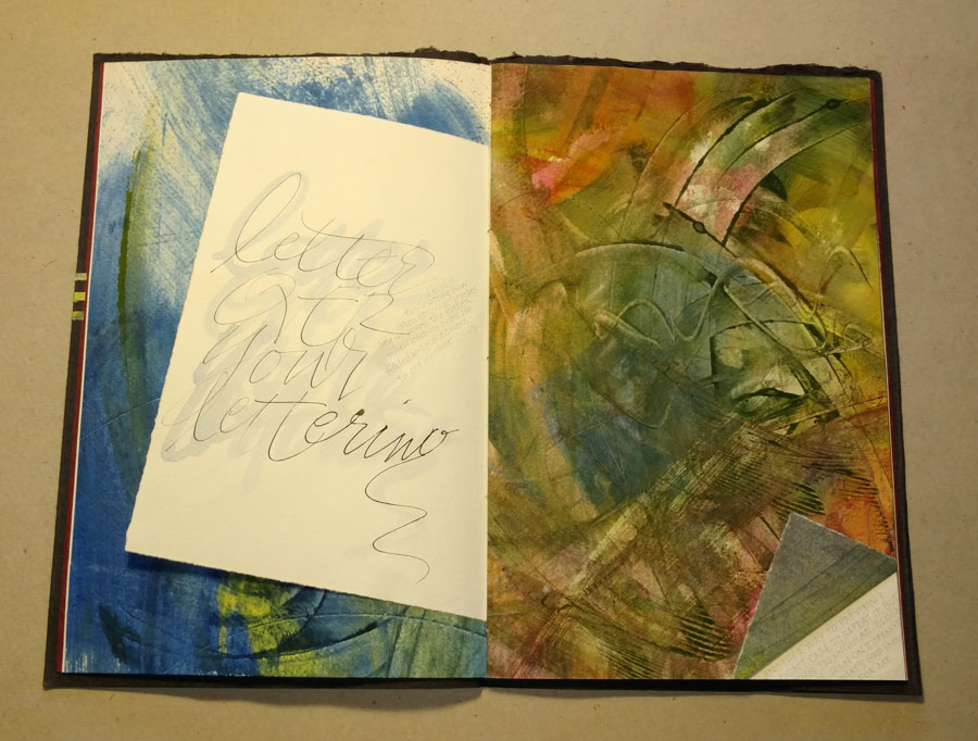


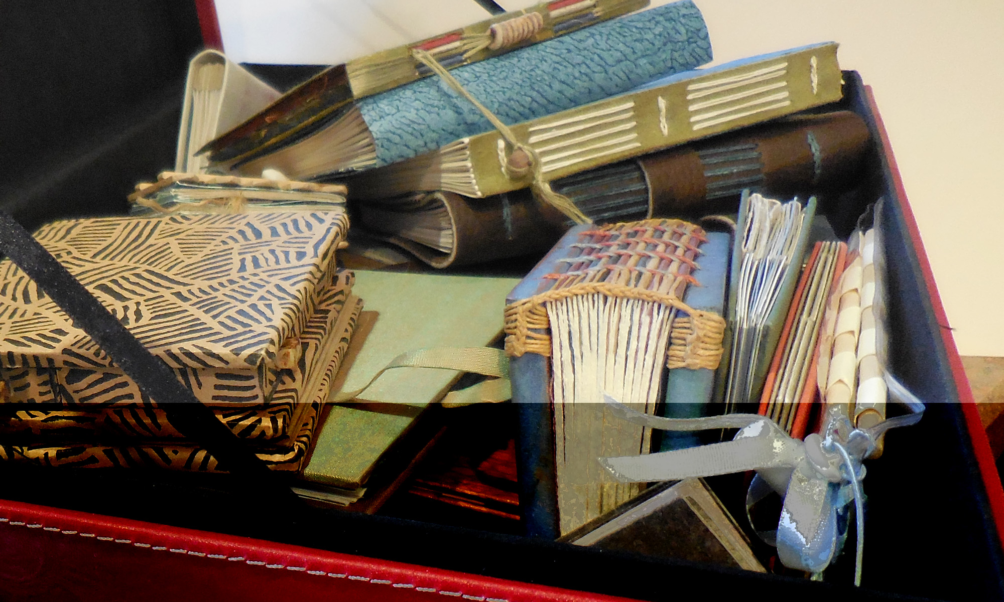
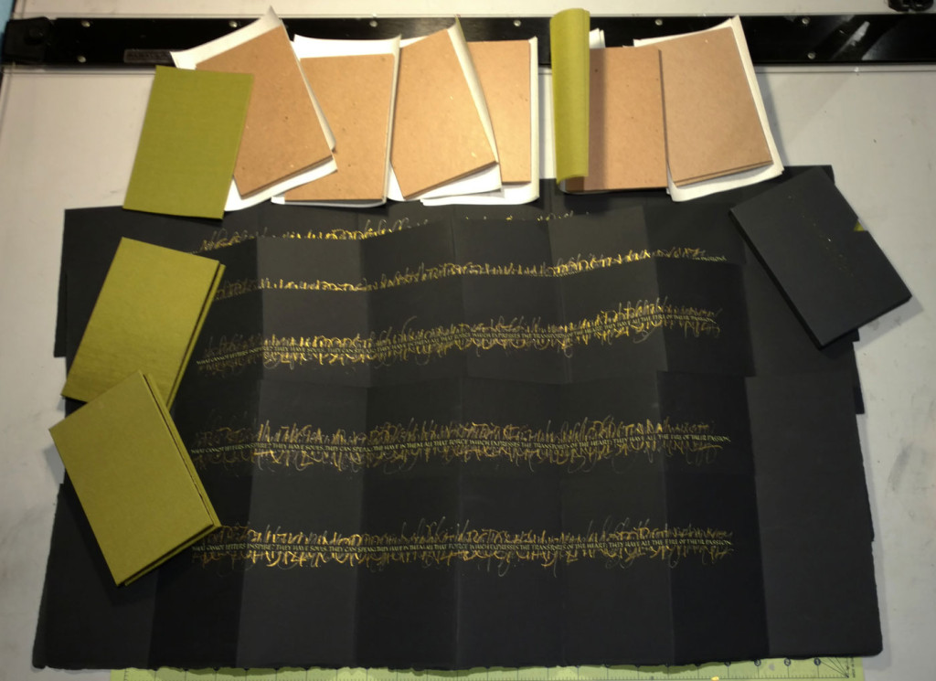 I didn’t want to post this until other seven members of our annual artist book exchange book got see theirs in person. I think nearly everyone has hers, so here’s an in-progress shot of the edition (or is that a series? — they’re all manuscript books, individually lettered) in progress. Making these books satisfied the magpie in me — plenty of shine in the gouache and book cloth.