Click on the title of this post to visit an excellent source of information about the bookbinding structures found in the collection Dunhuang and other Silk Road manuscripts housed in the British Library. The information at this website is both extensive and well illustrated with both photographs and diagrams.
Hearty Envelope Exchange
Scribbler to Scribe: Part 2
Dafatir: An Exhibition of Contemporary Iraqui Book Art

This art exhibit, organized by the University of North Texas Art Gallery, is currently on display at Carleton College. Surprisingly, I hadn’t heard anything about this exhibit through the book arts channels. Instead, I read about it in this post on the blog Across the Great Divide. While there are plenty of images at this Carleton College link,the blog post provides some interesting background information on Mohammed Al Shammarey, one of the artists, as well as a link to his own gallery.
Lettering artists online – Part 1: John Stevens
Here in Tallahassee, where the book arts are not exactly thriving, it’s easy to become disheartened. I am fortunate to have one friend, at least, who understands my preoccupation with serifs, ligatures, spacing, and the myriad concerns of the book arts.
When I begin to think that the long hours spent practicing my ABCs might simply be an unsupportable self-indulgence, I take a break and stroll through the virtual galleries of some of the best contemporary lettering artists.
John Stevens is one of the lettering artists I revere most. Before I tell you why, I should explain that I was a musician before I was a calligrapher, and over the years I’ve amused myself by matching various well-known calligraphers to famous composers and musicians.
I think of John Stevens as the Arthur Rubenstein of calligraphy. Both Stevens and Rubenstein share an expressiveness underpinned by impeccable technical fluency. And both have brought to their work a clarity of vision which combines breadth of perspective with attention to detail. The results have been fresh, contemporary interpretations which keep the best of historical forms without slavishly copying them.
His piece entitled Namaste is an example of these qualities: the spontaneity and expressiveness of the brush-lettered italic word belies the painstaking carving and gilding that followed.
I wander through galleries such as this, and return to my lettering inspired. And I ponder Rollo May’s question: “What if imagination and art are not frosting at all, but the fountainhead of human experience?”
More fun with Photoshop
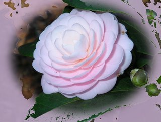
If I really knew what I was doing in Photoshop, I could tell you how I did this. Something to do with the elliptical marquee, inverse selection and fill using a color from the camellia. I’m not sure why the fill didn’t get everything outside the marquee, but I like the effect.
Here’s the original photo, cropped approximately the same way.
Tulip Magnolia — this time without a border?
Tulip Magnolia
Camellia
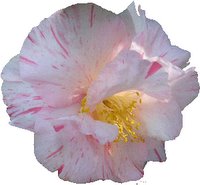 Everything is blooming here — the camellias, the tulip magnolias, and the azaleas. Here’s a double-bloom camellia that’s blooming by the front walk. I used the Magic Wand in Photoshop to get rid of the background. I know this is a basic procedure in Photoshop, but today I finally figured out the various parts of the Magic Wand, and made a GIF with a transparent background too. Well, it looked transparent before I uploaded it, anyway. Now it’s just a white background, instead of a transparent one.
Here’s the original photo, cropped a little.
Scribbler to Scribe: Part 1
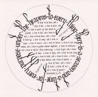
This week the latest issue of Letter Arts Review arrived in my mailbox. (I was on my way to the gym when I got the mail, so those 45 minutes on the elliptical machine just flew by.) I was especially interested in the new series article, “Scribbler to Scribe”. In this first article, Glen Epstein and Gwen Weaver remembered the beginning impulses that led to their years of calligraphy. There were three images for each of them: a recent piece of calligraphy, a beginning piece of calligraphy, and a picture of the scribbler about the time the early calligraphy was done.
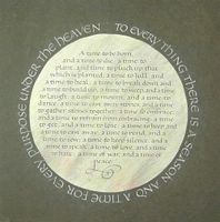
So I got to thinking. And yesterday I started a new version of Ecclesiastes 3:1-8, the text of one of the first finished pieces I ever did, back in 1983. I’ll be interested to see the 1983 version next to the 2006 version. Here’s the 1983 version.
I look at this piece and think – hey, not too bad for a beginner. But it’s clear that even as a beginner I was willing to go through some torture to get the results I want: the copy fitting for this piece had to have been really time-consuming. By contrast, this time around I used the computer to help with the layout. I wrote out the main text in a regular block of text, then scanned it in. Then in Photoshop Elements I created a circle shape and cut and pasted the bits of text until the circle worked. (I’m leaving out those lovely wooden swashes this time around.)
