Last week a friend pointed out a Facebook post by John Stevens: some “wrong weighted”
lettering, as he calls it, that she was working to emulate. I can’t find an example on his website, but if you’re on Facebook you might be able to see it here. I think it requires some time and enough kinetic familiarity to get a good rhythm going so that the strokes have more life than mine do. In the Facebook post, John calls it the “syncopated rhythm of Ben Shahn mixed with broad pen calligraphy.” In earlier posts here and here, you can see some of my attempts at the Ben Shahn lettering he references. Later, I used that lettering in a book commission of poetry by Madeleine Gomez:
2003 poem by Madeleine Gomez, written out 2013 by Beth Lee
While my go-to tools are metal calligraphy nibs (Mitchell, Brause, Tape) and gouache, sometimes a gold metallic gel pen can be a real pleasure .. and, sometimes more important, a portable one.
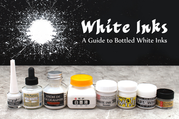
One time I ordered about 8 different gold metallic gel pens from Jetpens and had a field day testing them. Jetpens carries a whole bunch of writing tools and papers which are mostly geared toward the illustrators, manga artists, and crafters. They also provide comparative information about some of their tools and materials. Their guide to bottled white inks arrived in today’s email inbox. They compare opacity, reactivity, viscosity, water resistance, and nib compatibility.
Notably missing from the lineup for me:
Pro White– a favorite of mine for broad-pen work, it can be mixed with gouache for a little color.
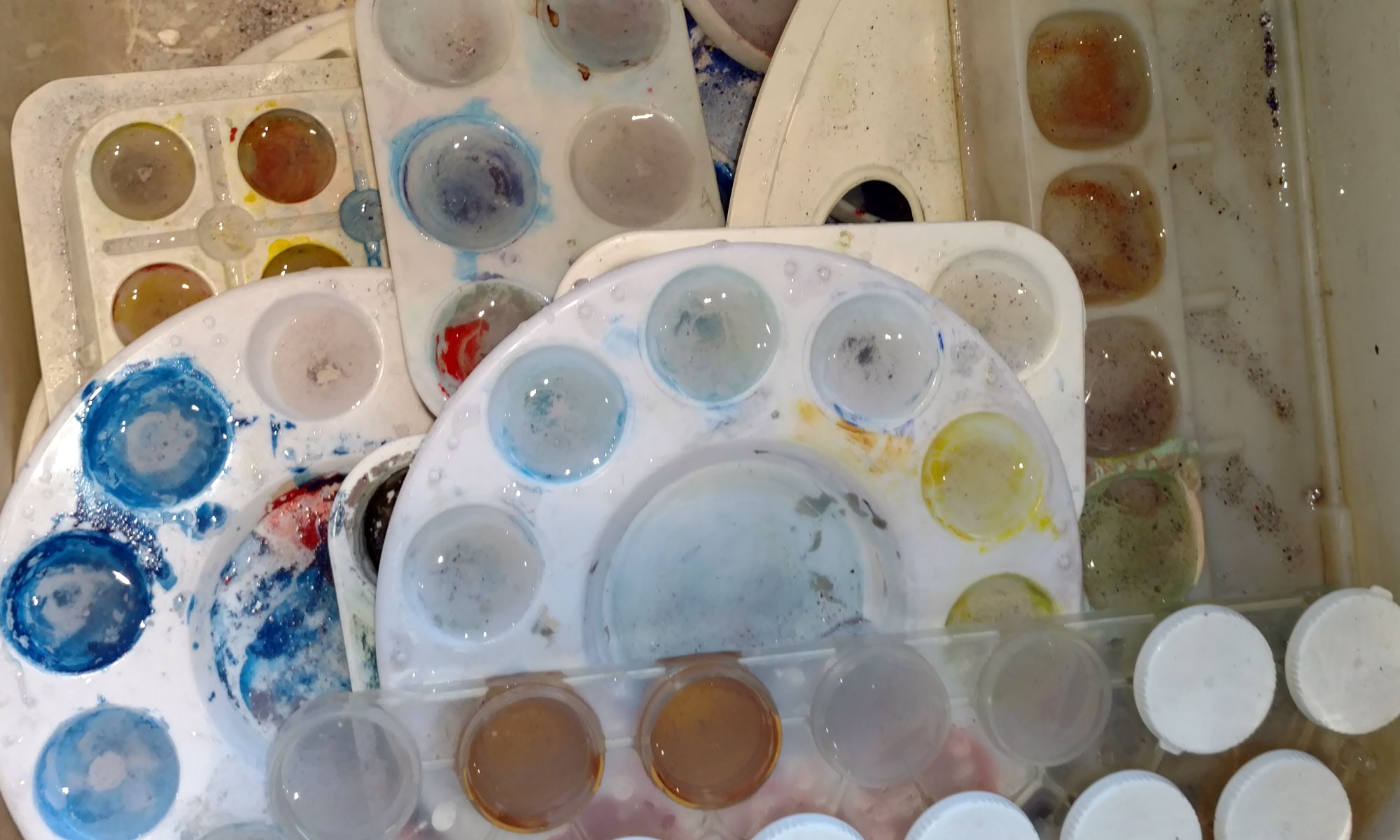
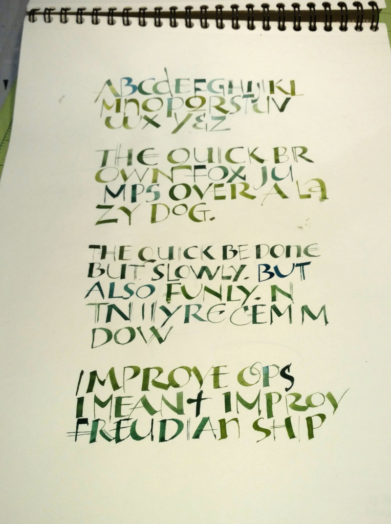
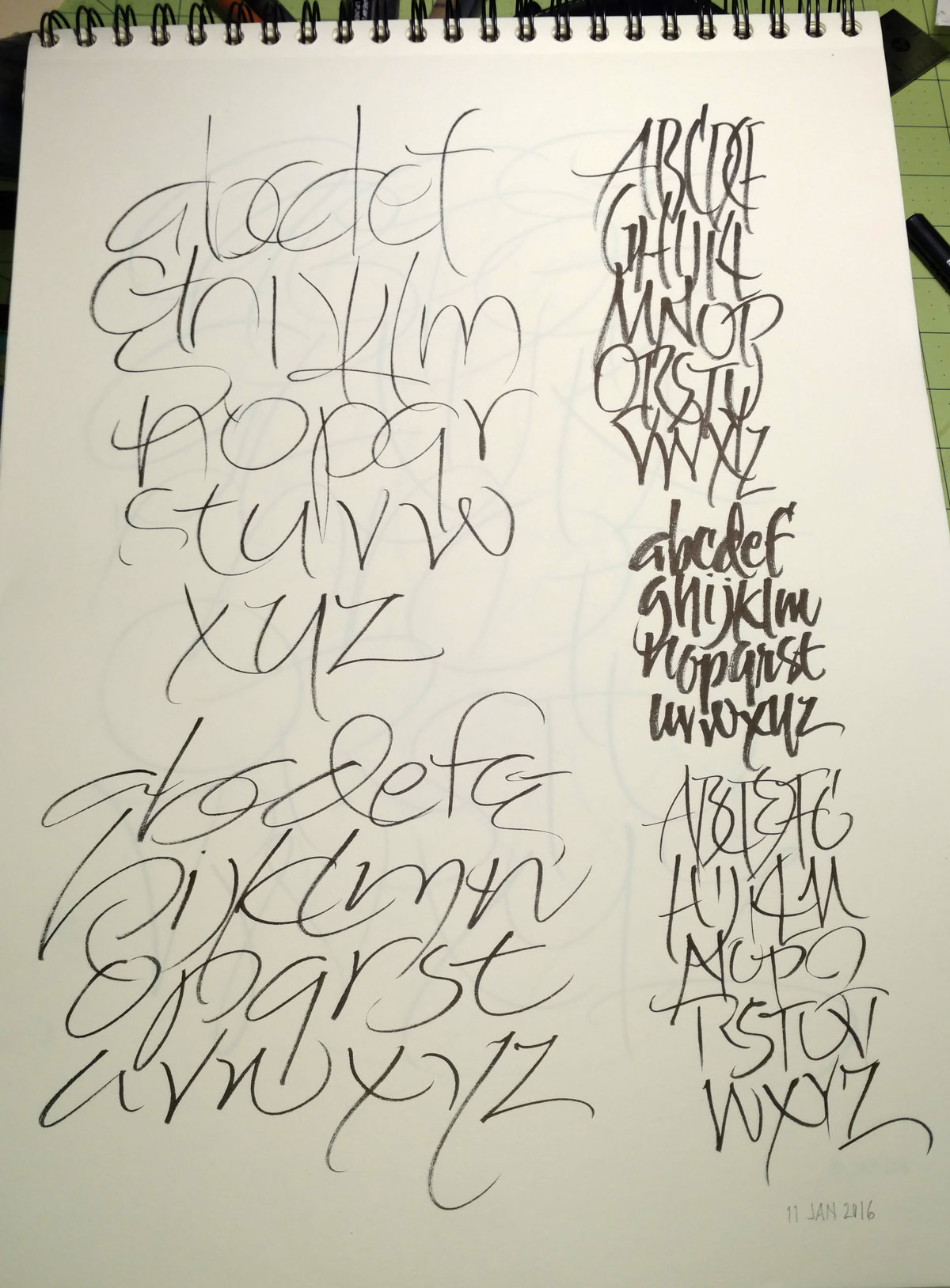
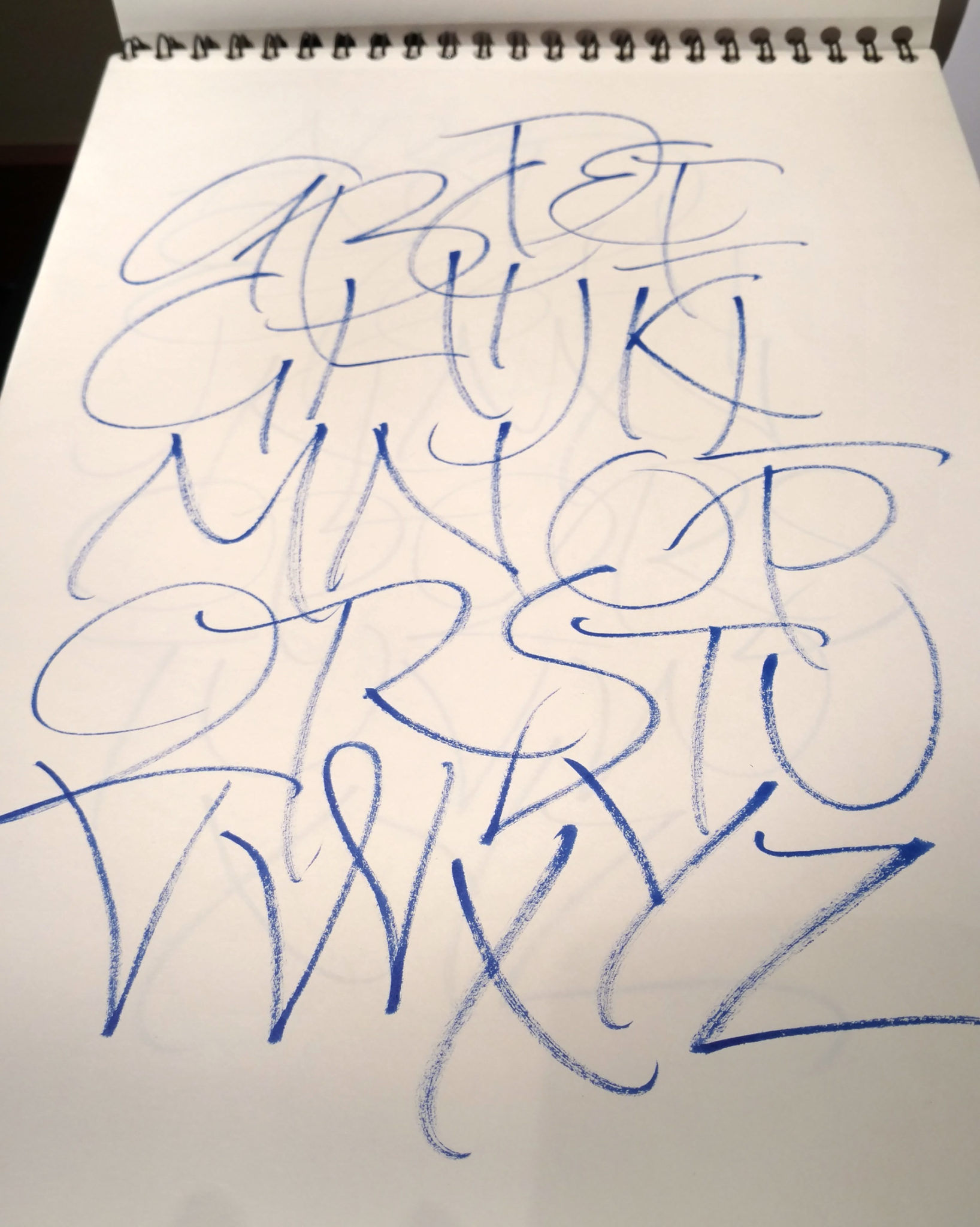
Daily alphabet(s) for January 11Some 5×7 dabbling earlier this month — a Brause 2mm nib and Schmincke Calligraphy Gouache (mostly: these are old palettes so who knows for sure?)
A simple manuscript book, with notes and calculations.
As I mentioned yesterday, I’ll be teaching a manuscript book class this winter and spring — 8 weeks, mostly weekly but with some breaks. A few days ago, as an aid to outlining the curriculum, I decided to go through the steps of making the simplest manuscript book. Simple is not so easy for me, but I did make this book entirely in an evening, from start to finish.
What was simple: First, the size of the book is mostly dictated by the grain and dimensions of a parent sheet of Strathmore charcoal paper. Second, I wrote with a pencil. This simplified matters when I wrote the wrong word on the penultimate page of the text block. Third, I chose a relatively short text. Besides making the lettering process shorter, it allowed the entire text block to be only 16 pages long. That meant that I could have 4 sheets folded together to make a single signature, the simplest codex structure. Fourth, I chose to make a soft binding and sew it along with the text block. Fifth, I chose the simplest end paper — a single sheet which covers the inside of the cover — and I didn’t choose to paste it down to the cover.
What I could not bear to make too simple: The pages are laid out based on the Von de Graaf canon of medieval page design. I guess would have simpler just to randomly choose where to put my lettering, but I would have hated the result.
Click on the image for a closer look. The open manuscript lies on top. Below that is an offcut of the end paper and the cover paper — a piece I painted and wadded up and painted and drew on in a Laurie Doctor workshop. Below that is the layout template based on the Von de Graaf canon. Below that are my notes which set out the division of the text amongst the pages, and some trial lettering which loosely served as copy fitting.
Even a simple manuscript book has a lot of steps. But it’s satisfying.
I am offering a 8-week class on the manuscript book that will begin January 18 and run, with some breaks, through April 11.
In this class we will examine a variety of handmade books, learn about the parts of a book. Then we’ll design, make and bind a manuscript book.
We’ll choose content, materials, and layout. We’ll learn how to copy fit, good ways to practice the lettering, and much more before finally creating and binding our own books.
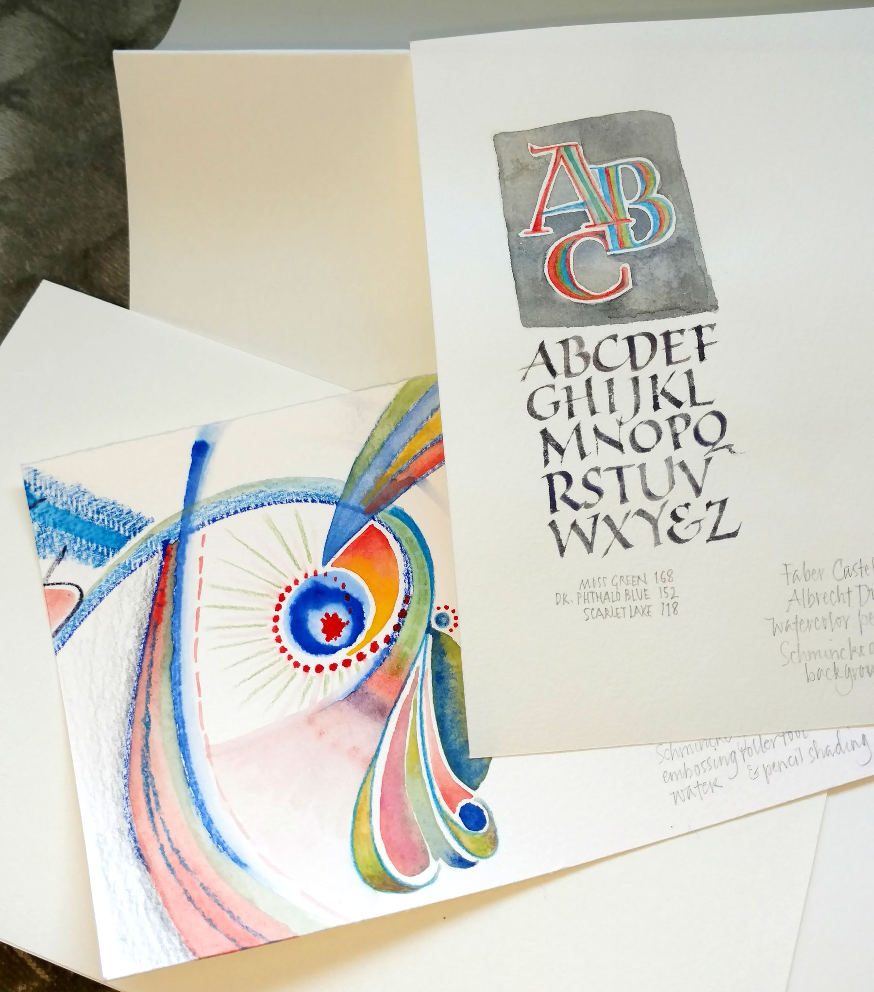
Faber-Casttell watercolor pencils and Schmincke gouache on bristol and Arches Cover, I think.
It started out as a full-court press to organize my studio, but was soon upgraded to play.
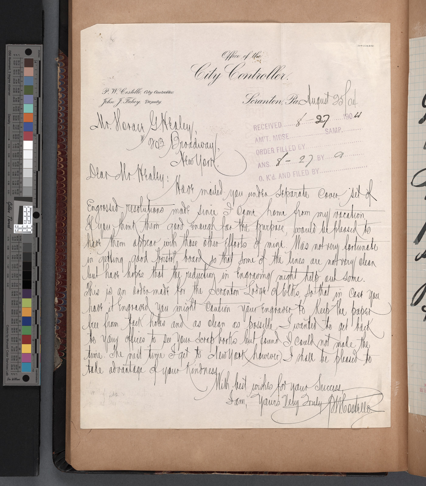
1904 letter from Patrick W. Costello to Horace G. Healey
On January 6, 2016, the New York Public Library announced that it has digitized over 180,000 public-domain images. Cool! It’s available here at www.nypl.org/research/collections/digital-collections/public-domain. You can try searching for an image, as I did to find this 1904 letter from Costello to Healey. It was interesting to see that in 1904 he was writing on city stationery; images of later letters are shown written on his own letterhead.
Also interesting is this remix by Brian Foo of NYPL Labs that provides an interface for searching by color, dates, genre, or color. The usability leaves something to be desired, not the least of which is performance. Ideas for improvements come to mind immediately. Of course, the remix is only as good as the data, which seems to still be somewhat spotty. If you’re a techie (or even a wannabe like me), see the source code (mostly Python) for the remix on Github. I’m tempted to try my hand at it. The data is here, and the API.
So I got this ZIG Clean Color brush pen from my dealer, with a note wishing me happy holidays and inviting me to “enjoy this free gift”. This is a good thing, right? So why does it feel like they’re just hoping to engender a new dependency on a new drug writing tool?
It’s an interesting brush pen, very brush-y rather than pen-like.
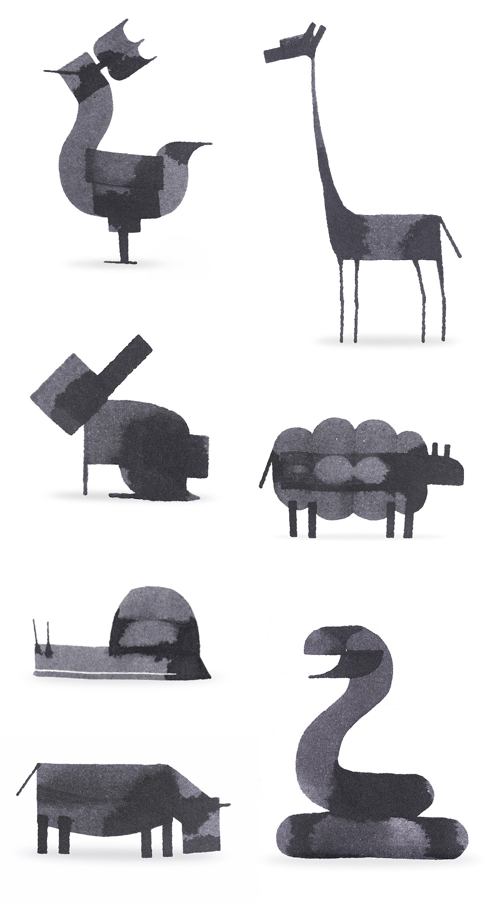
I’ve seen Andrew Fox’s calligraphy animals several times over the past year or so, and I now I see that he has an instructional book out. Not having read it, I can’t vouch for the book, but his animals — and bugs and robots and sushi and bombs and so on — are trés cute!
 Last week a friend pointed out a Facebook post by John Stevens: some “wrong weighted”
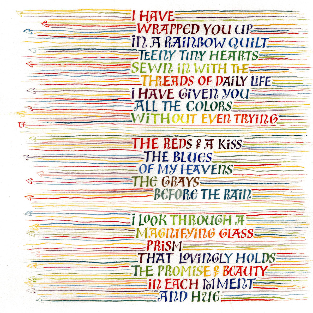


