More pencil work … after Amity

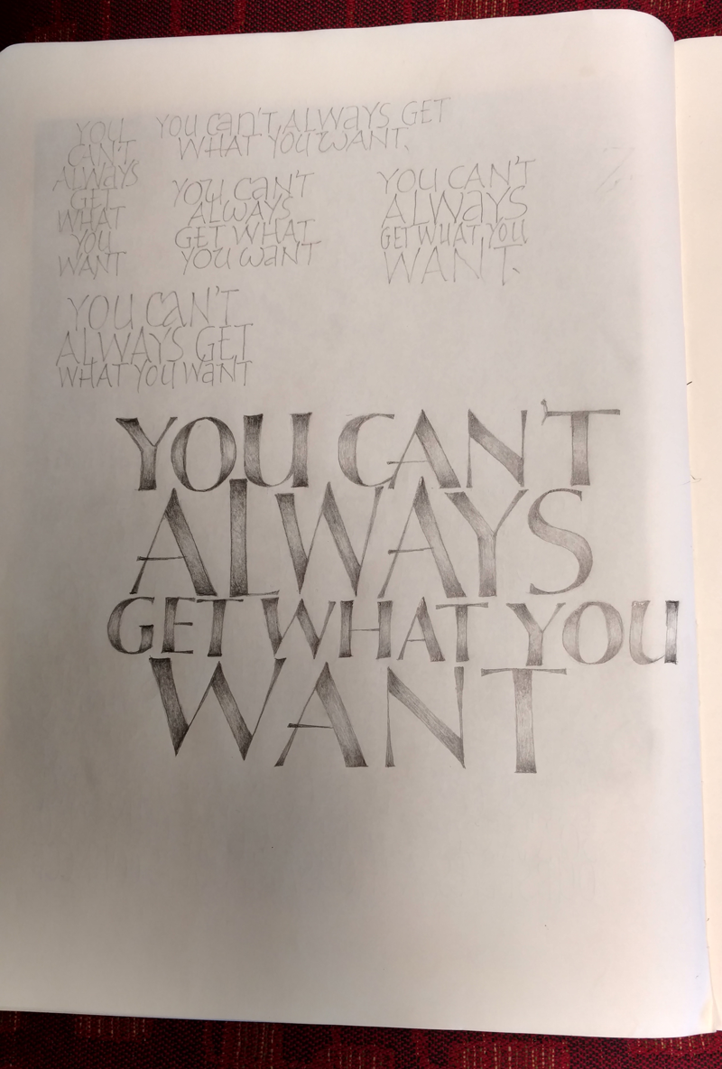
I’m loving my new pencil journal. Here’s a page I started right after the workshop but just finished yesterday morning. Really, the lines are straight. It’s just that the page was folded back and set on a cushioned chair.

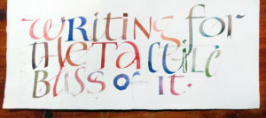
Using Amity’s method (sort of) of trying out layouts, and then laying out the text and executing it in pencil

A Sharp Pencil and a Keen Eye

That was the name of the two-day workshop that Amity Parks taught to Big Sky Scribes weekend before last in Great Falls. Focused on pen techniques, it was a jam-packed but easily digestible workshop.

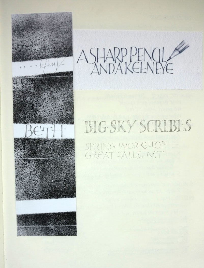
I came home inspired to start a pencil journal similar to the ones that Amity showed us. Here are the first few pages of mine:

The title page of my new Moleskine journal for pen exploration.
A page of pressurized capitals, done partly during lulls in opera chorus rehearsal, and partly in my studio the next day.
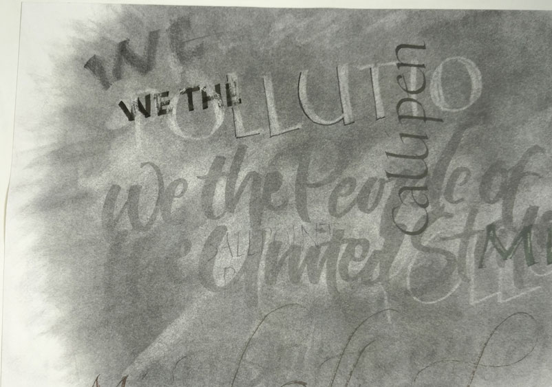
A tipped-in page of a many-layered experiment in various pencils, graphite powder, water brush, erasers … and a couple of markers. Fun stuff.

Baltimore and book arts

Through a post in the Book-Arts-L listserv, I recently discovered that something interesting things have been going on in Baltimore regarding artist books. This article in HUB, the Johns Hopkins magazine, describes an interesting class, “Paper Museums: Exhibiting Artists’ Books at the Baltimore Museum of Art”, which led to an exhibit from the collection of artists’ books at the Baltimore Museum of Art. This exhibit, entitled Off the Shelf: Modern and Contemporary Artists’ Books, opens tomorrow, and I wish I could see it.

Many of the books are collaborations between authors and artists –between Guillaume Apollinaaire and Raoul Dufy, between Stephen King and Barbara Kruger, between Joan Miró and Paul Élard. This article has more detailed information about the pieces in the exhibit. Unfortunately, there is no catalog. I asked.


Paper stuff

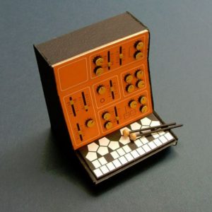
Modular Marimba – one of many awesome paper models by Dan McPharlin

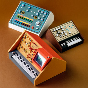
I love paper modeling and this guy Dan McPharlin does it right! He says, on his website, “… the Analogue Miniatures series was my attempt to pay tribute to early synthesizers and analogue recording equipment. Rather than replicating existing machines, the focus was on creating a revisionist history where analogue technology continued to flourish uninterrupted. Each piece was hand-made from framing matt-boards, paper, plastic sheeting, string and rubber bands.” See them all together in a 36-photo set at Flickr.

“Analogue Miniatures 2” by Dan McPharlin

via Strictly Paper

The attentive eye


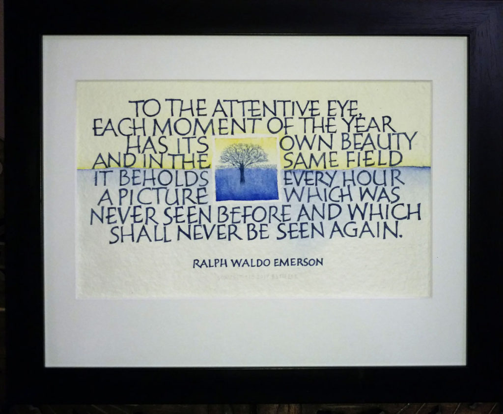
“To the attentive eye,
each moment of the year
has its own beauty,
and in the same field,
it beholds, every hour,
a picture which was never seen before,
and which shall never be seen again.”

– Ralph Waldo Emerson.

I matted and framed (11″ x 14″) this piece to today for the calligraphy exhibit at Rocky Mountain College’s The Ryniker-Morrison Gallery in Billings, MT.
The watercolor lettering was initially done with a disc-ended Brause Ornament nib –  similar to a Speedball “B” series nib – and then the rough edges and finials tidied square with a bowl-pointed school nib. All on St. Armand handmade watercolor paper, a luxuriously felty, bumpy surface.

The Secret History of Twin Peaks

Wait, isn’t this a lettering blog? Not to worry. Read on.

I mentioned last May in passing that I had finished a fun bit of commercial lettering. There was the usual last-minute scramble to make a deadline, and then I turned to all the work I had set aside. 

Well, yesterday upon being reminded of the book, I looked it up on Amazon .. and I ordered a copy. Meanwhile, I’ve enjoyed seeing my lettering in the “Look Inside” Amazon feature. Click on the book jacket to go to Amazon and see for yourself.

Book exchange books complete!

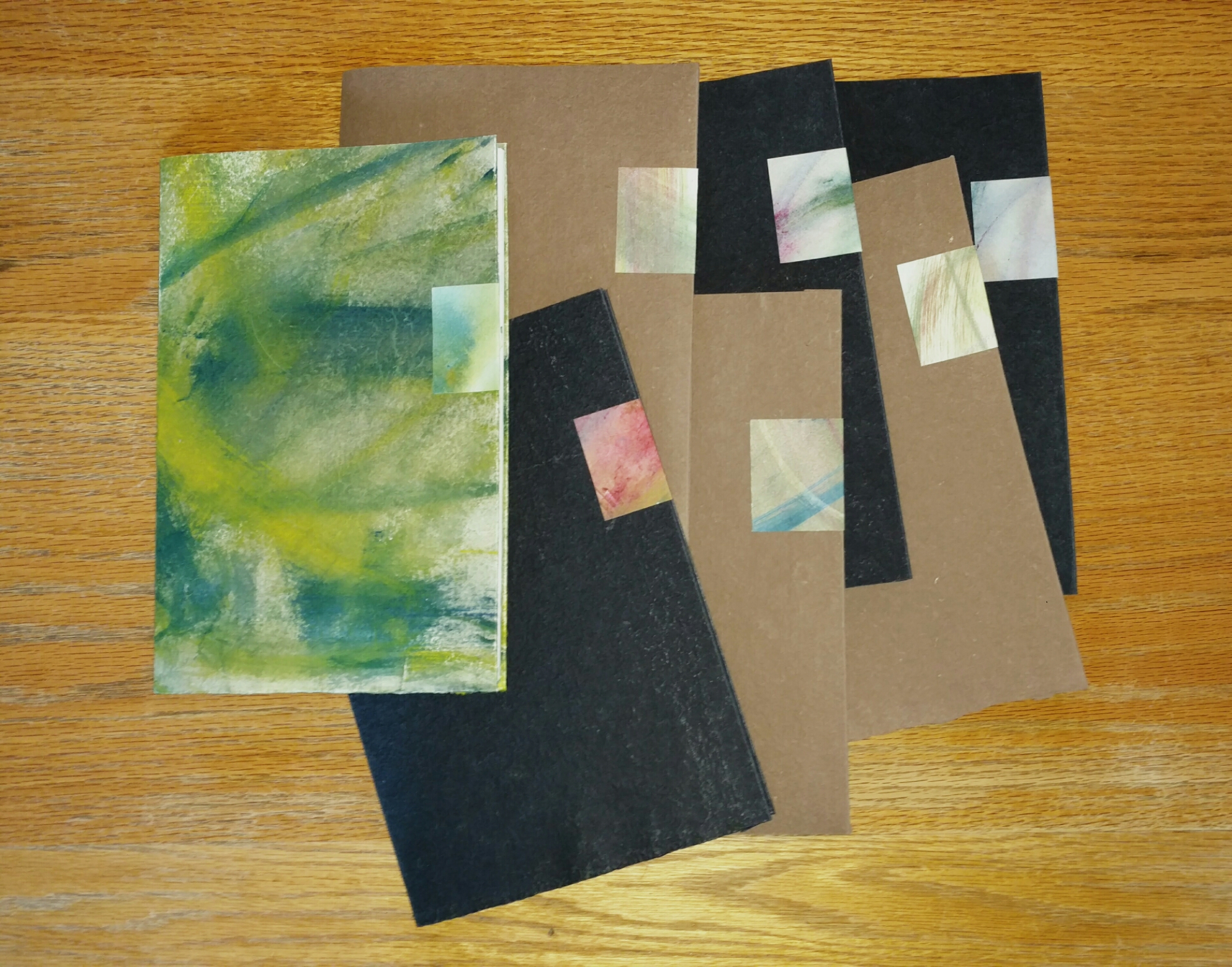
The eight books that were due on Valentine’s Day were actually completed in time to arrive by the deadline. Yay! I’ll make two more for a series of 10. Usually I do an “edition” of manuscript books (if there is such a thing), but this time I’ve done a series instead. To my mind, the difference is that I didn’t try to make these books closer to identical. The painted pages are all different. But the text, which consists 8 haiku, are all the same.