Seattletters – envelope contest

Made for John Neal Books envelope contest β€” gouache+sumi mixture and gouache mixture; Speedball “B” nib and a flexible pointed nib clipped to a tiny broad edge; envelope made from 80# Strathmore 400 Drawing paper.


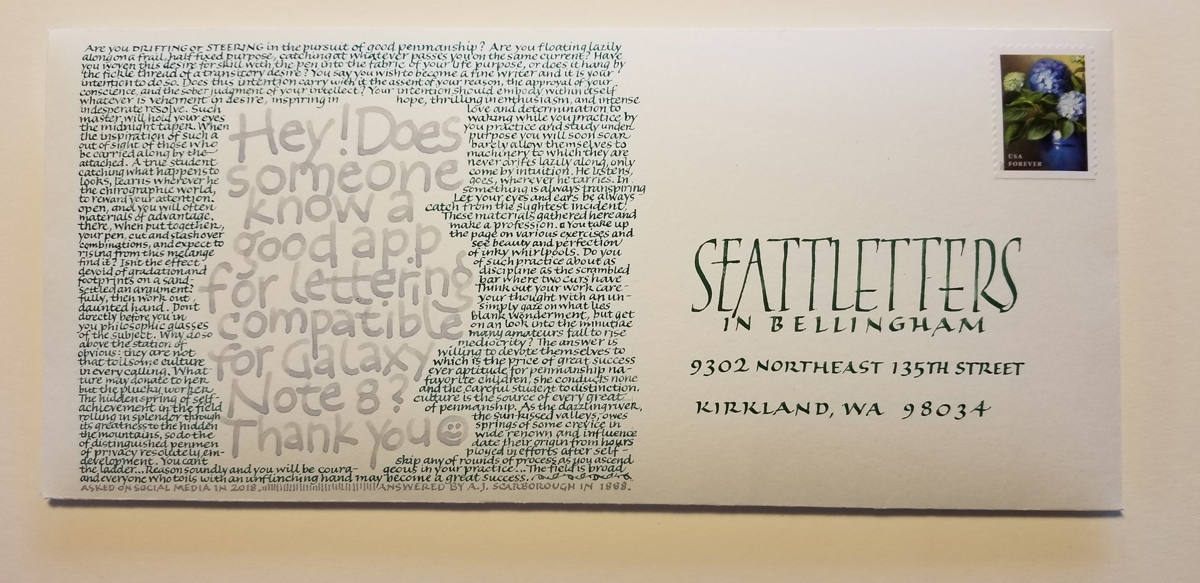
Here’s my submission to the envelope contest that John Neal Books hosted in association with Seattletters.  The deadline was April 20. The gray lettering is a post I read in a calligraphy group on social media. I surrounded it with text from an 1888 article by A. J. Scarborough which had been posted in 2000 to the Cyberscribes discussion list.  I like the contrast in approaches πŸ™‚

I penciled baseline guidelines 2mm apart for the small lettering, making the x-height about 1mm. I clipped a pointed nib (a blue Esterbrook of some sort, I think) to make a tiny broad-edge nib. Seattleletters address is #5 Mitchell nib, I think.

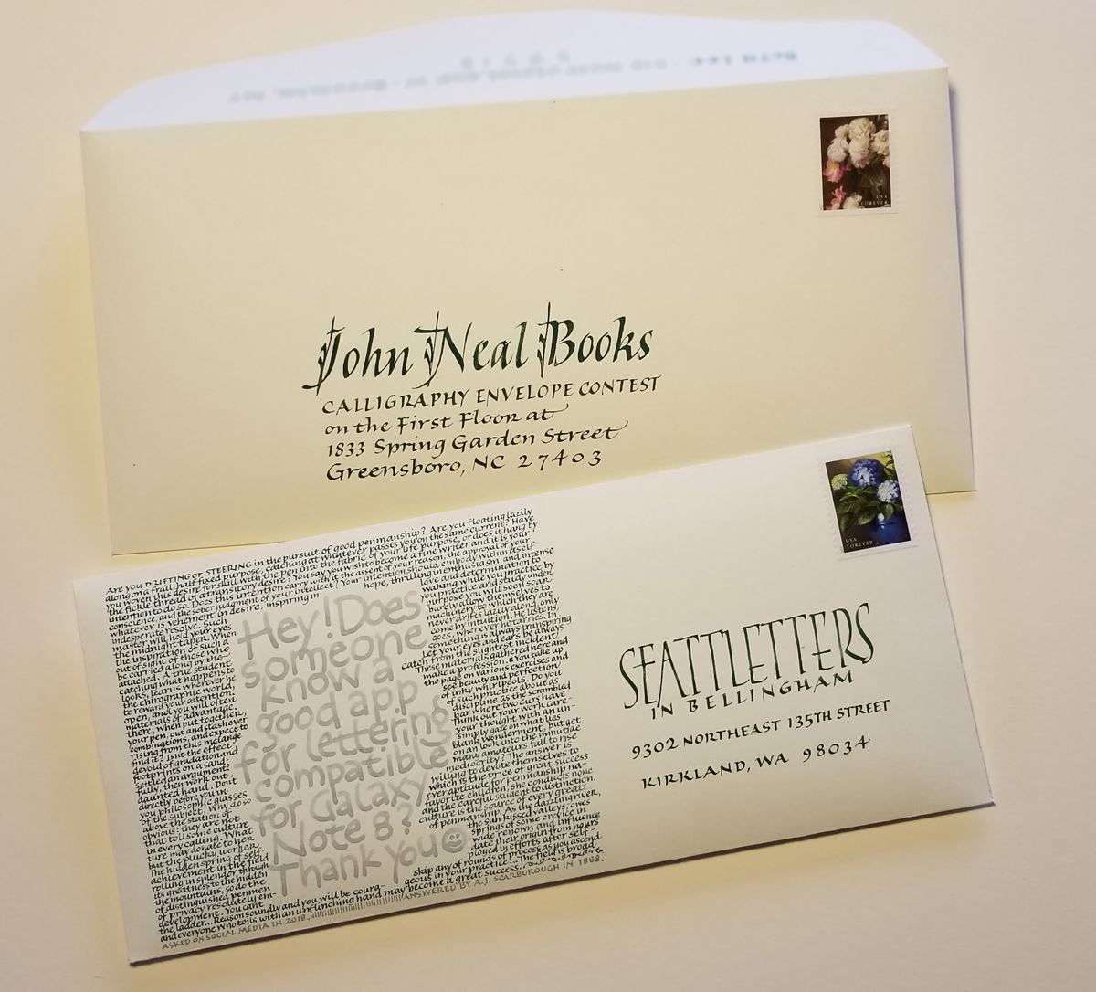
After all that work, I couldn’t bear to send it through the US Mail unprotected, so I made another envelope, just ΒΌ” larger in each direction, to house the submission.

Prairie Spring by Willa Cather

“Prairie Spring” – Text by Willa Cather. White ink and metal pen on paste-painted paper ground. Framed to 14 in x 18 in.

This piece, “Prairie Spring”, is currently on display in “The Horse” exhibition at the Ryniker-Morrison Gallery of the Rocky Mountain College in Billings, MT. The text is a Willa Cather poem of the same name.

I have arrived … in the Letter Arts Review

The back cover of the current issue of Letter Arts Review

I’m so pleased to have been selected for inclusion in the annual juried review issue of the Letter Arts ReviewAnd to be included as a tile on the page cover (top right)!

I realize that although I have posted a process image of the piece , I never did post a final image. Here it is, shown below. I’m also honored to have “Fragment” included “Formation,” a juried exhibition of the Guild of Book Workers which will travel to Minneapolis, Atlanta, Los Angeles, Boston, and Philadelphia in the coming year.

“Fragment” – poem by Amy Lowell. Paper mosaic cut from a single piece of paste-painted paper.

Homegrown Trajans with Yves Leterme

I’m taking my very first online calligraphy course. “Homegrown Trajans” is taught by the wonderfully clear and thorough master Yves Leterme via Harvest Crittendon’s site, Acorn Arts. It’s as rigorous as anyone could wish for, and I’m already just a tiny bit behind. Week 3 posted today, but these are my worksheets from week 1 (complete) and week 2 (not quite complete). I think some of these students have no other demands on their time! Or perhaps I’m just incredibly slow. Either way, I’m buckling down tonight and catching up.

Those gestural brush alphabets

I do like to return to the gestural brush alphabet from time to time, especially when I pair with a contrasting element. This particular one was made to put in the solo exhibit in Missoula last fall. 

Having embarked today on Yves Leterme’s online course, “Homegrown Trajans”, I can predict that I won’t be doing anything like the above in the near future. Unless … it’s as relief from those demanding Trajan Romans.

My latest artist book edition

I realize that, although I posted process photos of my last book edition, I never did post photos of the book itself. (I forgot to photograph the entire edition before it dispersed. Gah!)

Umm, I seem to have misplaced those photos. But … I do have more process photos. As always, click on the image for a closer look. Next time, photos of a completed book or two. Promise.

A stack of lettered accordion text blocks, ready for their covers.
Various parts of the books, spiraling clockwise from top left: some folded text blocks and their end sheets; a pair of covered-board covers; a standing text block with end papers; a put-together book (partially shown); a text block being held open with a micro-spatula; 3 weaving strips; a homemade scoring tool, a needle punch, and a bone folder; another pair of covers; a couple of templates; a stack of unfolded end sheets under a template; 4 covers which have been laced together and are ready to be laced to their text blocks.
Lacing the cover to the text block. I’m using a micro-spatula and a tool made to pull elastic through a sewn casing.

Pointed pen practice/play

I’m having the best time teaching a great group of students this winter. Although I’ve taught calligraphy classes for [checks rΓ©sumΓ©] 30 years (!), this is the first time I’ve taught pointed pen scripts in a classroom setting. To teach others is always to educate myself. Determining how to explain a concept often spotlights previously ignored fuzzy areas in my own thinking.

We’ve begun with a business hand and no pressure, gotten an intro to pointed pen nib and offset holder and ink, and then moved on to a working copperplate hand that is not too fussy (think Buddy Blackwell). 

Here is a bit of silliness that broke out during a practice session focusing on whole-arm movement exercises. Contrary to what this image may suggest, I do not plan to cover “modern calligraphy” in any depth. I was just having fun. Click on the image for a closer look.