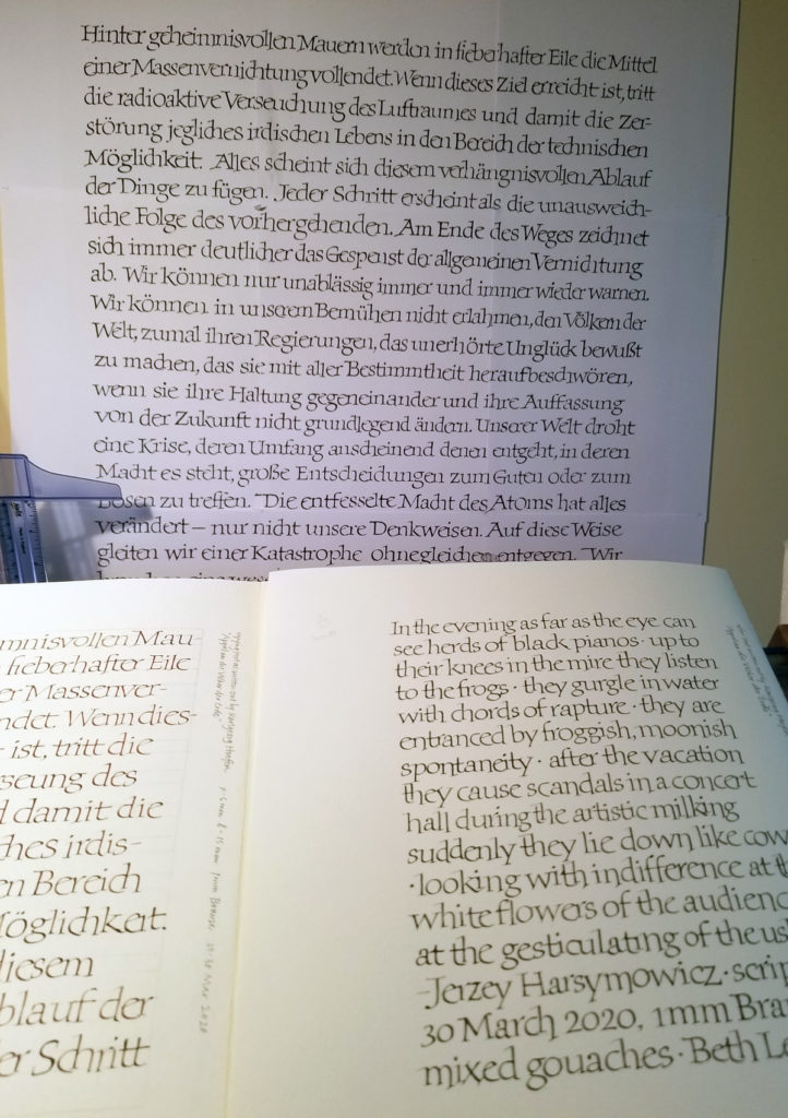
Ever since I saw it in International Calligraphy Today (1982, International Typeface Corporation), I have admired “Appel an die Völker der Erde”, a calligraphic poster by Karlgeorg Hoefer, . Here I’ve blown it up to the original 22 x 29.75 in and tacked it on the wall, the better to study. In my daily lettering journal, on the verso side, I copied the text as closely as I could, learning the Hoefer’s shapes and connections. He often slightly minimizes and tucks the ‘i’ in; I ‘ve inadvertently exaggerated it here, but I was so enjoying this tucking-in. The second stroke of the ‘r’ is often raised up the waistline to allow the next letter to tuck in. The bottom of the bowl of the ‘e’ is often pulled below the baseline to allow the next letter to tuck in. In a double ‘l’, the first one is usually normal while the second one dropped a little low to unlock it from the first. The ‘ch’ combination is always connected, but because the bowl of the ‘c’ is extended and foot of the ‘h’ raised to tuck into the bowl, it isn’t seen as a ‘d’. He seems to have done a push-pull on the finials of the ‘r’ and the ‘a’, similar to what happens in Carolingian ascenders, for instance.
These details form a compelling picture of idiosyncratic yet consistent choices that are both subtle and purposeful. Rhythm is important to the success of this piece.
Rhythm is also what my studies don’t have … yet. I’ll keep working. I’m thinking that a better paper (this is Strathmore Drawing 400 heavyweight), would be helpful. Hoefer wrote on “Japanese paper with Antiqua surface”. I haven’t been able to figure out just what that means. Nontheless, a kinetic understanding of Hoefer’s letters and connections will eventually yield that rhythm, and it’s what interests me most in this study.
