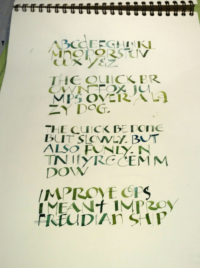
 Last week a friend pointed out a Facebook post by John Stevens: some “wrong weighted”
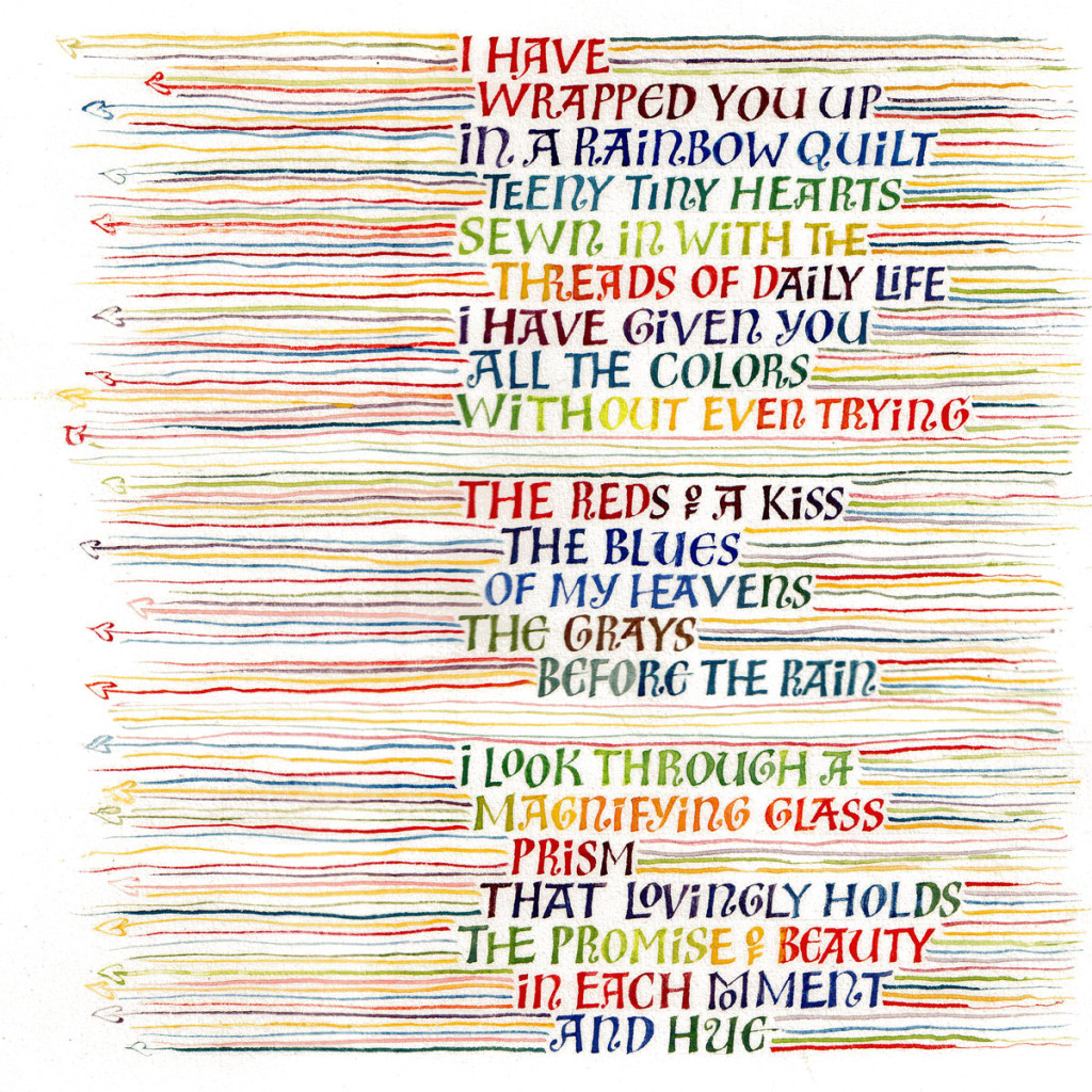
lettering, as he calls it, that she was working to emulate. I can’t find an example on his website, but if you’re on Facebook you might be able to see it here. I think it requires some time and enough kinetic familiarity to get a good rhythm going so that the strokes have more life than mine do. In the Facebook post, John calls it the “syncopated rhythm of Ben Shahn mixed with broad pen calligraphy.” In earlier posts here and here, you can see some of my attempts at the Ben Shahn lettering he references. Later, I used that lettering in a book commission of poetry by Madeleine Gomez:


Lovely work! Do you know what kind of pen Ben Shahn used to do his lettering with? I recently took a class on his lettering and we used a folded pen, but the teacher didn’t know what tool Shahn used. You don’t actually say what you used, but mention a broad edged nib.
When Ewan Clayton taught it at the calligraphy conference a few years ago, we used a broad-edge pen, and, as I recall it, he said that Ben Shahn had used a broad-edge pen for this lettering, with a good deal of pen manipulation. Shahn was an accomplished lettering artist and could make formal Roman capitals with a pen, but he was drawn to signs that had been made by untutored hands.