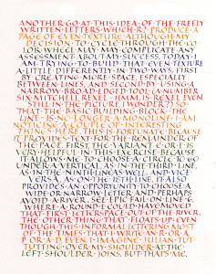
I had planned to write about Irene Wellington today, but I’m still back at that page of even texture that Hans-Joachim Burgert discusses in The Calligraphic Line. I tried it again today. I have things to say about it, but most of it is on the page itself, so why repeat myself? If you want to read it, click on the image to get a larger image.
I did try to have a more open texture than yesterday, but as I progressed down the page I reverted to my “default” density, I guess. Something to work on. There’s always something to work on. There are always multiple things to work on. I was particularly aware of the left shoulders of letters like R, P, and D.
This 9″ x 12″ page (IRL the margins are somewhat larger) was BK Rives Heavyweight, which is rather grainy, especially at an x-height of something less than 1/4 inch.

