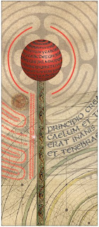
 Typography poster completed in class today. I began with the split uncial typeface I’ve been designing, added a scan of a sheet of vellum and some medieval images of a maze, a sky chart, manuscript illumination, and probably a few other things.
It’s part of a continuing exploration of the historical made contemporary. Not as contemporary as I’d hoped, but still interesting to me.
As usual, click on the image for a closer look.

very neat poster! that would go nice in my ‘studio’ … if I had a studio, and you were selling prints … hahaha
Hmm. I have a studio. Maybe I’ll hang one in *my* studio. What a concept 🙂