Some days my letters run the gamut from A to … um, A.
Continue reading “Daily ABCs … sort of”

Calligraphy & more — the studio of Beth Lee, Bozeman, MT
Some days my letters run the gamut from A to … um, A.
Continue reading “Daily ABCs … sort of”

Today’s work included the final lettering for a commission: a long text in pointed pen script. I haven’t done much pointed pen lately, so I did this piece as a warm-up. It’s the beginning of the famous letter from Darcy to Elizabeth in Pride and Prejudice. Fun stuff. Good thing this wasn’t the real commission: there is a hando (rather than a typo) at the end of the very first line. The pen nib was new but awful. I had to change it out before starting on the actual commissioned piece.
Yesterday I finished the testing binding for our local guild’s collaborative book. It had been awhile since I cased in a book. It’s rather amazing how much I forget between bindings … and also how much I remember of the tiny details. Unfortunately, often the details I remember are the same ones I’ve forgotten until just after that detail is executed.
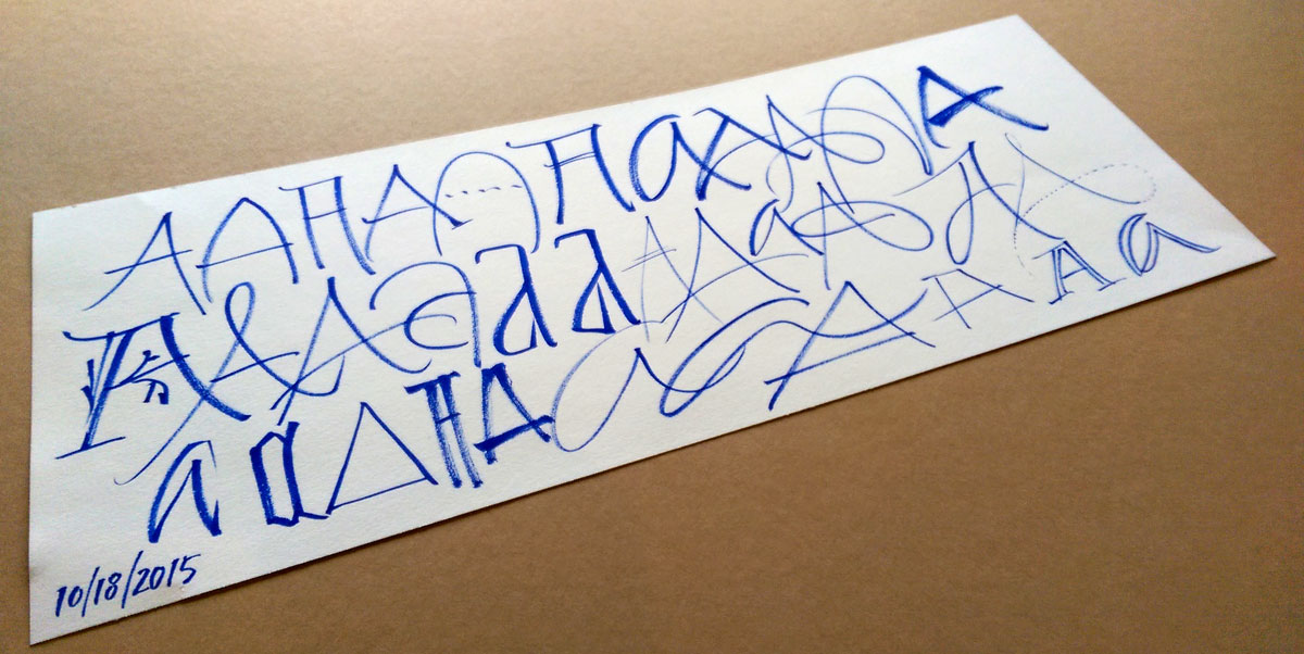
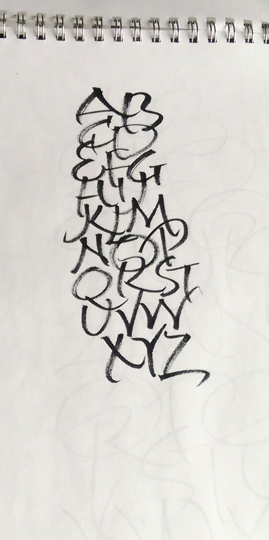
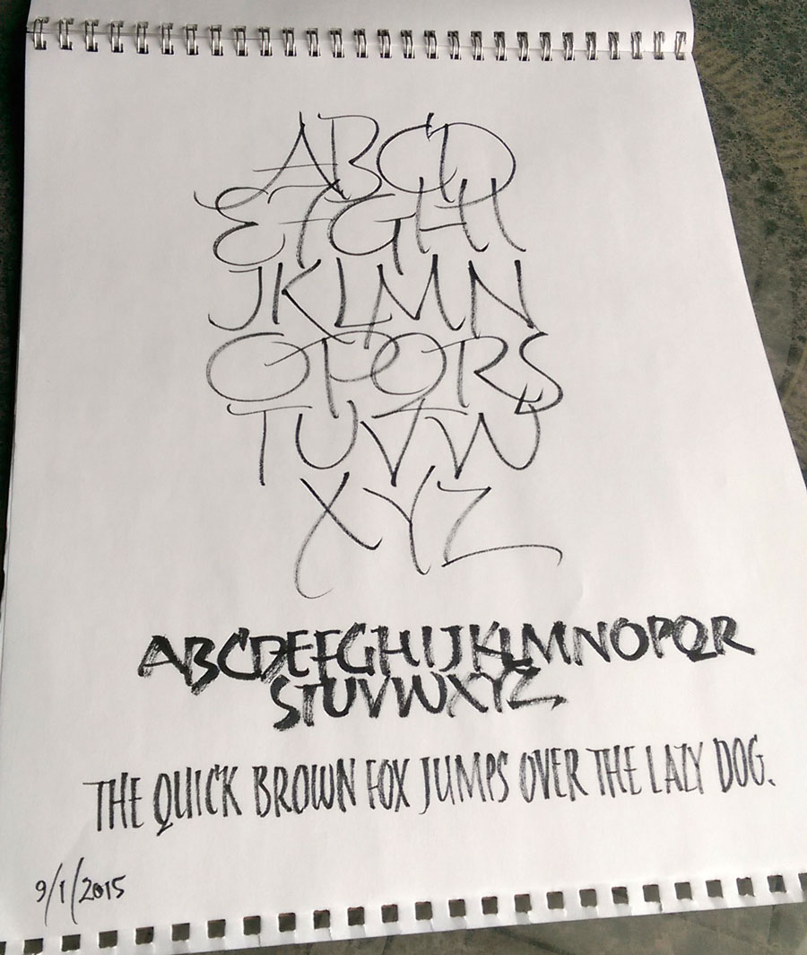
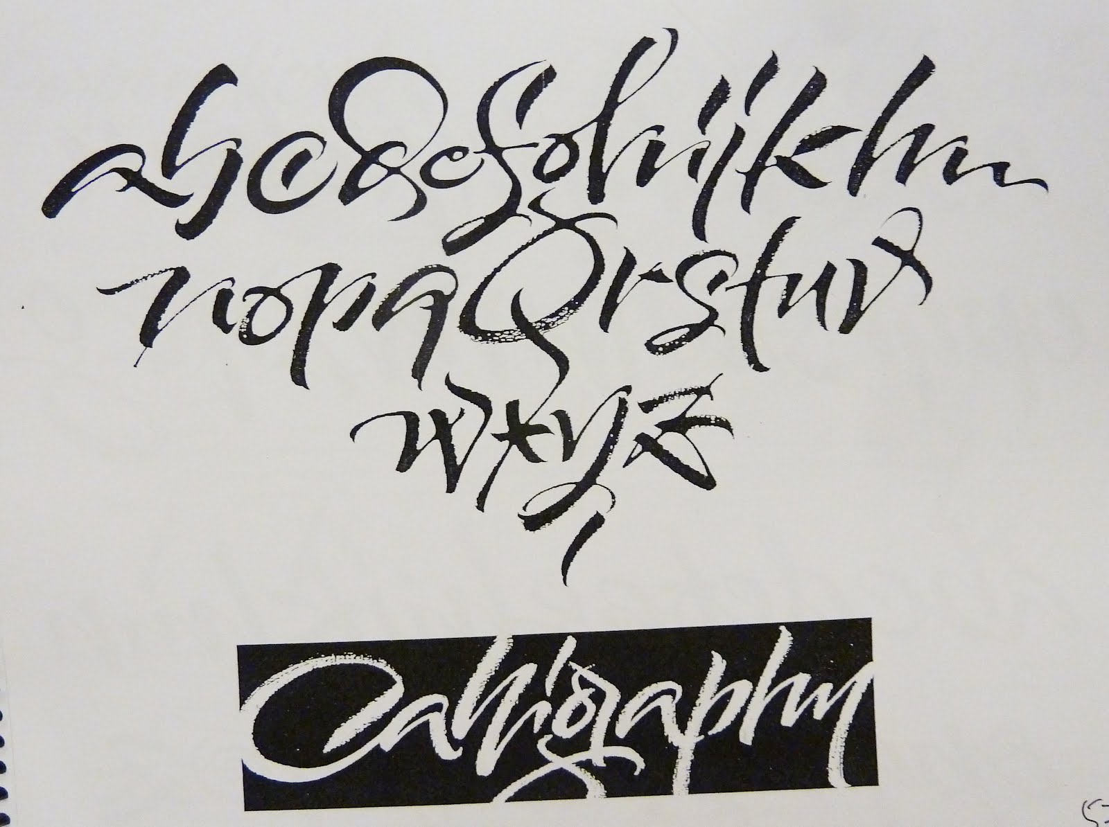
And here is one of this morning’s daily ABCs.
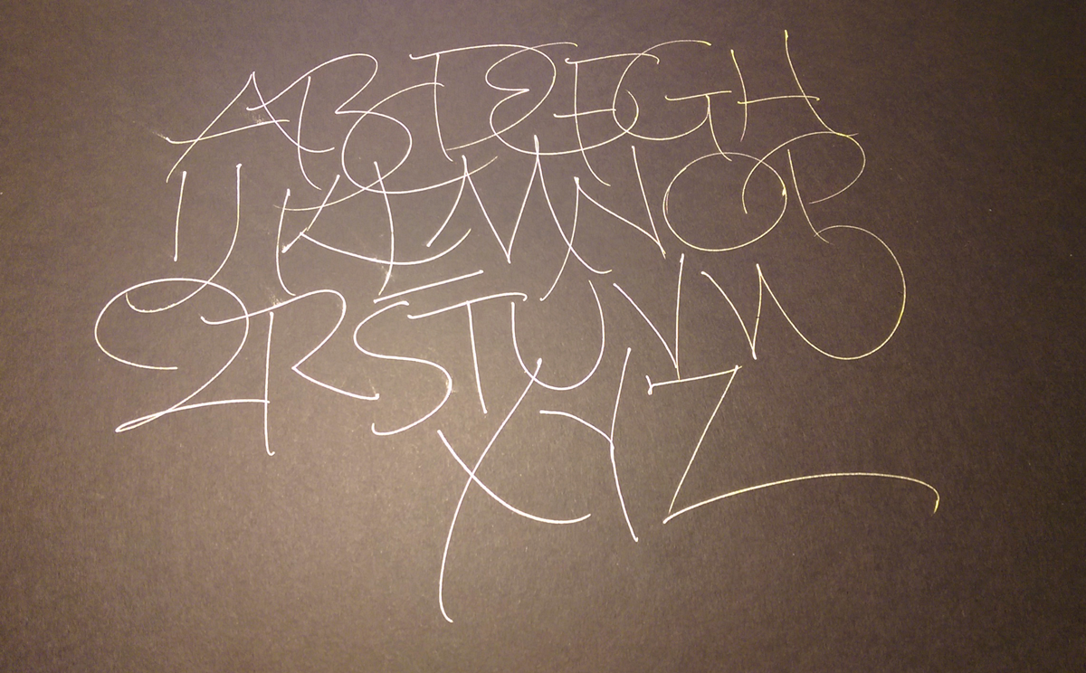 More daily lettering, this with a new Y&C Xtreme Gel Pen on Artagain black paper.
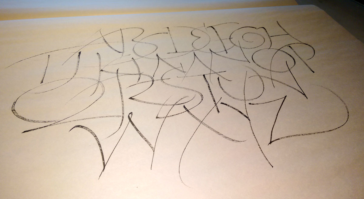
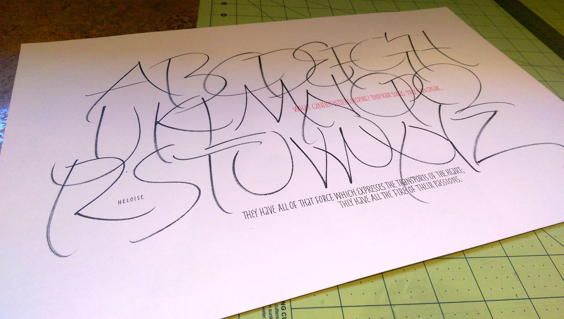
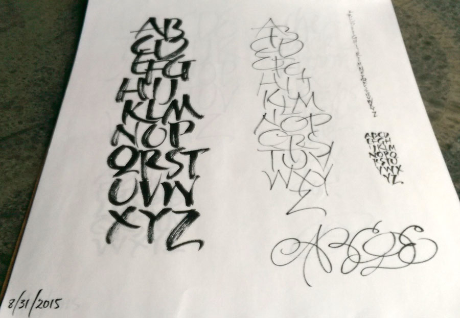
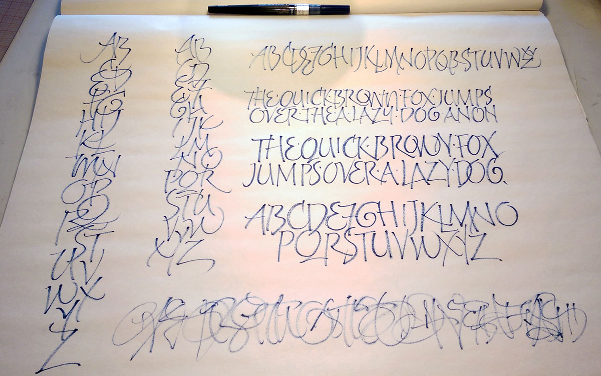
Trying to improve on one of the daily lettering pieces I did on Sunday. You can’t step in the same river twice, and often diverting the flow has unintended consequences. Even though I didn’t like Sunday’s E while I making it, that Sunday E is much better than today’s. Sunday’s H was cramped, probably because I was conscious that I was getting to the right edge of the paper; this one is a better shape but not a better line. In general, the lines are much better on Sunday’s sheet. Only now as I look at the photo of today’s work do I see that I skipped the down stroke of the T. Or, to be more accurate, made it do double duty as the first stroke of the U. I was thinking ahead to the V, which was not good on Sunday’s sheet — way too narrow, for one think. Today’s is still narrow, but I don’t mind it as much because I haven’t allowed the W to encroach. Much better X on Sunday’s sheet. I could go on, but here’s another page from today’s daily lettering:
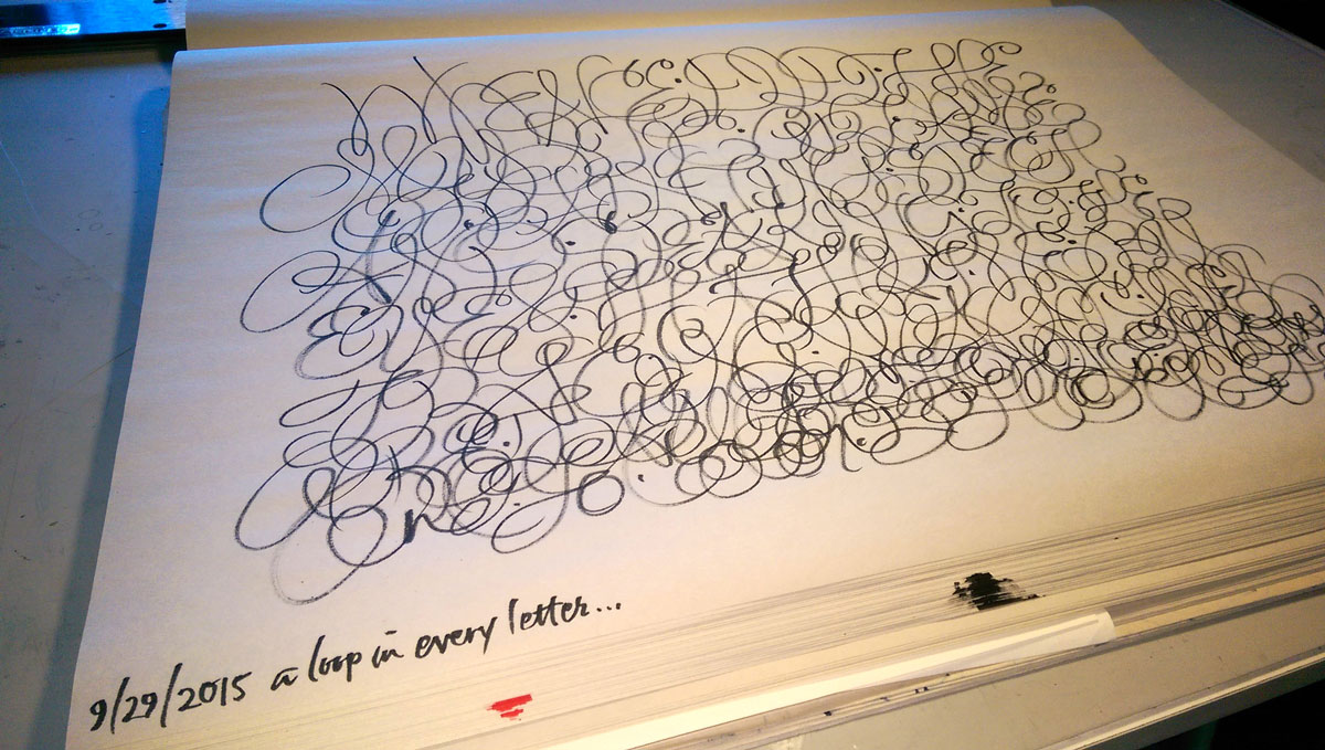
I have a love-hate relationship with loops in letters. I generally hate mine, I often hate loops made by other people, but I love loops made by a few wonderful calligraphers who really know how to swing it. I though that I might use loops to generate a certain texture — I’m back to reading Burgert’s Calligraphic Line again.
 A pretty good page of daily lettering. The small stuff could have benefited from a little Fibonacci planning … if I had been planning. Cocoiro brush pen and Zig roller pens on Strathmore Charcoal paper.
As usual, click on the image for a closer look.
Even though I’ve been on the road for a week, I still found time to do some daily lettering. This gestural stuff is simply addicting.


Someone stop me. No, not really. Well, maybe.
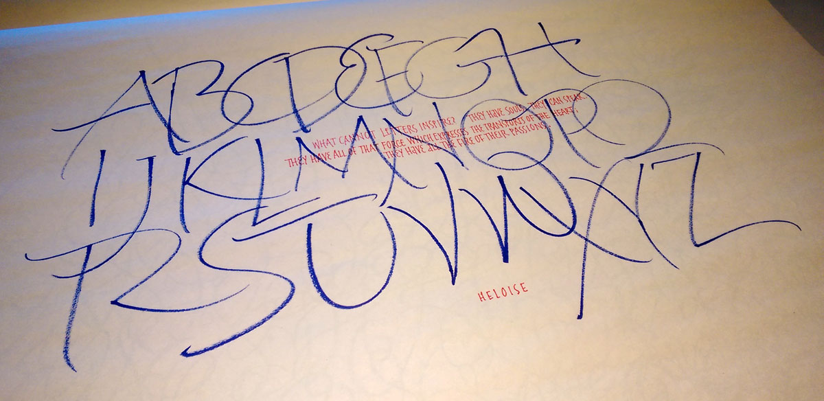
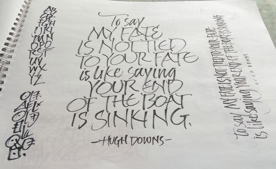
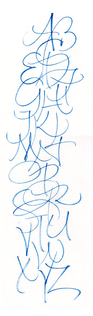
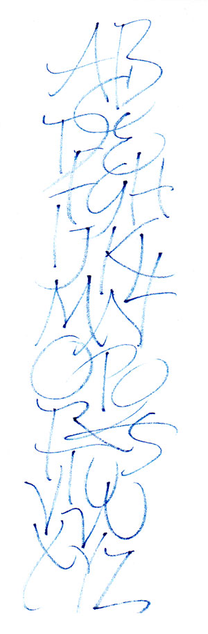
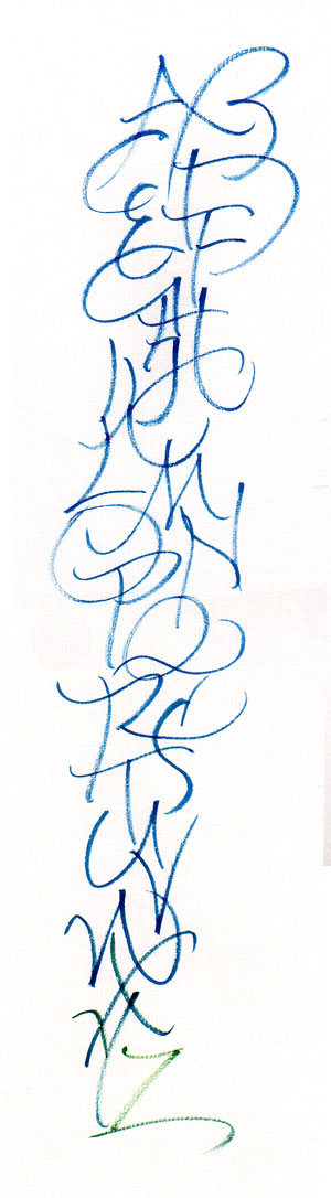
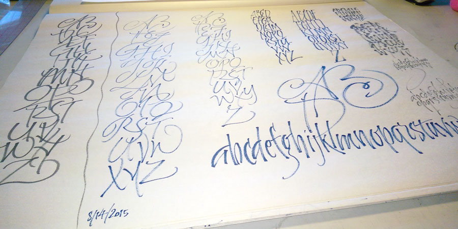
I’ve now done several alphabets in Z-to-A order. The third image is one of those. It is about focus to some extent. I find it easier to be more even* when I work up, and it’s interesting how the questions of space change when I’m going in the opposite direction.
*By “even”, I mean that my focus and tempo and looseness tend stay more constant throughout. This third image is a poor example of that, but as a rule, this evenness is more pronounced when I start at the end.
As always, click on the images for a closer look.
 It’s really quite addictive. I’m not sure what I’m going to do with, but it’s absorbing.
Pentel Color Brush on newsprint.
 At the annual calligraphy conference held this year in Sonoma County last month, I was honored to attend Ewan Clayton’s four-day workshop entitled “The Spirit of Invention”. We looked at new directions which several German calligraphers took after World War II. One of these calligraphers, Werner Schneider, explored handwriting and gestural mark-making.
We were introduced to an image of a gesturally made “ABC”, and every morning we began with a page or more of the same, first copying that gesture and then branching out on our own, changing the gesture and/or adding more letters.
As we repeated the exercise each morning of the workshop, I was interested to see not just kinetic memory development but a change in my own awareness of what I was doing. Here’s one example: I would make the A and the B and then change my position to make the C. I was totally unaware of this until Ewan pointed it out to me. Something I figured out on my own, later: I was losing focus at the end of the C.
Back home, I’ve continued the practice, spurred by the purchase of a 100-sheet roll of packing paper at Home Depot for $4.97. A few days later I realized that I had an 18″ x 24″ pad of newsprint that would serve even better, especially in keeping the pages in order. (I’m working from the back of the pad of paper to the front.) Every once in awhile I’ll switch to better paper. I’ve used a number of tools: the Winsor Newton 7 Series brush that I used for most of the exercises during the workshop, a blue slick-rolling pen that was in our conference goody back, a couple of Pentel Color Brushes.
I’m learning a lot, but most of it is difficult to communicate.