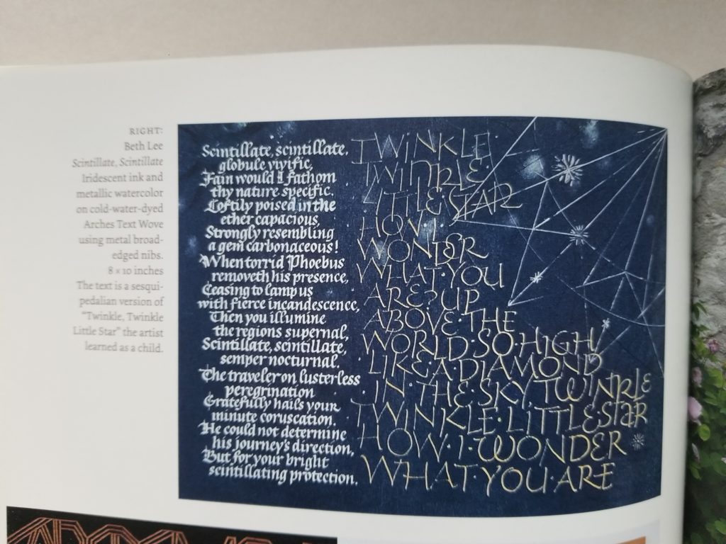
I’m honored and delighted that two of my pieces were chosen for inclusion in annual juried review issue of the Letter Arts Review. I’m in exalted company!
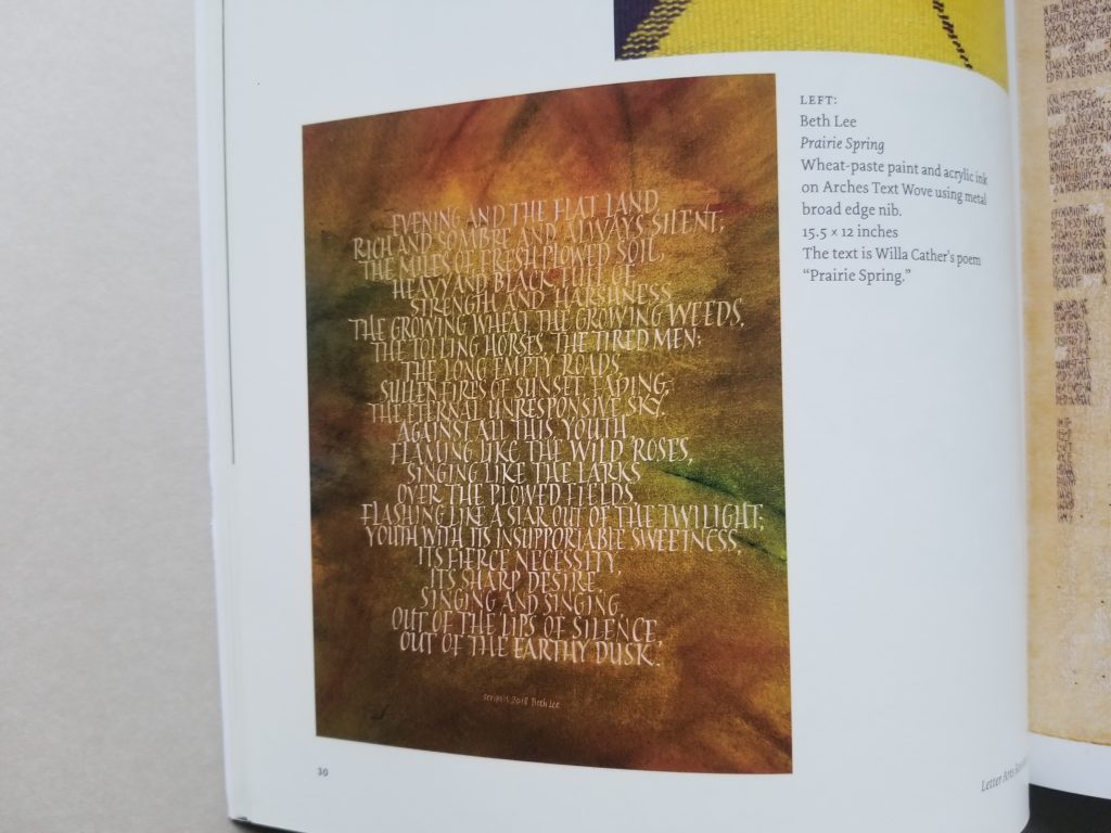
I’ve blogged about “Prairie Spring” before, here.

Calligraphy & more — the studio of Beth Lee, Redmond, WA
I’m honored and delighted that two of my pieces were chosen for inclusion in annual juried review issue of the Letter Arts Review. I’m in exalted company!
I’ve blogged about “Prairie Spring” before, here.
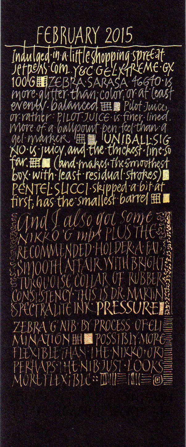
From a couple of days ago … trying out various metallic ink pens, including gel pens and ballpoint pens. Also, Nikko G and Zebra G nibs with Dr. Martin’s Spectralite gold ink formulated for airbrush work.
It’s difficult to type without the use of my left index finger. And that’s my excuse for the last few days’ silence here, although I’m still working daily on lettering.

Today was not a day for inspired lettering. But I showed up anyway. That’s what it’s all about (all hokey pokey aside). Maybe the muse will be there tomorrow when I show up. And I will show up.
Details of the crime: It was done by the C-2 Speedball nib with the White Schmincke Calligraphy Gouache on the black Artagain paper. The side crime was done by a Mitchell Roundhand #4 nib with Luna silver pan watercolor, mostly to make a comparison of coverage between white gouached and metallic watercolor.
I didn’t use any guidelines, but I did frame the text area using a Fons and Porter white fabric marking pencil, which I like for dark paper and painted backgrounds. The point stays sharp and the eraser that comes with it works well without damaging the paper. Not all of the 9″ x 12″ page is shown. I will eventually bind this folio into a notebook with other lettering trials.
One of my favorite combinations. You know it’s the holiday season.
This gold watercolor doesn’t show up well in the photo, but it’s nice and sparkly in real life.
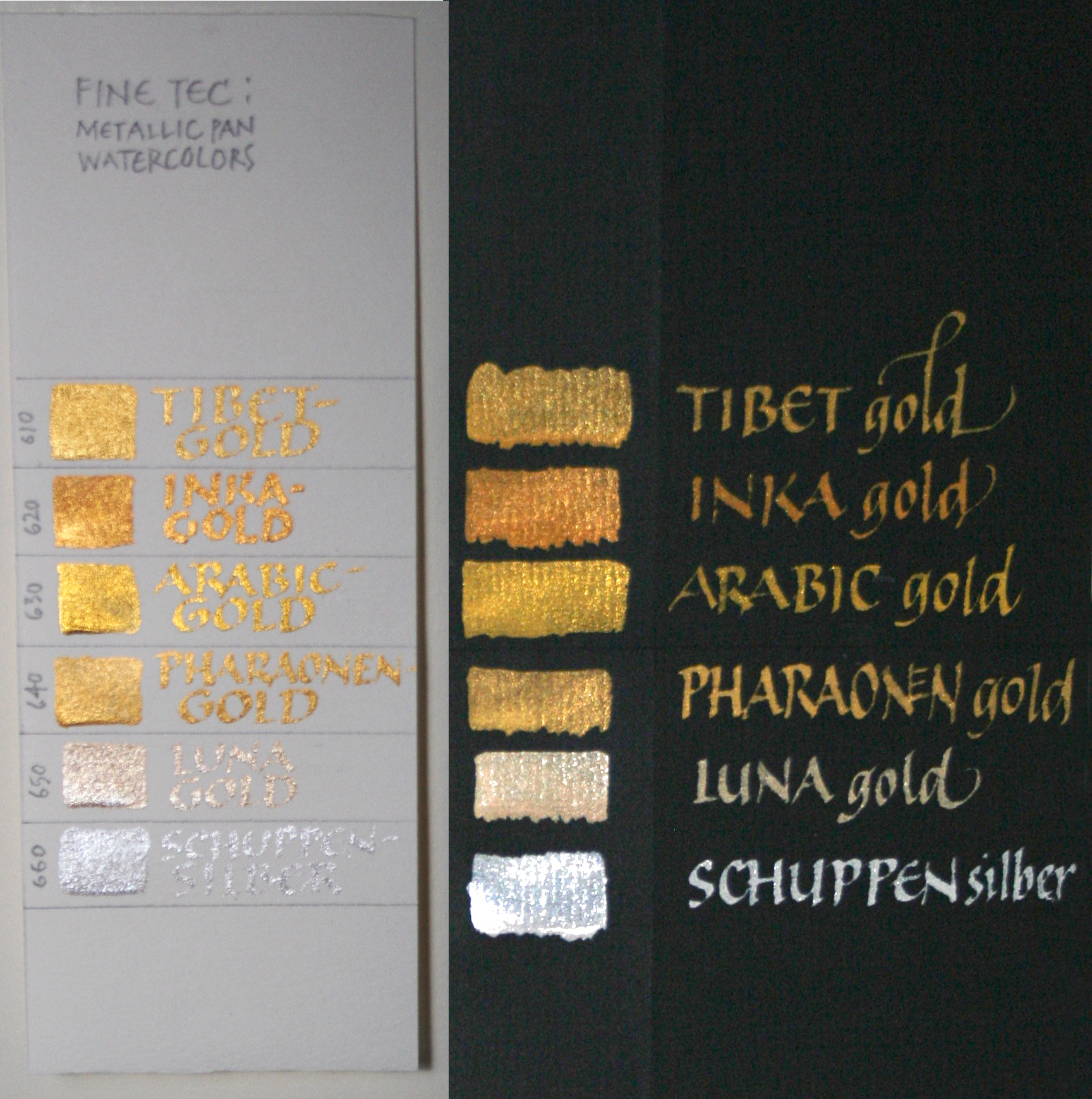
This summer at The Summit at Colorado Springs, I bought a set of Finetec gold watercolors, because everybody had been raving about them. As soon as I got home, I tested them out, on white paper and on black. This photograph doesn’t do them justice, even with an external flash and a diffuser. I’ll try a few more options, and maybe post a better photo later.
They are a new favorite for lettering, especially for broad-edge nibs.
 I’ve been busy on the book commission, but took a few minutes to do my envelope for the year-long 2011 Envelope Exchange. I’ve been spending a lot of time lately with my Epson wide-format new inkjet printer, and I carried that experimentation over to this envelope. (As usual, click on the image to see it at a larger size.)
These are the layers on this #10 Strathmore Laid envelope:

Another year, another sampling of gold inks. It’s amazing how different the gold inks and gouaches are from one another. I ordered some more gold inks after I did this sampler. Dr. Martin’s Iridescent Cooper Plate Gold ink remains one of my favorites. For earlier posts on metallic inks, click on the metallic inks label in the sidebar (or this link).
 Finally … something calligraphic!!
Here are the 4 envelopes I mailed yesterday for the Black Tie Exchange over at the Yahoo group, Calligraphy Exchange. The rules: Use a black envelope and either white or gold “ink” address in calligraphy.
I made my envelopes out of Strathmore Artagain black paper — comes in a 9″ x 12″ pad. The two insert square are on Arches cover black, I think. I used my favorite gold ink — Dr. Martin’s Copper Plate Gold.
Names and addresses blurred to protect the innocent.
As usual, click on the image for a closer look.

Here’s an example of a valuable scrap of an experiment I’ve saved from a job in which I had to match a very greenish gold printing ink. The notes have come in handy in later years. If you click on the image above, you should be able to read my penciled notes. In case you can’t, I’ll repeat them here. All the paints are gouache, a calligrapher’s best friend because they aren’t transparent as watercolors are, and yet don’t dry fast and turn to plastic as acrylics do.
Row 1: I started with equal parts Schmincke Glitter Gold + Schmincke Bronze.
Row 2: added Winsor Green.
Row 3: a little more Winsor Green, and a little more.
Row 4: a little more Winsor Green to the first row-3 block, and a little Yasutomo black stick ink to the second row-3 block; then a little more stick ink, and then a little less stick ink
Since a block of paint doesn’t look like a block of lettering, I continued on with lettering to further tweak the ink matching, using the ink from the last block on row 4, then adding more and more black. Notice that on the 4th line of lettering I didn’t change color at all, only taking off the pen nib’s reservoir; however, the 4th line looks darker than the 3rd line. Especially with metallic colors, the reservoir seems to collect color/metallic particles behind its tip and make the delivered paint more watery.
By the way, I’m using a Mitchel Roundhand nib here, probably a size 2½. The whole page is about 7″ x 8″. And this photo shows no light reflection. I tried to get a photo to contrast the color with light reflection, but no luck.

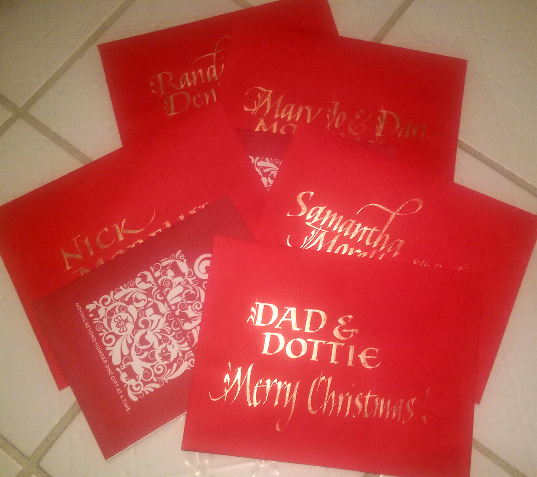
Well, it’s that time of year: The Season of Gold Ink.
I just finished a Christmas-card-addressing job. Some of the envelopes were red, and some were a creamy white. The two you see here are — obviously — the remains of a couple of errors. I shouldn’t say “obviously”. You, my readers, may be calligraphers, in which case you most likely looked more carefully at the letter forms than the actual words, a tendency which non-calligrapher friends and spouses find humorous.
Anyway. As I was saying.
I thought I would have to use two different media: a light gold for contrast on the red, and a darker gold for contrast on the white. I started with the red envelopes and Schmincke gold pearl calligrapher’s gouache, which is about the lightest gold I know of, excepting only the late lamented Schmincke platinum gouache. Although it worked well on the red, the pearl gold is too light to make enough contrast on the creamy white. I checked.
After awhile I switched to the creamy white envelopes. After some experimentation, and a look at a handy metallic colors guide I painted awhile back (maybe I’ll blog that later), I determined that after I shook up my bottle of “Dr. Ph. Martin’s Iridescent Calligraphy Colors 11R Cooper Plate Gold” ink (henceforth known in this post as “long-name ink”) — and it took a very long time before I could see movement on the bottom of the bottle when I turned it upside down — umm, I lost my train of thought. I think I was headed toward something about the little ball in the bottle of fingernail polish that could have helped this process … Have I mentioned that I’ve had a sinus-and-respiratory infection for 13 days? This is my 2nd day of antibiotics and I’m feeling quite light-headed (haha). Or it could be the Claritin.
Anyway.
I used the long-name ink for the creamy white envelopes, since it was dark enough to contrast with the paper. And the ink was so much easier to use than the gouache! With the gouache I was constantly re-mixing with the brush, occasionally cleaning the nib, and sometimes going over letters twice. With the ink, I just reloaded the pen nib with a a drop from the dropper onto the top of the nib and kept going.
So when I switched back to the red envelopes I tried the long-name ink on one, and was surprised to see that the contrast was just about equal to the contrast I had been achieving with the gold pearl gouache (which took 25% longer because of the mixing and double-stroking, etc.). I never looked back. The rest of the envelopes were done using long-name ink.
As usual, click on the photo for a closer look.
The creamy white envelope shown (poorly photographed, sorry) has an address in long-name ink, with a contrasting vertically oriented note in the gold pearl gouache. The difference in contrast with the paper doesn’t show up so well here as it does in real life.
The red envelope’s first line of the address was done in gold pearl gouache, and the rest in long-name ink. There’s almost no difference in contrast here or in real life.
P.S. Anybody get the zip code references? (Looking back, the entire post seems to be a very broad hint.)