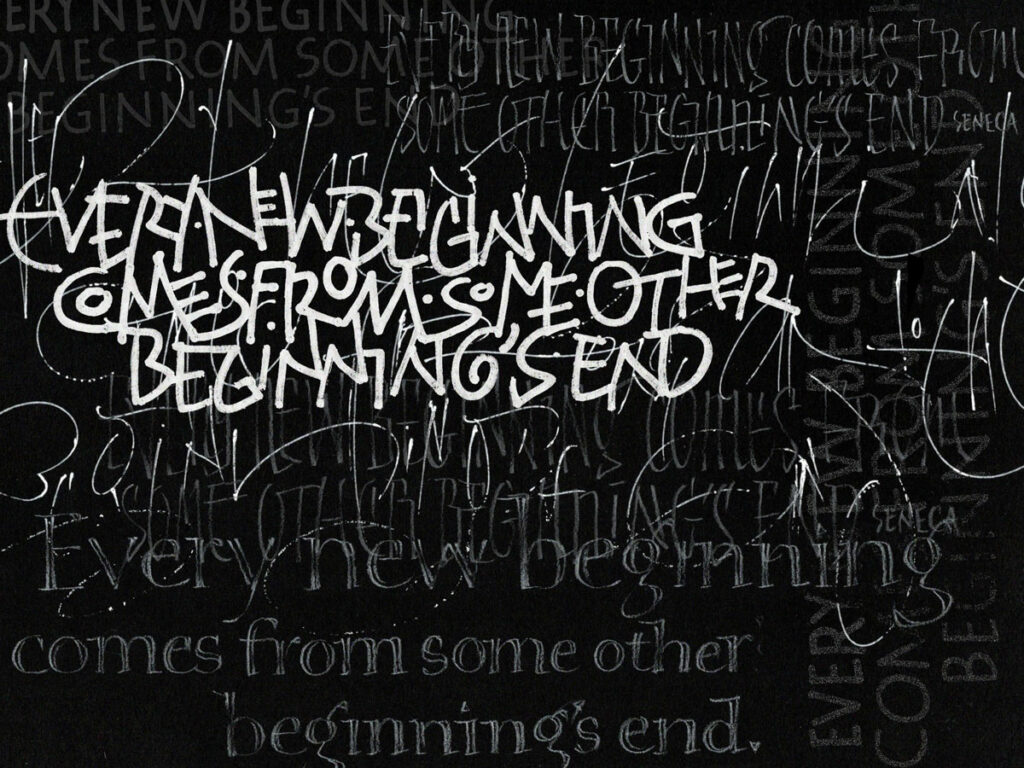
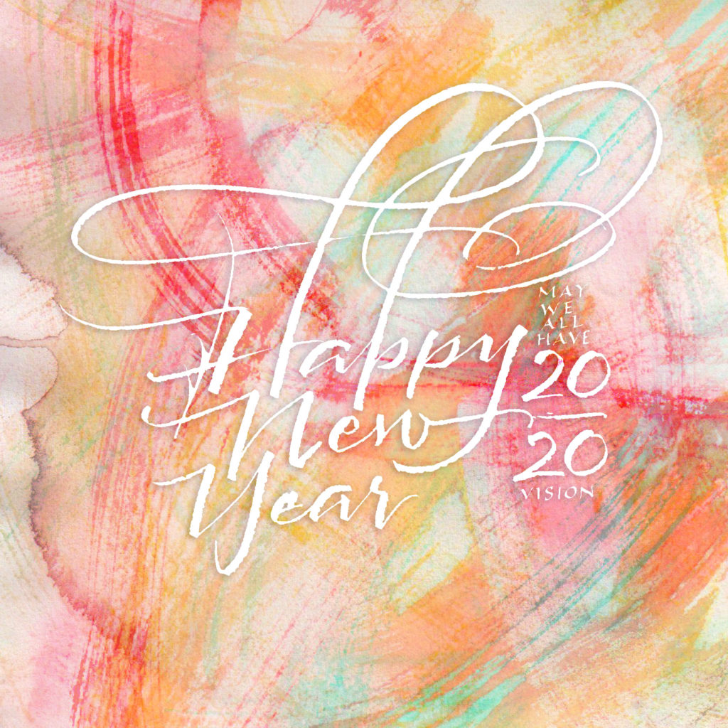
The first prompt of the year in our FB group is “Clean Slate”. I like the idea of a clean slate, but I’m not so sure I believe in ’em. A well-scraped palimpsets, maybe: they’re way more interesting, anyway.
Calligraphy & more — the studio of Beth Lee, Bozeman, MT
The first prompt of the year in our FB group is “Clean Slate”. I like the idea of a clean slate, but I’m not so sure I believe in ’em. A well-scraped palimpsets, maybe: they’re way more interesting, anyway.
When I’m laying out hand lettered text in Photoshop, there are a few shortcuts I always use. If it’s been awhile since I did a digital paste-up, I have to look up the shortcuts online because I’ve forgotten them. So I’m posting this for my benefit as much as for anyone else’s use. I use a PC because that’s where my latest copy of Photoshop (CS5) is. If you’re on a Mac, make the following substitutions in the notes below: Cmd = Ctrl and Opt = Alt. Because your workspace is likely not to look just like mine, some of these steps may require a little Googling to adapt them to your setup. Most of this can be done using Photoshop Elements, I think, but the tools are organized a little differently from Photoshop.
I’ll use this common scenario:
Here’s an overview of what I do. I begin with two files — the scanned text stitched together digitally, and the master document with a circular mat which delineates the area that will hold the text. I drop a merged layer of the scanned, stitched text onto the master document, use the penciled guidelines to create digital guidelines. Then I cut up the lines to fit the matted circular area just the way it used to be done with blue-lined paste-up boards (my master document), wax (Photoshop) and printed copy (my scanned text file). It’s not a short process, but if you’re proficient in Photoshop it’s not a fiddly as this description might seem to indicate.
The advantages of digital paste-up over physical paste-up are that these files are available for future use and they can be reused, enlarged, reduced, and guidelines mixed and matched in a way that doesn’t work in physical paste-ups.

Here I’ve scanned some daily lettering I posted recently. The original is 12″ x 18″. It was scanned in three parts because the whole thing won’t fit on the scanner. I’ve stitched these three parts together into one T file, and purposely let the edges of the pieces show here, so you can see the stitching. (Click thumbnail for a closer view.)
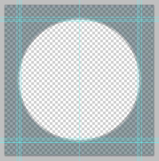
Create a “matted circle” the size of the circle in which you wish to position the text:
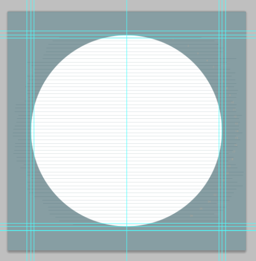
At this point, I have the two files, and they’re both open. I drag the top layer (only) of the T file onto the master document. This should be familiar process, as you’ve probably done step 3.D. of the first file at least twice by now. You can close the T now, so that only the master document is now open.
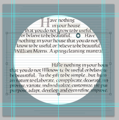
For this screenshot, I’ve turned off the visibility of the T layer. I’ll mention here that I’m using the master document from the “real” job I’m working on today, but I’m using the T file created from recent daily lettering. There are three sets of dimension guidelines because I had the devil’s own time getting the real lettering to fit properly, so there have been three sets of dimensions and three circle mats. This screenshot shows the original lettering/paste-up guidelines, but you’ll see that on the next screenshot the guidelines are further apart. Between this screenshot and next I just lengthened the guidelines layer to match the guidelines on my daily lettering T file. In a non-digital environment I would have had to re-draw those lines.
I can print file with the T file not visible for use as a guide for my final lettering. Usually I’ll just fold it in half vertically, copy the lines as tick marks on my good paper and then pencil the guidelines on the good paper with a T-square. (Click thumbnail for a closer view.)
Now begins the copyfitting. It doesn’t hurt to add up all your line lengths to make sure this going to work before you start this step. The sum of all the line lengths of your trial lettering should be close to the sum of all the lines within the circle.
This screenshot shows work in progress on pasting up (not that I’ll finish it.) Line 6 was a little long, so I compressed it just a bit. When a paste-up is finished, I can print it full-size, tiling the printing over several pages if necessary and tape it together. I can then use it as a guide when doing the final lettering. I can fold the printed piece to the current line I’m writing, and place it just below the line of writing where it can double as a guide and a hand guard.
Whew! It’s a lot quicker to do than to explain, especially after you’ve done it a few times.
If I’m doing this for Hebrew lettering, I’m always in danger of skipping or repeating text, much like the illiterate medieval scribes writing out Latin texts. To minimize errors I will often make a copy of the T layer, lock and hide the original layer at the bottom of the layer stack, and instead of copying and pasting the lines of text I will cut and paste (step B Ctrl+X instead of Ctrl+C to cut and Ctrl+Shift+V to paste in place). Or copy and paste, but then erase each line from the T copy layer as I go. This helps me to keep track of what I’ve used and what I’ve got left to use.
*This is a shortcut I use a lot — it simultaneously duplicates and merges all visible layers. Turn off the visibility of anything you don’t want included. Select the top layer to make it active, then Ctrl+Alt+Shift+E.
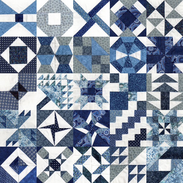 I’ve been making a Farmer’s Wife quilt, a sampler quilt consisting of 111 unique blocks. Since the beginning of the year, my sister has been posting tutorials, templates, and settings on two or three Farmer’s Wife blocks each week on her blog, Handmade Karma, and I’ve been trying to keep up — with variable success. Upon finishing the last block of week 10 this morning, I now have 25 blocks completed to date. (Click on the image to see it full size.)
This image was a quick little exercise in Photoshop: Scripts > Image Processor > Resize to Fit all my scans to 120 px square, set up a 600 x 900 px image with vertical and horizontal guidelines at 120 px intervals, open all the small files and drop them onto the grid. Can a Photoshop document have 111 layers? A quick google answers that question: the maximum number of layers in Photoshop is … 8,000. Wow. Who would do that?
Shown here are the 25 blocks, in no particular order. I can see that at the end of the block-making part of this quilt, I will be spending a good deal of time figuring out block order. And what to do about sashing? Not to worry: those decisions are for the future.
Meanwhile, I’ve been examining optional settings on this Pinterest board, and my sister has been pinning our squares to her Pinterest board here.
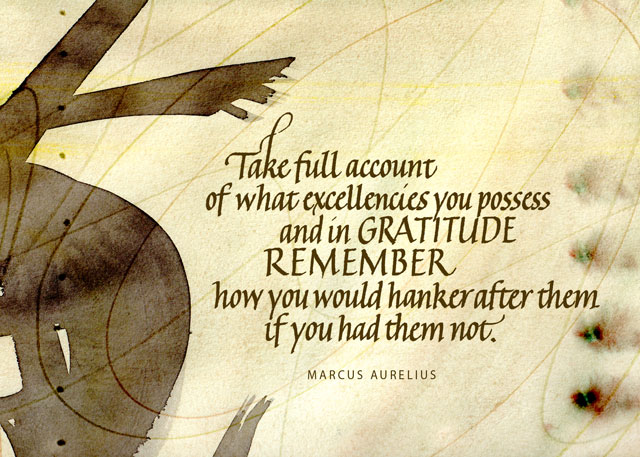
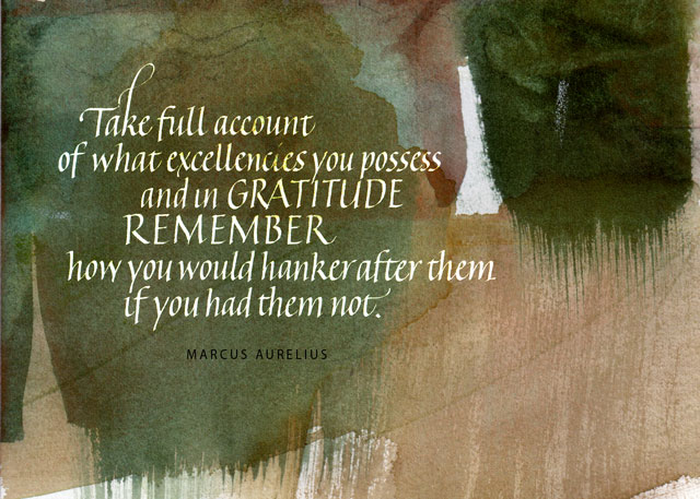
Our local calligraphy group here has been choosing a quotation a month from ten qualities that make up what Dr. Barbara L. Fredrickson calls a “joy portfolio,” helping to build resilience in the face of hardship:
We’re at month 8 (or 9, I’ve confused myself as to whether the numbers represent work months or due dates), and I’ve only got a couple of completed. So this month I going to attempt to finish all the unfinished quotations.
I had thought to use the quotation below for “gratitude,” but I’m having trouble finding a quotation I like for “pride,” and this might work for that. I double that either of these is the final version, although they are the 3rd and 4th versions if you count the plain-white-background version as a 2nd version. The backgrounds are scans of watercolor studies (or, if not study, serendipity) that I’ve painted in the past. Maybe I’ll post the 1st version, which was as much finished thumbnail as a draft. So much for progress: I still don’t have a finished piece.