More Akim lettering for our guild project

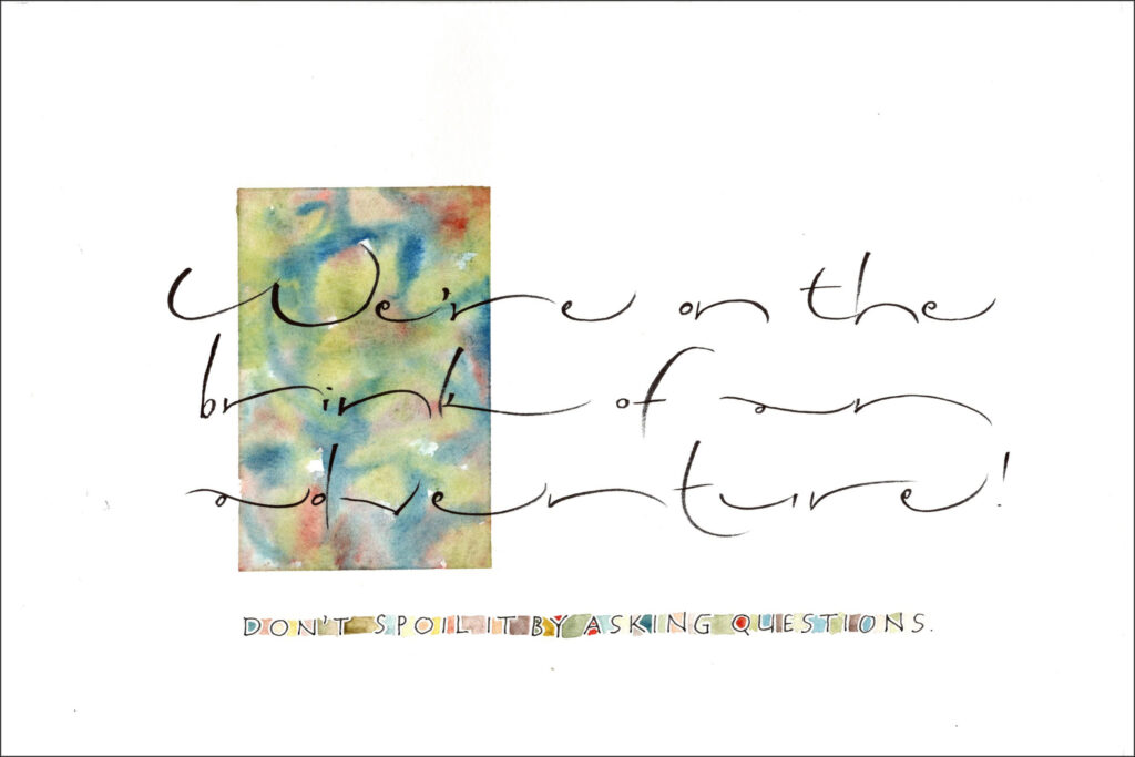
Gouache, Zig Cocoiro brush pen, ZIG Mangaka 01 pen on Canson XL watercolor paper. 6 x 9 in.

I’m continuing to enjoy Akim lettering. I made these in preparation for next month’s local guild meeting. Even though I switched to a brush pen for the main lettering, I tried for a fairly monoline effect. I love doing Akim lettering with a brush pen.
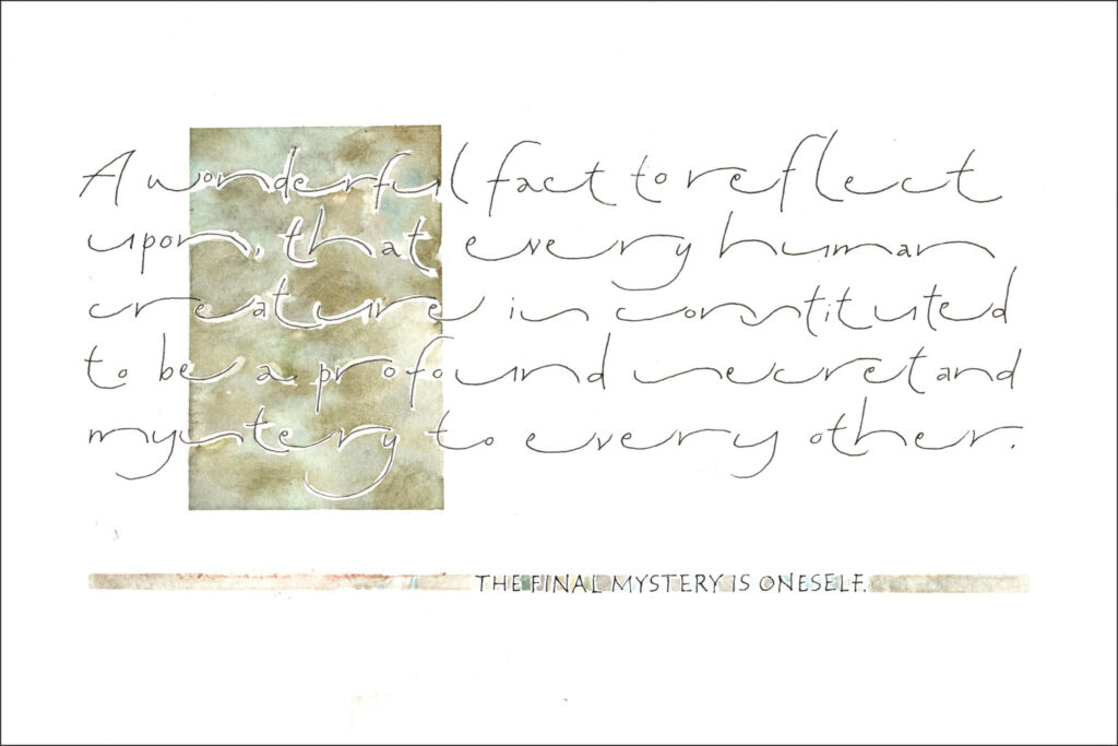
Gouache, ZIG Mangaka 01 pen on Canson XL watercolor paper. 6 x 9 in.

Here I used the same palette as for the first one, but mixed neutrals. After I penciled in the box and did the main lettering, I went over the lettering inside the box with Pebeo masking fluid and a bowl-pointed pen (didn’t want to ruin my tiny brushes). Then I painted in the box. When the paint was dry, I removed the masking fluid with a rubber cement eraser. I had done a pretty bad job of tracing the lettering, but that was all right. And where it was just too egregiously out of whack I painted some neutral back in and blended it with the rest of the painting.
Akim – a surprisingly enjoyable script

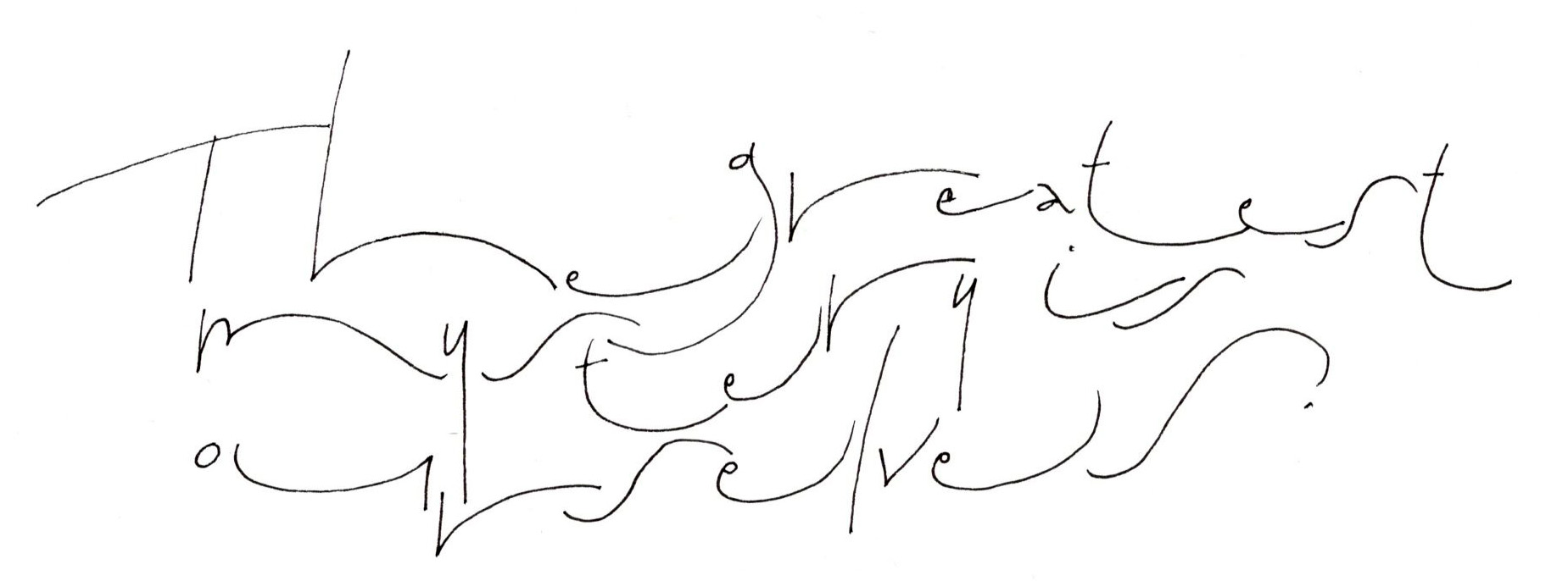
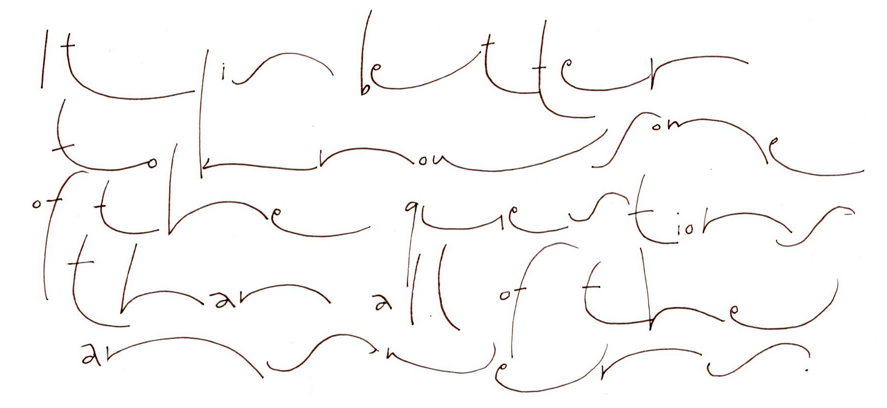
Studying Akim for our guild’s long-term project with monoline lettering. Here the lines are discrete, but the letter elements are stretched to maximize the graphic impact and slow down reading. Fine-line marker on Clairfontaine paper. About 4 x 6 in, as I recall.

I’ve come across Akim script several times over the years, most usually because I return again and again to Hans-Joachim Burgert’s book The Calligraphic Line. This script is an approach as much as a hand, developed by Burgert. Until now, it has not drawn me in. But now I see it as a relaxation of the confines of lettering in favor of the graphical aspect of the page. And I’m really enjoying it.

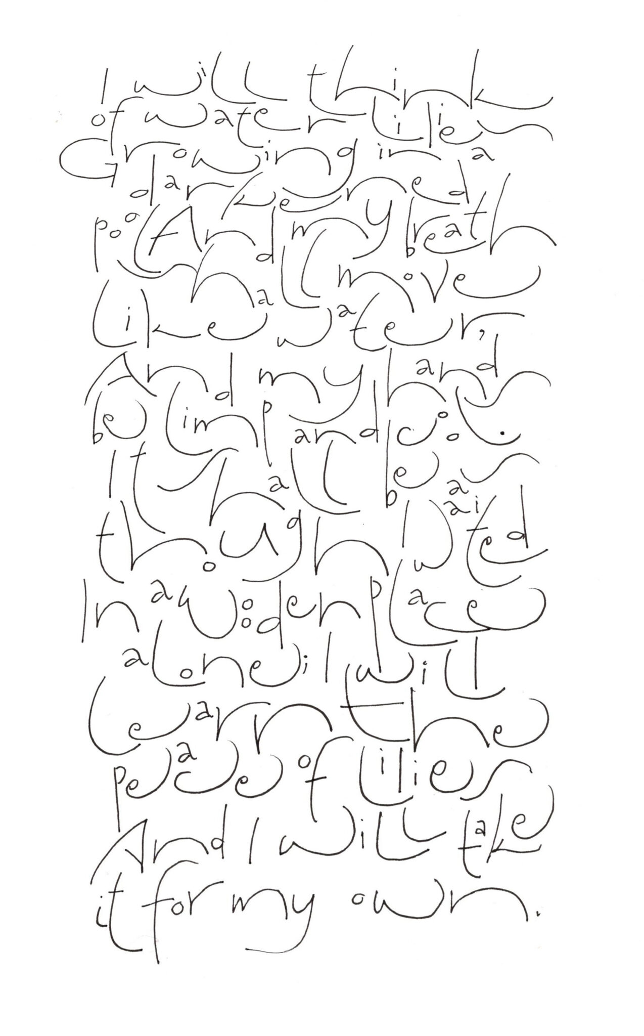
These pages were done while sitting at the piano through many hours of choreography and staging and technical rehearsals for a production of “Carousel.” All I needed was a pad of Clairfontaine Triomphe paper and a fine-line marker. (I didn’t even need guidelines, a circumstance that is quite freeing.) Most of these were done with ZIG Millennium markers, sizes 005 to 03.

Here the lines are baselines are allowed to wave, but the lines intrude only sometimes upon one another. Fine-line marker on Clairfontaine paper. About 4 x 6 in, as I recall.
Akim script practice
Here I’m exploring a less linear texture by allowing the lines of text to intrude upon one another. Because of this intrusion, I’ve lessened the contrast between the letters’ wide arcs and the small counters. The text is “After Quiet,” by Hazel Hall. Fine-line marker on Clairfontaine paper, about 8 x 10 in.