Music Quote & Envelope Exchange


Yikes! I’m two weeks overdue on this exchange. Does anybody else get August and September dates mixed up when they’re in numerical-month — 08 and 09 — form? Anyway, this morning I got on the stick and got them done. They’re going in the mail today.

Here’s the way these started. I had:
1) A quote is by Auerbach: “Music washes away from the soul the dust of everyday life.”
2) A scrap piece of paper with a cut-out square in the middle — from the Concertina Carnival book I constructed the other day.
3) Some leftover square invitation envelopes from a wedding job.
4) Some scraps of watercolor paper which I cut 6.75″ square to fit the envelopes.

Just to get started, I wrote out the quote on this scrap of paper. I put the word “Music” above the cut-out square, realized I wasn’t going to have room at the top for the rest of the quote and so wrote the rest of the quote below the square. And voila! I had my design.

I masked off a 1.75″ square in middle of my scraps of watercolor paper, cut an abstract violin/viola/guitar shape from a couple of pieces of removable Scotch tape, rummaged around in my drawer for a palette with some gouache colors already on them … and had some fun. In the process, I got out a gold gel pen, the luscious Sennelier oil pastels I bought so long ago and some cosmetic sponges for rubbing the oil pastels over the gouaches.

The envelopes are supposed to have a teaser on the outside as to the quote inside. I painted my spattering brush with brown for dust, but I guess the blue that was dried on the brush had more effect than the brown.

It’s been a fun morning.

Concertina Cabaret

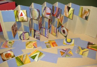
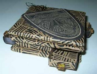
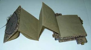
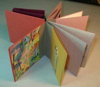
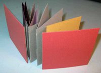
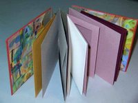
This morning I’m making a model of the “Concertina Cabaret” structure in Michael Jacobs’ latest book, Books Unbound. Except for my painted endpapers and the tomato red cover papers (and perhaps the olive green pieces), these are not familiar colors. Actually, I don’t know what “my” colors are anymore; the colors in the painted endpapers are pretty new to me still. But I digress.

The reason I took this picture is to preserve that feeling of satisfaction at this point in the process: all the pieces are prepared and I’m ready to begin constructing the book — each piece grain identified, papers measured, re-measured, cut, labeled. At this point — and this is true even if I’m constructing a book whose structure I’ve worked out on my own — it almost feels like I’ve constructed a kit, and it only remains to fit slot A into sleeve B, etc. It feels this way even though I know from bitter experience that at some point in the process it will become clear that slot A will never fit into sleeve B because piece C was cut 1/8″ too short, or because I forgot to allow for the width of the fold X, or … The possibilities for miscalculation are endless.

Foreknowledge notwithstanding, the feeling of satisfaction at this point in the process remains. To paraphrase Rona in “The Twenty-fifth Annual Putnam County Spelling Bee”, “It’s my favorite moment in the book.”Fortunately, as with Rona at the spelling bee, I have more than one “favorite moment” in the making of a book.

Morning glory

Well, it’s August in Florida, and both the refrigerator and my studio air-conditioning are broken. I haven’t done a creative thing in forever.

But the morning glories blooming on the compost heap this morning are an unexpected pleasure.

That’s birdseed coming up in our otherwise-unused garden. In light of the pair of hawks which have taken up residence, I feel just a little guilty luring birds to our house. But evidently not quite guilty enough to stop …

Broad-edge script

I’ve been away on an of-my-gosh-school’s-about-to-start-and- we’ve-got-one-more-opportunity-for-a family trip. Now I’m working on addressing wedding invitations. Here’s a bit from the invitation itself:

Although I first thought I’d use a pointed-pen script for the addresses, after struggling through a few envelopes I quickly bowed to the necessities of the materials. The paper proved to be way too toothy and not at all sized enough to allow the use of a pointed pen.

I could include a rant here about wedding stationers and their high-priced unwritable stock — even Crane has been known to make their envelopes inside-out at times, so that the sizing is on the useless inside of the envelope. Oh, the torture of having the beautiful side of the paper so close and yet so far away. It’s like a tying up a horse within 5 inches’ reach of water. All right, all right, I’ve just deleted the rest of this rant. Calligraphers know exactly whereof I speak, and the rest of you can only imagine our pain.

Anyway. On with my saga.

After I concluded that pointed pen was impossible for these envelopes, I started experimenting with a #5 Mitchell Roundhand nib — a narrow broad-edge nib — and tailored a script that I think complements the script above. Here it is (as always, click on the thumbnail for a closer view):

I began with a standard italic, and then made changes so that it more closely resembles a pointed-pen script such as Copperplate. I used the same lining guide I had set up for the original pointed-pen script, and this had the effect of a) making very small lower-case letters, b) enlarging the capitals in proportion to the lower-case letters, and c) slanting the lettering from the usual italic 5-15 degrees to about 40 degrees.

Then I modified the capitals to follow Copperplate forms a little more closely. See the B, the T’s and the F’s. This modification worked because the capitals are so tall: 11 pen-widths.

The x-height is 3 pen-widths tall, which necessitated a widening of the script.

And, voila! I like this script. I think I’ll add it to my standard style offerings.

Embossing


Yesterday afternoon and today, Ashley and I have been working with embossing. I’m participating in an exchange on the Yahoo Calligraphy Exchange, and today’s the deadline for mailing mine in.
To the left is the 5″ x 7″ artwork. Beneath is a portion of the envelope, which should contain a hint as to what’s inside, some embossing and some calligraphy. (The envelope is cropped to protect the innocent 🙂 )

Messing around in my recently clean studio


My 11-year-old niece Ashley is visiting for a short week of art camp. Yesterday we got out all the Zig markers — and I’ve got a slew of ’em: writers, calligraphy, brush-and-scroll — and spent half the day playing around with them. Here’s my experiment, on Fabriano cold-pressed watercolor paper. The bamboo comes out of a booklet, Color Layering System, by Suzy Ratto. The rather strange column of lettering is based on one of Hans Joachim Burgert’s pieces.

Crossword Puzzles, Music and Calligraphy

The other night I saw the movie “Wordplay”, an absorbing documentary about the crossword puzzle world. It features Will Shortz, the man who has influenced crossword puzzles so profoundly in the past couple of decades, as well as several expert puzzle makers and solvers.

My thoughts keep returning to the following bit in the movie. The narrator begins by saying that most expert crossword solvers come from math or music backgrounds, and speculates that this is true because both mathemeticians and musicians are practiced in, and probably drawn to, decoding written symbols in real time. One of the expert crossword solvers featured in the movie is also a musician — a pianist — and he accompanies contestants who participate in the talent show at the annual crossword puzzle contest. He usually practices with the contestants just once (if at all) before the talent show, and so his accompaniment is necessarily a real-time decoding of the music. He describes the satisfaction of being able to do this, and the sense of flow that comes with the process. I really identify with this description, both as a musician and a calligrapher. It’s probably why I’ve always been a better sight reader than a memorizer. I really love that decoding process.

Both music and calligraphy occur in time. It’s this relationship of time to calligraphy that sets novice calligraphers apart from master calligraphers. I can’t remember which teacher has described calligraphy as a record of a performance. Sheila Waters once said that it was more important to get the rhythm of lettering, and then work on the shapes — strong words from The Stickler for letterforms!

Ewan Clayton has been experimenting with teaching calligraphy by gesture rather than by structure. This approach could lead to a revolution in calligraphy education along much the same lines as the revolution that the Suzuki method brought to violin education. My son, who has had ten years of Suzuki violin education, has a very different kinetic understanding of music than do I, who learned scales and letter names and theory well before any teacher began to teach me about phrasing and different touches.

Working

I haven’t been doing much lately except certificate fill-ins and cleaning my studio. And I’ve gotten back to working on the latest Hebrew calligraphy assignment from Izzy Pludwinski’s correspondence course. So I haven’t been posting much.

In the meantime, take a look at the work of a couple of calligraphers I met in Jerusalem this past month:


Izzy Pludwinski —
His website, www.impwriter.com features galleries of ketubot, fine art, liturgical work for synagogues, his limited-edition book Song of Songs, Judaica, commercial work, and more. There is also information about the Hebrew calligraphy correspondence course I began there and am finishing here.

David Moss —
This website, www.bet-alpha-editions.com, shows a tiny slice of the work of this prolific calligrapher. He brought out piece after piece in his studio for us to look at. And I was reminded of the story of one of J.S. Bach’s pupils asking him, “Papa, how do you ever think of so many tunes?” to which Bach replied, “My dear boy, my greatest difficulty is to avoid stepping on them when I get up in the morning.” I’m sure that David Moss suffers from the same difficulty.

Mystery bird

Anybody know what this bird is? It was hanging out between the front pond and the front walkway this morning, not at all flustered to have three chattering people burst in on its space. And it waited for me to go back for the camera.

I’ve looked through several bird databases online, and in several good books on North American birds, but I don’t see anything like it. Maybe it’s a young something that looks different when it’s older?

It’s not a small bird. To give you idea of scale, the larger shiny brown leaf on the ground is a magnolia leaf. Click on the picture for a better look