
I don’t think we’re in Florida anymore, Toto
Calligraphy & more — the studio of Beth Lee, Bozeman, MT
I’m finally settling in here in Bozeman. In the meantime, I’ve been collecting some interesting things to blog about, and now I’ve got a bit of time for it.
Several great book arts exhibitions are online. Don’t miss these:
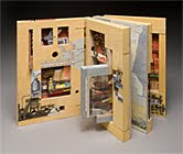
Marking Time — a juried show under the auspices of the Guild of Book Workers. Shown here are books by Susan Collard and Bridget O’Malley. Clicking the images takes you to each of their pages in the online exhibit.

The Minnesota Center for the Book Arts has awarded their first annual international artist’s book award: The MCBA Prize 2009. See the winner, the finalists, and all the submitted books here.
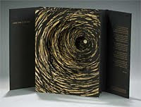
This past June at 23 Sandy Gallery: The Beautiful Book: Exploring the Allure of Artist Books. The image is of Susan Lowdermilk’s book in the show, and clicking it takes you to that page of the exhibit.


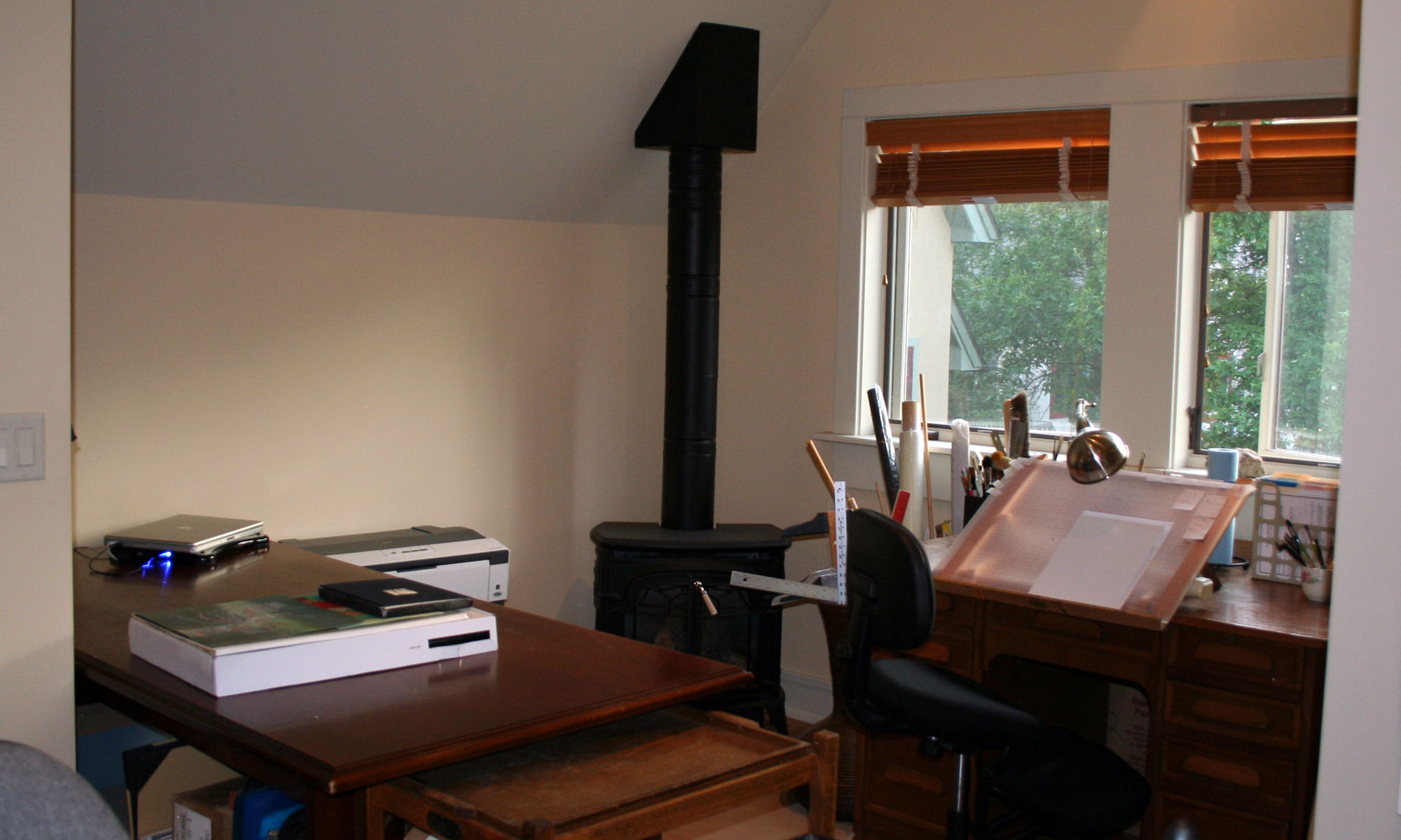
Well, I’m here. My studio is not quite the pile of boxes it was earlier in the week, but it’s still a wreck. I can’t find my “real” camera, but here are a couple of shots of the chaos that is my new studio. It’s a huge studio — these pics only show 2 opposing corners of it.
It’s been quite a trip. We drove from Tallahassee to Bozeman in a little less than a week. From Sioux Falls, Iowa, all across South Dakota, and into Wyoming we were driving through the Sturgis rally — Harleys stretched that far along US-90. I got some pictures — if only I can find my camera, which I’m sure I put somewhere for “safekeeping” (my standard method for driving myself crazy).
Yep, I discovered this morning that my website (callibeth.com — don’t bother to try it today) was hacked a week ago. It’s been cleaned up, but I’m still waiting for Google to clear it for browsing. What a drag. I had a strong password, but evidently it wasn’t strong enough.
Meanwhile, back at the ranch … Am I using that phrase because we’re moving to Montana? I hope not. The kitchen is all packed up (we even packed the plastic tableware by mistake), most of our clothes, all the sheet music and nearly all the books are packed away. I was holding out the books for a paper that was due (and therefore finished) today, among them:
Spring Lines, edited by Ewan Clayton
A History of Illuminated Manuscripts, by Christopher de Hamel
The Ideal Book, by William Morris
Words as Images: Contemporary Work from the Society of Scribes and Illuminators
Time: Past, Present and Future, the 5th Calligraphy Exhibition of the Alpha Club (Japan)
The Book As Art, by Krystyna Wasserman (NMWA) plus Johanna Drucker & Audrey Niffenegger
More Than Fine Writing: The Life and Calligraphy of Irene Wellington, by Heather Child et al
American Book Design and William Morris, by Susan Otis Thompson
Zen Brushwork: Focusing the Mind with Calligraphy and Painting, by Tanchu Terayama
Graphic Design History: A Critical Guide, by Johanna Drucker & Emily McVarish
Letterwork, by Brody Neuenschwander
Words of Risk: The Art of Thomas Ingmire, by Michael Gullick

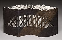
Take a look at the winners of the DB International Bookbinding Competition. Here’s a little more information about the competition. The book being bound in each case was a specially commissioned fine press, limited-edition (500) publication from Incline Press, entitled Water. It contains poems and illustrations about water.
I love to see all the different approaches to the same subject. I’m probably denigrating this exhibit to compare it to a challenge quilt exhibit, but I love both in the just the same way. They’re both testaments to the individual creativity of us humans. The image shown here is of the 2nd prize book, made by Jenny Grey.

With all the chaos here, I had gotten behind in my exchange envelope commitments. Not anymore. I’m all caught up … until July 1. In keeping with these hard economic times, the theme for these is Frugality. Recycled envelopes, a dried-up Zig calligraphy marker, and a re-purposed Zig Millennium mark cut to a chisel edge with an X-acto blade.
The envelopes frame a bit of doodling. I don’t know what to do with it, so it just sits on the table reproaching me for my indecisiveness.
As usual, click on the image to get a closer look.

This wonderful article, Shop Class as Soulcraft, has been expanded into a book of the same name that is on my short list of books to read.
In this article at The New Atlantis, Matthew B. Crawford compares today’s trend toward design that hides how it was made (automobiles which have “another hood under the hood”) with the full-disclosure philosophy of bygone Sears catalogues which used to include blown-up parts diagrams and schematics.
He suggests that we resurrect the ideal of manual competence, and describes the goodness of concrete work which is integrated, diagnostic, individualistic and fulfilling. There’s a lot more; read the article. I’m going to read the book.
This discussion has some parallels with what I’ve been thinking about the past couple of weeks: the fate of specialized manual tools in today’s world. I’ve been cleaning out my studio in preparation for a move. Over the past 24 years that we’ve been in this house, I’ve amassed duplicates of many of my tools. I’ve got a box started for Goodwill, but what is the use of sending a lettering guide (I have 2 extra) to Goodwill? How many customers will recognize this little piece of plastic as a valuable tool for calligraphers?
Thanks to Dave Allen for mentioning this on the Book Arts-L.

One of my summer my art history classes is French Gothic Cathedrals: Chartres, Reims, and Amiens. Tomorrow we’ll be out on the green, laying out the apse end of a Gothic cathedral, using a rod (okay, 1/2 rod, out of PVC), hemp string (okay, nylon), and stakes. Bonus homework for tomorrow is to draw a decagon on graph paper using only a compass and straight edge. I’m not a good instructions reader, I guess: I drew mine on plain paper with a compass and square. I had a blast. I’ve made a PDF of the above diagram with step-by-step instructions that you can download from this link or from my experimentation website.

This is one of several pieces I did last month for the show “Made” at Railroad Square. Now it’s headed to the summer showcase, a juried invitational event at the Thomasville Cultural Center 25 miles up the road from my house.

This piece of paper-cut lusciousness, by Bovey Lee, is one of the 100 shown in a recent blog post at Web Designer Depot. I’ve mentioned some of these artists before (Peter Callesen and Su Blackwell in particular), but the image list is impressive. I’ve listed links to other paper-cut artists in this earlier post.