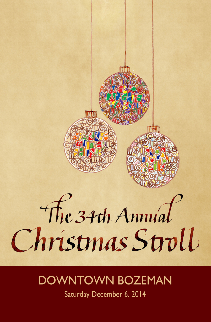
My poster design was not chosen for this year’s Christmas Stroll, but I did get second place. The image of it in the newspaper today was tiny and grainy. This one is better:
Something every day
That’s my plan. I try to practice lettering every day. Now my plan is to scan it and upload it every day too.
Today I had only about 15 minutes, so I used a scrapbook marker on a scan of some earlier painting printed on Mohawk Superfine paper — Eggshell, I think.
How chiyogami is made
An interesting video about the printing of chiyogami paper:
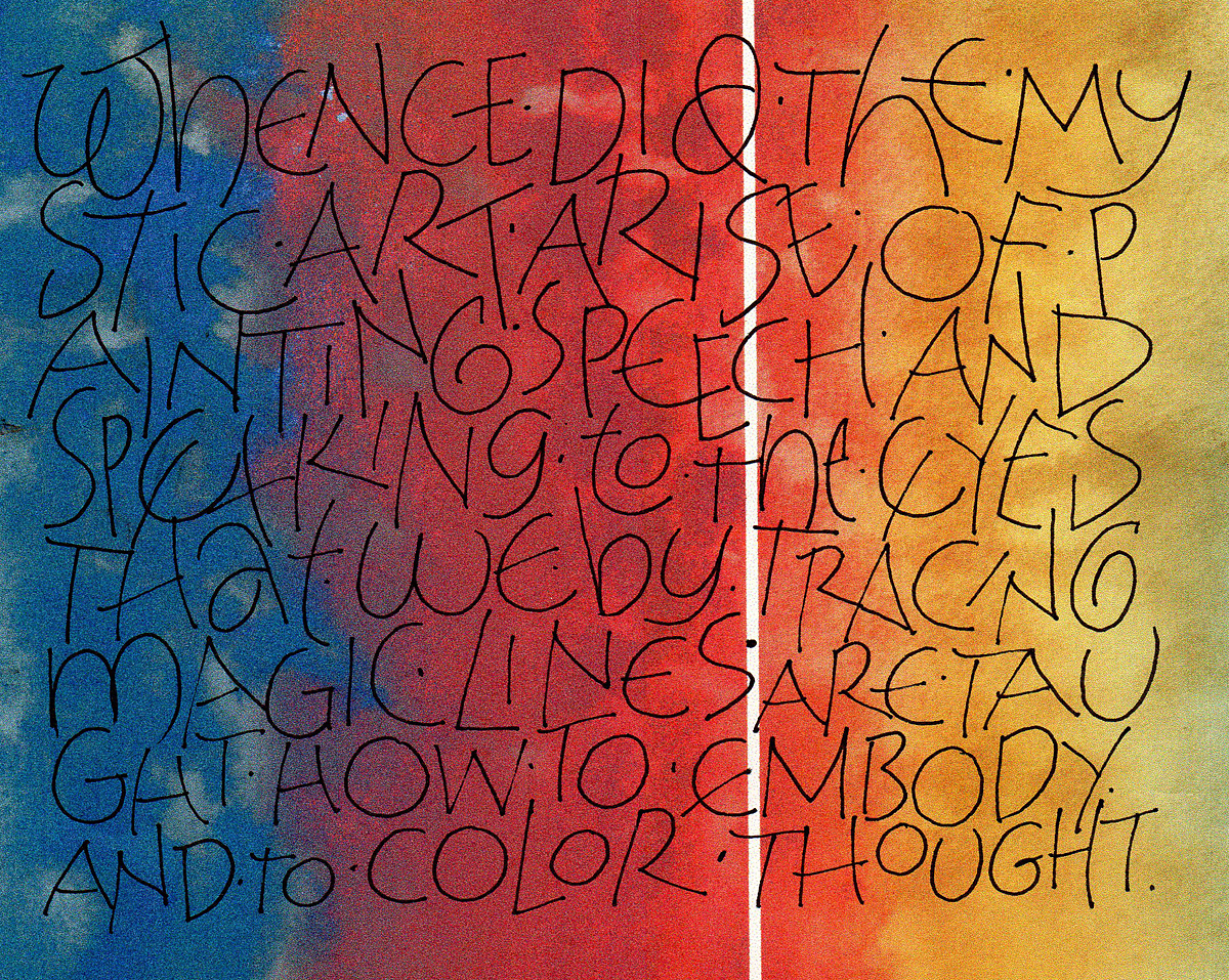
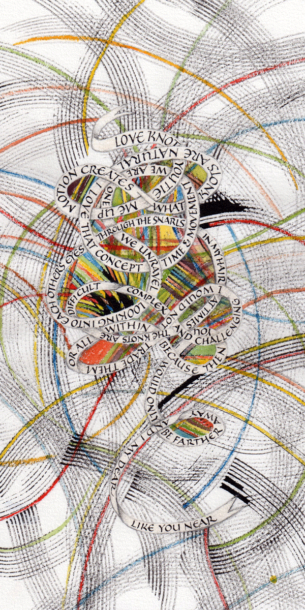
A poem from the book of poems by Mady Gomez
Here’s an image from the book commission which ended recently. It’s a wonderful poem by Madeleine Gomez. I don’t know if it’s readable in this format.
New resource for bookbinding information
Paul Thomson and his grandson have put together a valuable resource at ibookbinding.com, and they continue to update it
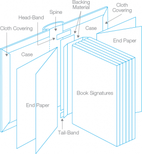 The post on the anatomy of a book, for example, pulls together an illustration, a glossary and a video explaining the parts of the book.
Another post aggregates 10 coptic binding tutorials, another post gathers various stitching ideas together, and another shows various headband/endband options.
A birthday present for a composer
Walnut and acrylic inks, a folded pen.
Sample pointed pen lettering
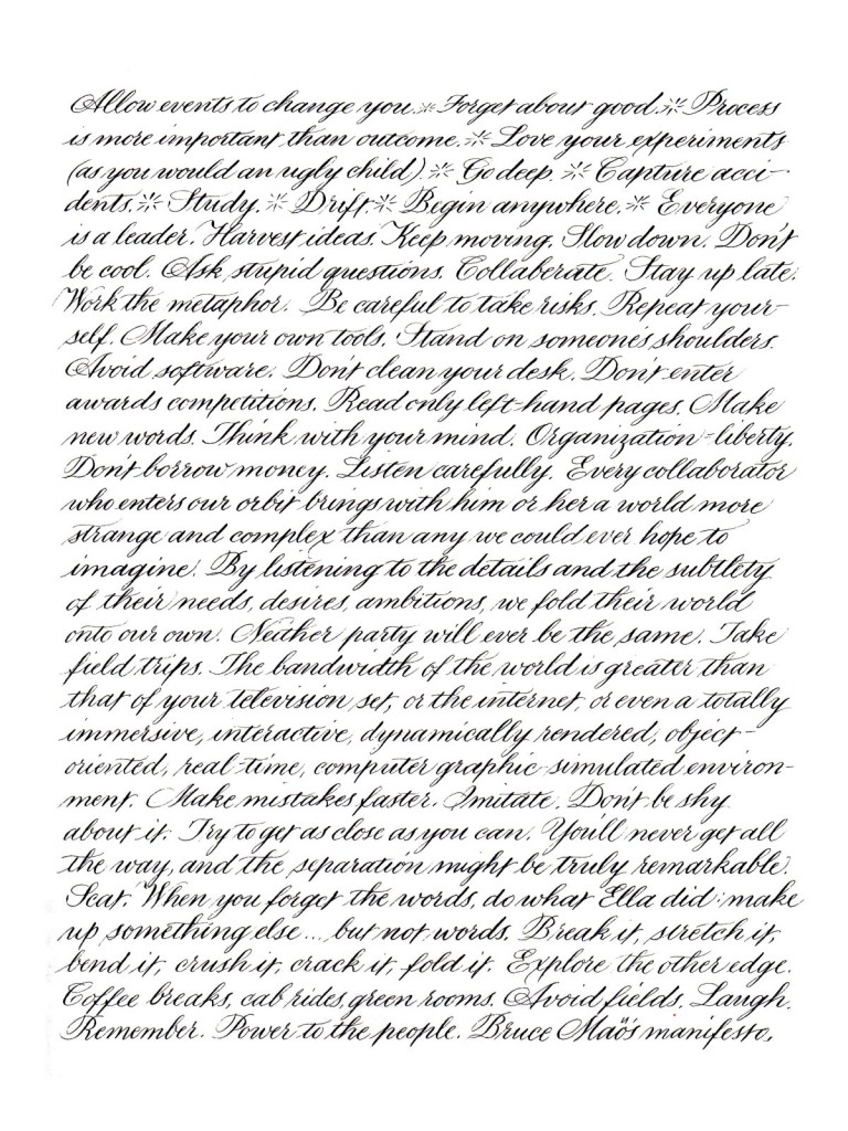
Done as comparison for a client, so she could compare this with trial lettering lettering that was larger lettering and had more leading. (The larger lettering was a birthday letter to her daughter, not shown here for obvious reasons.) This is a 9″ x 12″ page of lettering with 2.2mm x-height and 8.8mm leading. Moon Palace ink, Strathmore 400 Drawing paper. The text is from Bruce Mau’s “An Incomplete Manifesto for Growth“.
Pointed pen lettering
… on various papers with various mediums (or media, but people don’t put it that way).
This top image shows lettering done on Canson Mi-Tientes and Strathmore colored papers using McCaffery’s Ivory ink.
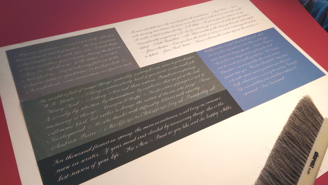
The image below shows lettering on a sheet of Strathmore Drawing paper using, in turn, McCaffery’s black ink, a mixture of Schmincke Calligraphy Gouache colors, that mixture + McCaffery’s Ivory ink, and that mixture + white gouache.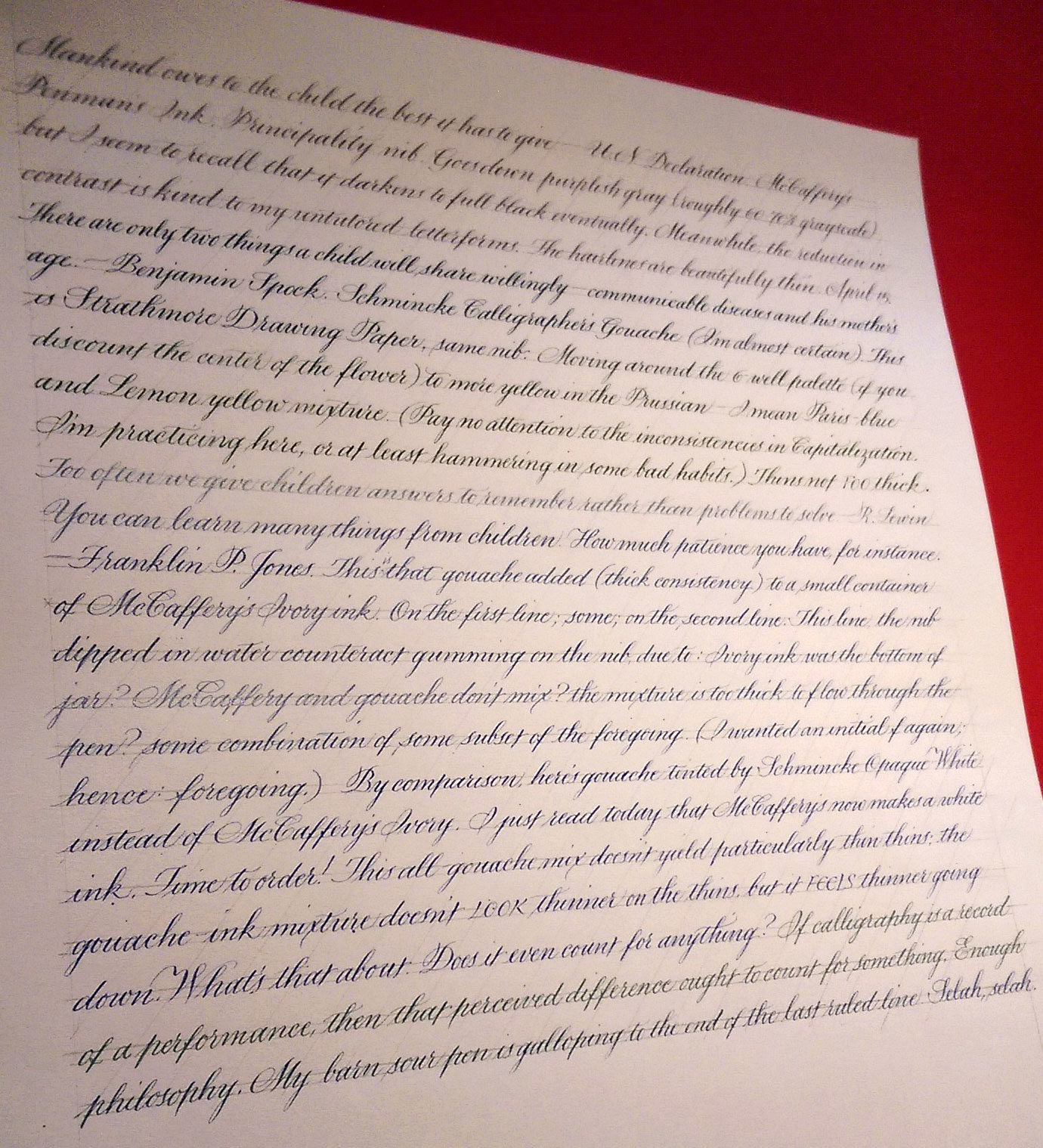
At the MONA in Tasmania
On a recent trip to Australia, I visited the best ever museum: the Museum of Old and New Art (MONA), up the river from Hobart, Tasmania. What a ride! And I’m not talking about the ferry we took from Hobart’s Sullivan Cove to the MONA — although that was a great way to start the journey.
Here are a couple of photos of one of my favorite installations, entitled “”.
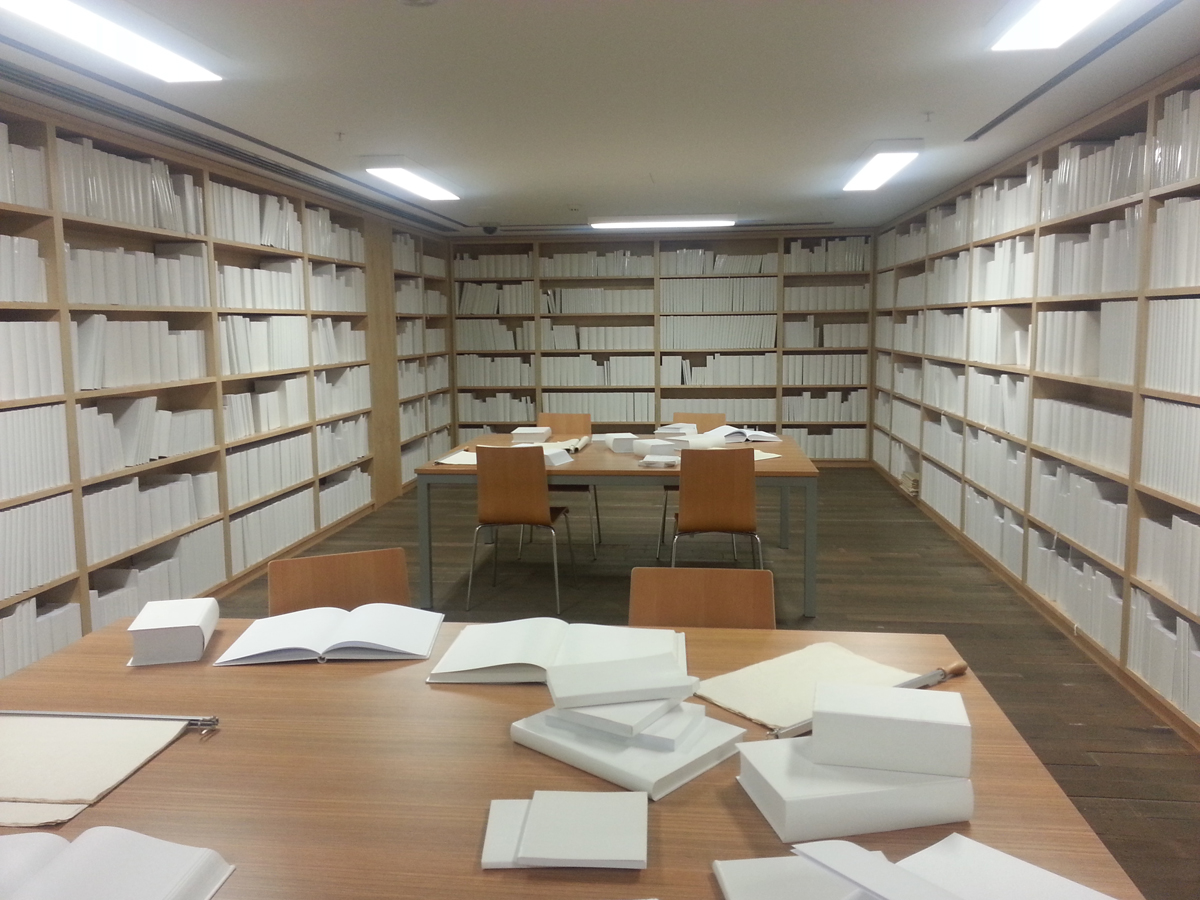
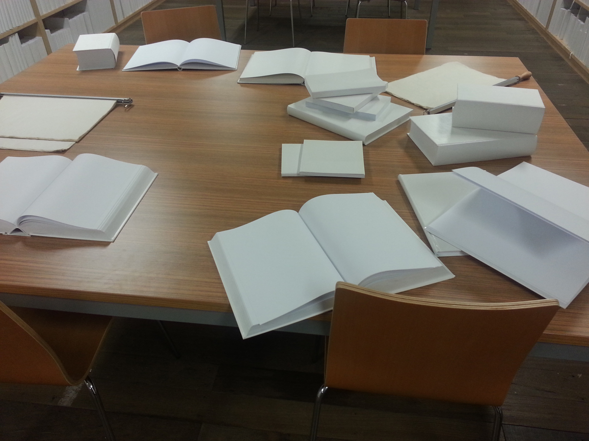
- A closer look at the untitled installation
I was aware of so many simultaneous reactions to this room full of blank white books — undergoing a kind of vertigo of meaning while critiquing a loose headband; contemplating the horror of a zombie library while wondering at the artist’s control in not making a mark in any of the books or shelves or tables; imagining the impact of one red dot while wondering at the impulse to find meaning even in this blank room; acknowledging the urge to make a mark somewhere while mulling over various criticisms of the blank book made within the artist book community; remembering a cartoon from my childhood in which all the musical notes came loose from the staves and fell off the page; thinking about invisible ink, the perils of magnetic media …
And that was just one work of art on the three subterranean floors of the MONA. We stayed all afternoon and didn’t see everything — not even close.
Here were some of the highlights for me:
- “Kryptos” by Brigita Ozolins— winding corridors upon whose walls were a binary code translation of The Epic of Gilgamesh, with ancient cuneiform artifacts set into the walls at intervals;
- “Pulse” by Rafael Lozano Hemmer — a row of incandescent bulbs (imported from China because the are illegal to buy in Australia), each one blinking at the heart rate of a visitor who stepped up to the monitor and recorded his or her pulse — and then you turn the corner into a room full of the bulbs;
- “When My Heart Stops Beating” by Patrick Hall — open each of the floor-to-ceiling drawers to read text and hear a recorded “I love you”; it’s indescribable, you just have to be there, but here’s an article about it;
- A collection of Henry Darger‘s drawings
I could go on. And have, much to the boredom of my friends.
And when it all got to be too much, a bounce on the trampoline outside was the perfect break.
The finished commission!