C is for Carl … Rohrs

C is for Carl Rohrs.

2015-01-03-Carl---my-piece-today
3 Jan 2015 — picking up a brush again after a long hiatus


Letterforum, the 1995 annual international calligraphy conference, was held at St. Mary’s College in Maryland. I took two 2-day workshops with Carl: “Pointed Brush Laboratory” and “Signs and Broadsides”. This was my first education in brush lettering, I believe. To watch Carl wield a brush was an eye-opener, introducing me to the concept of brush sensitivity that John Stevens has explored so eloquently in his book, Scribe.

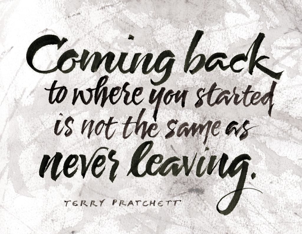
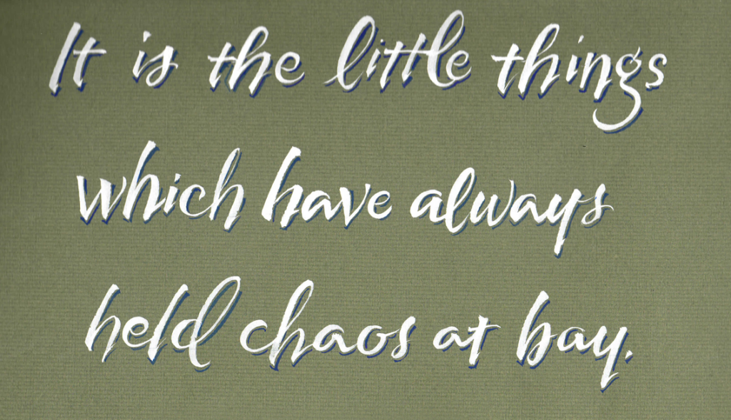
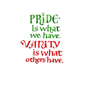
Here is one of the pieces that I did in that workshop. (I thought that I had read the quotation in a Madeleine L’Engle book, but I’ve never been able to find it since.)

2015-01-03 Carl - my piece in 1995 workshop
White ink and pointed brush on Canson Mi-Tientes, done in a 1995 workshop with Carl Rohrs


B is for Brody … Neuenschwander

B is for Brody Neuenschwander.

He and Thomas Ingmire taught a week-long workshop entitled “Textual Reverberations” at Camp Cheerio in September 2000.

We spent time each morning looking at text-based art by Jenny Holzer, Bruce Nauman, Gillian Wearing and the YBAs (Young British Artists), etc. I believe this was my first introduction to the work of Hans Joachim-Burgert. Here I finally began to get a big picture of the continua of lettering styles, traditions, and influences which included graphic design, the Arts & Crafts Movement, modern conceptual art and so on. Many of the ideas I began to look at after this workshop went into a paper I wrote in an art history class nearly 10 years later, entitled “Text and Image”.

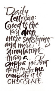
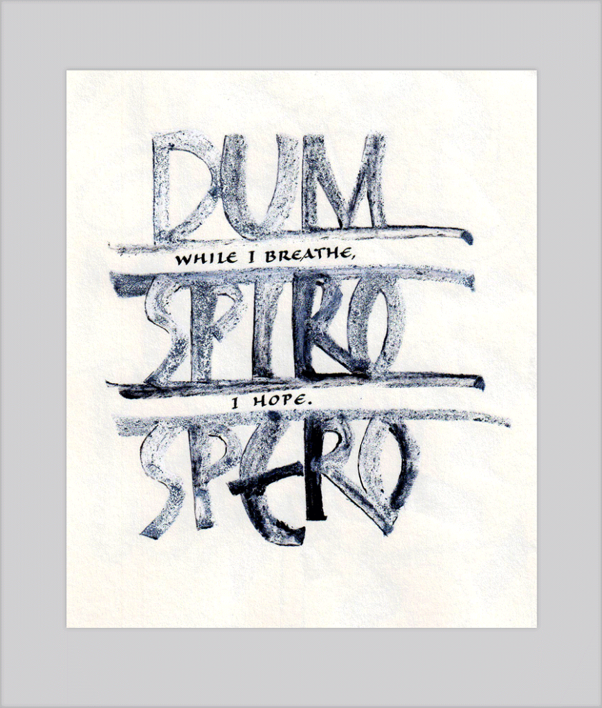
In the workshop we developed a book that intertwined three quotes in three styles of lettering, looking at ways to handle text differently throughout the book. We morphed text, changed up the rhythm, altered the orientation, and much more. Today’s lettering reflects combines three lettering styles, but the text is all one quotation rather than three. Of these three, only the top line resembles one of my three lettering styles, although the style in the book was less linear and less legible.

2015-01-02 Brody 3 styles


The workshop part of this class was, in many ways, over my head at the time, although fortunately I didn’t have the good sense to recognize then. But I learned a lot, and continued to learn from that workshop for many years afterwards.

A is for Alice

Happy New Year! I begin this new year with gratitude for all the teachers who have enriched my calligraphy education over the past … OMG, 34 years. Because it is calligraphy, I’m going to make it an alphabetical listing of them. A, A, what who begins with A?


Alice Koeth.

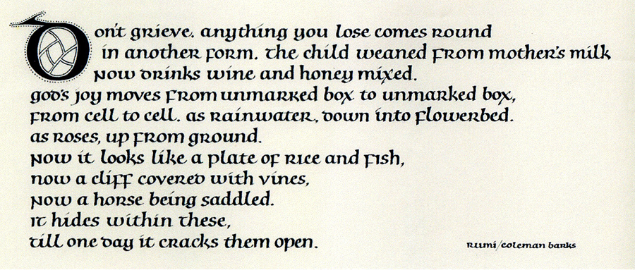
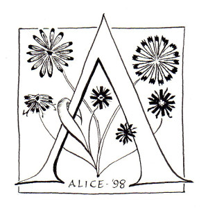
In October 1998, I was privileged to take a workshop with Alice at Camp Cheerio. Although the putative subject was pen-made flowers, the true subject was line. By getting away from letter forms (is this letter too narrow? is my pen angle too steep? how do I get this space to look right?), we focused on the quality of the line itself. We were taught to be aware of subtle serif choices. We saw how using the same pen for lettering and drawing can marry the two elements of a layout. And we learned how to make adjustments to pens, their corners and edges, to make them work for us. And, of course, we learned much more than these, but these were the most important things I was ready to learn at the time.

I made this illuminated “A” today as a codification and review of some of the things I learned in that workshop 14 years ago.