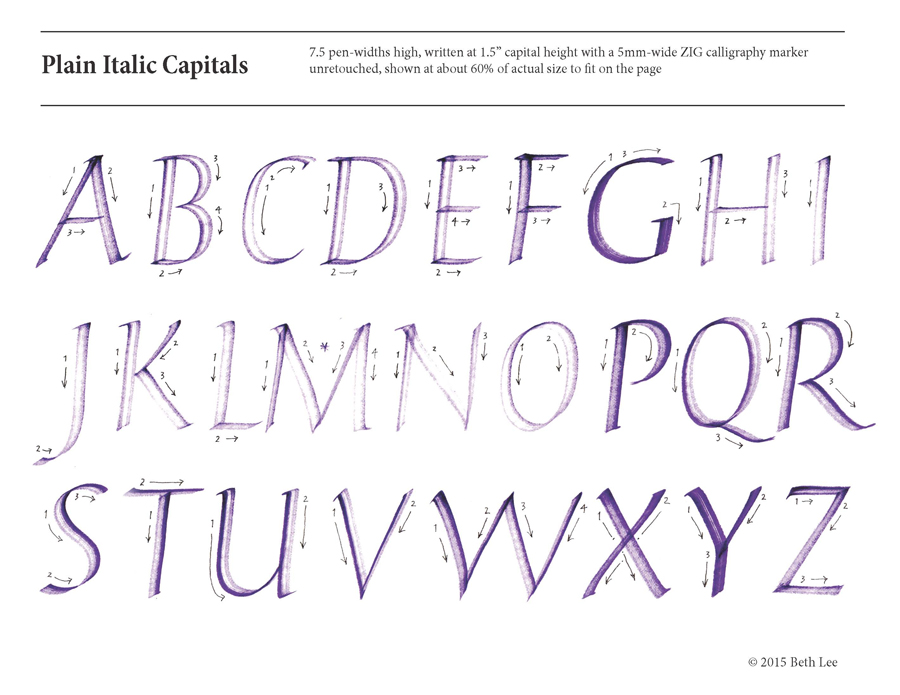
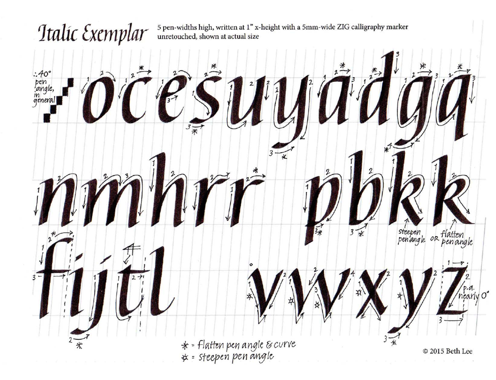
Smithsonian Libraries Artists’ Books now online

I was pleased this morning to read the announcement of the webpage for the Smithsonian Libraries Artists’ Books Collection at library.si.edu/collection/artists-books

More from Anne Evenhaugen, Reference Librarian:

The Artists’ Books Collection includes hundreds works of art in book form at numerous branches at the Smithsonian Libraries, spanning the 20th century through today. The site serves as the portal to search or browse the entirety of the collection at all of the branches, to provide information about collection access, and to highlight book arts-related happenings, projects and acquisitions at the Smithsonian Libraries.

This search portal has been a collaborative effort to bring artists’ books to light at the Smithsonian’s Cooper Hewitt, National Design Library, the American Art Museum/National Portrait Gallery Library, the Hirshhorn Museum and Sculpture Garden Library, and the Warren M. Robbins Library at the National Museum of African Art, as well as the Dibner Library of the History of Science and Technology. The webpage is the culmination of several years of work on the part of staff and interns across the Smithsonian Libraries.

More details about the Smithsonian Libraries Artists’ Books Collection can be found at the following web link: https://library.si.edu/collection/artists-books

It will help in planning a visit to Washington DC, but there are no images of the books, as far as I can tell, except for the slideshow of images on the page list above. In the search pages, the slideshow view of the reference documents does not seem to working yet.

More metallic ink experimentation

2015-02-05 Jetpens order experimentation

From a couple of days ago … trying out various metallic ink pens, including gel pens and ballpoint pens. Also, Nikko G and Zebra G nibs with Dr. Martin’s Spectralite gold ink formulated for airbrush work.

It’s difficult to type without the use of my left index finger. And that’s my excuse for the last few days’ silence here, although I’m still working daily on lettering.

More abstraction – metallic on Mi-Tientes

I did this a few days ago, lost it, and just found it again today. More abstraction of the letter forms I’ve been using from Hans-Joachim Burgert’s book.

2015-01-28-earlier-abstract-gold-on-green


This is fairly small, a sheet torn from a 6″ x 8.5″  book of Canson Mi-Tientes paper, done with Luna metallic watercolors and a #6 Mitchell nib, I think.

White gouache on black Artagain paper

2015-01-27-lettering-white-gouache-on-Artagain-black

Today was not a day for inspired lettering. But I showed up anyway. That’s what it’s all about (all hokey pokey aside). Maybe the muse will be there tomorrow when I show up. And I will show up.

Details of the crime: It was done by the C-2 Speedball nib with the White Schmincke Calligraphy Gouache on the black Artagain paper. The side crime was done by a Mitchell Roundhand #4 nib with Luna silver pan watercolor, mostly to make a comparison of coverage between white gouached and metallic watercolor.

I didn’t use any guidelines, but I did frame the text area using a Fons and Porter white fabric marking pencil, which I like for dark paper and painted backgrounds. The point stays sharp and the eraser that comes with it works well without damaging the paper. Not all of the 9″ x 12″ page is shown. I will eventually bind this folio into a notebook with other lettering trials.

Daily lettering – Mohawk Superfine and italic as texture

A little materials testing, a little more abstraction …

2015-01-26-lettering-sumi-on-Mohawk-Superfine

2015-01-26-italic-as-abstract-texture


Moving towards a two-dimensional , flat all-over pattern. I tried to keep the pen-angle, pen-width size, letter order and shape intact, abandoning word spacing and changing only the direction. Sometimes I broke the rules to preserve the texture, but sometimes the broken rules were inadvertent.

And now for something completely different

Well, it’s still book arts, so it’s not completely different. But I was cleaning up my studio and came across a book I recently purchased, Little Book of Book Making, by Charlotte Rivers. The book showcases a series of accordion books with washi tape covers, made by Ruth Bleakley. I decided to try it today. I like the result, which is rather difficult to see here. It turns out that a piece of shiny book cloth is not the best background for this book. This book is 3 in x 4 in.

2015-01-21 washi tape accordion book

Further abstraction from yesterday’s lettering

Now’s it more work — not work, but play, difficult play. And a nice change from the italic exemplar over which I slaved most of today. There is nothing like making an exemplar to point up all the ways my lettering falls short!

2015-01-17 further abstraction


I’m tempted to start again with another set of formal letters, but I may move on.

More Hans-Joachim Burgert process

I’ve been continuing to re-read Burgert’s book,  The Calligraphic Line. At the beginning, he writes that calligraphy is two-dimensional design using a limited set of symbols with a limiting set of rules. He discusses the spectrum of legibility  -> abstract 2D design, and the concomitant spectrum of typography -> fine art. (Or something like that; I don’t have the book in front of me.)

Burgert provides a hittite heiroglyphics image as an illustration to go with his discussion of the leap from flowing oral language to written symbols. After reading this, I constructed an alphabet using elements of that hittite image. It was handy; another image could have done as well. This is the alphabet:

2015-01-16 formal alphabet

Using this alphabet, I wrote out a quotation following standard rules of typography, writing left to right in horizontal lines, paying attention to kerning, and so on.

2015-01-16-formal-alphabet-whence-did

It was interesting, but I wanted to push it further to abstract two-dimensional design. After one falst start, this was the next step:

2015-01-16-formal-alphabet-whence-did-2

I thought it was interesting. And then pushed it further along the abstraction spectrum:

2015-01-16 formal alphabet whence did 3, but was surprised at how little I had moved along the typography/abstraction spectrum between lettering 2 and lettering 3. So far, it’s fairly easy, so I probably haven’t gone far enough yet.