Tea dyeing paper trials

2015-04-01 tea dye flag book closed
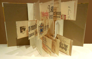
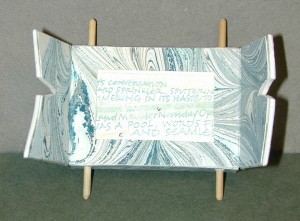
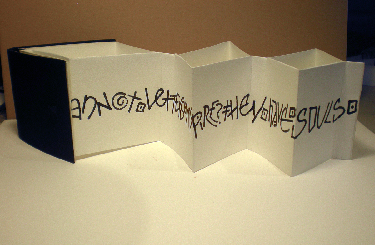
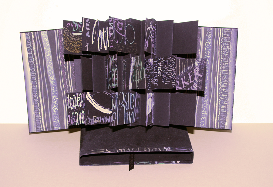
So after I finished the faux-medieval invitations yesterday, I cut up all the tea dye trials and made flag book of them for future reference.

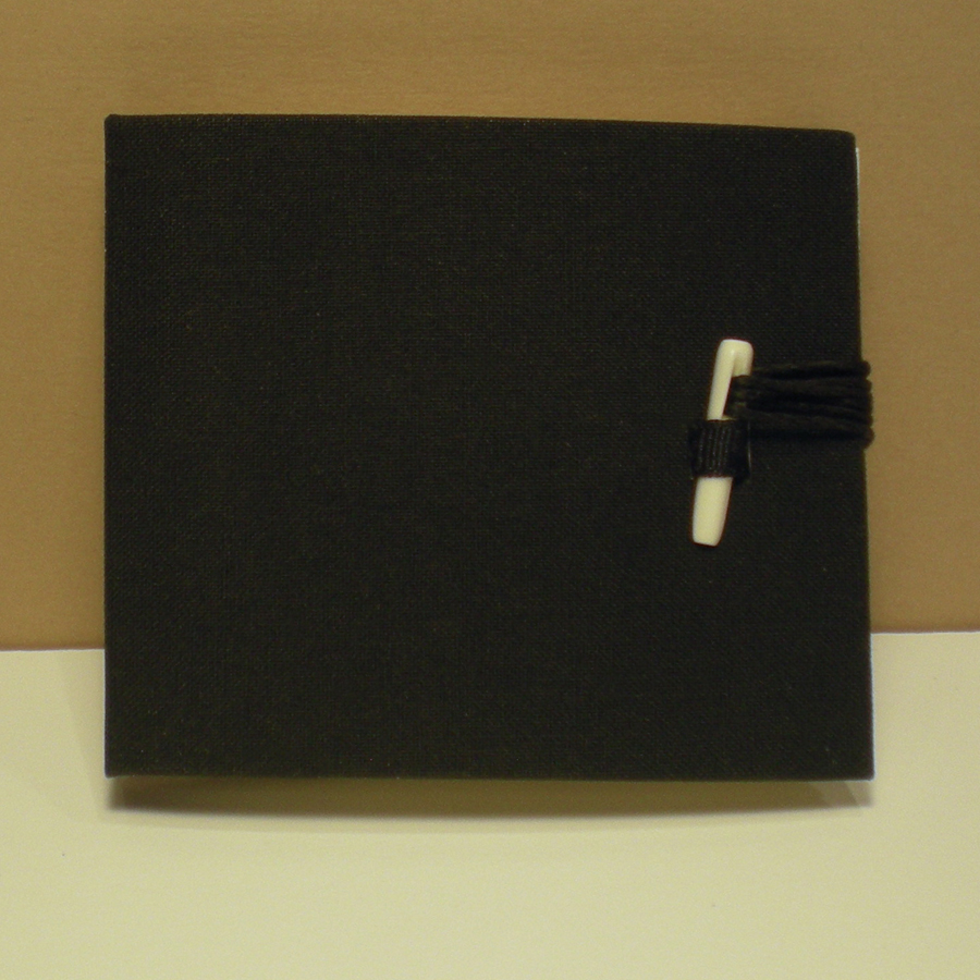
The covers are not tea dyed; they are gouache on Arches Text Wove, on boards. Most of the trial papers were Strathmore Drawing 400, 80-lb. and 100-lb. weights, although I also tried out a couple of watercolor papers. A few sheets were included with no tea dyeing, for comparison.

On some sheets I lettered before dyeing, and on some I lettered afterwards. Some sheets I spray-fixed after dyeing, some not. Some I lettered with stick sumi, some with bottled sumi, some with gouache. Some I printed on, both before and after, using various printer settings.

I didn’t have to iron or otherwise flatten the pages, partly because I  had dried them under light weights between layers of blotting paper and corrugated cardboard, but also because I didn’t use light-weight papers.

Book size is 5″ x 8″. Endpapers are Canson Mi-Tientes, a poor choice I continue to make on a regular basis. It’s a poor choice for me because it curls so much when the glue is applied.
2015-04-01 tea dye flag book open

Faux-medieval invitation

MSU madrigal dinner invitation scroll

Today I made a couple of faux-medieval invitations for a madrigal dinner. (The invitee’s name is of course quite clear on the original; it will be presented in person later this week.) Although the image doesn’t show it well, the paper (80-lb. Strathmore Drawing 400) was tea-dyed.

I did a number of trials to determine what papers are suitable for tea dyeing, how long to soak the paper, whether it would be better to print the coat of arms (created in Photoshop for the event) before or after, whether I should letter on the paper before or after tea dyeing, and so on.

I printed the coat of arms before dyeing the paper because the inkjet ink is waterproof and I liked the printing better after dyeing. Then I dyed paper by soaking it in a Pyrex dish of Lipton Iced Tea (2 family size bags in a teakettle of boiling water) for 2-5 minutes. In one the earliest trials I put the dyed paper between waxed paper to dry, but this created a pattern (which I liked but didn’t concide with my intention); my final solution was to dry the papers between shop towels sandwiched between large sheets of blotting paper and under a few pieces of corrugated cardboard with a heavy-ish book on top.

MSU madrigal dinner invitation scrolls and boxes

I wove together two blue ribbons and a gold rattail cord to make the cords that keep the scrolls rolled up. A 9″ x 14″ scrolled piece of paper is rather fragile, so at the last minute I decided to make boxes to hold the scrolls. I used some scrap gold matboard and some more of the washi tape I used for this book in January. The boxes definitely qualify as ephemera; washi tape, at least this washi tape, is not very sticky and doesn’t stay stuck for long.

A cool desk — plans

deskI like this desk, which creator Kirsten Camara calls an Analog Memory Desk. (Click on the image to get plans for the desk.)

2001-06 Jacobs TV scroll
It reminds me of this scroll book that I made in Michael Jacobs’ class. It has a nice little wrapper that is not shown. I’d like to make another of these, with more substantial scroll posts.

2015-03-13-Fisher-Price-Music-Box-TV
 
 
The desk also reminds me of the Fisher Price music box TV that one of my younger siblings had.

Fishbone Fold Book


2015-03-03 fishbone book 1

At yesterday’s meeting of our local calligraphy guild, Bridger Mountain Scribes, I led a tutorial on the fishbone fold, invented by Hedi Kyle. Despite having finally figured it out earlier that morning (!), it went smoothly. I followed the fishbone variation tutorial that Alisa Golden published on her blog, Making Handmade Books.

As I understand it, the standard fishbone has a stepped-out fore-edge; in this variation, the fore-edges are all the same width from the spine … ideally.

At the close of the tutorial, we each had a 3″ x 3-1/2″ text block of Arches Text Wove and a black pastel paper cover; end papers could be added at home. Even though we had measured a spine based on the width of the text block, the book did not close nicely and the glue stick (this was tutorial, remember) did not adhere the pastel paper cover well.

I returned to the studio and kept looking at the model I had made during the tutorial. I love Arches Text Wove, and this book block called out for some yummy black lettering. I did that. I decided to replace the paper cover with a cloth-covered board cover. This helped the book to close, but didn’t altogether solve the problem. So I added a bone closure.

2015-03-03 fishbone book 2Now it had a book shape. I lettered in black sumi and watered-down white gouache on black paper and trimmed those down for end papers.

I like it.


2015-03-03 fishbone book 3


Freudian slip

2015-03-01 Freudian slipA Freudian slip is when you say one thing but mean your mother.

Lettering on tricot nylon/ spandex — not the easiest substrate — with Zig markers: scroll, brush, and Writers. No planning, because it’s for a costume party this evening. And I had to come up with the content. Family commissions are often the most difficult of all.

(The asterisk is a small tribute to Kurt Vonnegut.)


Yale University’s Traveling Scriptorium

Yale University has put together a teaching kit that travels to classrooms on Yale’s campus to “support the study of the medieval and early modern book as material artifact”. What a great idea!

2015-02-28 Yale Traveling Scriptorium samplerWe can benefit too, if only virtually. Their blog archive addresses such topics as pigment manufacturing process, bookbinding terms and models, and the online version of their ink and pigment sampler is interesting, as is the online version of their leather and parchment sample set. There is also a PDF of medieval ink and pigment recipes.

Lemons into lemonade

My daily lettering earlier this week was pretty uninspiring. I had been trying all kinds of gouache tints with various mark-making tools, all on a big sheet of black Arches Cover. It was a mess. I often tell myself this is a good piece of the collage bin. This time I cut out as many 2″ x 4″ windows as I could find on the piece and assembled it into this flag book.

2015-02-25 flag book Arches Cover black


The photo still has a slight purple cast to it, but nothing like the electric blue cast it had straight out of the camera.

Cover boards are wrapped in old scraps of amateur homemade book cloth — made a long time ago, before I convinced myself not to use synthetic fabric. I painted the end papers when I couldn’t find anything that looked right. The book is propped up on the book box I made of more Arches Cover and off cuts of the lettering practice. Renaissance wax on the book box doesn’t seem to have been a great choice, but I may try adding another couple of layers later.

Quotation – gratitude or pride

Our local calligraphy group here has been choosing a quotation a month from ten qualities that make up what Dr. Barbara L. Fredrickson calls a “joy portfolio,” helping to build resilience in the face of hardship:

  1. Joy
  2. Gratitude
  3. Serenity
  4. Interest
  5. Hope
  6. Pride
  7. Amusement
  8. Inspiration
  9. Awe
  10. Love

We’re at month 8 (or 9, I’ve confused myself as to whether the numbers represent work months or due dates), and I’ve only got a couple of completed. So this month I going to attempt to finish all the unfinished quotations.

I had thought to use the quotation below for “gratitude,” but I’m having trouble finding a quotation I like for “pride,” and this might work for that. I double that either of these is the final version, although they are the 3rd and 4th versions if you count the plain-white-background version as a 2nd version. The backgrounds are scans of watercolor studies (or, if not study, serendipity) that I’ve painted in the past. Maybe I’ll post the 1st version, which was as much finished thumbnail as a draft. So much for progress: I still don’t have a finished piece.

2015-02-09-gratitude-or-pride-quotation

2015-02-09-gratitude-or-pride-quotation-v2


Brian Dettmer on Ted Talks

Brian Dettmer has an interesting take on the current role of books. He talks of the book as a body, a tool, a machine, a landscape. He makes an interesting book is not the best format for non-linear information; digital media does that better. He says that just as photography allowed painting to quit its day job, now that most of our information is stored in digital form, the book is becoming something new.

But watch it yourself: