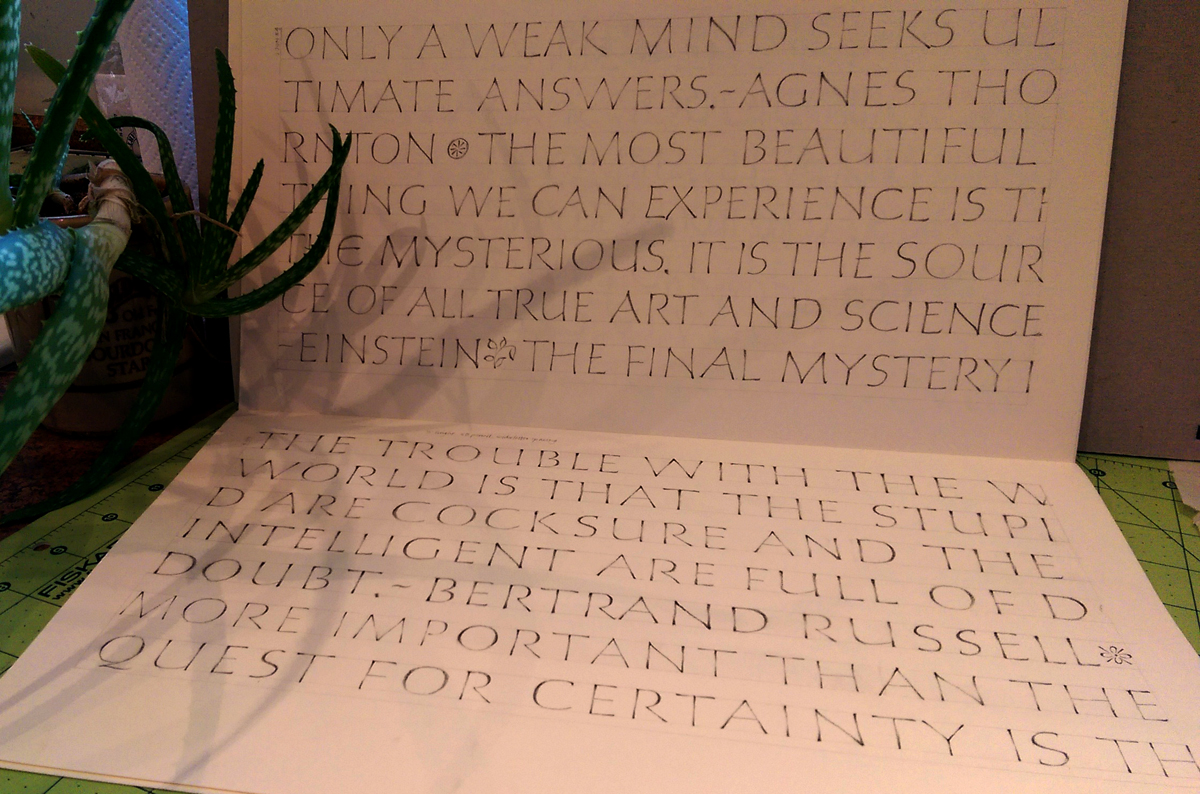
These letters are slowly seeping into my kinetic memory. Spacing is still problematic (story of my life), and 3 o’clock to 6 o’clock on O, Q, C, G, D is just not happening with any regularity at all. That area of the circle is like trying to scratch the itch between my shoulder blades: I can get there, but not natural and it’s not elegant.
Daily lettering – homework in preparation for a workshop with Peter Thornton later this month. Nothing like Roman capitals to make you feel like a child again. Day 6, page 9, progress … maybe.
Strathmore Drawing 400 paper (80#), 4B pencil, 1/2″ height. I started the homework at 1″ height for a few pages, moved to 3/4″ height for a few more pages, and this is the first page done at 1/2″ height.
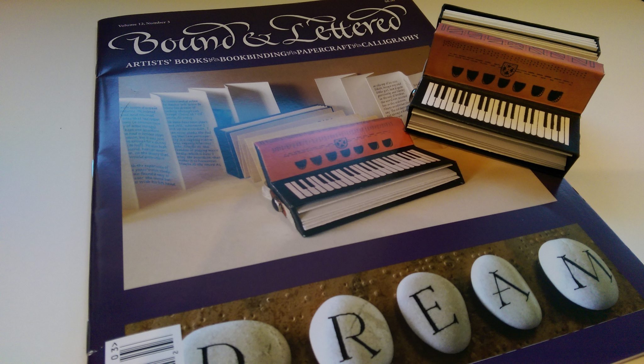
My book on the cover of Bound & Lettered magazine.
While I was traveling, I heard from several friends that they had received the current issue of Bound & Lettered and that my piano accordion book was pictured on the front cover. I was happy to finally get to see it for myself when I got home. My first thought was, “It looks bigger than life!” When I compared the book to the photo, I was right: It’s 106% bigger than life. Just like gettin’ my picture on the cover of the Rolling Stone 🙂
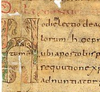
snippet of MS 1762 – Carolingian minuscule (click to navigate to the full image onsite)
The Schøyen Collection is an impressive resource for the study of historical manuscripts. As described on the website, “The Collection, based in London and Oslo, contains over 20,000 significant manuscripts of major cultural importance and is an important part of the world’s heritage.”
Begun about 1920 and probably digitized beginning in 2000, the collection spans centuries and continents. The website is easy to navigate and well organized in the old-style way — that is, by categories. It’s clear that some of the scanning was done earlier in the development of digitization techniques, but it is nevertheless a valuable resource.
Thanks to Christopher Haanes for pointing the way to this digitized repository of historical manuscripts.
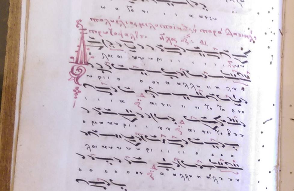
I’ve been traveling for the past few weeks, but I’m back in my studio and eager to get back to work. The next few posts will include images from my travels in Crete and Israel.
Here’s a detail shot of a Byzantine music manuscript I recently came across amongst a treasure trove of medieval manuscripts in a monastery in Crete.
As usual, click on the image for a closer look.
I’ll post more images once I get them all sorted out.
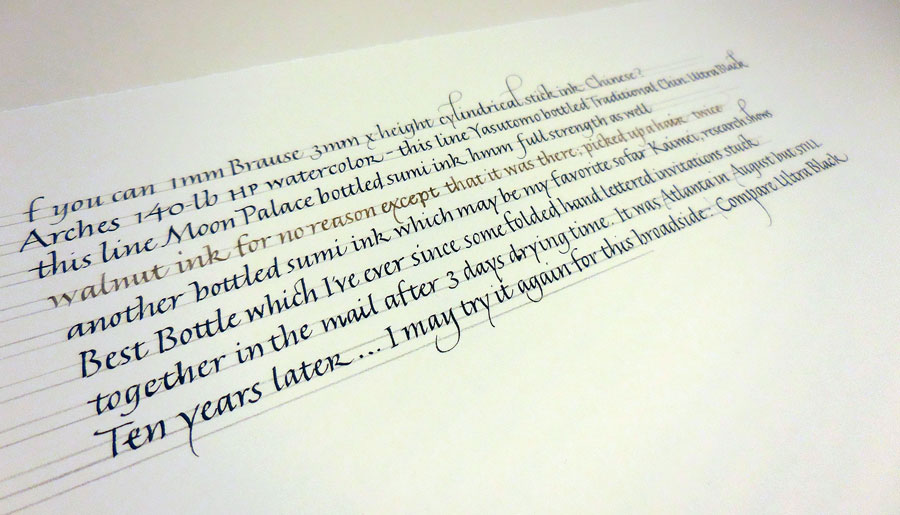
Testing inks on Aches 140# HP watercolor paper with a Brause nib
Today’s SAT analogy: Experimenting is to finished calligraphy as the tip of the iceberg is to the iceberg. One of the things that Christopher Haanes focused on in the workshop was sharpness of writing. His description of the differences between Chinese and Japanese stick inks has changed my thinking about them. (Don’t get me started on how bottled sumi ink bears no relation to stick sumi ink.)
Before I did the poem I mentioned in a recent post, I got out a bunch of inks and tested them on the paper I planned to use. This took forever, but was an interesting exercise. Of course, all the information is only useful with that paper and that nib …
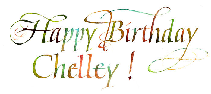
A bit of fun
And then I took a break and had a good time with paints left over from an earlier piece. It looks better in person.
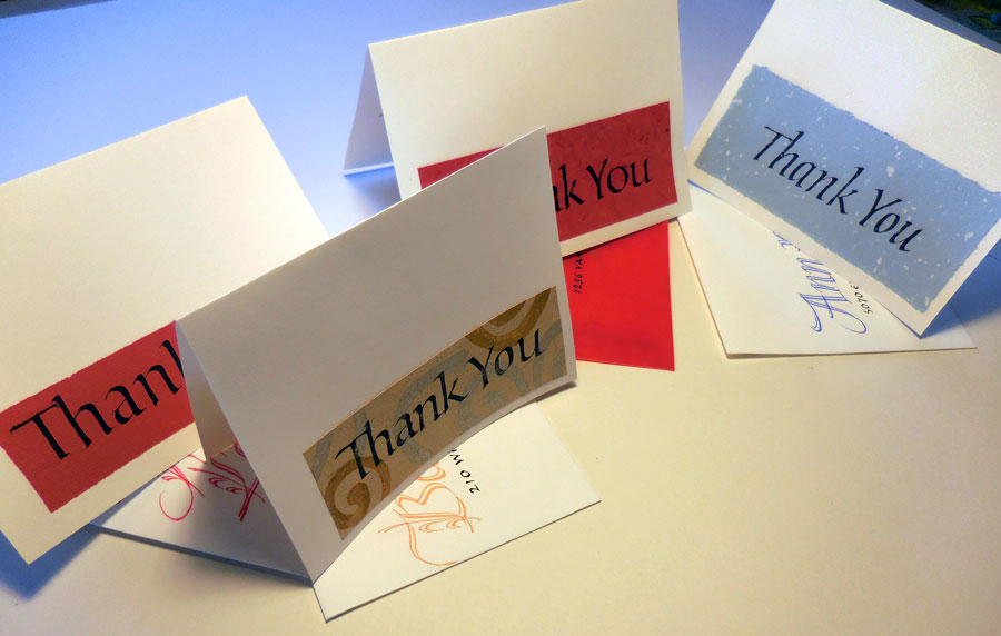
Some days the daily lettering actually has another purpose besides just practice. As it does today. These are four of a bunch of thank-you notes I wrote today. I was way behind.
I also finished a commission. I may show an image of it in a month or so, when it’s no longer a surprise to the recipient. I’ll give you a hint, though: it’s a poem that is requested often. I think I did it the first time in 1986, and have probably done it every other year, on average, since then. It’s long and oh so androcentric. I was quite pleased with the way this iteration turned out.
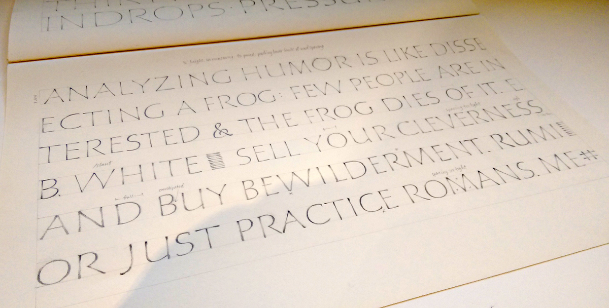
Daily lettering after the Christopher Haanes workshop
Working on Zerkall smooth with a Brause 3mm nib, the pen is sticking in the turns. Yes, I have a good cushion. The ink is stick ink, maybe Chinese, but I’m not sure. It’s a round cylinder of a stick ink. Tomorrow I’m switching to something else — changing both paper and ink, probably. These are some of the letters — or at least they want to be the letters — that we studied over the weekend with Christopher Haanes.
Like all good workshops, this workshop was like suspending one’s regular workout practice at the gym to work with a personal trainer for a little bit. At the gym, you know in the back of your mind that you haven’t really doing those squats properly, and you tend to skimp on triceps reps, and maybe it’s been awhile since you even visited that corner of the gym that houses the medicine balls.
Along those same lines, at this workshop I revisited ink choices, spent some much-needed time with pen manipulation and pressure. Oh, and it had been a good while since I had visited that very large corner of calligraphy that houses the Roman capitals.
Just returned from an inspiring weekend at the Big Sky Scribes fall workshop taught by Christopher Haanes. The more I learn, the more I am surprised that English and German styles of calligraphy are not considered to be as disparate from one another as they each are from ornamental penmanship.
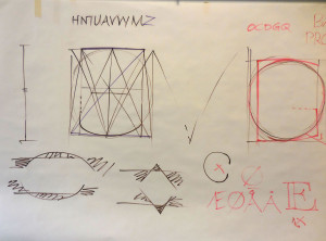
This is the most generic shot of the copious demo sheets that Christopher created during three days of teaching. I can’t wait to get back in my studio and keep working on the things I saw this weekend. I’ll post some of my own workshop practice in the next few days.

 Just returned from an inspiring weekend at the Big Sky Scribes fall workshop taught by Christopher Haanes. The more I learn, the more I am surprised that English and German styles of calligraphy are not considered to be as disparate from one another as they each are from ornamental penmanship.