 Lots of projects going these days.
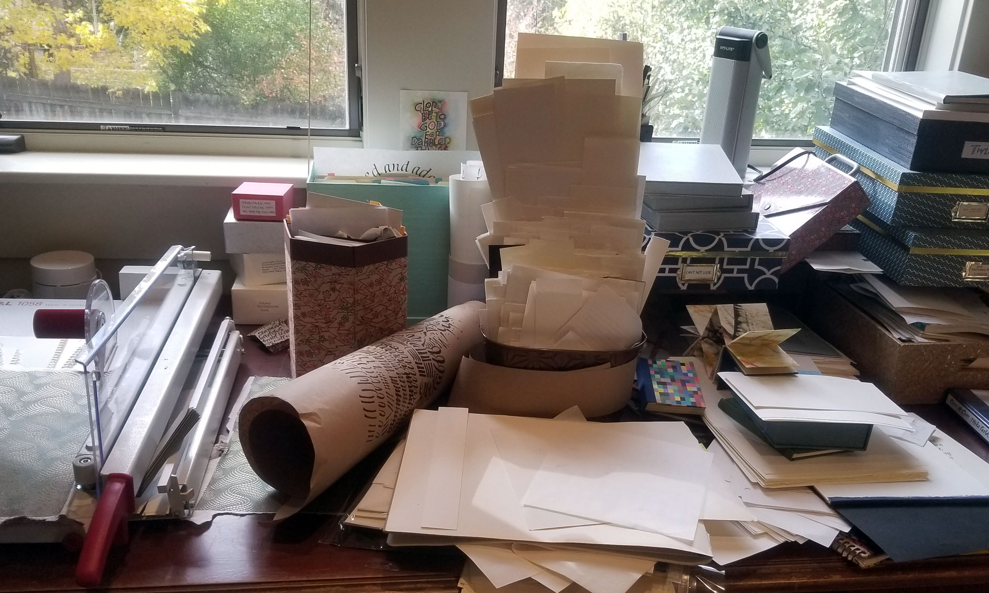
Today members of our local guild bound a test text block for the collaborative book we’ve been working on. We are making a standard case binding using the same paper on which the book will be printed. Today we got as far as applying the mull to the spine. I had brought supplies for this, and I was determined to unpack it all when I got back to my studio. This led eventually to trimming the text block and applying a headband. You can just see that text block underneath the top black square of paper. I did go ahead and cut out the cover and spine boards, but that’s for another day, because I continued to work on …
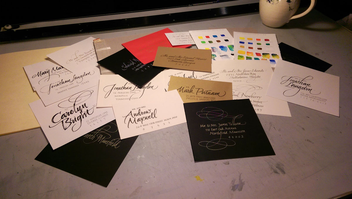
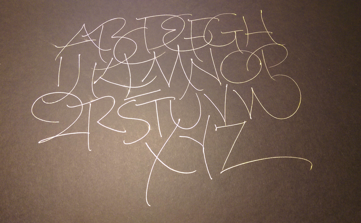
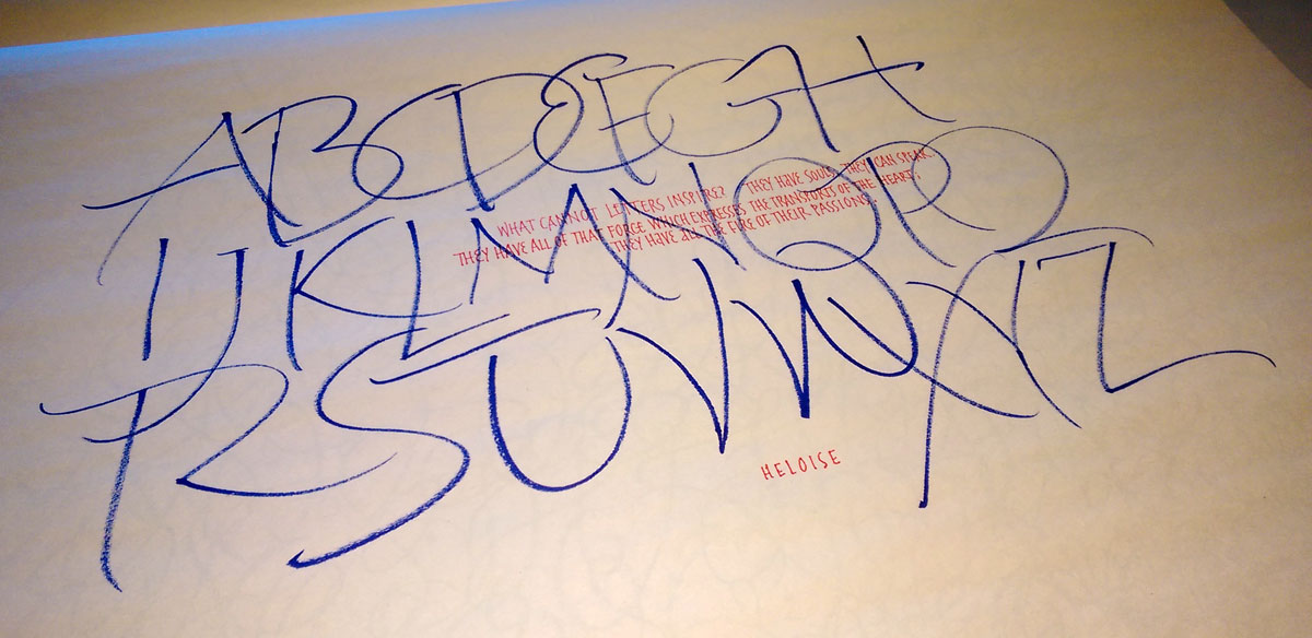
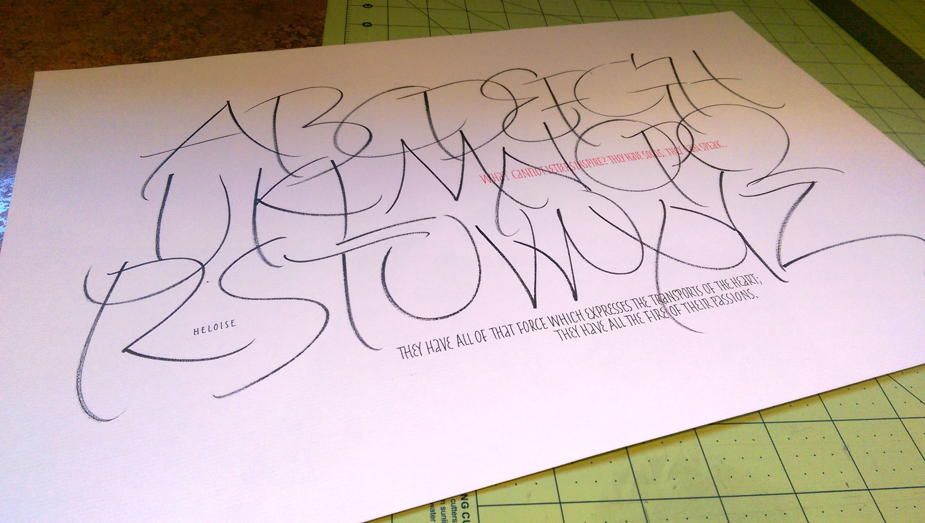
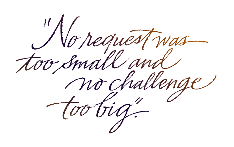
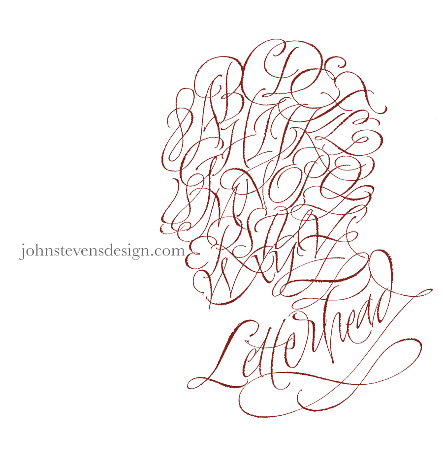
Addressing styles. I had the best time addressing some personal envelopes recently and discovered that I don’t really need guidelines for certain styles. So I’ve been developing some more casual envelope address styles. Some of what I tried today is shown above: sumi ink, pigment ink, gold gel pen, and fine marker on white, black and shimmery gold stock.
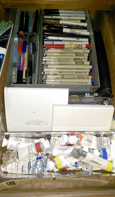
Yesterday I got out two travel watercolor sets and made test cards using a water brush. At the tops of the cards are the pure colors. At the bottoms of the cards I’ve experimented with mixing and tints.


