I’m having a good time with these new watercolors … and some sewing. At least a few parts of this page are interesting 🙂
Calligraphy & more — the studio of Beth Lee, Redmond, WA
I’m having a good time with these new watercolors … and some sewing. At least a few parts of this page are interesting 🙂
I’m so pleased to have my work included in this year’s juried annual issue of the Letter Arts Review! My copies arrived in the mail today.
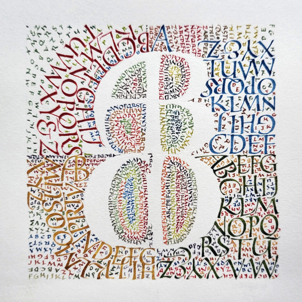
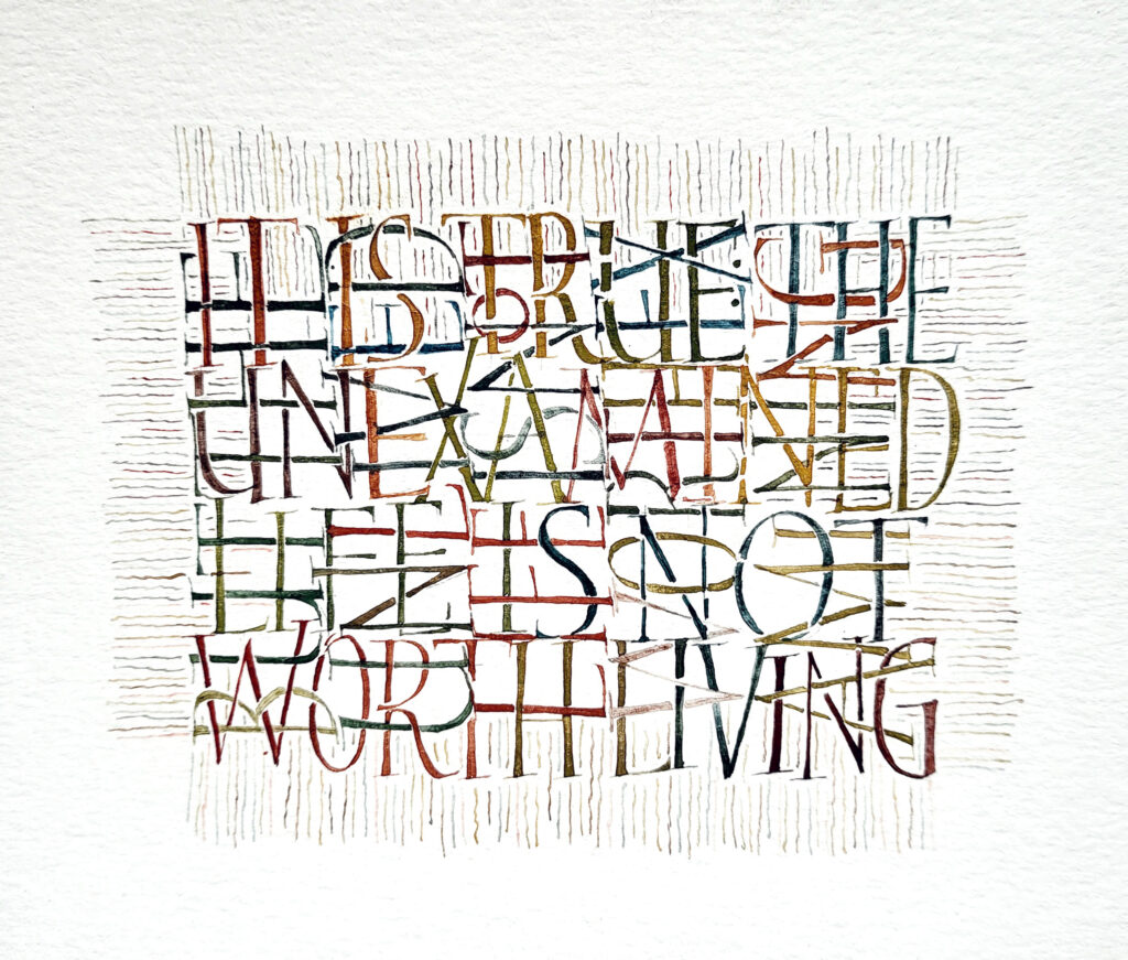
In making this piece I found myself exploring many of the same design elements that quilters contend with: proportion, color, texture, direction. At just four inches square, this was an exercise in small writing. Each 1-inch quadrant contains a large letter made of white space, the remainder of the alphabet in medium-sized capitals, and a lot of smaller complete alphabets.
I’m continuing to enjoy Akim lettering. I made these in preparation for next month’s local guild meeting. Even though I switched to a brush pen for the main lettering, I tried for a fairly monoline effect. I love doing Akim lettering with a brush pen.
Here I used the same palette as for the first one, but mixed neutrals. After I penciled in the box and did the main lettering, I went over the lettering inside the box with Pebeo masking fluid and a bowl-pointed pen (didn’t want to ruin my tiny brushes). Then I painted in the box. When the paint was dry, I removed the masking fluid with a rubber cement eraser. I had done a pretty bad job of tracing the lettering, but that was all right. And where it was just too egregiously out of whack I painted some neutral back in and blended it with the rest of the painting.
I’ve come across Akim script several times over the years, most usually because I return again and again to Hans-Joachim Burgert’s book The Calligraphic Line. This script is an approach as much as a hand, developed by Burgert. Until now, it has not drawn me in. But now I see it as a relaxation of the confines of lettering in favor of the graphical aspect of the page. And I’m really enjoying it.
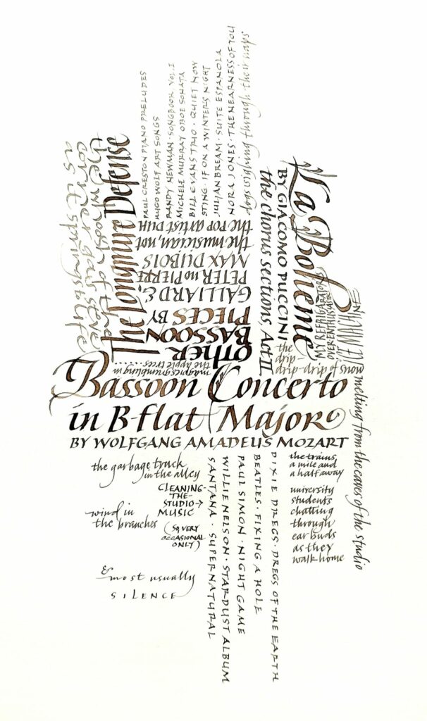
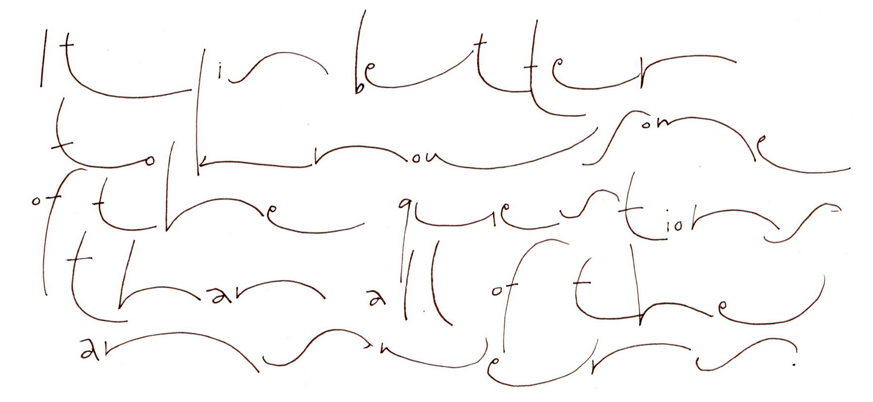
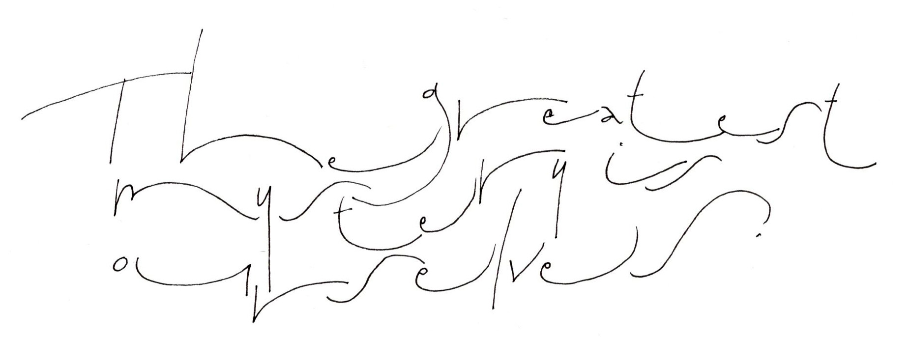
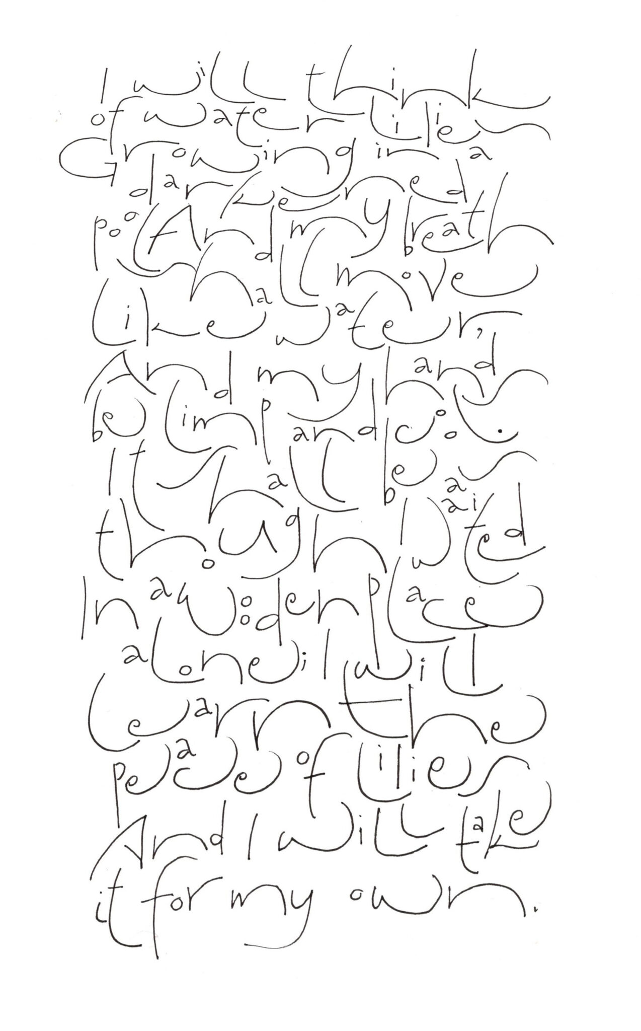
These pages were done while sitting at the piano through many hours of choreography and staging and technical rehearsals for a production of “Carousel.” All I needed was a pad of Clairfontaine Triomphe paper and a fine-line marker. (I didn’t even need guidelines, a circumstance that is quite freeing.) Most of these were done with ZIG Millennium markers, sizes 005 to 03.
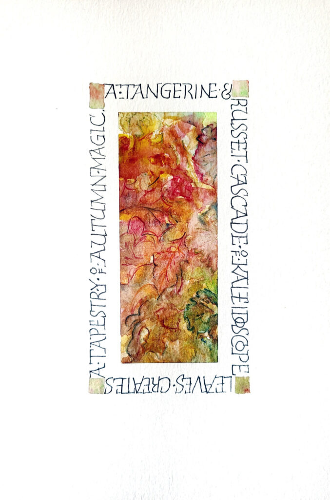
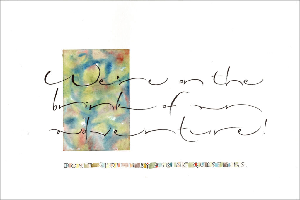
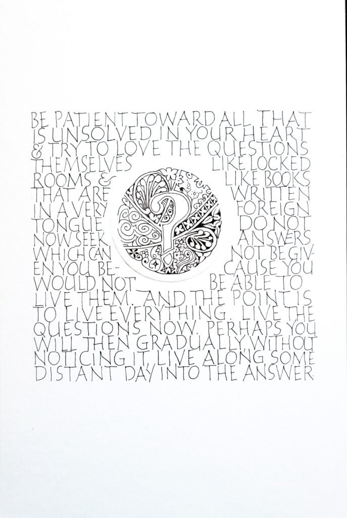
Our local guild, Bridger Mountain Scribes, is now 8 months into a year-long project. We are each making a portfolio of 6″ x 9″ pieces featuring a variety of monoline lettering styles and watercolor decorations. My theme is “Questions.” And here’s my piece, which I may re-do, for month 6. (You can see 3 earlier months’ work here.)
A weekly online lettering prompt “Warp & Weft” coincided with work I’ve been doing to develop a workshop on built-up capitals. And this resulted:
Note to self (for the umpteenth time): don’t use crappy paper even for experimentation if there’s any chance at all that something interesting will result.
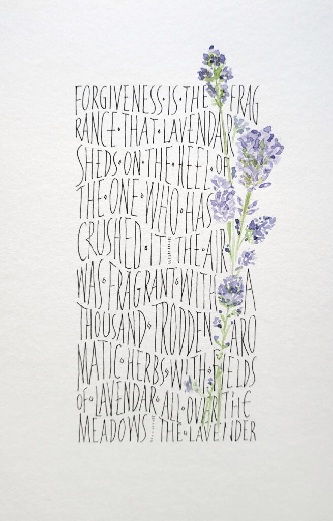
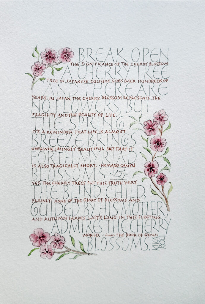
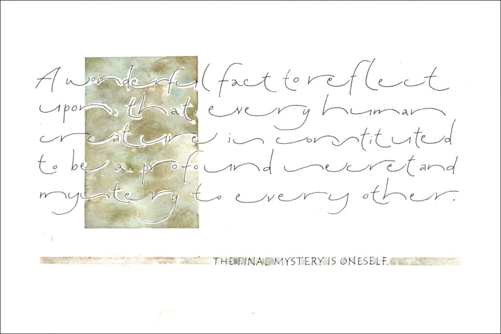
Our local calligraphy guild, Bridger Mountain Scribes, has embarked on a long-term project. Each month, Diana demonstrates a new layout, monoline lettering style, and/or decorative treatment for our 6″ x 9″ watercolor pages. At the end of the project, we’ll make an enclosure to house our pages. Here are three of the pages I’ve made during recent meetings.