CoolIris: very cool

I’m not sure how I got there (I hate that!), but this CoolIris rendering of my blog pics is very cool. As I’m dragging the cursor around, my efforts look quite monumental 🙂 I’m inspired to continue on.

edited to add: requires a CoolIris plugin to Firefox; evidently that had already been done on the MacBook Pro I inherited from my son, but when I got home and looked at the link on my PC, I had to download the plugin. It’s still inspiring.

Web Design project

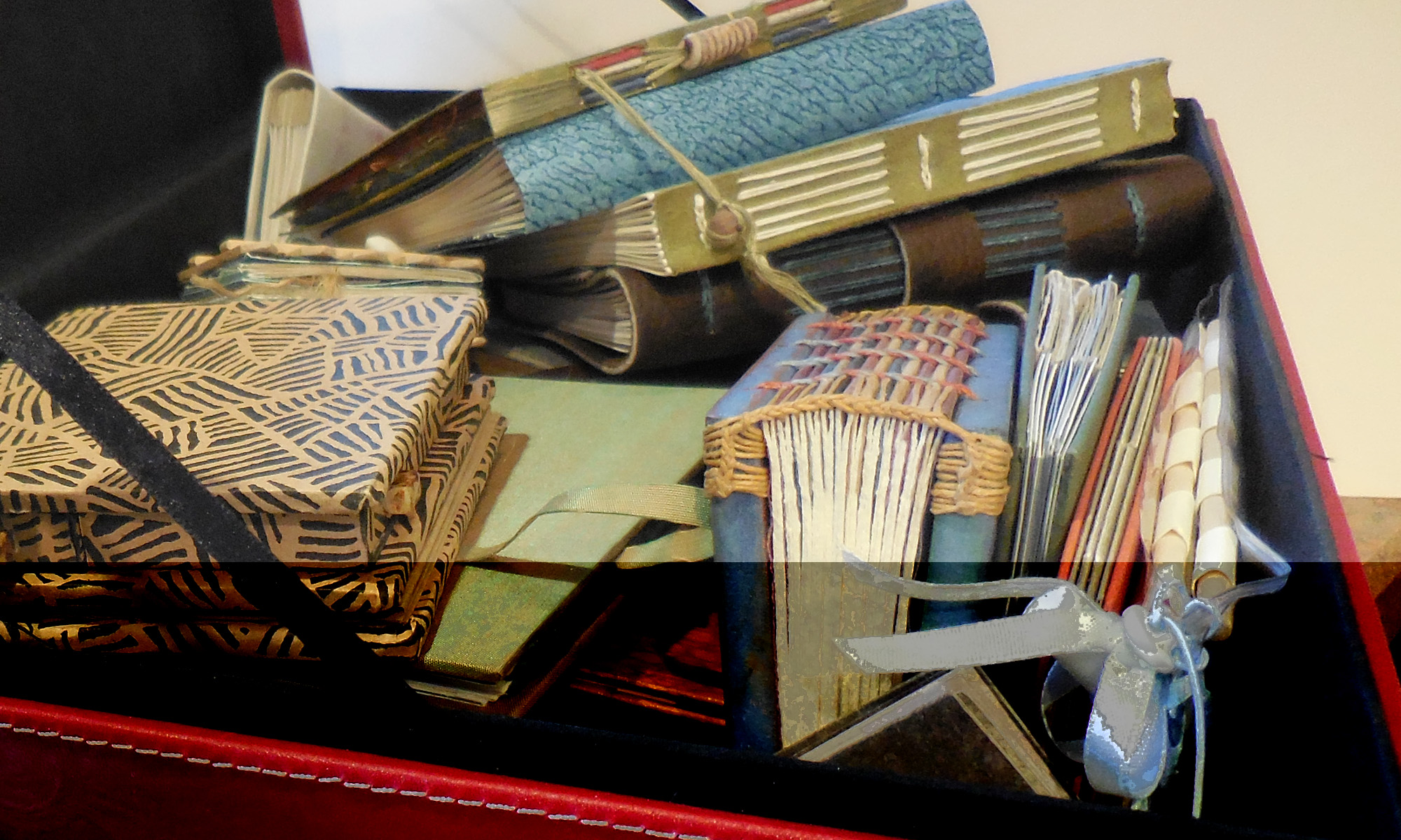
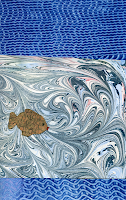
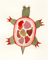
We’re starting an interesting project in my web design class. Groups of 4 people get together and agree on a basic narrative story and then each contribute 5 images that connect to the story. Then each person creates a website using the narrative and at least 1 image from each person in the group.

Our group narrative includes the following elements:

  • going to sleep;
  • a forest setting;
  • a fish named Lord Elric and a turtle named Sam, recurring characters;
  • being sent on a quest;
  • eat something, get special powers;
  • a monster or impossible situation;
  • wake up, write dream down, link to other narratives.

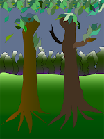
Here are 4 of the images I’m sharing. I have no idea what the others will contribute; I hope these will work. The lettering looks so much better than it would have before I’d worked with lettering in Illustrator. I’m pleased with it.

This last image is my very first attempt (well, 2nd, but I had to trash the first one because of a basic minunderstanding about paths) to make a drawing in Adobe Illustrator. I’ve done quite a lot now with type and converted images, but had never started from scratch to make an image in Illustrator. It’s a weird result, but I’m pleased that I was actually able to accomplish it.
As usual, click on the thumbnails for a closer view.

Webmaster Certification

This morning I got notice that I am a Certified Webmaster. Yay, me! I’m not sure what it signifies exactly. It definitely means that I completed courses in web architectures, XHTML, CSS, Photoshop and Dreamweaver, and that I designed a website that is compliant with W3C specifications and is accessible. As a bonus, the website I (re)designed is my own. Take a look at www.callibeth.com. Even though it was certified, I’m still not altogether happy with it — I’m continuing to work on converting all pixel measurements over to em measurements so that the website design won’t break when browsers choose to enlarge the type.

I do like my redesign of the 6 book swaps. They used to be rather ragtag and there were errors on the pages. Now it’s all consistent, and I like looking through all the books. See the books by starting here at www.callibeth.com/bookswaps.php.

Web design as fine graphic art

I see a lot of interesting web design and a lot of great art online. Hardly ever do I see both on one site. Checkland Kindleysides is one of the few sites I’ve seen that combine great web design with great art. Not only that, it’s one of the very, very few Flash sites that use Flash in an integrated way. It’s a magical experience.

One criticism: You can’t adjust font size on a Flash site.

Checking in


I haven’t been blogging much of late, and I’m going to have a hectic weekend, so I thought I’d just check in now while I’ve got the chance.

Two weeks ago I started a webmaster certification training program, and I’ve been having a blast. It’s an online endeavor consisting of 5 classes and a final project. So far I’ve gotten through the web architecture class, most of the XHTML 1.1 class, and about a quarter of the CSS class. Still to go are Dreamweaver and Photoshop classes. I’ve stumbled my way through Dreamweaver and Photoshop for awhile, so I don’t expect to have a whole lot of trouble with those classes, and I’m looking forward to positioning the bits and pieces I’ve culled into a coherent body of knowledge.

I love the right-brain “how-does-this-look” activity combined with the left-brain “how-can-I-make-it-look-like-this” work. Although the end of the XHTML class — a module-by-module discussion of every tag in XHTML1.1 — had my left brain fried for a little while. And even though I can’t imagine using the disapproved-of server-side image maps, for instance, still I dutifully slogged through every tag. A weekend off could be a good thing.

I’ve got an alphabet of painted letters that I’ve been playing around with digitally — both manually and virtually (ha ha) — and including in my homework exercises. It’s been fun. The final project is obvious: I’ll be redesigning my website. I can’t wait!