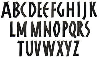
 The article, “Handwritten Typographers,” juxtaposes the type designs and handwriting samples of ten type designers. The comparisons themselves are intriguing, but more compelling to me is the whiff of attitude that each handwriting sample reveals. Type designers evidently aren’t exempt from personal handwriting shame, as Göran Söderström reveals. I’ve known lots of calligraphers who wished their handwriting were “better,” whatever that means, and type designers stand further away from handwriting than do calligraphers.
During the era of handwritten manuscripts, the same tools — brush and pen, mostly — were used for both formal and informal lettering systems, and the two systems informed the development of each other. But the tools for printing and writing now differ, and type design has fractured along lines of influence — influence of tools, culture, and more. The “serious” typefaces become more architectural, and the boutique (for want of a better word) typefaces more gestural but less grounded in traditional form.
I make these sweeping generalizations, and then I realize it’s not that simple or discrete; in this article I see many lines of connection between type and handwriting. Do I discern a repetition of rhythm in Nikola Djurek’s type design and handwriting. Does Kris Sowersby’s handwriting reveal a preoccupation with ligatures that gave rise to the typeface Feijoa? Eduardo Manso’s handwriting and type designs share the same lovely openness. Marian Bantjes tweaks her handwriting, not so surprising in a type illustrator; she’s a little closer to calligrapher than most type designers.
Interesting.
Like this:
Like Loading...


 ypography is interesting at the moment: we’re designing fonts. I wrote out an uncial font using a Zig scroll marker (first 4 letters shown above), scanned it in, and then vectorized the scan. The resulting paths are too complicated to go into Type Tool, and so I have traced each letter with the pen tool in Illustrator and then imported each into Type Tool. The initial letter of this paragraph has been traced in Illustrator. It’s tedious work, but somehow addicting.