This is the view from my studio window. Nice, huh? I will miss this hedge very much. The front yard is even more spectacular this year.
Edited to add a couple of photos of the front yard. It’s fairy-tale beautiful right now:

Calligraphy & more — the studio of Beth Lee, Bozeman, MT
Well, there’s a lot going on now. I’m in the Fine Arts Graphic Design program at Florida State University , and this semester I’m taking an unprecedented 15 hours … and they’re all studio classes:
I need to graduate in December, so this semester and the summer semester, in particularly, will be a slog in terms of class load .
Shockingly enough, on top of that we still need to eat and have clean clothes to wear, things still break and need repair (we’ve been riding on a wave of those), children still need help with their homework, and … I’ve got regular customer in my free-lance business who still call me on a regular basis.
As my grandfather said, “It’s a great life, if you don’t weaken.”
The essay question at the end of the final exam in History and Theory of Graphic Design directed us to speculate on the future of the book. It was an interesting question, and after I walked out of the exam room I continued to think about different aspects of the question.
At The New Atlantis, there’s a thought-provoking article by Christine Rosen entitled People of the Screen. In it, Ms. Rosen predicts what may result if we trade in the literacy learned throughout our 500-year-old history of book technology for “digital literacy,” as she calls it. The article is long and covers a wide range of issues. Two are particularly interesting to me. First, there is the connection between screen vs. paper reading and extrovert vs. introvert personality:
For centuries, print literacy has been one of the building blocks in the formation of the modern sense of self. By contrast, screen reading, a historically recent arrival, encourages a different kind of self-conception, one based on interaction and dependent on the feedback of others. It rewards participation and performance, not contemplation. It is, to borrow a characterization from sociologist David Riesman, a kind of literacy more comfortable for the “outer-directed” personality who takes his cues from others and constantly reinvents himself than for the “inner-directed” personality whose values are less flexible but also less susceptible to outside pressures. How does a culture of digitally literate, outer-directed personalities “read”?
The second issues is related but not identical:
[When encountering a novel,] you must first submit yourself to the process of reading it—which means accepting, at some level, the author’s authority to tell you the story. You enter the author’s world on his terms, and in so doing get away from yourself. Yes, you are powerless to change the narrative or the characters, but you become more open to the experiences of others and, importantly, open to the notion that you are not always in control. In the process, you might even become more attuned to the complexities of family life, the vicissitudes of social institutions, and the lasting truths of human nature. The screen, by contrast, tends in the opposite direction. Instead of a reader, you become a user; instead of submitting to an author, you become the master.
She finishes up with a rather harrowing picture of a monastic society of readers which dwindles to arcane hobbydom, gradually leaving the mainstream of society to fade into oblivion. This picture doesn’t seem likely to me, but it does somehow remind me of the surprise and sense of “otherness” I feel on discovering that someone I thought I knew well lives in a house which contains no books at all. It’s a divide which seems unbridgeable.
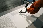
 Although I’ve seen it before, I don’t think I’ve posted about The Bible Scribe, a 2007 installation/project by robotlab. The installation itself addresses much larger issues, but the discussion I’ve seen about the project has mostly turned on whether the robotic writing is calligraphy or not. (I’ll spare you the suspense: it’s not.)
A poster on the Ornamental Penmanship list this week claims that because of its precise, beautiful and voluminous work, the robot should be granted Master Penman status. Of course not. The robot is a masterpiece of engineering, but its work is not penmanship and it’s not calligraphy. It’s printing — an unusual and interesting form of printing, but printing nonetheless.
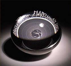
 I posted recently about the strange plaque that Carl Sagan and Frank Drake designed which was sent on the 1972 space probes. The Rosetta Project is more evidence of humankind’s drive to impact posterity and preserve knowledge. Kevin Kelly has an interesting post about it here.
Posted to the Ornamental Penmanship list this week: a link to a blog post entitled, “The Dying Art of Penmanship“. It stirred up some talk, as usual. Yes, we’re relying more and more on advanced technology to get things done … as opposed to traditional technology, of course. After all, paint is technology, and so are metal pens.
The implication in these hand-wringing analyses that crop up from time to time is that we are somehow less involved in The Making of Things now that we’re using tablets and electronic palettes instead of dip pens and ink. I don’t think that’s true, but it is harder to stay grounded. “Blue? Wait, what’s it look like in magenta? Oh, no, that’s not so great. Let’s try a nice mossy green. Hmm. Maybe blue. How about a nice drop-shadow — or maybe a bevel …” It’s easy to allow oneself to be driven by the options rather than driving the design process. Those monks who traveled from England to Afghanistan and back for some lapis lazuli for their manuscript books — now they were driving their design process!
What’s missing today, perhaps, is the physical cause-and-effect aspect of making things. When I do hand lettering, the movement of my hand and arm is directly related to the shapes of the letters forming on the paper. The ink glistens on the pen, slides down the nib onto the paper, and dulls as it sinks into the paper. By contrast, the click of a mouse can do so many disparate tasks: cause a letter to appear on the screen, or color in a shape, or close a file.
Yesterday in my typography class, I was speaking with the professor about how I use Adobe Illustrator to prepare my hand-lettered artwork for reproduction. She told me that Wacom now makes a stylus-and-tablet that emulates a calligraphy pen, so that the artist writes directly on the tablet and calligraphy appears in the graphics application window. She insists that these styluses are as sensitive as traditional copperplate nibs and that all the commercial hand lettering being done today is done using these $3,000+ tablets. Hmm. I like technology. Really I do. But I can’t imagine liking this electronic pen. As Peter Thornton (who really needs to get a website!) says, “It’s not wet enough.”

 What with traveling this summer and Tropical Storm Fay, I haven’t had much access to the Internet lately. Now school has started, and I’m looking forward to the classes.
I’m taking History & Theory of Graphic Design this semester. The textbook is Meggs’ History of Graphic Design but I’ve also bought Johanna Drucker’s new book, Graphic Design History: A Critical Guide, written with Emily McVarish.
Some interesting links from the first week of class:
And a couple of amusing links:
 Just back from more than two weeks in Montana and Wyoming, half of it spent sightseeing and hiking in Yellowstone. These trees were on the hillside by the trail up to Mount Washburn. I keep telling myself that I shouldn’t be expecting more from my sea-level Florida lungs than they were managing at 10,000 feet above sea level.
 These pages were made with a particular idea in mind, having to do with the island in central Florida on which I grew up. That green is very close to the greens of the pines, the palmetto bushes, and palm trees that made up much of the island‘s landscape. That brownish black is about the color of the pieces of wood that mixed in the sandy soil of the island.